Selections in .NET MAUI Calendar (SfCalendar)
21 Jul 202613 minutes to read
The Selection mode is specified in the Calendar property enumeration. You can select the dates by tapping the cell in the calendar. SfCalendar provides three types of modes such as Single, Multiple, and Range Selection. The default SelectionMode is Single, which allows only one date to be selected at a time.
NOTE You can select the cells in the Year, Decade, and Century views in the calendar only when the
AllowViewNavigationproperty is set to false.
Single selection
The Single selection can be performed in the Calendar by setting the CalendarSelectionMode property to Single. In this selection, you can select a single date at a time from the calendar.
<ContentPage
    . . .
    xmlns:calendar="clr-namespace:Syncfusion.Maui.Calendar;assembly=Syncfusion.Maui.Calendar">

    <calendar:SfCalendar x:Name="calendar"
                        View="Month"
                        SelectionMode="Single">
    </calendar:SfCalendar>

</ContentPage>
using Syncfusion.Maui.Calendar;
. . .
this.calendar.SelectionMode = CalendarSelectionMode.Single;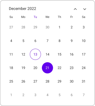
NOTE
- In the Year, Decade, and Century views, you can select the cells, only when the
AllowViewNavigationproperty is set to false.- In this scenario, the
selection changedevent will return the first date of the month, year, decade or century of the selected cell.
Eg:- In the year view, when the Dec month cell is selected then the selected date value will be 01-12-2022.
- In the decade view, when the (2022) year cell is selected then the selected date value will be 01-01-2022.
- In the century view, when the (2020-2029) decade cell is selected then the selected date value will be 01-01-2020.
Multiple selection
The Multiple selection can be performed in the Calendar by setting the CalendarSelectionMode property to Multiple. In this selection, you can select multiple dates from the calendar. If you want to remove the selected cell, click the same cell again.
<ContentPage
    . . .
    xmlns:calendar="clr-namespace:Syncfusion.Maui.Calendar;assembly=Syncfusion.Maui.Calendar">

    <calendar:SfCalendar x:Name="calendar"
                        View="Month"
                        SelectionMode="Multiple">
    </calendar:SfCalendar>

</ContentPage>
using Syncfusion.Maui.Calendar;
. . .
this.calendar.SelectionMode = CalendarSelectionMode.Multiple;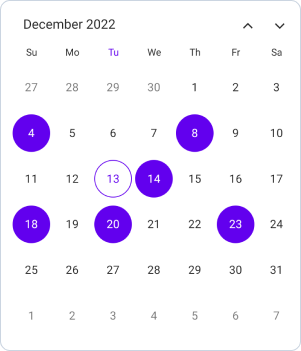
Range selection
The Range selection can be performed in the Calendar by setting the CalendarSelectionMode property to Range. In this selection, you can select a range of dates from the calendar by interacting with the cell using either a tap or swipe action. Swipe action can only be performed by setting the EnableSwipeSelection property to true in the calendar.
<ContentPage
    . . .
    xmlns:calendar="clr-namespace:Syncfusion.Maui.Calendar;assembly=Syncfusion.Maui.Calendar">

    <calendar:SfCalendar x:Name="calendar"
                        View="Month"
                        SelectionMode="Range">
    </calendar:SfCalendar>

</ContentPage>
using Syncfusion.Maui.Calendar;
. . .
this.calendar.SelectionMode = CalendarSelectionMode.Range;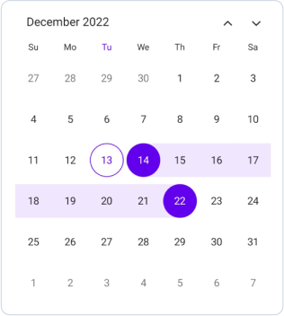
NOTE
- In the Year, Decade, and Century views, you can select cells only when the
AllowViewNavigationproperty is set tofalse.- In this scenario, the
SelectionChangedevent returns the first and last date of the month, year, decade, or century of the selected cell when the selection mode is set toRange.
Eg:- In the year view, when the range is selected as Sep - Dec, then the range value will be 01-09-2022 to 31-12-2022.
- In the decade view, when the range is selected as 2022 - 2025, then the range value will be 01-01-2022 to 31-12-2025.
- In the century view, when the range is selected as 2020-2029 to 2030-2039, then the range value will be 01-01-2020 to 31-12-2039.
Range selection direction
The RangeSelectionDirection is specified in the Calendar property enumeration and is used to select the range based on the direction. The RangeSelectionDirection provides five types of direction such as Default, Forward, Backward, Both, and None. The default RangeSelectionDirection is Default in the SfCalendar.
Forward
If you set the RangeSelectionDirection property to Forward, you can select only the dates after the selected range start date, while dates before the range start date are considered disabled. The start date will not be changed.
<ContentPage
    . . .
    xmlns:calendar="clr-namespace:Syncfusion.Maui.Calendar;assembly=Syncfusion.Maui.Calendar">

    <calendar:SfCalendar x:Name="calendar"
                        View="Month"
                        SelectionMode="Range"
                        RangeSelectionDirection="Forward">
    </calendar:SfCalendar>

</ContentPage>
using Syncfusion.Maui.Calendar;
. . .
this.calendar.SelectionMode = CalendarSelectionMode.Range;
this.calendar.RangeSelectionDirection = CalendarRangeSelectionDirection.Forward;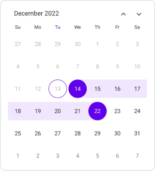
Backward
If you set the RangeSelectionDirection property to Backward, you can select only the dates before the selected range end date, while dates after the range end date are considered disabled. The end date will not be changed.
<ContentPage
    . . .
    xmlns:calendar="clr-namespace:Syncfusion.Maui.Calendar;assembly=Syncfusion.Maui.Calendar">

    <calendar:SfCalendar x:Name="calendar"
                        View="Month"
                        SelectionMode="Range"
                        RangeSelectionDirection="Backward">
    </calendar:SfCalendar>

</ContentPage>
using Syncfusion.Maui.Calendar;
. . .
this.calendar.SelectionMode = CalendarSelectionMode.Range;
this.calendar.RangeSelectionDirection = CalendarRangeSelectionDirection.Backward;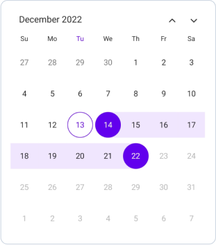
Both
If you set the RangeSelectionDirection property to Both, you can extend the selection from the selected range. Then, the tapped date is considered based on, if the date is nearby the start date, then the start date is updated, else if the date is nearby the end date, then the end date is updated, else if in-between the start and end date and both have the same distance, then the start date is updated.
<ContentPage
    . . .
    xmlns:calendar="clr-namespace:Syncfusion.Maui.Calendar;assembly=Syncfusion.Maui.Calendar">

    <calendar:SfCalendar x:Name="calendar"
                        View="Month"
                        SelectionMode="Range"
                        RangeSelectionDirection="Both">
    </calendar:SfCalendar>

</ContentPage>
using Syncfusion.Maui.Calendar;
. . .
this.calendar.SelectionMode = CalendarSelectionMode.Range;
this.calendar.RangeSelectionDirection = CalendarRangeSelectionDirection.Both;
None
If you set the RangeSelectionDirection property to None, you can select only the single range, while dates after the range end date and before the start date are considered disabled. It will remain in the initial range.
<ContentPage
    . . .
    xmlns:calendar="clr-namespace:Syncfusion.Maui.Calendar;assembly=Syncfusion.Maui.Calendar">

    <calendar:SfCalendar x:Name="calendar"
                        View="Month"
                        SelectionMode="Range"
                        RangeSelectionDirection="None">
    </calendar:SfCalendar>

</ContentPage>
using Syncfusion.Maui.Calendar;
. . .
this.calendar.SelectionMode = CalendarSelectionMode.Range;
this.calendar.RangeSelectionDirection = CalendarRangeSelectionDirection.None;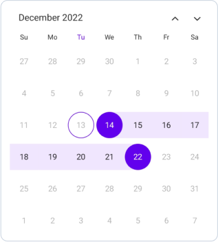
Multiple range selection
The MultiRange selection can be performed in the Calendar by setting the CalendarSelectionMode property to MultiRange. In this selection, multiple ranges of dates can be selected from the calendar by interacting with the cell using either a tap or swipe action.
<ContentPage
    . . .
    xmlns:calendar="clr-namespace:Syncfusion.Maui.Calendar;assembly=Syncfusion.Maui.Calendar">

    <calendar:SfCalendar x:Name="calendar"
                        View="Month"
                        SelectionMode="MultiRange">
    </calendar:SfCalendar>

</ContentPage>
using Syncfusion.Maui.Calendar;
. . .
this.calendar.SelectionMode = CalendarSelectionMode.MultiRange;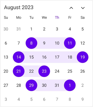
Selection shape
The selected date is rendered based on the SelectionShape property. The default SelectionShape is Circle. You can customize the selection shape to either Rectangle or Circle.
<ContentPage
    . . .
    xmlns:calendar="clr-namespace:Syncfusion.Maui.Calendar;assembly=Syncfusion.Maui.Calendar">

    <calendar:SfCalendar x:Name="calendar"
                      View="Month"
                      SelectionShape="Rectangle">
    </calendar:SfCalendar>

</ContentPage>
using Syncfusion.Maui.Calendar;
. . .
this.calendar.SelectionShape = CalendarSelectionShape.Rectangle;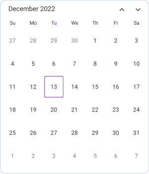
Enable swipe selection
You can select the dates by swiping using the EnableSwipeSelection property. By default, EnableSwipeSelection property is false.
<ContentPage
    . . .
    xmlns:calendar="clr-namespace:Syncfusion.Maui.Calendar;assembly=Syncfusion.Maui.Calendar">

    <calendar:SfCalendar x:Name="calendar"
                      View="Month"
                      EnableSwipeSelection="true">
    </calendar:SfCalendar>

</ContentPage>
using Syncfusion.Maui.Calendar;
. . .
this.calendar.EnableSwipeSelection = true;Toggle day selection
You can deselect the date by using the CanToggleDaySelection property. By default, CanToggleDaySelection property is false.
<ContentPage
    . . .
    xmlns:calendar="clr-namespace:Syncfusion.Maui.Calendar;assembly=Syncfusion.Maui.Calendar">

    <calendar:SfCalendar x:Name="calendar"
                      View="Month"
                      CanToggleDaySelection="true">
    </calendar:SfCalendar>

</ContentPage>
using Syncfusion.Maui.Calendar;
. . .
this.calendar.CanToggleDaySelection = true;