Getting started with JavaScript Tooltip
3 May 20216 minutes to read
Preparing HTML document
The Tooltip control has the following list of external JavaScript dependencies.
-
jQuery 1.7.1 and later versions
-
jQuery.easing - to support animation effects in the components
Refer to the internal dependencies in the following table.
| File | Description/Usage |
|---|---|
| ej.core.min.js | It is referred always before using all the JS controls. |
| ej.tooltip.min.js | The Tooltip's main file. |
To get started, you can use the ej.web.all.min.js file that encapsulates all the ej controls and frameworks in one single file. So the complete boilerplate code is
<!DOCTYPE html>
<html>
<head>
    <meta name="viewport" content="width=device-width, initial-scale=1.0">
    <meta name="description" content="Essential Studio for JavaScript">
    <meta name="author" content="Syncfusion">
    <title></title>
    <!-- Essential Studio for JavaScript  theme reference -->
    <link rel="stylesheet" href="http://cdn.syncfusion.com/28.1.33/js/web/flat-azure/ej.web.all.min.css" />

    <!-- Essential Studio for JavaScript  script references -->
    <script src="https://code.jquery.com/jquery-1.10.2.min.js"></script>
    <script src="http://cdn.syncfusion.com/js/assets/external/jquery.easing.1.3.min.js"> </script>
    <script src="http://cdn.syncfusion.com/28.1.33/js/web/ej.web.all.min.js"> </script>

    <!-- Add your custom scripts here -->

</head>
<body>

</body>
</html>
NOTE
In production, we highly recommend you to use our custom script generator to create custom script file with required controls and its dependencies only. Also to reduce the file size further please use GZip compression in your server.
For themes, you can use the ej.web.all.min.css CDN link from the code example given. To add the themes in your application, please refer to this link.
Create a Tooltip
The Tooltip can be created from any HTML element with the HTML id attribute and pre-defined options set to it. To create the Tooltip, you should call the ejTooltip jQuery plug-in function with the options as parameter. Refer to the following code example.
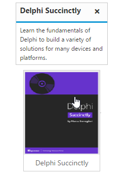
content option is used for tooltip content.
<div class="frame">
    <div class="img" id="sample">
        <a target="_blank" href="image/taj.png">
        <img src="http://js.syncfusion.com/demos/web/images/tooltip/template-05.png" alt="Delphi">
        </a>
        <div class="desc">Delphi Succinctly</div>
    </div>
</div>

// Creates the Tooltip
<script>
    $("#sample").ejTooltip({
        content: "Learn the fundamentals of Delphi to build a variety of solutions for many devices and platforms."
    });
</script>
Apply the following style sheet
<style>
    div.img {
        border: 1px solid #ccc;
        width: 159px;
        height: 213px;
        left: 35%;
        position: relative;
        top: 20%;
    }
    div.img img {
        width: 159px;
        height: 179px;
    }
    div.desc {
        padding: 8px;
        text-align: center;
    }
</style>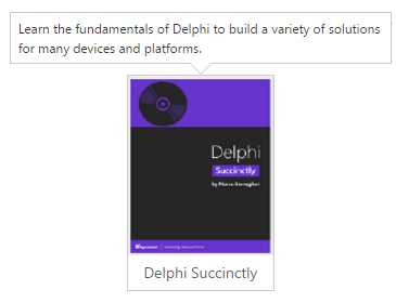
Setting Dimensions
Tooltip dimensions can be set using width and height API.
<div class="control">
    TypeScript lets you write <a id="test"><u> JavaScript</u> </a>the way you really want to.
</div>

// Creates the Tooltip
<script>
    $("#test").ejTooltip(
    {
        content: "JavaScript is the programming language of HTML and the Web.",
        width: "100px",
        height: "100px"
    });
</script>
Tooltip Appearance
You can configure the appearance of the Tooltip with the title, close button and call out as your application requires. isBalloon option is used to enable the arrow in the tooltip.
<div class="img" id="sample">
    <a target="_blank" href="image/taj.png">
    <img src="http://js.syncfusion.com/demos/web/images/tooltip/template-05.png" alt="Delphi">
    </a>
    <div class="desc">Delphi Succinctly</div>
</div>

// Creates the Tooltip
<script>
    $("#sample").ejTooltip({
        content: "Learn the fundamentals of Delphi to build a variety of solutions for many devices and platforms.",
        title: "Delphi Succinctly",
        width : "180px",
        closeMode : "sticky",
        isBalloon : false
    });
</script>
Apply the following styles to show the Tooltip.
<style>
    div.img {
        border: 1px solid #ccc;
        float: left;
        box-sizing: border-box;
        height: 200px;
        width: 146px;
    }
    div.img img{
        width: 100%;
        height: 166px;
    }
    div.desc {
        padding: 6px;
        text-align: center;
    }
</style>