- Adjusting ProgressBar size
- Custom text
- Theme
- CSS class
Contact Support
Appearance and Styling
23 Nov 20175 minutes to read
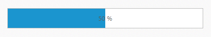
Adjusting ProgressBar size
ProgressBar widget provides the ability to change or adjust the ProgressBar size. The ‘height’ and ‘width’ properties in the ProgressBar widget allows you to set the maximum height and maximum width for the ProgressBar. The value set to this property is string or Number type.
The following steps explain you on how to adjust the ProgressBar size.
In the HTML page, add a <div> element to render the ProgressBar widget
<div class="control">
   <div id="progressbar"></div>
</div>$(function () {
//Declaration.
$("#progressbar").ejProgressBar({
value: 50,
width: "400px",
height: "40px"
});
var progress = $("#progressbar").data("ejProgressBar");
progress.setModel({ text: progress.getValue() + " %" });
});The following screenshot displays the output.
Custom text
Custom text is displayed when the ProgressBar shows different levels of progress in the ProgressBar. Support for Custom text to mention the percentage or any other message inside the ProgressBar is possible by using “text” property.
The following steps explain the configuration of the Custom text for the ProgressBar widget.
In the HTML page, add a <div> element to render the ProgressBar widget.
<div class="control">
   <div id="progressbar"></div>
</div>// Add Custom Text for the ProgressBar widget.
$(function () {
//Declaration.
$("#progressbar").ejProgressBar({
text: "loading",
value: 35,
height: 20,
width: 500
});
});The following screenshot displays the output.

Theme
The ProgressBar widget style and appearance are controlled based on CSS classes. In order to apply Theme to the ProgressBar widget, you can refer two files, namely, ej.widgets.core.min.css and ej.theme.min.css. When the file ej.widgets.all.min.css is referred, then it is not necessary to include the files ej.widgets.core.min.css and ej.theme.min.css in your project, as ej.widgets.all.min.css is the combination of these both.
By default, there are 12 themes’ support available for the ProgressBar widget namely,
- Default-theme
- Flat-azure-dark
- Fat-lime
- Flat-lime-dark
- Flat-saffron
- Flat-saffron-dark
- Gradient-azure
- Gradient-azure-dark
- Gradient-lime
- Gradient-lime-dark
- Gradient-saffron
- Gradient-saffron-dark
CSS class
To apply custom styles to the ProgressBar widget, you can specify the cssClass property. The specified CSS name is added in the root of the ProgressBar widget.
The following code example is used to render the ProgressBar widget with customized style.
In the HTML page, add a <div> element to render the ProgressBar widget.
<div class="control">
    <div id="progressbar"></div>
</div>// Add the class for the ProgressBar Widget.
$(function () {
//Declaration.
$("#progressbar").ejProgressBar({
cssClass: 'custom',
value: 70,
height: 20,
width: 500
});
var progress = $("#progressbar").data("ejProgressBar");
progress.setModel({ text: progress.getValue() + "%" });
});Add the following styles to render the ProgressBar with customized style.
<style type="text/css">
   .custom .e-progress {
       background-color:gray;
   }
</style>
The following screenshot displays the output.
