How can I help you?
Getting Started with JavaScript ComboBox
The external script dependencies of the ComboBox widget are,
- jQuery 1.7.1 and later versions.
And the internal script dependencies of the ComboBox widget are:
| File | Description / Usage |
|---|---|
| ej.core.min.js | Must be referred always before using all the JS controls. |
| ej.data.min.js | Used to handle data operation and should be used while binding data to JS controls. |
| ej.combobox.min.js | The ComboBox's main file |
| ej.globalize.min.js | processing specific source-side actions globally. |
For getting started you can use the ‘ej.web.all.min.js’ file, which encapsulates all the ‘ej’ controls and frameworks in one single file.
For themes, you can use the ‘ej.web.all.min.css’ CDN link from the snippet given. To add the themes in your application, please refer this link.
Preparing HTML Document
Create a new HTML file and add CDN links to the JavaScript and CSS dependencies to your project.
<!DOCTYPE html>

    <html>

    <head>

        <meta name="viewport" content="width=device-width, initial-scale=1.0" charset="utf-8" />

        <!-- style sheet for default theme(flat azure) -->

        <link href="http://cdn.syncfusion.com/33.1.44/js/web/flat-azure/ej.web.all.min.css"
              rel="stylesheet" />

        <!--scripts-->

        <script src="http://cdn.syncfusion.com/js/assets/external/jquery-1.11.3.min.js"></script>

        <script src="http://cdn.syncfusion.com/js/assets/external/jquery.easing.1.3.min.js"></script>

        <script src="http://cdn.syncfusion.com/33.1.44/js/web/ej.web.all.min.js"></script>

    </head>

    <body>

        <!--Place input element to create ComboBox-->

        <script>

            // Place your script code here to initialize ComboBox

        </script>

    </body>

    </html>
NOTE
In production, we highly recommend you to use our custom script generator to create custom script file with required controls and its dependencies only. Also to reduce the file size further please use GZip compression in your server.
Creating ComboBox
The ComboBox can be initialized through three different tags which described in Initialize Tags.
Add the HTML input element that needs to be initialized as ComboBox in sample.html.
<input type="text" tabindex="1" id="list" />Binding Data Source
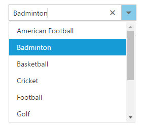
After initializing, populate the ComboBox with data using the dataSource property. Here, sportsData object is passed to the ComboBox component.
<input type="text" tabindex="1" id="list" />var sportsData = [
{ id: 'level1', game: 'American Football' }, { id: 'level2', game: 'Badminton' },
{ id: 'level3', game: 'Basketball' }, { id: 'level4', game: 'Cricket' },
{ id: 'level5', game: 'Football' }, { id: 'level6', game: 'Golf' },
{ id: 'level7', game: 'Hockey' }, { id: 'level8', game: 'Rugby' },
{ id: 'level9', game: 'Snooker' }, { id: 'level10', game: 'Tennis' }
];
$(function () {
$("#list").ejComboBox({
dataSource: sportsData,
fields: { text: 'game', value: 'id' },
width: '250px',
placeholder: 'Select a game',
index: -1
});
});After completing the configuration required to render a basic ComboBox, run the above sample to display the output in your default browser.
Custom Values
The ComboBox allows the user to give input as custom value which is not required to present in predefined set of values. By default, this support is enabled by allowCustom property. In this case, both text field and value field considered as same. The custom value will be sent to post back handler when a form is about to be submitted.
<input type="text" tabindex="1" id="list" /><script type="text/javascript">
var sportsData = [
{ Id: 'game1', Game: 'Badminton' },
{ Id: 'game2', Game: 'Football' },
{ Id: 'game3', Game: 'Tennis' }
];
$(function () {
$("#list").ejComboBox({
//set the data to dataSource property
dataSource: sportsData,
// By default, its enabled. For your better understanding, showcase this property here.
allowCustom: true,
// maps the appropriate column to fields property
fields: { text: 'Game', value: 'Id' },
// set placeholder to ComboBox input element
placeholder: "Select a game"
});
});
</script>Configure the Popup List
By default, the width of the popup list automatically adjusts according to the ComboBox input element’s width, and the height of the popup list has ‘300px’.
The height and width of the popup list can also be customized using the popupHeight and popupWidth properties respectively.
In the following sample, popup list’s width and height are configured.
<input type="text" tabindex="1" id="list" /><script type="text/javascript">
var sportsData = [
{ Id: 'game1', Game: 'Badminton' },
{ Id: 'game2', Game: 'Football' },
{ Id: 'game3', Game: 'Tennis' }
];
$(function () {
$("#list").ejComboBox({
//set the data to dataSource property
dataSource: sportsData,
// By default, its enabled. For your better understanding, showcase this property here.
allowCustom: true,
//set height to popup list
popupHeight: '200px',
//set width to popup list
popupWidth: '250px',
// maps the appropriate column to fields property
fields: { text: 'Game', value: 'Id' },
// set placeholder to ComboBox input element
placeholder: "Select a game"
});
});
</script>