Column Types in .NET MAUI DataGrid (SfDataGrid)
The .NET MAUI DataGrid contains different types of columns. Each column type serves a specific purpose and provides specialized functionality. Any of the columns can be used depending on the requirements.
To get started quickly with column types in .NET MAUI DataGrid, you can check this video:
The following table describes the types of columns and their usage:
| Column Type | Renderer | Key | Description |
|---|---|---|---|
| Text | To display a string or numbers in each row. | ||
| CheckBox | To display CheckBox in each row. | ||
| Image | To display an image in each row. | ||
| Template | To customize a column based on the requirements. | ||
| Numeric | To display numeric data. | ||
| DateTime | To display the date and time value. | ||
| ComboBox | To display a ComboBox within each cell | ||
| Picker | To display a Picker within each cell | ||
| Percentage | To display and edit percentage values in each row | ||
| MultiColumnComboBox | Use to display the IEnumerable data using | ||
| Currency | To display and edit currency values in each row | ||
| TimePicker | To display the time span value. | ||
| CheckBoxSelector | Selects or deselects rows based on the check box value, which is not bound with data object. | ||
| Unbound | To add additional columns that are not bound with data object from the underlying data source. |
DataGridColumn
The DataGridColumn is the base column type of all columns, hence its properties are used by all the columns. The following sub-sections explain the properties and customizations of DataGridColumn:
Binding options
The display content of the DataGridColumn is determined by the DataGridColumn.DisplayBinding property. It gets or sets display binding that associates the DataGridColumn with a property in the data source.
Mapping column to particular property
The DataGridColumn.MappingName associates the DataGridColumn with a property available in the underlying data source. While setting MappingName alone to the SfDataGrid, the DataGridColumn.DisplayBinding will be automatically generated based on the MappingName. Data manipulation operations like sorting and filtering will be done based on the MappingName property.
To format cell contents, use the converter of the DataGridColumn.DisplayBinding to customize the cell contents.
<ContentPage.Resources>
    <ResourceDictionary>
        <local:DisplayBindingConverter x:Key="displayBindingConverter" />
    </ResourceDictionary>
</ContentPage.Resources>

<syncfusion:SfDataGrid x:Name="dataGrid"
                       ItemsSource="{Binding OrderInfoCollection}">

    <syncfusion:SfDataGrid.Columns>
        <syncfusion:DataGridTextColumn MappingName="CustomerID"
                                   DisplayBinding="{Binding CustomerID,
                                   Converter={StaticResource displayBindingConverter}}" />
    </syncfusion:SfDataGrid.Columns>
</syncfusion:SfDataGrid>using System.Globalization;
public class DisplayBindingConverter : IValueConverter
{
public object Convert(object value, Type targetType, object parameter, CultureInfo culture)
{
if (value != null)
return "Customer : " + value.ToString();
return null;
}
public object ConvertBack(object value, Type targetType, object parameter, CultureInfo culture)
{
throw new NotImplementedException();
}
}Load DataTemplate for Cells
You can customize the display of any column in the SfDataGrid by setting the DataGridColumn.CellTemplate property. This allows you to format data visually using MAUI controls and apply conditional styling using DataTrigger or Binding. In edit mode, the appropriate editor will be loaded based on the column type.
<syncfusion:SfDataGrid x:Name="dataGrid"
                       ItemsSource="{Binding OrderInfoCollection}">
    <syncfusion:SfDataGrid.Columns>
        <syncfusion:DataGridNumericColumn HeaderText="Order ID" MappingName="OrderID">
           <syncfusion:DataGridNumericColumn.CellTemplate>
              <DataTemplate>
                 <Label Text="{Binding OrderID}" TextColor="Red" HorizontalOptions="Center" VerticalOptions="Center"/>
              </DataTemplate>
           </syncfusion:DataGridNumericColumn.CellTemplate>
        </syncfusion:DataGridNumericColumn>
        <syncfusion:DataGridTextColumn  HeaderText="Customer" MappingName="CustomerName" />
        <syncfusion:DataGridNumericColumn HeaderText="Quantity" MappingName="Quantity" Width="150">
            <syncfusion:DataGridNumericColumn.CellTemplate>
                <DataTemplate>
                    <Grid Padding="5" ColumnDefinitions="*,*" ColumnSpacing="5">
                        <Stepper Value="{Binding Quantity, Mode=TwoWay}" Minimum="1"
                                 Maximum="20" Increment="1" HorizontalOptions="Center"/>
                        <Label Text="{Binding Quantity, StringFormat='Qty: {0}'}"
                               HorizontalOptions="Center" VerticalOptions="Center" FontSize="14"
                               TextColor="#333333" Grid.Column="1" Margin="0,5,0,0" />
                    </Grid>
                </DataTemplate>
            </syncfusion:DataGridNumericColumn.CellTemplate>
        </syncfusion:DataGridNumericColumn>
        <syncfusion:DataGridTextColumn MappingName="City" HeaderText="Ship City" />
    </syncfusion:SfDataGrid.Columns>
</syncfusion:SfDataGrid>
The SfDataGrid also supports using a DataTemplateSelector to dynamically choose templates based on data. This is useful when you want to apply different styles or layouts depending on the properties of the data object.
In the following example, a custom DataTemplateSelector is used to apply different styles based on whether the OrderID is even or odd.
<ContentPage.Resources>
    <ResourceDictionary>
        <DataTemplate x:Key="DefaultTemplate">
            <Grid Background="#FFF3E0" Padding="5">
                <Label Text="{Binding OrderID}"
                       TextColor="#E65100"
                       FontAttributes="Bold"
                       HorizontalTextAlignment="Center"
                       VerticalTextAlignment="Center"/>
            </Grid>
        </DataTemplate>
        <DataTemplate x:Key="AlternateTemplate">
            <Grid Background="#E3F2FD" Padding="5">
                <Label Text="{Binding OrderID}"
                       TextColor="#0D47A1"
                       FontAttributes="Bold"
                       HorizontalTextAlignment="Center"
                       VerticalTextAlignment="Center" />
            </Grid>
        </DataTemplate>
        <selector:CustomCellTemplateSelector x:Key="OrderTemplateSelector"
                                             DefaultTemplate="{StaticResource DefaultTemplate}"
                                             AlternateTemplate="{StaticResource AlternateTemplate}" />
    </ResourceDictionary>
</ContentPage.Resources>

<syncfusion:SfDataGrid x:Name="dataGrid"
                       ItemsSource="{Binding OrderInfoCollection}"
                       AutoGenerateColumnsMode="None">
    <syncfusion:SfDataGrid.Columns>
        <syncfusion:DataGridNumericColumn HeaderText="Order ID"
                                          MappingName="OrderID"
                                          CellTemplate="{StaticResource OrderTemplateSelector}"/>
        <syncfusion:DataGridTextColumn HeaderText="Customer" MappingName="CustomerName" />
        <syncfusion:DataGridTextColumn HeaderText="Ship City" MappingName="City"/>
        <syncfusion:DataGridTextColumn HeaderText="Ship Country" MappingName="Country" />
    </syncfusion:SfDataGrid.Columns>
</syncfusion:SfDataGrid>public class CustomCellTemplateSelector : DataTemplateSelector
{
public DataTemplate DefaultTemplate { get; set; }
public DataTemplate AlternateTemplate { get; set; }
protected override DataTemplate OnSelectTemplate(object item, BindableObject container)
{
var order = item as OrderModel;
if (order != null)
{
return order.OrderID % 2 == 0 ? AlternateTemplate : DefaultTemplate;
}
return DefaultTemplate;
}
}
Reuse DataTemplate for multiple columns
To reuse a single DataTemplate across multiple columns, set the DataGridColumn.SetCellBoundValue property to true. This changes the BindingContext to a helper object with Value (column’s mapped value) and Record (original data object) properties.
<ContentPage.Resources>
    <ResourceDictionary>
        <DataTemplate x:Key="cellTemplate">
            <Label Text="{Binding Path=Value}"
                   HorizontalOptions="CenterAndExpand"
                   VerticalOptions="CenterAndExpand"
                   TextColor="#E65100"/>
        </DataTemplate>
    </ResourceDictionary>
</ContentPage.Resources>

<syncfusion:SfDataGrid x:Name="dataGrid"
                       ItemsSource="{Binding OrderInfoCollection}">
    <syncfusion:SfDataGrid.Columns>
        <syncfusion:DataGridNumericColumn HeaderText="Order ID"
                                          MappingName="OrderID"
                                          SetCellBoundValue="True"
                                          CellTemplate="{StaticResource cellTemplate}"/>
        <syncfusion:DataGridTextColumn HeaderText="Customer" MappingName="CustomerName"/>
        <syncfusion:DataGridTextColumn HeaderText="Ship City"
                                       MappingName="City"
                                       SetCellBoundValue="True"
                                       CellTemplate="{StaticResource cellTemplate}" />
        <syncfusion:DataGridTextColumn HeaderText="Ship Country" MappingName="Country" />
    </syncfusion:SfDataGrid.Columns>
</syncfusion:SfDataGrid>
CellTemplateis not supported byDataGridCheckboxColumn,DataGridImageColumnandDataGridUnboundColumncolumns. When using complex templates, consider the impact on scrolling performance with large datasets.
TextAlignment
In order to set the TextAlignment of the header cell and data row cell , use the DataGridColumn.HeaderTextAlignment and DataGridColumn.CellTextAlignment property. The default text alignment is based on the type of the columns. The header and data rows are right aligned for numeric, date columns and left aligned for text column.
Header customizations
HeaderText
To customize the display content of the header cell, use the DataGridColumn.HeaderText property. It specifies the text displayed in the column header. If the header text is not defined, then DataGridColumn.MappingName will be assigned to the header text and will be displayed as a column header.
Header template
Based on the requirement, the header cell can be customized using the DataGridColumn.HeaderTemplate property.
<syncfusion:SfDataGrid x:Name="dataGrid"
                       ItemsSource="{Binding OrderInfoCollection}">
    <syncfusion:SfDataGrid.Columns>
        <syncfusion:DataGridTextColumn MappingName="OrderID">
            <syncfusion:DataGridTextColumn.HeaderTemplate>
                <DataTemplate>
                    <Label x:Name="OrderID"
                           Text="Order ID"
                           TextColor="Black"
                           BackgroundColor="Yellow" />
                </DataTemplate>
            </syncfusion:DataGridTextColumn.HeaderTemplate>
        </syncfusion:DataGridTextColumn>
    </syncfusion:SfDataGrid.Columns>
</syncfusion:SfDataGrid>
Setting manual column width
The SfDataGrid allows you to customize the width of each DataGridColumn in the SfDataGrid.Columns collection. To customize the column width, use the DataGridColumn.Width property. By default, this property will not be assigned any value. The DataGridColumn renders based on the value of the DefaultColumnWidth property.
<syncfusion:SfDataGrid x:Name="dataGrid"
                       ItemsSource="{Binding OrderInfoCollection}"
                       AutoGenerateColumnsMode="None"
                       DefaultColumnWidth="120">
    <syncfusion:SfDataGrid.Columns >
        <syncfusion:DataGridTextColumn MappingName="OrderID"
                                       HeaderText="Order ID"
                                       Width="100" />
    </syncfusion:SfDataGrid.Columns >
</syncfusion:SfDataGrid>
OrderInfoRepository viewModel = new OrderInfoRepository();
SfDataGrid dataGrid = new SfDataGrid();
dataGrid.ItemsSource = viewModel.OrderInfoCollection;
// AutoGenerated Column
dataGrid.AutoGeneratingColumn += DataGrid_AutoGeneratingColumn;
private void DataGrid_AutoGeneratingColumn(object sender, DataGridAutoGeneratingColumnEventArgs e)
{
if (e.Column.MappingName == "OrderID")
{
e.Column.Width = 100;
}
}
// Manually generated column
dataGrid.AutoGenerateColumnsMode = AutoGenerateColumnsMode.None;
dataGrid.Columns.Add(new DataGridTextColumn() { MappingName = "OrderID" ,Width = 100 });Hiding a column
To hide a particular column, use the DataGridColumn.Visible property. The default value of the Visible property is True.
Set the Visible property to
Falseinstead of setting column width as0to hide a column.
<syncfusion:SfDataGrid x:Name="dataGrid"
                       ItemsSource="{Binding OrderInfoCollection}"
                       AutoGenerateColumnsMode="None"
                       DefaultColumnWidth="120">
    <syncfusion:SfDataGrid.Columns>
    <syncfusion:DataGridTextColumn MappingName="OrderID"
                                   Visible="False" />
    </syncfusion:SfDataGrid.Columns >
</syncfusion:SfDataGrid>
OrderInfoRepository viewModel = new OrderInfoRepository();
SfDataGrid dataGrid = new SfDataGrid();
dataGrid.ItemsSource = viewModel.OrderInfoCollection;
// AutoGenerate Column
dataGrid.AutoGeneratingColumn += DataGrid_AutoGeneratingColumn;
private void DataGrid_AutoGeneratingColumn(object sender, DataGridAutoGeneratingColumnEventArgs e)
{
if (e.Column.MappingName == "OrderID")
{
e.Column.Visible = false;
}
}
// Manually generated column
dataGrid.AutoGenerateColumnsMode = AutoGenerateColumnsMode.None;
dataGrid.Columns.Add(new DataGridTextColumn() { MappingName = "OrderID", Visible = false});Padding
The SfDataGrid allows users to set padding for the Header and cells in display mode by using the property DataGridColumn.HeaderPadding and DataGridColumn.CellPadding.
<syncfusion:DataGridTextColumn MappingName="OrderID"
                            CellTextAlignment="Start"
                            CellPadding="10,0,0,0"
                            HeaderPadding="10,0,0,0" />
DataGridTextColumn orderID = new DataGridTextColumn();
orderID.MappingName = "OrderID";
orderID.CellTextAlignment = TextAlignment.Start;
orderID.CellPadding = new Thickness(10, 0, 0, 0);
orderID.HeaderPadding = new Thickness(10, 0, 0, 0);Formatting
To format values displayed in the DataGridColumn, use the DataGridColumn.Format property. The format string is applied to the underlying data type. Common format strings include:
- C or C2 - Currency format (e.g., $1,234.56)
- N or N2 - Number format with decimal places (e.g., 1,234.56)
- P or P2 - Percentage format (e.g., 123.46%)
- d - Short date format (e.g., 7/6/2026)
- dd/MM/yyyy - Custom date format
- hh:mm - Time format
<syncfusion:SfDataGrid.Columns>
    <syncfusion:DataGridTextColumn MappingName="Freight"
                                   Format="C2" />
    <syncfusion:DataGridTextColumn MappingName="ShippingDate"
                                   Format="dd/MM/yyyy" />
    <syncfusion:DataGridTextColumn MappingName="Discount"
                                   Format="P2" />
</syncfusion:SfDataGrid.Columns>dataGrid.Columns.Add(new DataGridTextColumn()
{
MappingName = "Freight",
Format = "C2" // Displays as $1,234.56
});
dataGrid.Columns.Add(new DataGridTextColumn()
{
MappingName = "ShippingDate",
Format = "dd/MM/yyyy"
});
dataGrid.Columns.Add(new DataGridTextColumn()
{
MappingName = "Discount",
Format = "P2" // Displays as 25.50%
});Format column using converter
We can customize the format of a particular column using converter.
<ContentPage.Resources>
    <local:SummaryConverter x:Key="summaryConverter"/>
</ContentPage.Resources>

<syncfusion:SfDataGrid x:Name="dataGrid"
                       ItemsSource="{Binding OrderInfoCollection}">
    <syncfusion:SfDataGrid.Columns>
        <syncfusion:DataGridTextColumn HeaderText="Freight"
                                       MappingName="Freight"
                                       DisplayBinding="{Binding Freight, Converter={StaticResource summaryConverter}}" />
    </syncfusion:SfDataGrid.Columns >
</syncfusion:SfDataGrid>using System.Globalization;
public class SummaryConverter : IValueConverter
{
public object Convert(object value, Type targetType, object parameter, CultureInfo culture)
{
if (value != null)
{
var formattedString = string.Format("$ {0}", value);
return formattedString;
}
return null;
}
public object ConvertBack(object value, Type targetType, object parameter, CultureInfo culture)
{
throw new NotImplementedException();
}
}For AutoGenerated columns, formatting can be applied by handling the SfDataGrid.AutoGeneratingColumn event.
Formatting DataGridColumn with different culture
To apply a different CultureInfo for DataGridColumns, use the DataGridColumn.CultureInfo property. Assign the desired string format to this property. The column will format the value based on the type of the associated property. You can use different StringFormats to customize the values displayed in the record cells.
To apply different cultures for the DataGridColumns, follow the code example:
dataGrid.Columns.Add(new DataGridTextColumn()
{
    MappingName = "Customer",
    CultureInfo = new CultureInfo("en-US"),
});

dataGrid.Columns.Add(new DataGridTextColumn()
{
    MappingName = "OrderID",
    Format = "C",
    CultureInfo = new CultureInfo("en-GB"),
});
For auto-generated columns, this is achievable by handling the SfDataGrid.AutoGeneratingColumn event. To apply different cultures for auto-generated DataGridColumns, follow the code example:
<syncfusion:SfDataGrid x:Name="dataGrid"
                       ItemsSource="{Binding OrderInfoCollection}"
                       AutoGeneratingColumn="dataGrid_AutoGeneratingColumn"/>
OrderInfoRepository viewModel = new OrderInfoRepository();
SfDataGrid dataGrid = new SfDataGrid();
dataGrid.ItemsSource = viewModel.OrderInfoCollection;
dataGrid.AutoGeneratingColumn += dataGrid_AutoGeneratingColumn;
private void dataGrid_AutoGeneratingColumn(object sender, DataGridAutoGeneratingColumnEventArgs e)
{
if (e.Column.MappingName == "OrderID")
{
e.Column.Format = "C";
e.Column.CultureInfo = new CultureInfo("en-US");
}
else if (e.Column.MappingName == "Quantity")
{
e.Column.Format = "C";
e.Column.CultureInfo = new CultureInfo("en-GB");
}
}Header Line break mode
The text wrapping and truncation of a column’s header text can be customized by setting the DataGridColumn.HeaderLineBreakMode property.
<syncfusion:SfDataGrid x:Name="dataGrid"
                       AutoGenerateColumnsMode="None"
                       ItemsSource="{Binding OrderInfoCollection}">
    <syncfusion:SfDataGrid.Columns >
        <syncfusion:DataGridTextColumn MappingName="CustomerName" HeaderLineBreakMode="NoWrap" />
    </syncfusion:SfDataGrid.Columns>
</syncfusion:SfDataGrid>
OrderInfoRepository viewModel = new OrderInfoRepository();
SfDataGrid dataGrid = new SfDataGrid();
dataGrid.ItemsSource = viewModel.OrderInfoCollection;
dataGrid.Columns.Add(new DataGridTextColumn()
{
MappingName = "CustomerName",
HeaderLineBreakMode = LineBreakMode.NoWrap,
});The truncation modes will not work on the Windows platform. On Windows, text will be truncated by default and cannot be wrapped or configured via LineBreakMode.
Line break mode
The text wrapping and truncation of a column’s cell values can be customized by setting the DataGridColumn.LineBreakMode property.
<syncfusion:SfDataGrid x:Name="dataGrid"
                       AutoGenerateColumnsMode="None"
                       ItemsSource="{Binding OrderInfoCollection}">
    <syncfusion:SfDataGrid.Columns >
        <syncfusion:DataGridTextColumn MappingName="CustomerName" LineBreakMode="WordWrap" />
    </syncfusion:SfDataGrid.Columns>
</syncfusion:SfDataGrid>
OrderInfoRepository viewModel = new OrderInfoRepository();
SfDataGrid dataGrid = new SfDataGrid();
dataGrid.ItemsSource = viewModel.OrderInfoCollection;
dataGrid.Columns.Add(new DataGridTextColumn()
{
MappingName = "CustomerName",
LineBreakMode = LineBreakMode.WordWrap,
});
// Available LineBreakMode values:
// LineBreakMode.WordWrap - Text wraps to multiple lines
// LineBreakMode.NoWrap - Text on single line without truncation
// LineBreakMode.CharacterWrap - Text wraps at character boundariesThe truncation modes will not work on the Windows platform. On Windows, text will be truncated by default and cannot be wrapped or configured via LineBreakMode.
DataGridTextColumn
The DataGridTextColumn inherits all the properties of the DataGridColumn. It is used to host the textual content in the record cells. Each of the record cells displays text based on the MappingName that associates the column with a property in the data source.
<syncfusion:SfDataGrid x:Name="dataGrid"
                       ItemsSource="{Binding OrderInfoCollection}">
    <syncfusion:SfDataGrid.Columns>
        <syncfusion:DataGridTextColumn MappingName ="OrderID"
                                       HeaderText="Order ID" />
    </syncfusion:SfDataGrid.Columns>
</syncfusion:SfDataGrid>
OrderInfoRepository viewModel = new OrderInfoRepository();
SfDataGrid dataGrid = new SfDataGrid();
dataGrid.ItemsSource = viewModel.OrderInfoCollection;
dataGrid.Columns.Add( new DataGridTextColumn()
{
MappingName = "OrderID",
HeaderText = "Order ID"
});DataGridCheckBoxColumn
The DataGridCheckBoxColumn inherits all the properties of the DataGridColumn. It loads a CheckBox as the content of record cells in the column and responds to value changes in it. The underlying data source can be changed to toggle the values shown in the CheckBox. The SfDataGrid automatically generates a DataGridCheckBoxColumn when a property in the underlying collection is of type bool.
<ContentPage.BindingContext>
    <local:ViewModel />
</ContentPage.BindingContext>

<syncfusion:SfDataGrid x:Name="dataGrid"
                       ItemsSource="{Binding OrderInfoCollection}"
                       AutoGenerateColumnsMode="None">
    <syncfusion:SfDataGrid.Columns>
        <syncfusion:DataGridCheckBoxColumn MappingName="IsOnline"
                                           HeaderText="Is Online" />
    </syncfusion:SfDataGrid.Columns>
</syncfusion:SfDataGrid>
OrderInfoRepository viewModel = new OrderInfoRepository();
SfDataGrid dataGrid = new SfDataGrid();
dataGrid.ItemsSource = viewModel.OrderInfoCollection;
dataGrid.Columns.Add( new DataGridCheckBoxColumn()
{
MappingName = "IsOnline",
HeaderText = "Is Online"
});
By default,
DataGridCheckBoxColumnis read-only. To enable editing and allow users to toggle the checkbox, set theAllowEditingproperty totrueeither at the column level or the grid level:
<!-- Column-level -->
<syncfusion:DataGridCheckBoxColumn MappingName="IsOnline"
                                   AllowEditing="True" />

<!-- Or Grid-level -->
<syncfusion:SfDataGrid AllowEditing="True" />
DataGridImageColumn
The DataGridImageColumn is derived from the DataGridColumn. Hence, it inherits all the properties of the DataGridColumn. It displays an image as the cell content of a column. To create a DataGridImageColumn, the property corresponding to the column in the underlying collection must be ImageSource type.
It is possible to load images in any of the following four ways:
- FromFile: Required to specify the path of the file.
- FromResource: Required to set an image as an embedded resource.
- FromStream: Required to load an image from the byte[] array.
- FromURI: Required to set an image from a web service or website.
<ContentPage.BindingContext>
    <local:ViewModel />
</ContentPage.BindingContext>

<syncfusion:SfDataGrid x:Name="dataGrid"
                       ItemsSource="{Binding OrderInfoCollection}"
                       AutoGenerateColumnsMode="None">
    <syncfusion:SfDataGrid.Columns>
        <syncfusion:DataGridImageColumn  MappingName="DealerImage"
                                         HeaderText="Dealer" />
    </syncfusion:SfDataGrid.Columns>
</syncfusion:SfDataGrid>
OrderInfoRepository viewModel = new OrderInfoRepository();
SfDataGrid dataGrid = new SfDataGrid();
dataGrid.ItemsSource = viewModel.OrderInfoCollection;
dataGrid.Columns.Add( new DataGridImageColumn()
{
MappingName = "DealerImage",
HeaderText = "Dealer"
});
Aspect
The SfDataGrid allows you to set the Aspect to size the loaded images within the bounds of the grid cell using the DataGridImageColumn.Aspect property. The available values are:
- AspectFit (Default) - Scales the image to fit the cell while maintaining the aspect ratio.
- AspectFill - Scales the image to fill the cell while maintaining the aspect ratio; content may be clipped.
- Fill - Stretches the image to fill the cell completely, ignoring aspect ratio.
<ContentPage.BindingContext>
    <local:ViewModel />
</ContentPage.BindingContext>

<syncfusion:SfDataGrid x:Name="dataGrid"
                       AutoGenerateColumnsMode="None"
                       ItemsSource="{Binding OrderInfoCollection}">
    <syncfusion:SfDataGrid.Columns>
        <syncfusion:DataGridImageColumn MappingName="DealerImage"
                                    Aspect="AspectFit" />
    </syncfusion:SfDataGrid.Columns>
</syncfusion:SfDataGrid>
DataGridTemplateColumn
The DataGridTemplateColumn is derived from the DataGridColumn, hence, it inherits all the properties of the DataGridColumn. It allows you to extend the functionality of the DataGridColumn with your own view by creating the CellTemplate.
Underlying records will be the BindingContext for the CellTemplate.
<syncfusion:DataGridTemplateColumn MappingName="CustomerID"
                                   HeaderText="Customer ID">
    <syncfusion:DataGridTemplateColumn.CellTemplate>
        <DataTemplate>
            <StackLayout>
                <Label Text="{Binding CustomerID}"
                       TextColor="Blue" />
            </StackLayout>
        </DataTemplate>
    </syncfusion:DataGridTemplateColumn.CellTemplate>
</syncfusion:DataGridTemplateColumn>
Edit template
The SfDataGrid allows you to load any custom view in edit mode using the EditTemplate property.
<ContentPage.Content>
    <syncfusion:SfDataGrid x:Name="dataGrid"
                            ItemsSource="{Binding OrderInfoCollection}"
                            SelectionMode="Multiple"
                            NavigationMode="Cell"
                            AllowEditing="True"
                            AutoGenerateColumnsMode="None">
        <syncfusion:SfDataGrid.Columns>
            <syncfusion:DataGridNumericColumn Format="#"
                                                MappingName="OrderID"
                                                HeaderText="Order ID" />
            <syncfusion:DataGridTextColumn ColumnWidthMode="FitByHeader"
                                            MappingName="Name"
                                            HeaderText="Customer ID" />
            <syncfusion:DataGridTextColumn  MappingName="ShipCountry"
                                            HeaderText="Ship Country" />
            <syncfusion:DataGridTemplateColumn HeaderText="Is Confirmed"
                                                MappingName="IsOnline"
                                                Width="100">
                <syncfusion:DataGridTemplateColumn.CellTemplate>
                    <DataTemplate>
                        <Grid>
                            <Grid.ColumnDefinitions>
                                <ColumnDefinition Width="Auto" />
                                <ColumnDefinition Width="*" />
                            </Grid.ColumnDefinitions>
                            <Label x:Name="changeValue"
                                    Grid.Column="1"
                                    HorizontalTextAlignment="Center"
                                    VerticalTextAlignment="Center"
                                    Text="{Binding IsOnline}"
                                    TextColor="Black" />
                        </Grid>
                    </DataTemplate>
                </syncfusion:DataGridTemplateColumn.CellTemplate>
                <syncfusion:DataGridTemplateColumn.EditTemplate>
                    <DataTemplate>
                        <Grid>
                            <Grid.ColumnDefinitions>
                                <ColumnDefinition Width="Auto" />
                                <ColumnDefinition Width="*" />
                            </Grid.ColumnDefinitions>
                            <CheckBox Grid.Column="1"
                                        IsChecked="{Binding IsOnline}">
                            </CheckBox>
                        </Grid>
                    </DataTemplate>
                </syncfusion:DataGridTemplateColumn.EditTemplate>
            </syncfusion:DataGridTemplateColumn>
        </syncfusion:SfDataGrid.Columns>
    </syncfusion:SfDataGrid>
</ContentPage.Content>
Load view through template selector
You can load any view to the cells through the CellTemplate by assigning the TemplateSelector.
<ContentPage.Resources>
    <ResourceDictionary>
        <DataTemplate x:Key="low" >
            <Label Text="{Binding UnitPrice}"
                   TextColor="White"
                   BackgroundColor="Red"
                   HorizontalTextAlignment="Center"
                   VerticalTextAlignment="Center" />
        </DataTemplate>
        <DataTemplate x:Key="average" >
            <Label Text="{Binding UnitPrice}"
                   TextColor="Black"
                   BackgroundColor="Yellow"
                   HorizontalTextAlignment="Center"
                   VerticalTextAlignment="Center" />
        </DataTemplate>
        <DataTemplate x:Key="high" >
            <Label Text="{Binding UnitPrice}"
                   TextColor="White"
                   BackgroundColor="Green"
                   HorizontalTextAlignment="Center"
                   VerticalTextAlignment="Center" />
        </DataTemplate>
    </ResourceDictionary>
</ContentPage.Resources>

<syncfusion:DataGridTemplateColumn MappingName="UnitPrice"
                                   HeaderText="Unit Price">
    <syncfusion:DataGridTemplateColumn.CellTemplate>
        <local:FreightTemplateSelector High="{StaticResource high}"
                                       Average="{StaticResource average}"
                                       Low="{StaticResource low}" />
    </syncfusion:DataGridTemplateColumn.CellTemplate>
</syncfusion:DataGridTemplateColumn>// FreightTemplateSelector implementation
public class FreightTemplateSelector : DataTemplateSelector
{
public DataTemplate Low { get; set; }
public DataTemplate Average { get; set; }
public DataTemplate High { get; set; }
protected override DataTemplate OnSelectTemplate(object item, BindableObject container)
{
var value = double.Parse((item as OrderInfo).UnitPrice);
if (value > 750)
return High;
else if (value > 500)
return Average;
else
return Low;
}
}
- When using data template selector, performance issues occur as the conversion template views take time within the framework.
Loading DatePicker
You can load the DatePicker control in cells using the DataGridTemplateColumn.
<syncfusion:DataGridTemplateColumn MappingName="ShippingDate"
                                   HeaderText="Shipping Date">
    <syncfusion:DataGridTemplateColumn.CellTemplate>
        <DataTemplate>
            <StackLayout  Margin="10">
                <DatePicker Date="{Binding ShippedDate}"
                            TextColor="Black" />
            </StackLayout>
        </DataTemplate>
    </syncfusion:DataGridTemplateColumn.CellTemplate>
</syncfusion:DataGridTemplateColumn>
DataGridDateColumn
The DataGridDateColumn inherits all the properties of the DataGridColumn.It displays the date information as the content of a column. To create the DataGridDateColumn, the property corresponding to the column in the underlying collection must be of the type DateTime.
<ContentPage.BindingContext>
    <local:ViewModel x:Name ="viewModel"/>
</ContentPage.BindingContext>

<syncfusion:SfDataGrid x:Name="dataGrid"
                       ItemsSource="{Binding OrderInfoCollection}"
                       AutoGenerateColumnsMode="None">
    <syncfusion:SfDataGrid.Columns>
        <syncfusion:DataGridDateColumn Format="d"
                                       HeaderText="Date"
                                       MappingName="ShippedDate" />
    </syncfusion:SfDataGrid.Columns>
</syncfusion:SfDataGrid>
OrderInfoRepository viewModel = new OrderInfoRepository();
SfDataGrid dataGrid = new SfDataGrid();
dataGrid.ItemsSource = viewModel.OrderInfoCollection;
DataGridDateColumn dateColumn = new DataGridDateColumn()
{
MappingName = "ShippedDate",
HeaderText = "Date",
Format = "d"
};
dataGrid.Columns.Add(dateColumn);DataGridComboBoxColumn
The DataGridComboBoxColumn inherits all the properties of the SfDataGrid.DataGridColumn. It displays a list of items in the form of a SfComboBox as the content of a column. To enable or disable editing for a particular column, set the DataGridColumn.AllowEditing property to true or false. When in editing mode, it displays a SfComboBox element. The data source for the SfComboBox can be set using the DataGridComboBoxColumn.ItemsSource property. The combobox column can be populated with data in the following ways:
- Collection of primitive types
- Collection of user-defined types (custom objects)
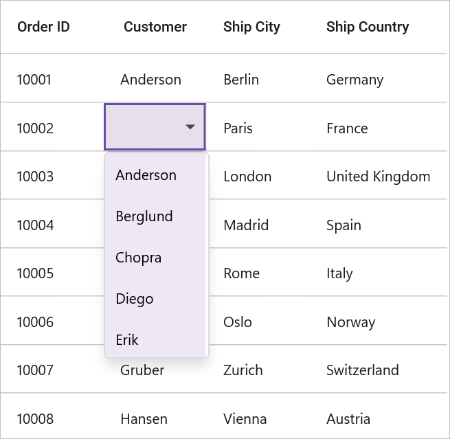
Collection of primitive types
To display the collection of items in the combo box drop-down, create a DataGridComboBoxColumn and set its ItemsSource property to a simple collection.
To load the DataGridComboBoxColumn with a simple string collection, refer to the following code example:
<ContentPage.BindingContext>
    <local:ViewModel x:Name="viewModel" />
</ContentPage.BindingContext>

<sfGrid:SfDataGrid x:Name="dataGrid"
                    ItemsSource="{Binding OrderInfoCollection}"
                    AllowEditing="True"
                    AutoGenerateColumnsMode="None"
                    SelectionUnit="Cell"
                    SelectionMode="Single">
    <sfGrid:SfDataGrid.Columns>
        <sfGrid:DataGridComboBoxColumn BindingContext="{x:Reference viewModel}"
                                        HeaderText="Customer"
                                        ItemsSource="{Binding CustomerNames}"
                                        MappingName="Customer" />
    </sfGrid:SfDataGrid.Columns>
</sfGrid:SfDataGrid>
OrderInfoRepository viewModel = new OrderInfoRepository();
SfDataGrid dataGrid = new SfDataGrid();
dataGrid.ItemsSource = viewModel.OrderInfoCollection;
DataGridComboBoxColumn comboBoxColumn = new DataGridComboBoxColumn()
{
BindingContext = viewModel,
MappingName = "Customer",
ItemsSource = viewModel.CustomerNames,
HeaderText = "Customer"
};
dataGrid.Columns.Add(comboBoxColumn);public class ViewModel
{
public ObservableCollection<string> CustomerNames { get; set; }
public ViewModel()
{
this.CustomerNames = Customers.ToObservableCollection();
}
internal string[] Customers = new string[] {"Adams","Crowley","Ellis","Gable","Irvine","Keefe","Mendoza","Owens","Rooney","Wadded",};
}Collection of user-defined types
To display a list of user-defined items in the drop-down of a combo box, create a DataGridComboBoxColumn and set its ItemsSource property to a user-defined collection. By default, if the DisplayMemberPath is not set, the combo box column will display the values from the MappingName property of the column.
Display member path
Displays a value by comparing values of the properties set as DataGridColumn.MappingName and ValueMemberPath in their respective underlying collections. If the values of ValueMemberPath property contains the current value of MappingName property, its corresponding value of DisplayMemberPath property is displayed in the DataGridCell. Or else the DataGridCell appears blank. However, in edit mode the values of the DisplayMemberPath property are displayed as picker items.
Value member path
Once editing completed, the column having the MappingName equal to the ValueMemberPath has its data changed to the corresponding ValueMemberPath value for the selected DisplayMemberPath value in the picker.
Loading different ItemSource for each row of DataGridComboBoxColumn
To load different ItemSources for each row of a DataGridComboBoxColumn, you can utilize the DataGridComboBoxColumn.ItemsSourceSelector property.
Implementing IItemsSourceSelector
DataGridComboBoxColumn.ItemsSourceSelector needs to implement the IItemsSourceSelector interface, which requires you to implement the GetItemsSource method. This method receives the following parameters:
- Record: This is the data object associated with the row.
- Data Context: This is the binding context of the data grid.
In the provided code, the ItemsSource for the ShipCity column is returned based on the value of the ShipCountry column. This is done by using the record and the binding context of the data grid, which are passed to the GetItemsSource method.
<ContentPage.Resources>
    <ResourceDictionary>
        <local:ItemSourceSelector x:Key="converter" />
    </ResourceDictionary>
</ContentPage.Resources>

<sfgrid:SfDataGrid x:Name="dataGrid"
                    ItemsSource="{Binding OrderInfoCollection}"
                    AllowEditing="True"
                    AutoGenerateColumnsMode="None"
                    SelectionUnit="Cell"
                    SelectionMode="Single">
    <sfgrid:SfDataGrid.Columns>
        <sfgrid:DataGridComboBoxColumn ItemsSourceSelector="{StaticResource converter}"
                                        MappingName="ShipCity"
                                        HeaderText="Ship City">
        </sfgrid:DataGridComboBoxColumn>
        <sfgrid:DataGridComboBoxColumn BindingContext="{x:Reference viewModel}"
                                        ItemsSource="{Binding CountryList}"
                                        MappingName="ShipCountry"
                                        HeaderText="Ship Country">
        </sfgrid:DataGridComboBoxColumn>
    </sfgrid:SfDataGrid.Columns>
</sfgrid:SfDataGrid>
public class ItemSourceSelector : IItemsSourceSelector
{
public IEnumerable GetItemsSource(object record, object dataContext)
{
if (record == null)
{
return null;
}
var orderinfo = record as OrderInfo;
var countryName = orderinfo.ShipCountry;
var viewModel = dataContext as OrderInfoRepository;
// Returns ShipCity collection based on ShipCountry.
if (viewModel.ShipCities.ContainsKey(countryName))
{
string[] shipcities = null;
viewModel.ShipCities.TryGetValue(countryName, out shipcities);
return shipcities.ToList();
}
return null;
}
}

Editing the combo box
The DataGridComboBoxColumn supports both editable and non-editable text boxes for selecting items from a given data source. Users can choose one item from the suggestion list.
The IsEditableMode property is used to enable the user input in DataGridComboBoxColumn. Its default value is false.
<ContentPage.BindingContext>
    <local:ViewModel x:Name="viewModel" />
</ContentPage.BindingContext>

<sfGrid:SfDataGrid x:Name="dataGrid"
                    ItemsSource="{Binding OrderInfoCollection}"
                    >
    <sfGrid:SfDataGrid.Columns>
        <sfGrid:DataGridComboBoxColumn BindingContext="{x:Reference viewModel}"
                                        HeaderText="Customer"
                                        IsEditableMode="True"
                                        ItemsSource="{Binding CustomerNames}"
                                        MappingName="Customer" />
    </sfGrid:SfDataGrid.Columns>
</sfGrid:SfDataGrid>
OrderInfoRepository viewModel = new OrderInfoRepository();
SfDataGrid dataGrid = new SfDataGrid();
dataGrid.ItemsSource = viewModel.OrderInfoCollection;
DataGridComboBoxColumn comboBoxColumn = new DataGridComboBoxColumn()
{
BindingContext = viewModel,
MappingName = "Customer",
ItemsSource = viewModel.CustomerNames,
IsEditableMode = true,
HeaderText = "Customer"
};
dataGrid.Columns.Add(comboBoxColumn);
Auto suggesting on edit mode
By default, the auto-suggestion in the dropdown will display values based on the StartsWith filter condition. However, you can change this behavior by utilizing the SuggestionMode property to retrieve matches using the Contains condition.
<ContentPage.BindingContext>
    <local:ViewModel x:Name="viewModel" />
</ContentPage.BindingContext>

<sfGrid:SfDataGrid x:Name="dataGrid"
                    ItemsSource="{Binding OrderInfoCollection}">
    <sfGrid:SfDataGrid.Columns>
        <sfGrid:DataGridComboBoxColumn BindingContext="{x:Reference viewModel}"
                                        HeaderText="Customer"
                                        IsEditableMode="True"
                                        SuggestionMode="Contains"
                                        ItemsSource="{Binding CustomerNames}"
                                        MappingName="Customer" />
    </sfGrid:SfDataGrid.Columns>
</sfGrid:SfDataGrid>
OrderInfoRepository viewModel = new OrderInfoRepository();
SfDataGrid dataGrid = new SfDataGrid();
dataGrid.ItemsSource = viewModel.OrderInfoCollection;
DataGridComboBoxColumn comboBoxColumn = new DataGridComboBoxColumn()
{
BindingContext = viewModel,
MappingName = "Customer",
ItemsSource = viewModel.CustomerNames,
IsEditableMode = True,
SuggestionMode = SuggestionMode.Contains,
HeaderText = "Customer"
};
dataGrid.Columns.Add(comboBoxColumn);
Change clear button visibility
The ComboBox control includes a clear button that allows users to easily remove the entered input. The visibility of the clear button can be adjusted using the ShowClearButton property. By default, the ShowClearButton property is set to true.
<ContentPage.BindingContext>
    <local:ViewModel x:Name="viewModel" />
</ContentPage.BindingContext>

<sfGrid:SfDataGrid x:Name="dataGrid"
                    ItemsSource="{Binding OrderInfoCollection}">
    <sfGrid:SfDataGrid.Columns>
        <sfGrid:DataGridComboBoxColumn BindingContext="{x:Reference viewModel}"
                                        HeaderText="Customer"
                                        IsEditableMode="True"
                                        ShowClearButton="False"
                                        ItemsSource="{Binding CustomerNames}"
                                        MappingName="Customer" />
    </sfGrid:SfDataGrid.Columns>
</sfGrid:SfDataGrid>
OrderInfoRepository viewModel = new OrderInfoRepository();
SfDataGrid dataGrid = new SfDataGrid();
dataGrid.ItemsSource = viewModel.OrderInfoCollection;
DataGridComboBoxColumn comboBoxColumn = new DataGridComboBoxColumn()
{
BindingContext = viewModel,
MappingName = "Customer",
IsEditableMode= true,
ItemsSource = viewModel.CustomerNames,
HeaderText = "Customer",
ShowClearButton= false,
};
dataGrid.Columns.Add(comboBoxColumn);The
ShowClearButtonproperty has no effect in non-editable mode..
Customize drop-down width
The combo box drop-down width can be customized by setting the DataGridComboBoxColumn.DropdownWidth property.
<syncfusion:SfDataGrid  x:Name="dataGrid"
                        AllowEditing="True"
                        NavigationMode="Cell"
                        SelectionMode="Single"
                        ItemsSource="{Binding OrderInfoCollection}">
    <syncfusion:SfDataGrid.Columns>
        <syncfusion:DataGridComboBoxColumn
                        DropDownWidth="200"
                        HeaderText="Customers"
                        ItemsSource="{Binding CustomerNames}"
                        MappingName="Customer">
        </syncfusion:DataGridComboBoxColumn>
    </syncfusion:SfDataGrid.Columns>
</syncfusion:SfDataGrid>
Can filter suggestions
The DataGridComboBoxColumn.CanFilterSuggestions property can be used to enable or disable the filtering of suggestions based on user input. When set to true, this property allows the combo box to dynamically filter the list of suggestions as the user types into the input field.
<syncfusion:SfDataGrid  x:Name="dataGrid"
                        AllowEditing="True"
                        NavigationMode="Cell"
                        SelectionMode="Single"
                        ItemsSource="{Binding OrderInfoCollection}">
    <syncfusion:SfDataGrid.Columns>
        <syncfusion:DataGridComboBoxColumn
                        HeaderText="Customers"
                        CanFilterSuggestions="True"
                        ItemsSource="{Binding CustomerNames}"
                        MappingName="Customer">
        </syncfusion:DataGridComboBoxColumn>
    </syncfusion:SfDataGrid.Columns>
</syncfusion:SfDataGrid>
DataGridPickerColumn
The DataGridPickerColumn inherits all the properties of the SfDataGrid.DataGridColumn. It displays a list of items in the form of a SfPicker as the content of a column. To enable or disable editing for a particular column, set the DataGridColumn.AllowEditing property to true or false. When in editing mode, it displays a SfPicker element. The data source for the SfPicker can be set using the DataGridPickerColumn.ItemsSource property. The picker column can be populated with data in the following ways:
- Collection of primitive types
- Collection of user-defined types (custom objects)

Collection of primitive types
To display the collection of items in the Picker drop-down, create a DataGridPickerColumn and set its ItemsSource property to a simple collection.
To load the DataGridPickerColumn with a simple string collection, you can refer to the code example below:
<ContentPage.BindingContext>
    <local:ViewModel x:Name="viewModel" />
</ContentPage.BindingContext>

<sfGrid:SfDataGrid x:Name="dataGrid"
                    ItemsSource="{Binding OrderInfoCollection}"
                    AllowEditing="True"
                    SelectionMode="Single"
                    SelectionUnit="Cell">
    <sfGrid:SfDataGrid.Columns>
        <sfgrid:DataGridPickerColumn HeaderText="Ship Country"
                                        MappingName="ShipCountry"
                                        ItemsSource="{Binding Countries}"/>
    </sfGrid:SfDataGrid.Columns>
</sfGrid:SfDataGrid>
OrderInfoRepository viewModel = new OrderInfoRepository();
SfDataGrid dataGrid = new SfDataGrid();
dataGrid.ItemsSource = viewModel.OrderInfoCollection;
dataGrid.AllowEditing = true;
dataGrid.SelectionMode = DataGridSelectionMode.Single;
dataGrid.SelectionUnit = DataGridSelectionUnit.Cell;
DataGridPickerColumn pickerColumn = new DataGridPickerColumn()
{
MappingName = "ShipCountry",
HeaderText = "Ship Country",
ItemsSource = viewModel.Countries
};
dataGrid.Columns.Add(pickerColumn);public class ViewModel
{
public ObservableCollection<OrderInfo> OrderInfoRepository { get; set; }
public ObservableCollection<string> Countries { get; set; }
public ViewModel()
{
this.Countries = this.shipCountry.ToObservableCollection();
}
private string[] shipCountry = new string[]
{
"Argentina",
"Austria",
"Belgium",
"Brazil",
"Canada",
"Denmark",
"Finland",
"France",
"Germany",
"Ireland",
"Italy",
"Mexico",
"Norway",
"Poland",
"Portugal",
"Spain",
"Sweden",
"UK",
"USA",
};
}Collection of user-defined types
To display a list of user-defined items in the picker, create a DataGridPickerColumn and set its ItemsSource property to a user-defined collection. By default, if the DisplayMemberPath is not set, the picker column will display the values from the MappingName property of the column.
Display member path
Displays a value by comparing values of the properties set as DataGridColumn.MappingName and ValueMemberPath in their respective underlying collections. If the values of ValueMemberPath property contains the current value of MappingName property, its corresponding value of DisplayMemberPath property is displayed in the DataGridCell. Or else the DataGridCell appears blank. However, in edit mode the values of the DisplayMemberPath property are displayed as picker items.
Value member path
Once editing completed, the column having the MappingName equal to the ValueMemberPath has its data changed to the corresponding ValueMemberPath value for the selected DisplayMemberPath value in the picker.
Loading different ItemSource for each row of DataGridPickerColumn
To load different ItemSources for each row of a DataGridPickerColumn, you can utilize the DataGridPickerColumn.ItemsSourceSelector property.
Implementing IItemsSourceSelector
DataGridPickerColumn.ItemsSourceSelector needs to implement the IItemsSourceSelector interface, which requires you to implement the GetItemsSource method. This method receives the following parameters:
- Record: This is the data object associated with the row.
- Data Context: This is the binding context of the data grid.
In the provided code, the ItemsSource for the ShipCity column is returned based on the value of the ShipCountry column. This is done by using the record and the binding context of the data grid, which are passed to the GetItemsSource method.
<ContentPage.Resources>
    <ResourceDictionary>
        <local:ItemSourceSelector x:Key="converter" />
    </ResourceDictionary>
</ContentPage.Resources>

<sfgrid:SfDataGrid x:Name="dataGrid"
                    ItemsSource="{Binding OrderInfoRepository}"
                    AllowEditing="True"
                    AutoGenerateColumnsMode="None"
                    NavigationMode="Cell"
                    EditTapAction="OnDoubleTap"
                    SelectionMode="Single">
    <sfgrid:SfDataGrid.Columns>
        <sfgrid:DataGridPickerColumn ItemsSourceSelector="{StaticResource converter}"
                                        MappingName="ShipCity"
                                        HeaderText="Ship City">
        </sfgrid:DataGridPickerColumn>
        <sfgrid:DataGridPickerColumn BindingContext="{x:Reference viewModel}"
                                        ItemsSource="{Binding CountryList}"
                                        MappingName="ShipCountry"
                                        HeaderText="Ship Country">
        </sfgrid:DataGridPickerColumn>
    </sfgrid:SfDataGrid.Columns>
</sfgrid:SfDataGrid>
public class ItemSourceSelector : IItemsSourceSelector
{
public IEnumerable GetItemsSource(object record, object dataContext)
{
if (record == null)
{
return null;
}
var orderinfo = record as DealerInfo;
var countryName = orderinfo.ShipCountry;
var viewModel = dataContext as EditingViewModel;
// Returns ShipCity collection based on ShipCountry.
if (viewModel.ShipCities.ContainsKey(countryName))
{
string[] shipcities = null;
viewModel.ShipCities.TryGetValue(countryName, out shipcities);
return shipcities.ToList();
}
return null;
}
}

DataGridNumericColumn
The DataGridNumericColumn inherits all the properties of the DataGridColumn. It is used to display numeric data. To create a DataGridNumericColumn, the property corresponding to the column in the underlying collection must be a numeric type (int, double, float, etc.).
<ContentPage.BindingContext>
    <local:ViewModel  x:Name ="viewModel"/>
</ContentPage.BindingContext>

<syncfusion:SfDataGrid x:Name="dataGrid"
                       ItemsSource="{Binding OrderInfoCollection}">
    <syncfusion:SfDataGrid.Columns>
        <syncfusion:DataGridNumericColumn Format="C"
                                          HeaderText="Order ID"
                                          MappingName="OrderID" />
    </syncfusion:SfDataGrid.Columns>
</syncfusion:SfDataGrid>
OrderInfoRepository viewModel = new OrderInfoRepository();
SfDataGrid dataGrid = new SfDataGrid();
dataGrid.ItemsSource = viewModel.OrderInfoCollection;
DataGridNumericColumn numericColumn = new DataGridNumericColumn()
{
MappingName = "OrderID",
HeaderText = "Order ID",
Format="C"
};
dataGrid.Columns.Add(numericColumn);Allow Null Value
The DataGridNumericColumn.AllowNullValue property allows you to commit a null value to the respective cell during the end edit.
<syncfusion:SfDataGrid x:Name="dataGrid"
                       AutoGenerateColumnsMode="None"
                       AllowEditing="True"
                       SelectionMode="Single"
                       NavigationMode="Cell"
                       ItemsSource="{Binding OrderInfoCollection}">
     <syncfusion:SfDataGrid.Columns>
         <syncfusion:DataGridNumericColumn HeaderText="Order ID"
                                           MappingName="OrderID"
                                           AllowNullValue="True" />
     </syncfusion:SfDataGrid.Columns>
</syncfusion:SfDataGrid>
OrderInfoRepository viewModel = new OrderInfoRepository();
SfDataGrid dataGrid = new SfDataGrid();
dataGrid.ItemsSource = viewModel.OrderInfoCollection;
dataGrid.AllowEditing = true;
dataGrid.SelectionMode = DataGridSelectionMode.Single;
dataGrid.NavigationMode = DataGridNavigationMode.Cell;
DataGridNumericColumn numericColumn = new DataGridNumericColumn()
{
MappingName = "OrderID",
HeaderText = "OrderID",
AllowNullValue = true,
};
dataGrid.Columns.Add(numericColumn);Number formatting
The DataGridNumericColumn allows formatting the numeric data with culture-specific information.
-
Minimum- To set the minimum value for the numeric column, use the DataGridNumericColumn.Minimum property. -
Maximum- To set the maximum value for the numeric column, use the DataGridNumericColumn.Maximum property. -
ShowClearButton- To clear the value for the numeric column, use the DataGridNumericColumn.ShowClearButton property. -
Placeholder- To set the placeholder when the numeric cell value is null, use the DataGridNumericColumn.Placeholder property. -
NullValue- To set the null value when the numeric cell value is null, use the DataGridNumericColumn.NullValue property.
DataGridPercentColumn
DataGridPercentColumn is a specialized column for displaying and editing percentage values consistently across platforms. It supports two display modes, culture-aware formatting, numeric filtering, and serialization.
The PercentEditMode property controls how values are interpreted and presented: use PercentMode to display values as percentages, or DoubleMode to treat the cell value as a plain numeric (double) value.
<syncfusion:SfDataGrid x:Name="dataGrid"
                       ItemsSource="{Binding Orders}">
    <syncfusion:SfDataGrid.Columns>
        <syncfusion:DataGridPercentColumn MappingName="Discount"
                                          HeaderText="Discount"
                                          PercentEditMode="DoubleMode" />
    </syncfusion:SfDataGrid.Columns>
</syncfusion:SfDataGrid>
SfDataGrid dataGrid = new SfDataGrid();
OrderInfoViewModel orderInfoViewModel = new OrderInfoViewModel();
dataGrid.ItemsSource = orderInfoViewModel.Orders;
dataGrid.Columns.Add(new DataGridPercentColumn()
{
MappingName = "Discount",
HeaderText = "Discount",
PercentEditMode = DataGridPercentEditMode.DoubleMode
});
this.Content = dataGrid;
The DataGridPercentColumn supports culture-aware parsing and formatting for percentage values. By default the percent operator (%) is used when displaying and parsing values; change this symbol using the PercentSymbol property to support alternate conventions.
Allow Null Value
You can allow null values in the column by setting the DataGridPercentColumn.AllowNullValue property to true.
The
AllowNullValueproperty will work only when the underlying property type is nullable.
DataGridMultiColumnComboBoxColumn
The DataGridMultiColumnComboBoxColumn displays enumeration as cell contents and hosts a SfMultiColumnComboBox in editing mode. This column type allows you to define the predefined columns in its drop-down, similar to SfDataGrid.
You can change the value by selecting the item from drop down or by editing the entry in SfMultiColumnComboBox. To disable text editing, set the IsTextReadOnly property to true.
<syncfusion:SfDataGrid x:Name = "dataGrid"
                       ItemsSource = "{Binding OrderInfoCollection}"
                       AllowEditing = "True"
                       SelectionMode = "Single"
                       AutoGenerateColumnsMode = "None"
                       NavigationMode="Row">
    <syncfusion:SfDataGrid.Columns>
        <syncfusion:DataGridMultiColumnComboBoxColumn AutoGenerateColumnsMode = "None"
                                                      MappingName = "Product"
                                                      ItemsSource = "{Binding OrderDetails}"
                                                      DisplayMember = "Product"
                                                      ValueMember = "Product"
                                                      HeaderText="Product">
            <syncfusion:DataGridMultiColumnComboBoxColumn.Columns>
                <syncfusion:DataGridTextColumn MappingName = "Product" HeaderText = "Product"/>
                <syncfusion:DataGridNumericColumn MappingName = "ProductID" HeaderText = "Product ID"/>
            </syncfusion:DataGridMultiColumnComboBoxColumn.Columns>
        </syncfusion:DataGridMultiColumnComboBoxColumn>
    </syncfusion:SfDataGrid.Columns>
</syncfusion:SfDataGrid>
OrderInfoRepository viewModel = new OrderInfoRepository();
SfDataGrid dataGrid = new SfDataGrid()
{
ItemsSource = viewModel.OrderInfoCollection,
AutoGenerateColumnsMode = AutoGenerateColumnsMode.None,
AllowEditing = true,
SelectionMode = DataGridSelectionMode.Single,
NavigationMode = DataGridNavigationMode.Row,
};
var column = new DataGridMultiColumnComboBoxColumn()
{
MappingName = "Product",
HeaderText = "Product",
ValueMember = "Product",
DisplayMember = "Product",
ItemsSource = viewModel.OrderDetails,
AutoGenerateColumnsMode = AutoGenerateColumnsMode.None,
Columns = new ColumnCollection()
{
new DataGridTextColumn() { MappingName = "Product" },
new DataGridNumericColumn() { MappingName = "ProductID" }
}
};
dataGrid.Columns.Add(column);SfDataGrid triggers, CurrentCellDropDownSelectionChanged event, when the SelectedValue is changed. CurrentCellDropDownSelectionChangedEventArgs of CurrentCellDropDownSelectionChanged event provides the information about the changed cell value.
SelectedIndex property returns the index of selected item.
SelectedItem property returns the selected item from drop down list.

Auto-complete support
You can enable the SfMultiColumnComboBox to automatically complete the entered input value by setting the (AllowAutoComplete)[] property to true. When enabled, this property compares the entered text with each item in the underlying data source of DataGridMultiColumnComboBoxColumn and autocomplete the input with the matched value based on the DisplayMember.
Filtering
You can enable the SfMultiColumnComboBox to dynamically filter the drop-down list items based on the text typed in the entry by setting AllowIncrementalFiltering property to true. Additionally, DataGridMultiColumnComboBoxColumn allows filtering based on case sensitivity by setting AllowCaseSensitiveFiltering to true. These features help users to quickly select items from large list.
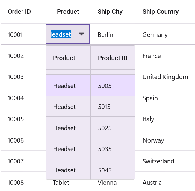
Null value support
You can allow null values in the column by setting the AllowNullValue property to true.
The AllowNullValue will work only when the underlying property type is Nullable.
Popup Size Customization
You can change the size of drop-down popup by setting PopupWidth and PopupHeight properties. If these values are not set, the popup width defaults to the PopupMinWidth property, which is 200.0 by default. Similarly, the popup height defaults to the PopupMinHeight property, which is 300.0 by default.
Additionally, SfMultiColumnComboBox can automatically adjust the popup width based on the actual size of the SfDataGrid by setting the IsAutoPopupSize property to true.
Loading different ItemsSource for each row
You can load different ItemsSource to each row of DataGridMultiColumnComboBoxColumn by setting the SfDataGrid.ItemsSourceSelector property.
Implementing IItemsSourceSelector
ItemsSourceSelector must implement the IItemsSourceSelector interface, which requires the implementation of the GetItemsSource method. The GetItemsSource method receives the following parameters:
- Record – The data object associated with row.
- Data Context – The data context of data grid.
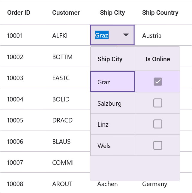
In the following example, the items source for ShipCity column is returned based on the value of the ShipCountry column, using the record and data context passed to the GetItemsSource method.
<ContentPage.Resources>
    <local:ItemsSourceSelector x:Key = "itemSourceSelector"/>
</ContentPage.Resources>

<syncfusion:SfDataGrid ItemsSource = "{Binding OrderInfoCollection}"
                       AllowEditing = "True"
                       SelectionMode = "Single"
                       AutoGenerateColumnsMode = "None">
    <syncfusion:SfDataGrid.Columns>
        <syncfusion:DataGridNumericColumn MappingName = "OrderID" HeaderText = "Order ID" Format = "D"/>
        <syncfusion:DataGridMultiColumnComboBoxColumn AutoGenerateColumnsMode = "None"
                                                      DisplayMember = "ShipCity"
                                                      HeaderText = "Ship City"
                                                      ItemsSourceSelector = "{StaticResource itemSourceSelector}"
                                                      MappingName = "ShipCity"
                                                      ValueMember = "ShipCity">
            <syncfusion:DataGridMultiColumnComboBoxColumn.Columns>
                <syncfusion:DataGridTextColumn HeaderText = "Ship City" MappingName = "ShipCity" />
                <syncfusion:DataGridCheckBoxColumn HeaderText = "Is Online" MappingName = "IsOnline" />
            </syncfusion:DataGridMultiColumnComboBoxColumn.Columns>
        </syncfusion:DataGridMultiColumnComboBoxColumn>
        <syncfusion:DataGridTextColumn MappingName = "ShipCountry" HeaderText = "Ship Country"/>
    </syncfusion:SfDataGrid.Columns>
</syncfusion:SfDataGrid>
internal class ItemsSourceSelector : IItemsSourceSelector
{
public IEnumerable GetItemsSource(object record, object dataContext)
{
if (record == null)
return null;
var orderinfo = record as OrderInfoCollection;
var countryName = orderinfo.ShipCountry;
var viewModel = dataContext as OrdersViewModel;
//Returns ShipCity collection based on ShipCountry.
if (viewModel.ShipCityItemsSources.ContainsKey(countryName))
{
ObservableCollection<ShipCityEntry> shipCities = null;
viewModel.ShipCityItemsSources.TryGetValue(countryName, out shipCities);
return shipCities.ToList();
}
return null;
}
}
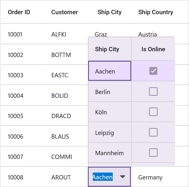
You can download the sample from the following link: Sample.
DataGridHyperlinkColumn
The DataGridHyperlinkColumn inherits all the properties of the DataGridTextColumn. It displays column data as clickable hyperlinks. It renders link text in each record cell and lets end users invoke navigation.
<syncfusion:SfDataGrid x:Name="dataGrid"
                       AutoGenerateColumnsMode="None"
                       ItemsSource="{Binding OrderInfoCollection}">
     <syncfusion:SfDataGrid.Columns>
         <syncfusion:DataGridHyperlinkColumn HeaderText="Country"
                                             MappingName="Country" />
     </syncfusion:SfDataGrid.Columns>
</syncfusion:SfDataGrid>
OrderInfoRepository viewModel = new OrderInfoRepository();
SfDataGrid dataGrid = new SfDataGrid()
dataGrid.ItemsSource = viewModel.OrderInfoCollection;
dataGrid.AutoGenerateColumnsMode = AutoGenerateColumnsMode.None;
DataGridHyperlinkColumn hyperlinkColumn = new DataGridHyperlinkColumn()
{
MappingName = "Country",
HeaderText = "Country",
};
dataGrid.Columns.Add(hyperlinkColumn);You can enable end-users to navigate to a URI either when the cell value contains a valid URI address or by handling the DataGridCurrentCellRequestNavigatingEventArgs event. The CurrentCellRequestNavigating event is triggered whenever a cell in the DataGridHyperlinkColumn is clicked for navigation.
The DataGridCurrentCellRequestNavigatingEventArgs associated with the CurrentCellRequestNavigating event provides details about the hyperlink that initiated the action. Its DataGridCurrentCellRequestNavigatingEventArgs.NavigateText property returns the value from the column’s DisplayBinding if one is defined; otherwise, it falls back to the value bound to MappingName.
dataGrid.CurrentCellRequestNavigating += dataGrid_CurrentCellRequestNavigating;

private void dataGrid_CurrentCellRequestNavigating(object sender, DataGridCurrentCellRequestNavigatingEventArgs e)
{
    string address = "https://en.wikipedia.org/wiki/" + e.NavigateText;
    Launcher.OpenAsync(new Uri(address));
}
Cancel the navigation
You can cancel the navigation by setting DataGridCurrentCellRequestNavigatingEventArgs.Cancel to true.
dataGrid.CurrentCellRequestNavigating += dataGrid_CurrentCellRequestNavigating;

private void dataGrid_CurrentCellRequestNavigating(object sender, DataGridCurrentCellRequestNavigatingEventArgs e)
{
     e.Cancel = true;
}
Appearance
HyperlinkTextColor
You can set the hyperlink text color using the HyperlinkTextColor property. If both HyperlinkTextColor and a DataGridCell TextColor (via implicit or explicit styles) are defined, HyperlinkTextColor takes precedence and will be used. If HyperlinkTextColor is not specified, the implicit or explicit cell styles will determine the hyperlink text color.
<syncfusion:SfDataGrid x:Name="dataGrid"
                       AutoGenerateColumnsMode="None"
                       ItemsSource="{Binding OrderInfoCollection}">
  <syncfusion:SfDataGrid.DefaultStyle>
      <syncfusion:DataGridStyle  HyperlinkTextColor="Yellow"/>
  </syncfusion:SfDataGrid.DefaultStyle>
</syncfusion:SfDataGrid>
OrderInfoRepository viewModel = new OrderInfoRepository();
SfDataGrid dataGrid = new SfDataGrid()
dataGrid.ItemsSource = viewModel.OrderInfoCollection;
dataGrid.AutoGenerateColumnsMode = AutoGenerateColumnsMode.None;
dataGrid.DefaultStyle = new DataGridStyle
{
HyperlinkTextColor = Colors.Yellow
};DataGridCurrencyColumn
The DataGridCurrencyColumn inherits all the properties of the DataGridColumn. It displays numeric values with the currency symbol. To create a DataGridCurrencyColumn, define the column manually by adding the DataGridCurrencyColumn object to the SfDataGrid.Columns collection. The property corresponding to the column in the underlying collection must be a numeric type (int, double, float, etc.).
<ContentPage.BindingContext>
    <local:ViewModel  x:Name ="viewModel"/>
</ContentPage.BindingContext>

<syncfusion:SfDataGrid x:Name="dataGrid"
                       ItemsSource="{Binding OrderInfoCollection}">
    <syncfusion:SfDataGrid.Columns>
        <syncfusion:DataGridCurrencyColumn HeaderText="Unit Price"
                                           MappingName="UnitPrice" />
    </syncfusion:SfDataGrid.Columns>
</syncfusion:SfDataGrid>
OrderInfoRepository viewModel = new OrderInfoRepository();
SfDataGrid dataGrid = new SfDataGrid();
dataGrid.ItemsSource = viewModel.OrderInfoCollection;
DataGridCurrencyColumn currencyColumn = new DataGridCurrencyColumn()
{
MappingName = "UnitPrice",
HeaderText = "Unit Price"
};
dataGrid.Columns.Add(currencyColumn);Currency Symbol
By default, the currency symbol is displayed based on the current culture. You can customize the symbol using the CurrencySymbol property.
<syncfusion:SfDataGrid x:Name="dataGrid"
                       ItemsSource="{Binding OrderInfoCollection}">
    <syncfusion:SfDataGrid.Columns>
        <syncfusion:DataGridCurrencyColumn HeaderText="Unit Price"
                                           MappingName="UnitPrice"
                                           CurrencySymbol="€" />
    </syncfusion:SfDataGrid.Columns>
</syncfusion:SfDataGrid>
SfDataGrid dataGrid = new SfDataGrid();
dataGrid.ItemsSource = viewModel.OrderInfoCollection;
DataGridCurrencyColumn currencyColumn = new DataGridCurrencyColumn()
{
MappingName = "UnitPrice",
HeaderText = "Unit Price",
CurrencySymbol = "€"
};
dataGrid.Columns.Add(currencyColumn);Allow Null Value
You can allow null values in the column by setting the DataGridCurrencyColumn.AllowNullValue property to true.
The
AllowNullValueproperty will work only when the underlying property type is nullable.
DataGridTimePickerColumn
DataGridTimePickerColumn is derived from DataGridColumn and displays column data as a time span. It hosts an SfTimePicker element in editing mode.
<syncfusion:SfDataGrid x:Name="dataGrid"
                       ItemsSource="{Binding OrderInfoCollection}">
    <syncfusion:SfDataGrid.Columns>
        <syncfusion:DataGridTimePickerColumn HeaderText="Delivery Time"
                                             MappingName="DeliveryTime">
        </syncfusion:DataGridTimePickerColumn>
    </syncfusion:SfDataGrid.Columns>
</syncfusion:SfDataGrid>
SfDataGrid dataGrid = new SfDataGrid();
OrderInfoViewModel viewModel = new OrderInfoViewModel();
dataGrid.ItemsSource = viewModel.Orders;
var timePickerColumn = new DataGridTimePickerColumn()
{
MappingName = "DeliveryTime",
HeaderText = "Delivery Time"
};
dataGrid.Columns.Add(timePickerColumn);
this.Content = dataGrid;
Null value support
DataGridTimePickerColumn provides support to restrict or allow null values in columns based on the AllowNull property. Instead of displaying null values, you can display hint text using the NullValue property.
The NullValue property will not work when AllowNull is set to false.
Setting input value range
You can restrict the input value to a specific range using Minimum and Maximum properties.
Data formatting
You can format the time span values by setting the Format property.
<syncfusion:SfDataGrid x:Name="dataGrid"
                       ItemsSource="{Binding OrderInfoCollection}">
    <syncfusion:SfDataGrid.Columns>
        <syncfusion:DataGridTimePickerColumn HeaderText="Delivery Time"
                                             MappingName="DeliveryTime"
                                             Format="hh\:mm">
        </syncfusion:DataGridTimePickerColumn>
    </syncfusion:SfDataGrid.Columns>
</syncfusion:SfDataGrid>
SfDataGrid dataGrid = new SfDataGrid();
OrderInfoViewModel viewModel = new OrderInfoViewModel();
dataGrid.ItemsSource = viewModel.Orders;
var timePickerColumn = new DataGridTimePickerColumn()
{
MappingName = "DeliveryTime",
HeaderText = "Delivery Time",
Format = @"hh\:mm"
};
dataGrid.Columns.Add(timePickerColumn);
this.Content = dataGrid;
DataGridCheckBoxSelectorColumn
SfDataGrid allows you to select or deselect individual rows through SfCheckBox using DataGridCheckBoxSelectorColumn, which is not bound to a data object from the underlying data source and can be added like any other column. The selector column supports only row selection, and selection in the selector column works based on the SelectionMode.
<syncfusion:SfDataGrid x:Name="dataGrid"
                       ItemsSource="{Binding OrderInfoCollection}"
                       SelectionMode="Multiple">
    <syncfusion:SfDataGrid.Columns>
        <syncfusion:DataGridCheckBoxSelectorColumn MappingName="SelectorColumn"
                                                   Width="50">
        </syncfusion:DataGridCheckBoxSelectorColumn>
    </syncfusion:SfDataGrid.Columns>
</syncfusion:SfDataGrid>
SfDataGrid dataGrid = new SfDataGrid();
OrderInfoViewModel viewModel = new OrderInfoViewModel();
dataGrid.ItemsSource = viewModel.Orders;
dataGrid.SelectionMode = DataGridSelectionMode.Multiple;
var checkBoxSelectorColumn = new DataGridCheckBoxSelectorColumn()
{
MappingName = "SelectorColumn",
Width = 50
};
dataGrid.Columns.Add(checkBoxSelectorColumn);
this.Content = dataGrid;By default, a checkbox is displayed in the header of the selector column, which is used to select or deselect all rows in the datagrid.

Text on column header
You can display text instead of a checkbox in the header of the selector column by setting the AllowCheckboxOnHeader property to false.
<syncfusion:SfDataGrid x:Name="dataGrid"
                       ItemsSource="{Binding OrderInfoCollection}"
                       SelectionMode="Multiple">
    <syncfusion:SfDataGrid.Columns>
        <syncfusion:DataGridCheckBoxSelectorColumn MappingName="SelectorColumn"
                                                   Width="100"
                                                   AllowCheckboxOnHeader="False"
                                                   HeaderText="Selector">
        </syncfusion:DataGridCheckBoxSelectorColumn>
    </syncfusion:SfDataGrid.Columns>
</syncfusion:SfDataGrid>
SfDataGrid dataGrid = new SfDataGrid();
OrderInfoViewModel viewModel = new OrderInfoViewModel();
dataGrid.ItemsSource = viewModel.Orders;
dataGrid.SelectionMode = DataGridSelectionMode.Multiple;
var checkBoxSelectorColumn = new DataGridCheckBoxSelectorColumn()
{
MappingName = "SelectorColumn",
Width = 100,
AllowCheckboxOnHeader = false,
HeaderText = "Selector"
};
dataGrid.Columns.Add(checkBoxSelectorColumn);
this.Content = dataGrid;
Canceling the checkbox state change
The checkbox state change in the DataGridCheckBoxSelectorColumn can be canceled by setting DataGridCheckboxSelectorCheckedEventArgs.Cancel to true in the SfDataGrid.CheckboxSelectorChecked event. Additionally, the checkbox value can be modified by setting DataGridCheckboxSelectorCheckedEventArgs.NewValue within the same event.
Based on this, the selection state is not changed when e.Cancel is set to true, and the selection is applied according to the value specified in e.NewValue.
<syncfusion:SfDataGrid x:Name="dataGrid"
                       ItemsSource="{Binding OrderInfoCollection}"
                       SelectionMode="Multiple"
                       CheckboxSelectorChecked="OnCellCheckBoxClick">
    <syncfusion:SfDataGrid.Columns>
        <syncfusion:DataGridCheckBoxSelectorColumn MappingName="SelectorColumn"
                                                   Width="50">
        </syncfusion:DataGridCheckBoxSelectorColumn>
    </syncfusion:SfDataGrid.Columns>
</syncfusion:SfDataGrid>
SfDataGrid dataGrid = new SfDataGrid();
OrderInfoViewModel viewModel = new OrderInfoViewModel();
dataGrid.ItemsSource = viewModel.Orders;
dataGrid.SelectionMode = DataGridSelectionMode.Multiple;
dataGrid.CheckboxSelectorChecked += OnCellCheckBoxClick;
var checkBoxSelectorColumn = new DataGridCheckBoxSelectorColumn()
{
MappingName = "SelectorColumn",
Width = 50
};
dataGrid.Columns.Add(checkBoxSelectorColumn);
this.Content = dataGrid;void OnCellCheckBoxClick(object sender, DataGridCheckboxSelectorCheckedEventArgs e)
{
if (e.RowIndex == 1)
e.Cancel = true;
else if (e.RowIndex == 2)
e.NewValue = CheckState.Checked;
}Limitations
The following are the limitations of DataGridCheckBoxSelectorColumn:
- The Selector column does not support cell selection.
- The Selector column does not support data operations such as sorting, filtering, and grouping.
- The Selector column is excluded from operations such as printing and exporting.
- The Selector column does not support the filter row.
Row header
The row header is a type of column that is placed as the first cell of each row and remains frozen. To enable the row header, set SfDataGrid.ShowRowHeader to true Additionally, the SfDataGrid allows you to customize the row header width using the SfDataGrid.RowHeaderWidth property. The default value is 30.
<syncfusion:SfDataGrid x:Name="dataGrid"
                  ShowRowHeader="True"
                  ItemsSource="{Binding OrderInfoCollection}"
                  GridLinesVisibility="Both"
                  HeaderGridLinesVisibility="Both">
</syncfusion:SfDataGrid>
OrderInfoRepository viewModel = new OrderInfoRepository();
SfDataGrid dataGrid = new SfDataGrid();
dataGrid.ItemsSource = viewModel.OrderInfoCollection;
dataGrid.ShowRowHeader = true,
dataGrid.GridLinesVisibility = GridLinesVisibility.Both;
dataGrid.HeaderGridLinesVisibility = GridLinesVisibility.Both;
Load template in row header
The data template can be loaded to the row header by setting the SfDataGrid.RowHeaderTemplate property.
<syncfusion:SfDataGrid x:Name="dataGrid"
                  ShowRowHeader="True"
                  ItemsSource="{Binding OrderInfoCollection}"
                  GridLinesVisibility="Both"
                  HeaderGridLinesVisibility="Both">
        <syncfusion:SfDataGrid.RowHeaderTemplate>
                <DataTemplate>
                    <Label Text="{Binding ID}" HorizontalTextAlignment = "Center" VerticalTextAlignment = "Center"/>
                </DataTemplate>
        </syncfusion:SfDataGrid.RowHeaderTemplate>
</syncfusion:SfDataGrid>
Bind a view model property inside header template
The SfDataGrid allows binding the view model property to the HeaderTemplate by setting the BindingContext of the DataGridColumn as ViewModel.
<syncfusion:SfDataGrid x:Name="dataGrid"
                       ItemsSource="{Binding OrderInfoCollection}"
                       AutoGenerateColumnsMode="None">
    <syncfusion:SfDataGrid.Columns>
        <syncfusion:DataGridTextColumn MappingName="OrderID">
            <syncfusion:DataGridColumn.HeaderTemplate>
                <DataTemplate>
                    <StackLayout>
                        <Label BindingContext="{StaticResource viewModel}"
                               Text="{Binding Headertext}"
                               VerticalOptions="CenterAndExpand"
                               HorizontalOptions="CenterAndExpand"
                               TextColor="Blue"
                               IsVisible="{Binding Visibility}" />
                    </StackLayout>
                </DataTemplate>
            </syncfusion:DataGridColumn.HeaderTemplate>
        </syncfusion:DataGridTextColumn>
        <syncfusion:DataGridTextColumn  MappingName="CustomerID"
                                        HeaderText="Customer" />
        <syncfusion:DataGridTextColumn MappingName="ShipCity"
                                       HeaderText="Ship City" />
        <syncfusion:DataGridTextColumn MappingName="ShipCountry"
                                       HeaderText="Ship Country" />
    </syncfusion:SfDataGrid.Columns>
</syncfusion:SfDataGrid>