Filter menu in JavaScript Grid control
The filter menu in the JavaScript Grid control allows you to enable filtering and provides a user-friendly interface for filtering data based on column types and operators.
To enable the filter menu, you need to set the filterSettings->type property to Menu. This property determines the type of filter UI that will be rendered. The filter menu UI allows you to apply filters using different operators.
Here is an example that demonstrates the usage of the filter menu in the JavaScript Grid:
- allowFiltering must be set as true to enable filter menu.
- By setting columns->allowFiltering as false will prevent filter menu rendering for a particular column.
Custom control in filter menu
You can enhance the filtering experience in the JavaScript Grid control by customizing the filter menu with custom controls. This allows you to replace the default search box with custom controls like dropdowns or textboxes. By default, the filter menu provides an autocomplete control for string type columns, a numeric textbox for number type columns, and a dropdown control for boolean type columns, making it easy to search for values.
To customize the filter menu, you can make use of the column.filter.ui property. This property allows you to integrate your desired custom filter control into a specific column of the Grid. To implement a custom filter UI, you need to define the following functions:
- create: This function is responsible for creating the custom control for the filter.
- write: The write function is used to wire events for the custom control. This allows you to handle changes in the custom filter UI.
- read: The read function is responsible for reading the filter value from the custom control. This is used to retrieve the selected filter value.
For example, you can replace the standard search box in the filter menu with a dropdown control. This enables you to perform filtering operations by selecting values from the dropdown list, rather than manually typing in search queries.
Here is a sample code demonstrating how to render a dropdownlist control for the CustomerID column:
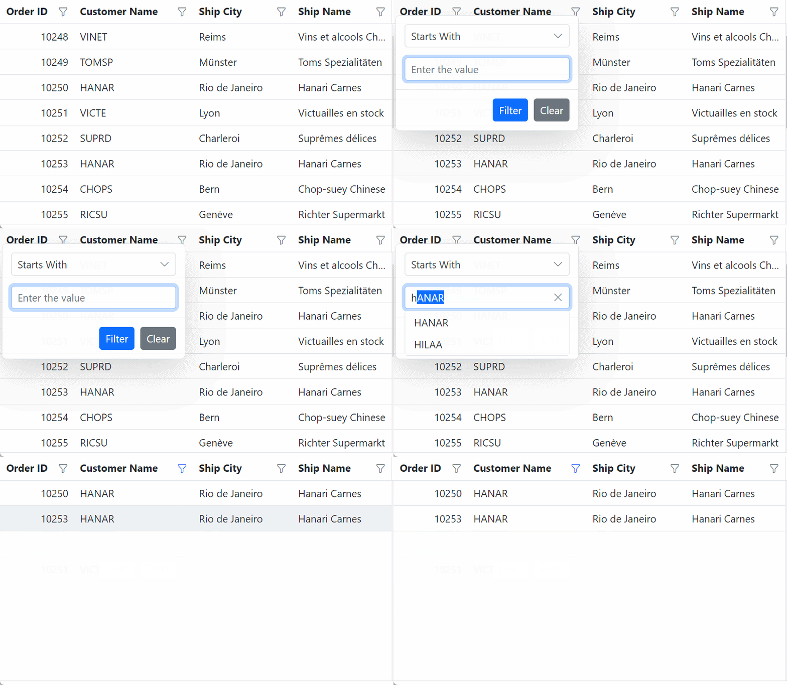
Default filter input for CustomerID column
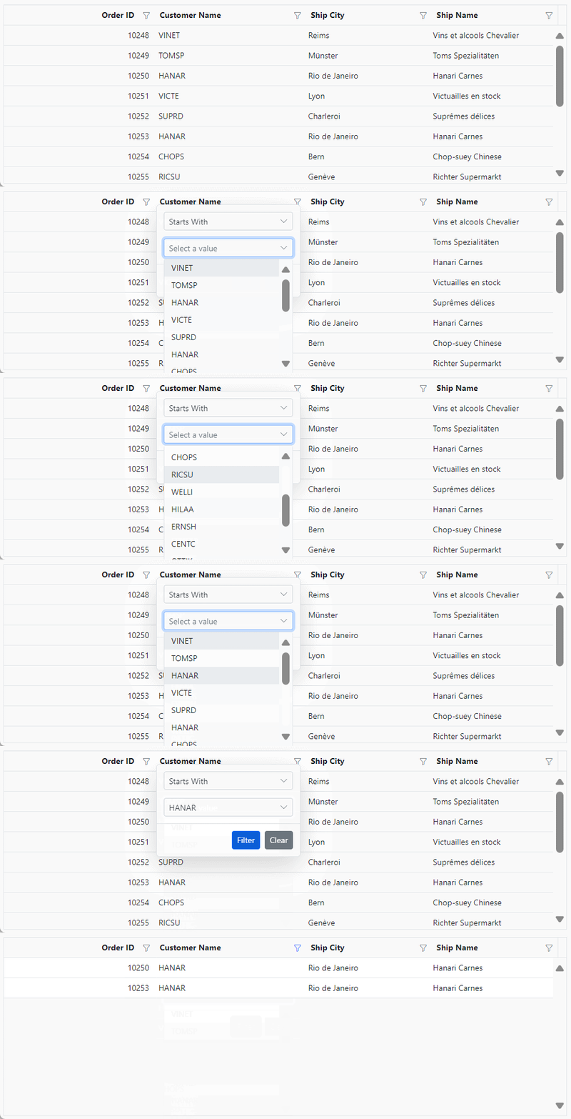
Custom dropdown filter for CustomerID column
Show 24 hours time format in filter dialog
The JavaScript Grid provides a feature to display the time in a 24-hour format in the date or datetime column filter dialog. By default, the filter dialog displays the time in a 12-hour format (AM/PM) for the date or datetime column. However, you can customize the default format by setting the type as dateTime and the format as M/d/y HH:mm. To enable the 24-hour time format in the filter dialog, you need to handle the actionComplete event with requestType as filterAfterOpen and set the timeFormat of the DateTimepicker to HH:mm.
Here is an example that demonstrates how to show 24 hours time format in filter dialog:
Customizing filter menu operators list
The JavaScript Grid enables you to customize the default filter operator list by utilizing the filterSettings->operators property. This feature allows you to define your own set of operators that will be available in the filter menu. You can customize operators for string, number, date, and boolean data types.
The available options for customization are:
- stringOperator- defines customized string operator list.
- numberOperator - defines customized number operator list.
- dateOperator - defines customized date operator list.
- booleanOperator - defines customized boolean operator list.
Here is an example of how to customize the filter operators list in JavaScript Grid:
Filter by multiple keywords using filter menu
The JavaScript Grid allows you to perform filtering actions based on multiple keywords, rather than a single keyword, using the filter menu dialog. To enable this feature, you can set filterSettings->type as Menu and render the MultiSelect control as a custom control in the filter menu dialog.
Here is an example that demonstrates how to perform filtering by multiple keywords using the filter menu in the JavaScript Grid:
Customize the default input control of filter menu dialog
You have the flexibility to customize the default settings of input controls within the menu filter by utilizing the params property within the column definition of filter. This allows you to modify the behavior of specific filter controls to better suit your needs.
To know more about the feature, refer to the Getting Started documentation and API Reference
In the example provided below, the OrderID and Freight columns are numeric columns. When you open the filter dialog for these columns, you will notice that a NumericTextBox with a spin button is displayed to change or set the filter value. However, using the params property, you can hide the spin button specifically for the OrderID column.
Prevent autofill option in autocomplete of menu filter
You can prevent autofill feature by setting the autofill parameter to false using the params property within the column definition of the filter.
Hide default filter icons while perform filtering through method
When performing filtering programmatically using methods in the Syncfusion® JavaScript Grid component, you may want to hide the default filter icons to provide a simpler interface.
To customize the filter icon in the Grid, use the display property of the filtermenu as mentioned below
.e-filtermenudiv.e-icons.e-icon-filter {
    display: none;
}
The following example demonstrate how to hide the default filter icons while filtering the CustomerID column programmatically using a method.
Filter menu events
The JavaScript Grid offers the actionBegin and actionComplete events, which provide information about the actions being performed. Within the event handlers, you receive an argument named requestType. This argument specifies the action that is being executed, such as filterBeforeOpen, filterAfterOpen, or filtering. By analyzing this action type, you can implement custom logic or showcase messages.
filtering - Defines current action as filtering.
filterBeforeOpen - Defines current action as filter dialog before open.
filterAfterOpen - Defines current action as filter dialog after open.
Here’s an example of how to use these events to handle filter menu action in the JavaScript Grid:
Troubleshoot filter menu operator issue
When using the filter menu, the UI displays operators for all columns based on the data type of the first data it encounters. If the first data is empty or null, it may not work correctly. To overcome this issue, follow these steps to troubleshoot and resolve it:
Explicitly Define Data Type: When defining columns in your JavaScript Grid control, make sure to explicitly specify the data type for each column. You can do this using the type property within the columns configuration. For example:
Handle Null or Empty Data: If your data source contains null or empty values, make sure that these values are appropriately handled within your data source or by preprocessing your data to ensure consistency.
Check Data Types in Data Source: Ensure that the data types specified in the column definitions match the actual data types in your data source. Mismatched data types can lead to unexpected behavior.