Paging customization in Blazor DataGrid
The appearance of paging elements in the Blazor DataGrid can be customized using CSS. Styling options are available for different parts of the pager interface:
- Root container: The outermost wrapper that holds all pager content.
- Pager container: The inner layout that positions the controls.
- Navigation buttons: Commands for first, previous, next, and last page navigation.
- Numeric page indicators: Indicators that jump directly to specific pages.
- Current page indicator: The highlight that marks the active numeric page button.
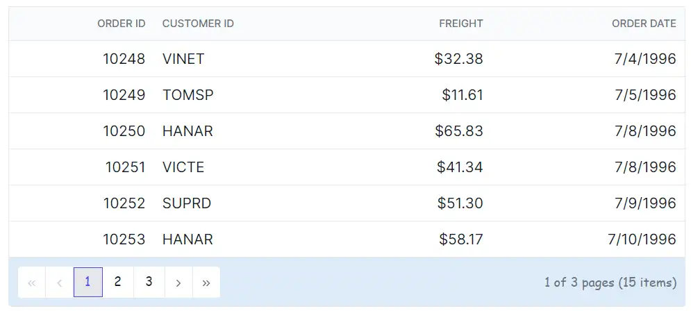
Customize the pager root element
The .e-gridpager class styles the pager root element in the Blazor DataGrid. Use CSS to adjust its appearance:
.e-grid .e-gridpager {
    font-family: cursive;
    background-color: #deecf9;
}
Properties like font-family, background-color, and spacing-related styles can be changed to fit the grid layout design.
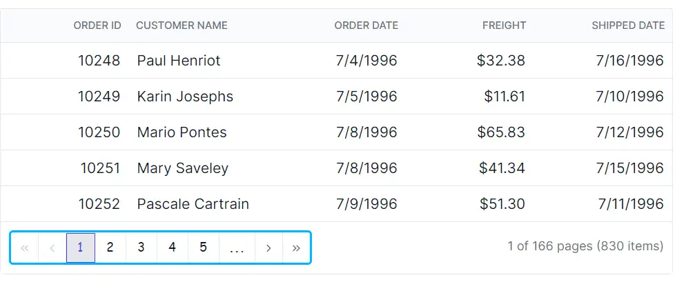
Customize the pager container element
The .e-pagercontainer class styles the pager container in the Blazor DataGrid. Apply CSS to modify its look:
.e-grid .e-pagercontainer {
    border: 2px solid #00b5ff;
    font-family: cursive;
}
Properties such as font-family, background-color, and spacing-related styles can be adjusted to align with the grid design.
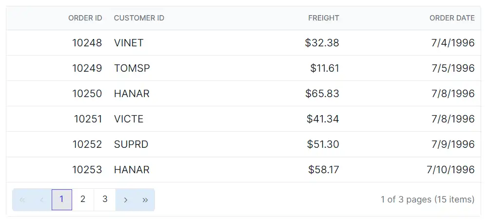
Customize the pager navigation elements
The .e-prevpagedisabled, .e-prevpage, .e-nextpage, .e-nextpagedisabled, .e-lastpagedisabled, .e-lastpage, .e-firstpage, and .e-firstpagedisabled classes define the appearance of the pager navigation buttons in the Blazor DataGrid. Apply CSS to customize their styling:
.e-grid .e-gridpager .e-prevpagedisabled,
.e-grid .e-gridpager .e-prevpage,
.e-grid .e-gridpager .e-nextpage,
.e-grid .e-gridpager .e-nextpagedisabled,
.e-grid .e-gridpager .e-lastpagedisabled,
.e-grid .e-gridpager .e-lastpage,
.e-grid .e-gridpager .e-firstpage,
.e-grid .e-gridpager .e-firstpagedisabled {
    background-color: #deecf9;
}
Adjust properties like background-color to match the design, while keeping clear focus styles for accessibility.
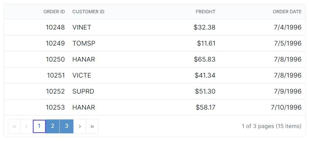
Customize the pager numeric button elements
The .e-numericitem class styles the numeric page buttons in the Blazor DataGrid. Apply CSS to change their appearance:
.e-grid .e-gridpager .e-numericitem {
    background-color: #5290cb;
    color: #ffffff;
    cursor: pointer;
}

.e-grid .e-gridpager .e-numericitem:hover {
    background-color: white;
    color: #007bff;
}
Modify properties such as background-color, color, and hover effects to improve clarity and interaction.
Customize the current page numeric element
The .e-currentitem class styles the current page indicator in the Blazor DataGrid pager. Use CSS to adjust it:
.e-grid .e-gridpager .e-currentitem {
    background-color: #0078d7;
    color: #fff;
}
Change properties like background-color and color to highlight the active page.
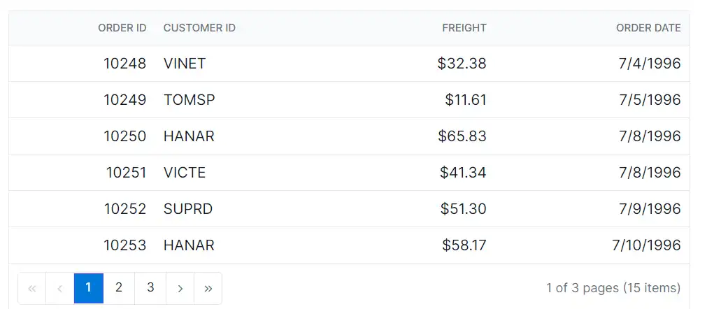
@using Syncfusion.Blazor.Grids

<SfGrid @ref="Grid" DataSource="@Orders" Height="315" AllowPaging="true">
    <GridPageSettings PageSize="8"></GridPageSettings>
    <GridColumns>
        <GridColumn Field=@nameof(OrderData.OrderID) HeaderText="Order ID" TextAlign="TextAlign.Right" Width="140"></GridColumn>
        <GridColumn Field=@nameof(OrderData.CustomerID) HeaderText="Customer ID" Width="120"></GridColumn>
        <GridColumn Field=@nameof(OrderData.Freight) HeaderText="Freight" TextAlign="TextAlign.Right" Width="120"></GridColumn>
        <GridColumn Field=@nameof(OrderData.OrderDate) HeaderText="Order Date" Format="d" Width="100" TextAlign="TextAlign.Right"></GridColumn>
    </GridColumns>
</SfGrid>

<style>
    .e-grid .e-gridpager .e-currentitem {
        background-color: #0078d7;
        color: #fff;
    }
    .e-grid .e-gridpager .e-numericitem {
        background-color: #5290cb;
        color: #ffffff;
        cursor: pointer;
    }
    .e-grid .e-gridpager .e-numericitem:hover {
        background-color: white;
        color: #007bff;
    }
    .e-grid .e-gridpager .e-prevpagedisabled,
    .e-grid .e-gridpager .e-prevpage,
    .e-grid .e-gridpager .e-nextpage,
    .e-grid .e-gridpager .e-nextpagedisabled,
    .e-grid .e-gridpager .e-lastpagedisabled,
    .e-grid .e-gridpager .e-lastpage,
    .e-grid .e-gridpager .e-firstpage,
    .e-grid .e-gridpager .e-firstpagedisabled {
        background-color: #deecf9;
    }
    .e-grid .e-pagercontainer {
        border: 2px solid #00b5ff;
        font-family: cursive;
    }
    .e-grid .e-gridpager {
        font-family: cursive;
        background-color: #deecf9;
    }
</style>

@code {
    private SfGrid<OrderData> Grid;
    private List<OrderData> Orders { get; set; }

    protected override void OnInitialized()
    {
        Orders = OrderData.GetAllRecords();
    }
}
internal sealed class OrderData
{
private static readonly List<OrderData> Data = new();
public OrderData(int orderID, string customerID, double freight, DateTime orderDate)
{
OrderID = orderID;
CustomerID = customerID;
Freight = freight;
OrderDate = orderDate;
}
internal static List<OrderData> GetAllRecords()
{
if (Data.Count == 0)
{
Data.Add(new OrderData(10248, "VINET", 32.38, new DateTime(2024, 1, 10)));
Data.Add(new OrderData(10249, "TOMSP", 11.61, new DateTime(2024, 1, 11)));
Data.Add(new OrderData(10250, "HANAR", 65.83, new DateTime(2024, 1, 12)));
Data.Add(new OrderData(10251, "VICTE", 41.34, new DateTime(2024, 1, 13)));
Data.Add(new OrderData(10252, "SUPRD", 51.3, new DateTime(2024, 1, 14)));
Data.Add(new OrderData(10253, "HANAR", 58.17, new DateTime(2024, 1, 15)));
Data.Add(new OrderData(10254, "CHOPS", 22.98, new DateTime(2024, 1, 16)));
Data.Add(new OrderData(10255, "RICSU", 148.33, new DateTime(2024, 1, 17)));
Data.Add(new OrderData(10256, "WELLI", 13.97, new DateTime(2024, 1, 18)));
Data.Add(new OrderData(10257, "HILAA", 81.91, new DateTime(2024, 1, 19)));
}
return Data;
}
public int OrderID { get; set; }
public string CustomerID { get; set; }
public double Freight { get; set; }
public DateTime OrderDate { get; set; }
}