Tooltip in ASP.NET Core Pivot Table
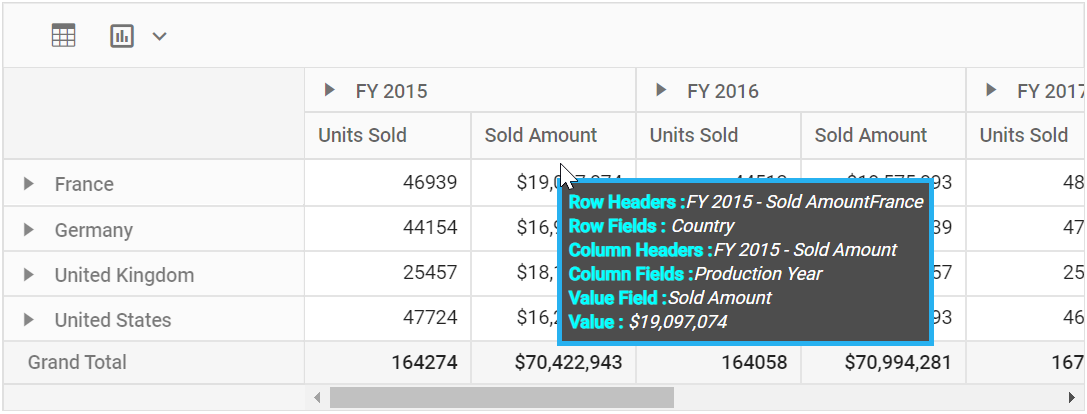
The tooltip displays contextual information when users hover over value cells in the pivot table. It can be enabled or disabled by setting the showTooltip property to true or false. By default, tooltip is enabled in the pivot table and shows the cell value along with row and column header information.
Tooltip Template
Users can customize the tooltip in the Pivot Table component by setting the tooltipTemplate property with their own HTML elements. This property accepts either an HTML string or an element ID. Use the following placeholders within the HTML to display dynamic values:
-
${rowHeaders}– Displays the row headers for the selected value cell. -
${columnHeaders}– Displays the column headers for the selected value cell. -
${rowFields}– Displays the row fields of the selected value cell. -
${columnFields}– Displays the column fields of the selected value cell. -
${valueField}– Displays the value field name of the selected cell. -
${aggregateType}– Specifies the aggregate type of the selected value cell. -
${value}– Displays the formatted value of the selected value cell.
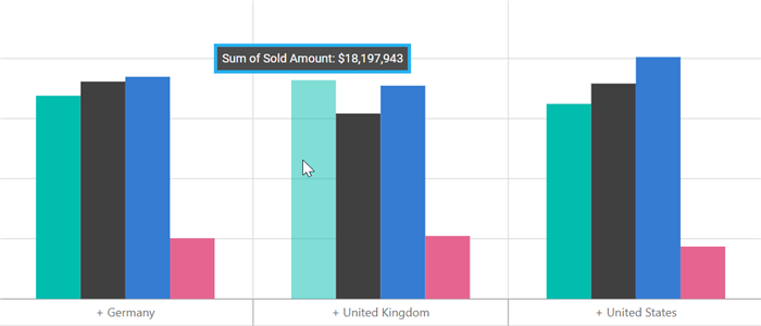
Tooltip customization can be applied to both pivot table and pivot chart together, or configured individually. To customize the Pivot Table tooltip, define the HTML template via the tooltipTemplate property as described above. To set a custom tooltip for the Pivot Chart only, use the template property within the tooltip object of the e-chartSettings property.
The example below shows how to define the Pivot Table tooltip template in index.html and assign it to the tooltipTemplate property. The Pivot Chart tooltip is customized by setting an HTML string in the tooltip property of e-chartSettings.