Getting Started with Syncfusion Flutter Charts
This section explains the steps required to populate the chart with data, title, data labels, legend, and tooltips. This section covers only the minimal features needed to know to get started with the chart.
To get start quickly with our Flutter chart widget, you can check on this video.
Add Flutter Charts to an application
Create a simple project using the instructions given in the Getting Started with your first Flutter app documentation.
Add dependency
Add the Syncfusion Flutter Chart dependency to your pub spec file.
dependencies:

    syncfusion_flutter_charts: ^1.0.0-beta.3
Get packages
Run the following command to get the required packages.
$ flutter pub getImport package
Import the following package in your Dart code.
import 'package:syncfusion_flutter_charts/charts.dart';Initialize chart
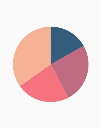
Once the package has been imported, initialize the chart as a child of any widget. There are two kinds of chart widgets - SfCartesianChart and SfCircularChart. SfCircularChart can be used to render pie, doughnut and radial bar charts. Here, as we are rendering pie chart, initialize SfCircularChart widget as a child of Container widget.
@override
    Widget build(BuildContext context) {
        return Scaffold(
            body: Center(
                child: Container(
                    //Initialize chart
                    child: SfCircularChart()
                )
            )
        );
    }
Bind data source
Based on your data, initialize the series type. In the series, you need to map the data source and the fields for x and y data points. Here, pie series is rendered that is demonstrated in the following code snippet.
@override
    Widget build(BuildContext context) {
        final List<ChartData> chartData = [
            ChartData('David', 25),
            ChartData('Steve', 38),
            ChartData('Jack', 34),
            ChartData('Others', 52)
        ];
        return Scaffold(
            body: Center(
                child: Container(
                    child: SfCircularChart(series: <CircularSeries>[
                        // Render pie chart
                        PieSeries<ChartData, String>(
                            dataSource: chartData,
                            pointColorMapper:(ChartData data,  _) => data.color,
                            xValueMapper: (ChartData data, _) => data.x,
                            yValueMapper: (ChartData data, _) => data.y
                        )
                    ])
                )
            )
        );
    }

    class ChartData {
      ChartData(this.x, this.y, [this.color]);
        final String x;
        final double y;
        final Color color;
    }
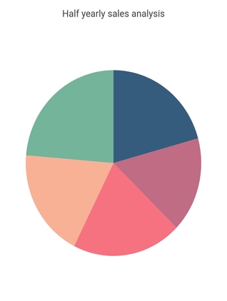
Add title
You can add a title to the chart to provide quick information to users about the data plotted in the chart. The title to chart can be set as demonstrated in the following code snippet.
@override
    Widget build(BuildContext context) {
        return Scaffold(
            body: Center(
                child: Container(
                    width: 480,
                    height: 560,
                    child: SfCircularChart(
                        // Chart title text
                        title: ChartTitle(text: 'Half yearly sales analysis'),
                        series: <CircularSeries>[
                        // Render pie chart
                            PieSeries<ChartData, String>(
                                dataSource: [
                                // Bind data source
                                ChartData('Jan', 35),
                                ChartData('Feb', 28),
                                ChartData('Mar', 34),
                                ChartData('Apr', 32),
                                ChartData('May', 40)
                                ],
                                pointColorMapper: (ChartData data, _) => data.color,
                                xValueMapper: (ChartData data, _) => data.x,
                                yValueMapper: (ChartData data, _) => data.y
                            )
                        ]
                    )
                )
            )
        );
    }
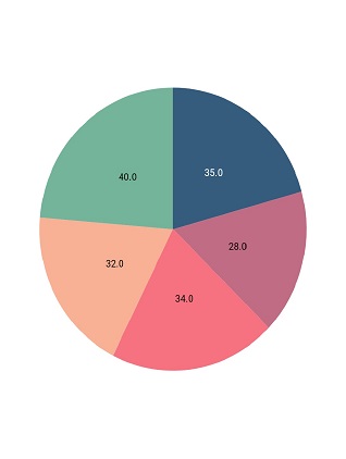
Enable data labels
You can add data labels to improve the readability of the chart using the dataLabelSettings property.
@override
    Widget build(BuildContext context) {
        return Scaffold(
            body: Center(
                child: Container(
                    child: SfCircularChart(
                        series: <ChartSeries>[
                            // Initialize line series
                            PieSeries<SalesData, String>(
                                dataSource: [
                                    // Bind data source
                                    SalesData('Jan', 35),
                                    SalesData('Feb', 28),
                                    SalesData('Mar', 34),
                                    SalesData('Apr', 32),
                                    SalesData('May', 40)
                                ],
                                pointColorMapper: (SalesData sales, _) => sales.color,
                                xValueMapper: (SalesData sales, _) => sales.year,
                                yValueMapper: (SalesData sales, _) => sales.sales,
                                // Render the data label
                                dataLabelSettings:DataLabelSettings(isVisible : true)
                            )
                        ]
                    )
                )
            )
        );
    }
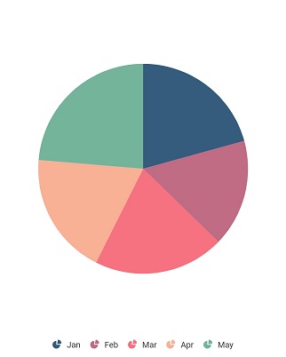
Enable legend
The legend provides information about the series rendered in the chart.
You can use legend in chart by setting the isVisible property to true in SfCircularChart.legend.
@override
    Widget build(BuildContext context) {
        return Scaffold(
            body: Center(
                child: Container(
                    child: SfCircularChart(
                        // Enables the legend
                        legend: Legend(isVisible: true),
                        series: <ChartSeries>[
                            // Initialize line series
                            PieSeries<SalesData, String>(
                                dataSource: [
                                    // Bind data source
                                    SalesData('Jan', 35),
                                    SalesData('Feb', 28),
                                    SalesData('Mar', 34),
                                    SalesData('Apr', 32),
                                    SalesData('May', 40)
                                ],
                                pointColorMapper: (SalesData sales, _) => sales.color,
                                xValueMapper: (SalesData sales, _) => sales.year,
                                yValueMapper: (SalesData sales, _) => sales.sales,
                                name: 'Sales'
                            )
                        ]
                    )
                )
            )
        );
    }
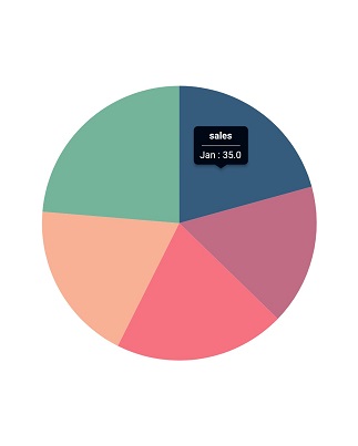
Enable tooltip
The tooltip is used when you cannot display information using the data labels due to space constraints.
The tooltipBehavior property in chart is used to enable and customize the tooltip for all the series whereas the enableTooltip property in series is used to toggle the tooltip visibility of each series. The tooltip is enabled as demonstrated in the following code snippet.
@override
    Widget build(BuildContext context) {
        return Scaffold(
            appBar: AppBar(
                title: Text(widget.title),
            ),
            body: Center(
                child: Container(
                    child: SfCircularChart(
                        // Enables the tooltip for all the series in chart
                        tooltipBehavior: TooltipBehavior(enable: true),
                        series: <ChartSeries>[
                            // Initialize line series
                            PieSeries<SalesData, String>(
                                // Enables the tooltip for individual series
                                enableTooltip: true,
                                dataSource: [
                                    // Bind data source
                                    SalesData('Jan', 35),
                                    SalesData('Feb', 28),
                                    SalesData('Mar', 34),
                                    SalesData('Apr', 32),
                                    SalesData('May', 40)
                                ],
                                pointColorMapper: (SalesData sales, _) => sales.color,
                                xValueMapper: (SalesData sales, _) => sales.year,
                                yValueMapper: (SalesData sales, _) => sales.sales
                            )
                        ]
                    )
                )
            )
        );
    }
You can find the complete getting started sample from this link.