Axis in Syncfusion flutter charts
Charts typically have two axes that are used to measure and categorize data: a vertical (Y) axis, and a horizontal (X) axis.
Vertical(Y) axis always uses numerical scale. Horizontal(X) axis supports the following types of scale:
- Category
- Numeric
- Date-time
- Logarithmic
Numeric axis
Numeric axis uses numerical scale and displays numbers as labels. By default, Numeric Axis is set to both horizontal axis and vertical axis.
@override
    Widget build(BuildContext context) {
        return Scaffold(
            body: Center(
                child: Container(
                    child: SfCartesianChart(
                        primaryXAxis: NumericAxis(),
                        primaryYAxis: NumericAxis()
                    )
                )
            )
        );
    }
Inversed numeric axis
By using the isInversed Property in Cartesian charts, the numeric axis can be inverted.Axis is rendered from the minimum value to the maximum value by default, and can be inverted from the maximum value to the minimum value.
@override
    Widget build(BuildContext context) {
        return Scaffold(
            body: Center(
                child: Container(
                    child: SfCartesianChart(
                        primaryXAxis: NumericAxis(isInversed: true),
                        primaryYAxis: NumericAxis(isInversed: true)
                    )
                )
            )
        );
    }
Customizing range
To customize the range of an axis, use the minimum and maximum properties of NumericAxis. By default, nice range will be calculated automatically based on the provided data.
@override
    Widget build(BuildContext context) {
        return Scaffold(
            body: Center(
                child: Container(
                    child: SfCartesianChart(
                        primaryYAxis: NumericAxis(
                            minimum: 10,
                            maximum: 50
                        )
                    )
                )
            )
        );
    }
Customizing interval
Axis interval can be customized using the interval property of ChartAxis. By default, nice interval will be calculated based on the minimum and maximum values of the provided data.
@override
    Widget build(BuildContext context) {
        return Scaffold(
            body: Center(
                child: Container(
                    child: SfCartesianChart(
                        primaryYAxis: NumericAxis(
                            // axis interval is set to 10
                            interval: 10
                        )
                    )
                )
            )
        );
    }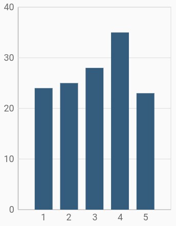
Applying padding to the range
Padding can be applied to the minimum and maximum extremes of the axis range using the rangePadding property. Numeric axis supports the following types of padding:
- additional
- auto
- none
- normal
- round
additional
When the value of rangePadding property is additional, the axis range will be rounded and an interval of the axis will be added as padding to the minimum and maximum values of the range.
@override
    Widget build(BuildContext context) {
        return Scaffold(
            body: Center(
                child: Container(
                    child: SfCartesianChart(
                        primaryYAxis: NumericAxis(
                            // Additional range padding is applied to y axis
                            rangePadding: ChartRangePadding.additional
                        )
                    )
                )
            )
        );
    }
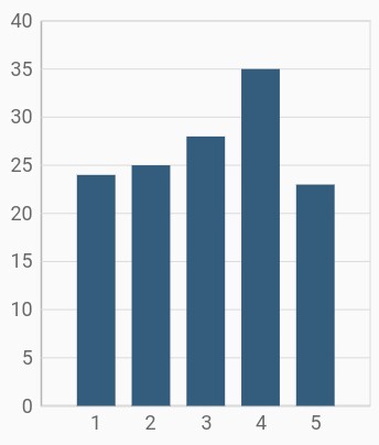
auto
When the value of rangePadding property is auto, the horizontal numeric axis takes none for padding calculation, whereas the vertical numeric axis takes normal for padding calculation. This is also the default value of rangePadding.
@override
    Widget build(BuildContext context) {
        return Scaffold(
            body: Center(
                child: Container(
                    child: SfCartesianChart(
                        primaryYAxis: NumericAxis(
                            rangePadding: ChartRangePadding.auto
                        )
                    )
                )
            )
        );
    }
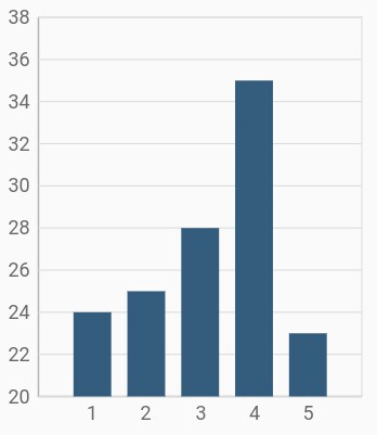
none
When the value of rangePadding property is none, padding will not be applied to the axis.
@override
Widget build(BuildContext context) {
return Scaffold(
body: Center(
child: Container(
child: SfCartesianChart(
primaryYAxis: NumericAxis(
rangePadding: ChartRangePadding.none
)
)
)
)
);
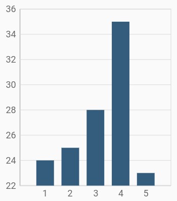
}normal
When the value of rangePadding property is normal, padding is applied to the axis based on the default range calculation.
@override
    Widget build(BuildContext context) {
        return Scaffold(
            body: Center(
                child: Container(
                    child: SfCartesianChart(
                        primaryYAxis: NumericAxis(
                            rangePadding: ChartRangePadding.normal
                        )
                    )
                )
            )
        );
    }
round
When the value of rangePadding property is round, axis range will be rounded to the nearest possible numeric value.
@override
    Widget build(BuildContext context) {
        return Scaffold(
            body: Center(
                child: Container(
                    child: SfCartesianChart(
                        primaryYAxis: NumericAxis(
                            rangePadding: ChartRangePadding.round
                        )
                    )
                )
            )
        );
    }
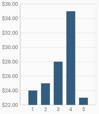
Formatting the labels
The numberFormat property of numeric axis formats the numeric axis labels with globalized label formats. The following code snippet demonstrates how to format numeric labels.
@override
    Widget build(BuildContext context) {
        return Scaffold(
            body: Center(
                child: Container(
                    child: SfCartesianChart(
                        primaryYAxis: NumericAxis(
                            // Y axis labels will be rendered with currency format
                            numberFormat: NumberFormat.simpleCurrency()
                        )
                    )
                )
            )
        );
    }
Also refer label format and date format for formatting the labels further.
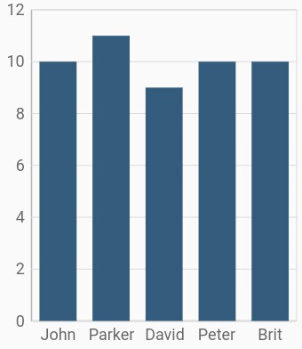
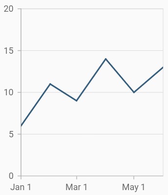
Category axis
Category axis displays text labels instead of numbers. When the string values are bound to x values, then the x-axis must be initialized with CategoryAxis.
@override
    Widget build(BuildContext context) {
        return Scaffold(
            body: Center(
                child: Container(
                    child: SfCartesianChart(
                        primaryXAxis: CategoryAxis()
                    )
                )
            )
        );
    }
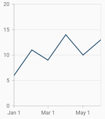
Placing labels between the ticks
Labels in category axis can be placed on the ticks by setting the labelPlacement to onTicks. The default value of the labelPlacement property is betweenTicks. So, the labels will be placed between the ticks by default.
@override
    Widget build(BuildContext context) {
        return Scaffold(
            body: Center(
                child: Container(
                    child: SfCartesianChart(
                        primaryXAxis: CategoryAxis(
                            // Axis labels will be placed on the ticks
                            labelPlacement: LabelPlacement.onTicks
                        )
                    )
                )
            )
        );
    }
Displaying labels after a fixed interval
To display the labels after a fixed interval n, set the interval property of ChartAxis to n. The default value of interval is null.
@override
    Widget build(BuildContext context) {
        return Scaffold(
            body: Center(
                child: Container(
                    child: SfCartesianChart(
                        primaryXAxis: CategoryAxis(
                            labelPlacement: LabelPlacement.betweenTicks,
                            interval: 2
                        )
                    )
                )
            )
        );
    }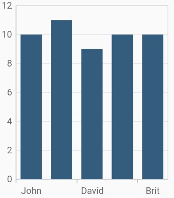
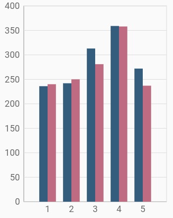
Indexed category axis
Category axis can also be rendered based on the index values of data source by setting the arrangeByIndex property to true in the axis.
final List<ChartData> chartData = [
        ChartData('John', 10),
        ChartData('David', 9),
        ChartData('Brit', 10),
    ];

    final List<ChartData> chartData2 = [
        ChartData('Anto', 11),
        ChartData('Peter', 12),
        ChartData('Parker', 8),
    ];

    @override
    Widget build(BuildContext context) {
        return Scaffold(
            body: Center(
                child: Container(
                    child: SfCartesianChart(
                        primaryXAxis: CategoryAxis(
                            // Axis will be rendered based on the index values
                            arrangeByIndex: true
                        ),
                        series: <ChartSeries<ChartData, String>>[
                            ColumnSeries<ChartData, String>(
                                dataSource: chartData,
                                xValueMapper: (ChartData sales, _) => sales.x,
                                yValueMapper: (ChartData sales, _) => sales.y,
                            ),
                            ColumnSeries<ChartData, String>(
                                dataSource: chartData2,
                                xValueMapper: (ChartData sales, _) => sales.x,
                                yValueMapper: (ChartData sales, _) => sales.y,
                            )
                        ]
                    )
                )
            )
        );
    }
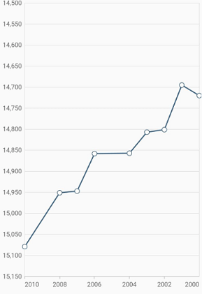
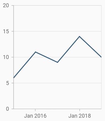
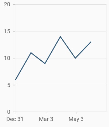
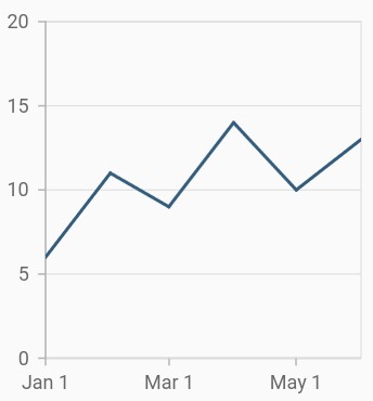
Date-time axis
The date-time axis uses date-time scale and displays date-time values as axis labels in specified format.
@override
    Widget build(BuildContext context) {
        return Scaffold(
            body: Center(
                child: Container(
                    child: SfCartesianChart(
                        primaryXAxis: DateTimeAxis()
                    )
                )
            )
        );
    }
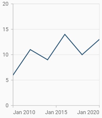
Customizing range
To customize the range of an axis, use the minimum and maximum properties of DateTimeAxis. By default, nice range will be calculated automatically based on the provided data.
@override
    Widget build(BuildContext context) {
        return Scaffold(
            body: Center(
                child: Container(
                    child: SfCartesianChart(
                        primaryXAxis: DateTimeAxis(
                            minimum: DateTime(2010),
                            maximum: DateTime(2020)
                        )
                    )
                )
            )
        );
    }
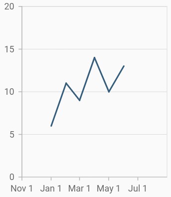
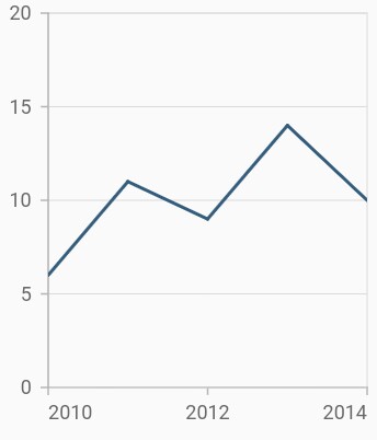
Date-time intervals
The date-time intervals can be customized using the interval and intervalType properties of DateTimeAxis. For example, setting interval as 2 and intervalType as years will consider 2 years as interval.
The Flutter Chart supports the following types of interval for date-time axis:
- auto
- years
- months
- days
- hours
- minutes
- seconds
@override
    Widget build(BuildContext context) {
        return Scaffold(
            body: Center(
                child: Container(
                    child: SfCartesianChart(
                        primaryXAxis: DateTimeAxis(
                            // Interval type will be months
                            intervalType: DateTimeIntervalType.months,
                            interval: 2
                        )
                    )
                )
            )
        );
    }
Applying padding to range
Padding can be applied to the minimum and maximum extremes of a range using the RangePadding property. The date-time axis supports the following types of padding:
- none
- round
- additional
- normal
none
When the value of rangePadding property is none, padding will not be applied to the axis.
@override
    Widget build(BuildContext context) {
        return Scaffold(
            body: Center(
                child: Container(
                    child: SfCartesianChart(
                        primaryXAxis: DateTimeAxis(
                            rangePadding: ChartRangePadding.none
                        )
                    )
                )
            )
        );
    }
round
When the value of rangePadding property is round, axis range will be rounded to the nearest possible date-time value.
@override
    Widget build(BuildContext context) {
        return Scaffold(
            body: Center(
                child: Container(
                    child: SfCartesianChart(
                        primaryXAxis: DateTimeAxis(
                            rangePadding: ChartRangePadding.round
                        )
                    )
                )
            )
        );
    }
additional
When the value of rangePadding property is additional, range will be rounded and date-time interval of the axis will be added as padding to the minimum and maximum extremes of a range.
@override
    Widget build(BuildContext context) {
        return Scaffold(
            body: Center(
                child: Container(
                    child: SfCartesianChart(
                        primaryXAxis: DateTimeAxis(
                            rangePadding: ChartRangePadding.additional
                        )
                    )
                )
            )
        );
    }
normal
When the value of rangePadding property is normal, padding is applied to the axis based on the default range calculation.
@override
    Widget build(BuildContext context) {
        return Scaffold(
            body: Center(
                child: Container(
                    child: SfCartesianChart(
                        primaryXAxis: DateTimeAxis(
                            rangePadding: ChartRangePadding.normal
                        )
                    )
                )
            )
        );
    }
Formatting the labels
The dateFormat property formats the date-time axis labels. The default data-time axis label can be formatted with various built-in date formats, which depend on the given data source.
@override
    Widget build(BuildContext context) {
        return Scaffold(
            body: Center(
                child: Container(
                    child: SfCartesianChart(
                        primaryXAxis: DateTimeAxis(
                            // X axis labels will be rendered based on the below format
                            dateFormat: DateFormat.y()
                        )
                    )
                )
            )
        );
    }
Also refer label format and number format for formatting the labels further.
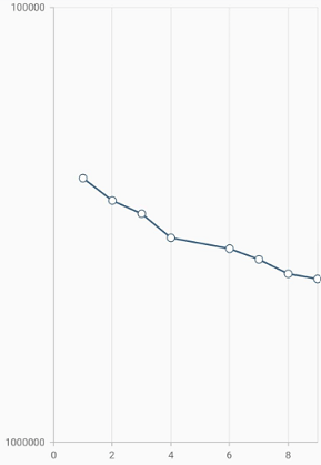
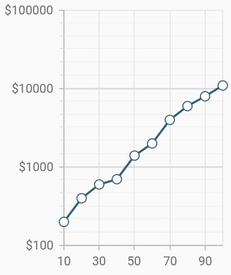
Logarithmic axis
Logarithmic axis uses logarithmic scale and displays numbers as axis labels.
@override
    Widget build(BuildContext context) {
        return Scaffold(
            body: Center(
                child: Container(
                    child: SfCartesianChart(
                        primaryXAxis: NumericAxis(),
                        primaryYAxis: LogarithmicAxis()
                    )
                )
            )
        );
    }
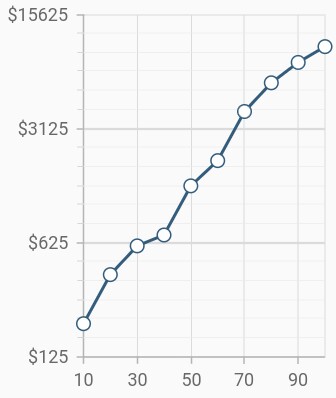
Change logarithmic range
To customize the range of log axis, use the minimum, maximum, and interval properties. By default, the range will be calculated automatically based on the provided data.
@override
    Widget build(BuildContext context) {
        return Scaffold(
            body: Center(
                child: Container(
                    child: SfCartesianChart(
                        primaryYAxis: LogarithmicAxis(
                            minimum: 300,
                            maximum: 10000,
                            interval: 1,
                        )
                    )
                )
            )
        );
    }
Change log base value
To customize the log base value, use the logBase property.
@override
    Widget build(BuildContext context) {
        return Scaffold(
            body: Center(
                child: Container(
                    child: SfCartesianChart(
                        primaryYAxis: LogarithmicAxis(
                           logBase: 5,
                        )
                    )
                )
            )
        );
    }
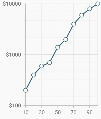
Inversed logarithmic axis
By using the isInversed Property in Cartesian charts, the logarithmic axis can be inverted.Axis is rendered from the minimum value to the maximum value by default, and can be inverted from the maximum value to the minimum value.
@override
    Widget build(BuildContext context) {
        return Scaffold(
            body: Center(
                child: Container(
                    child: SfCartesianChart(
                        primaryXAxis: LogarithmicAxis(
                          isInversed:true,
                        )
                    )
                )
            )
        );
    }