Customization of range slider
This section explains about how to customize the range slider elements.
Active color
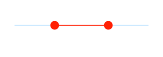
Represents the color applied to the active track, thumb, overlay, and inactive divisors. The active side of the range slider is between the left and right thumbs.
SfRangeValues _values = SfRangeValues(3.0, 7.0);

@override
Widget build(BuildContext context) {
  return MaterialApp(
      home: Scaffold(
          body: Center(
              child: SfRangeSlider(
                    min: 0.0,
                    max: 10.0,
                    values: _values,
                    activeColor: Colors.red,
                    showDivisors: true,
                    onChanged: (SfRangeValues newValues) {
                        setState(() {
                            _values = newValues;
                        });
                    },
              )
          )
      )
  );
}
NOTE
Refer the
SfRangeSliderThemeDatato know about updating the individual active range slider element’s visual.
Inactive color
Represents the color applied to the inactive track and active divisors. The “inactive” side of the range slider is between the min value and the left thumb, and the right thumb and the max value.
SfRangeValues _values = SfRangeValues(3.0, 7.0);

@override
Widget build(BuildContext context) {
  return MaterialApp(
      home: Scaffold(
          body: Center(
              child: SfRangeSlider(
                    min: 0.0,
                    max: 10.0,
                    values: _values,
                    activeColor: Colors.red,
                    inactiveColor: Colors.red.withOpacity(0.2),
                    showDivisors: true,
                    onChanged: (SfRangeValues newValues) {
                        setState(() {
                            _values = newValues;
                        });
                    },
              )
          )
      )
  );
}
NOTE
Refer the
SfRangeSliderThemeDatato know about updating the individual inactive range slider element’s visual.
Was this page helpful?
Yes
No
Thank you for your feedback!
Thank you for your feedback and comments. We will rectify this as soon as possible!
An unknown error has occurred. Please try again.
Help us improve this page