Flutter Date Range Picker (SfDateRangePicker) Overview
21 Oct 20222 minutes to read
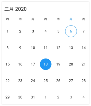
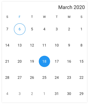
The Syncfusion Flutter Date Range Picker is a lightweight widget that allows users to easily select a single date, multiple dates, or a range of dates. It provides month, year, decade, and century view options to quickly navigate to the desired date. It supports minimum, maximum, and disabled dates to restrict date selection.
Key features
-
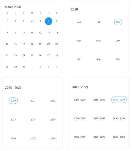
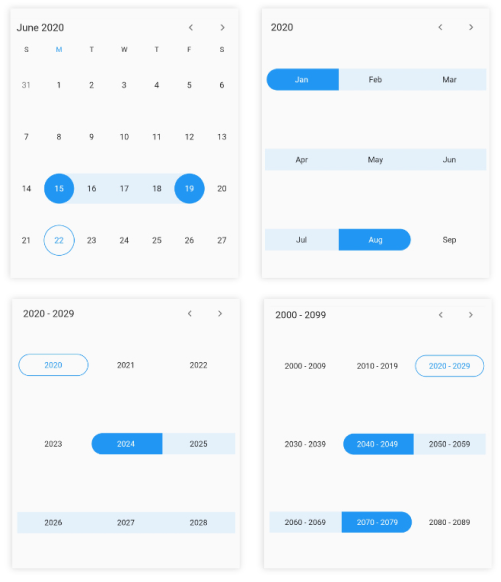
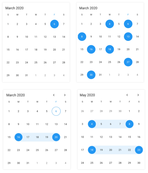
Multiple picker views: Display month, year, decade, and century views that allow users to easily select and navigate between built-in views. Supports programmatic navigation.
-
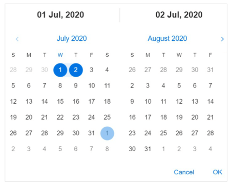
Multi-date picker view: Display two Date Range Pickers side by side, allowing you to select ranges of dates within two separate months easily.
-
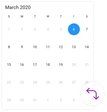
Quick navigation: Navigate back and forth the date-range views and between different view modes.
-
Enable/disable built-in view switching: Restrict users from navigating to different picker views by disabling view switching. Select values in terms of month, year, or decade with this feature enabled.
-
Date selection: Select single, multiple, and range of dates. It also supports programmatic selection.
-
Limit the date selection range: Select only a date range with a specific minimum and maximum numbers of days (span of days) by setting the minimum and maximum days options.
-
Change first day of week: Customize the first day of the week as needed. The default first day is Sunday.
-
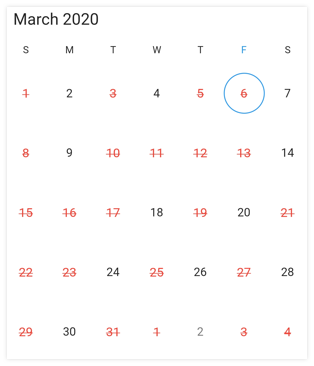
Blackout dates: Disable any date to make it inactive in a date range picker. Easily prevent the selection of weekends by disabling them.
-
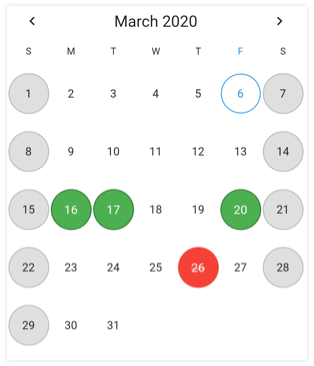
Highlight holidays and weekends: Highlight any date or every weekend in a month as special days using decoration in Flutter date range picker.
-
Appearance customization: Change the look and feel of the date range picker by customizing its default appearance and style using Flutter decorations.
-
Right to left (RTL) - Right-to-left direction support for users working in RTL languages like Hebrew and Arabic.
-
Accessibility - Easy access of the date range picker by the screen readers.
-
Globalization - Display the current date and time by following the globalized date and time formats.