Scatter Chart in Flutter Cartesian Charts (SfCartesianChart)
21 May 2021 / 6 minutes to read
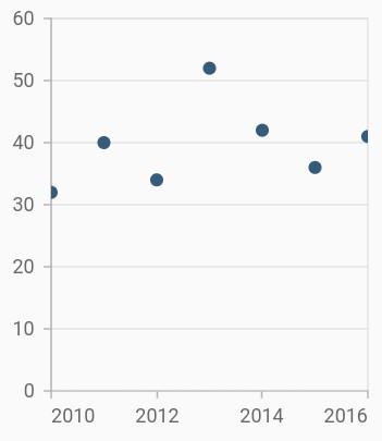
To render a scatter chart, create an instance of ScatterSeries, and add it to the series collection property of SfCartesianChart. The following properties can be used to customize the scatter segment appearance.
-
color- changes the color of the series. -
opacity- controls the transparency of the chart series. -
borderWidth- changes the stroke width of the series. -
borderColor- changes the stroke color of the series.
@override
    Widget build(BuildContext context) {
         return Scaffold(
            body: Center(
                child: Container(
                    child: SfCartesianChart(
                        primaryXAxis: DateTimeAxis(),
                        series: <ChartSeries>[
                            // Renders scatter chart
                            ScatterSeries<ChartData, DateTime>(
                                dataSource: chartData,
                                xValueMapper: (ChartData sales, _) => sales.x,
                                yValueMapper: (ChartData sales, _) => sales.y
                            )
                        ]
                    )
                )
            )
        );
    }
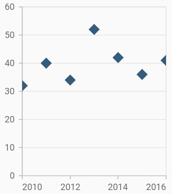
Change shape and size of the scatter
The shape property is used to change the rendering shape of scatter series. The available shapes are circle, rectangle, pentagon, verticalLine, horizontalLine, diamond, triangle, image, and invertedTriangle. If image shape is specified, then you can assign the image using the image property.
The height and width properties of markerSettings can be used to change the height and width of the scatter series, respectively.
@override
    Widget build(BuildContext context) {
         return Scaffold(
            body: Center(
                child: Container(
                    child: SfCartesianChart(
                        primaryXAxis: DateTimeAxis(),
                        series: <ChartSeries>[
                            ScatterSeries<ChartData, DateTime>(
                                dataSource: chartData,
                                xValueMapper: (ChartData sales, _) => sales.x,
                                yValueMapper: (ChartData sales, _) => sales.y,
                                markerSettings: MarkerSettings(
                                    height: 15,
                                    width: 15,
                                    // Scatter will render in diamond shape
                                    shape: DataMarkerType.diamond
                                )
                            )
                        ]
                    )
                )
            )
        );
    }
Also refer, color palette, color mapping, animation, gradient and empty points for customizing the scatter series further.