Range column Chart in Flutter Cartesian Charts (SfCartesianChart)
21 May 2021 / 12 minutes to read
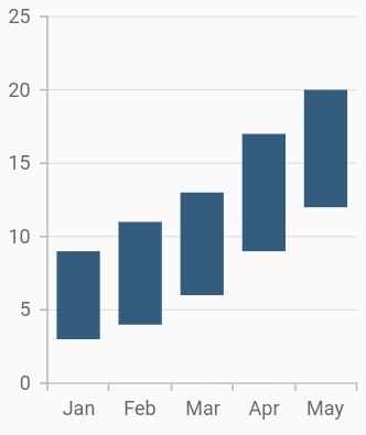
To render a range column chart, create an instance of RangeColumnSeries and add to the series collection property of SfCartesianChart.
Since the RangeColumnSeries requires two Y values for a point, your data should contain high and low values. High and low value specifies the maximum and minimum range of the point.
-
highValueMapper- field in the data source, which is considered as high value for the data points. -
lowValueMapper- field in the data source, which is considered as low value for the data points.
@override
    Widget build(BuildContext context) {
         return Scaffold(
            body: Center(
                child: Container(
                    child: SfCartesianChart(
                        primaryXAxis: CategoryAxis(),
                        series: <ChartSeries>[
                            RangeColumnSeries<ChartData, String>(
                                dataSource: <ChartData>[
                                    ChartData('Jan', 3, 9),
                                    ChartData('Feb', 4, 11),
                                    ChartData('Mar', 6, 13),
                                    ChartData('Apr', 9, 17),
                                    ChartData('May', 12, 20),
                                ],
                                xValueMapper: (ChartData sales, _) => sales.x,
                                lowValueMapper: (ChartData sales, _) => sales.low,
                                highValueMapper: (ChartData sales, _) => sales.high,
                            )
                        ]
                    )
                )
            )
        );
    }

    class ChartData {
        ChartData(this.x, this.high, this.low);
            final String x;
            final double high;
            final double low;
    }
Data label
In the range column chart when data label is enabled, by default there will be two values displayed namely, high and low, but in the other types of charts, only y value will be displayed.
@override
    Widget build(BuildContext context) {
         return Scaffold(
            body: Center(
                child: Container(
                    child: SfCartesianChart(
                        primaryXAxis: CategoryAxis(),
                        series: <ChartSeries>[
                            RangeColumnSeries<ChartData, String>(
                                dataSource: chartData,
                                xValueMapper: (ChartData sales, _) => sales.x,
                                lowValueMapper: (ChartData sales, _) => sales.low,
                                highValueMapper: (ChartData sales, _) => sales.high,
                                dataLabelSettings: DataLabelSettings(
                                    isVisible: true,
                                    labelAlignment: ChartDataLabelAlignment.top
                                ),
                            )
                        ]
                    )
                )
            )
        );
    }
Transposed range column
The isTransposed property of CartesianSeries is used to transpose the horizontal and vertical axes, to view the data in a different perspective. Using this feature, you can render range column chart.
@override
    Widget build(BuildContext context) {
         return Scaffold(
            body: Center(
                child: Container(
                    child: SfCartesianChart(
                        isTransposed: true,
                        primaryXAxis: CategoryAxis(),
                        series: <ChartSeries>[
                            RangeColumnSeries<ChartData, String>(
                                dataSource: <ChartData>[
                                    ChartData('Jan', 3, 9),
                                    ChartData('Feb', 4, 11),
                                    ChartData('Mar', 6, 13),
                                    ChartData('Apr', 9, 17),
                                    ChartData('May', 12, 20),
                                ],
                                xValueMapper: (ChartData sales, _) => sales.x,
                                lowValueMapper: (ChartData sales, _) => sales.low,
                                highValueMapper: (ChartData sales, _) => sales.high,
                            )
                        ]
                    )
                )
            )
        );
    }

    class ChartData {
        ChartData(this.x, this.high, this.low);
            final String x;
            final double high;
            final double low;
    }
Was this page helpful?
Yes
No
Thank you for your feedback!
Thank you for your feedback and comments. We will rectify this as soon as possible!
An unknown error has occurred. Please try again.
Help us improve this page