Histogram Chart in Flutter Cartesian Charts (SfCartesianChart)
21 May 2021 / 4 minutes to read
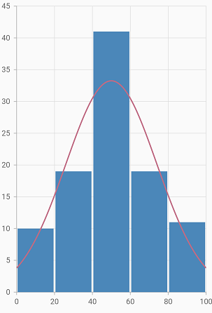
Histogram chart is a graphical representation that organizes a group of data points into user-specified ranges. It is similar in appearance to a bar chart. The histogram condenses a data series into an easily interpreted visual by taking many data points and grouping them into logical ranges.
To render a histogram chart, create an instance of HistogramSeries and add to the series collection property of SfCartesianChart.
You can customize intervals using the binInterval property. Interval value by which the data points are grouped and rendered as bars, in histogram series.
For example, if the binInterval is set to 20, the x-axis will split with 20 as the interval. The first bar in the histogram represents the count of values lying between 0 to 20 in the provided data and the second bar will represent 20 to 40.
If no value is specified for this property, then the interval will be calculated automatically based on the data points count and value.
You can collapse the normal distribution curve using the showNormalDistributionCurve property. You can use the following properties to customize the appearance.
-
color- changes the color of the series. -
opacity- controls the transparency of the chart series. -
borderWidth- changes the stroke width of the series. -
borderColor- changes the stroke color of the series. -
curveColor- changes the color of the normal distribution curve. -
curveWidth- changes the width of the normal distribution curve. -
curveDashArray- renders the normal distribution curve with dashes.
@override
    Widget build(BuildContext context) {
        return Scaffold(
            body: Center(
                child: Container(
                    child: SfCartesianChart(
                        series: <ChartSeries>[
                            HistogramSeries<SalesDaa, num>(
                                dataSource: chartData,
                                yValueMapper: (SalesData sales, _) => sales.yValue,
                                binInterval: 20,
                                showNormalDistributionCurve: true,
                                curveColor: const Color.fromRGBO(192, 108, 132, 1),
                                borderWidth: 3
                            ),
                        ]
                    )
                )
             )
        );
    }