Marker and data label
Marker
Markers are used to provide information about the exact point location. You can add a shape to adorn each data point. Markers can be enabled by using the isVisible property of markerSettings. You can use the following properties to customize the appearance.
-
color– used to change the color of the marker shape. -
borderWidth– used to change the stroke width of the marker shape. -
borderColor– used to change the stroke color of the marker shape. -
height- used to change the height of the marker shape. -
width- used to change the width of the marker shape.
@override
    Widget build(BuildContext context) {
        return Scaffold(
            body: Center(
                child: Container(
                    child: SfCartesianChart(
                        series: <CartesianSeries>[
                            LineSeries<ChartData, double>(
                                dataSource: chartData,
                                xValueMapper: (ChartData data, _) => data.x,
                                yValueMapper: (ChartData data, _) => data.y,
                                // Renders the marker
                                markerSettings: MarkerSettings(
                                    isVisible: true
                                )
                            )
                        ]
                    )
                )
            )
        );
    }
Customizing marker shapes
Markers can be assigned with different shapes using the shape property. By default, markers are rendered with circle shape. The shapes of markers are listed below.
- circle
- rectangle
- image
- pentagon
- verticalLine
- horizontalLine
- diamond
- triangle
- invertedTriangle
@override
    Widget build(BuildContext context) {
        return Scaffold(
            body: Center(
                child: Container(
                    child: SfCartesianChart(
                        series: <CartesianSeries>[
                            LineSeries<ChartData, double>(
                                dataSource: chartData,
                                xValueMapper: (ChartData data, _) => data.x,
                                yValueMapper: (ChartData data, _) => data.y,
                                markerSettings: MarkerSettings(
                                    isVisible: true,
                                    // Marker shape is set to diamond
                                    shape: DataMarkerType.diamond
                                )
                            )
                        ]
                    )
                )
            )
        );
    }
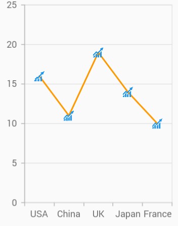
Image marker
The markers can be rendered with desired image as shape. For this you have to specify the shape as image and refer the image path using imageUrl property.
@override
    Widget build(BuildContext context) {
        return Scaffold(
            body: Center(
                child: Container(
                    child: SfCartesianChart(
                        series: <CartesianSeries>[
                            LineSeries<ChartData, double>(
                                dataSource: chartData,
                                xValueMapper: (ChartData data, _) => data.x,
                                yValueMapper: (ChartData data, _) => data.y,
                                markerSettings: MarkerSettings(
                                    isVisible: true,
                                    shape: DataMarkerType.image,
                                    // Renders the image as marker
                                    imageUrl: 'images/livechart.png'
                                )
                            )
                        ]
                    )
                )
            )
        );
    }
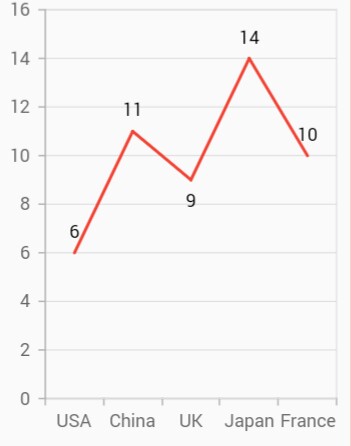
Data label
Data label can be added to a chart series by enabling the isVisible option in the dataLabelSettings. You can use the following properties to customize the appearance.
-
color– used to change the background color of the data label shape. -
borderWidth– used to change the stroke width of the data label shape. -
borderColor– used to change the stroke color of the data label shape. -
alignment- aligns the data label text tonear,centerandfar. -
textStyle– used to change the data label text color, size, font family, font style, and font weight. -
color– used to change the color of the data label. -
fontFamily- used to change the font family for the data label. -
fontStyle- used to change the font style for the data label. -
fontWeight- used to change the font weight for the data label. -
fontSize- used to change the font size for the data label. -
margin- used to change the margin size for data labels. -
opacity- used to control the transparency of the data label. -
labelAlignment- used to align the Cartesian data label positions. The available options to customize the positions areouter,auto,top,bottomandmiddle. -
borderRadius- used to add the rounded corners to the data label shape. -
angle- used to rotate the labels.
@override
    Widget build(BuildContext context) {
        return Scaffold(
            body: Center(
                child: Container(
                    child: SfCartesianChart(
                        series: <CartesianSeries>[
                            LineSeries<ChartData, double>(
                                dataSource: chartData,
                                xValueMapper: (ChartData data, _) => data.x,
                                yValueMapper: (ChartData data, _) => data.y,
                                dataLabelSettings: DataLabelSettings(
                                    // Renders the data label
                                    isVisible: true
                                )
                            )
                        ]
                    )
                )
            )
        );
    }
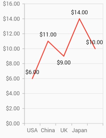
Formatting label content
Data label considers the format used in the vertical axis by default. In the below code snippet, we have specified format to y-axis and you can see the same format is applied to the data label.
@override
    Widget build(BuildContext context) {
        return Scaffold(
            body: Center(
                child: Container(
                    child: SfCartesianChart(
                        // Applies currency format for y axis labels and also for data labels
                        primaryYAxis: NumericAxis(numberFormat: NumberFormat.simpleCurrency()),
                        series: <CartesianSeries>[
                            LineSeries<ChartData, double>(
                                dataSource: chartData,
                                color: Colors.red,
                                xValueMapper: (ChartData data, _) => data.x,
                                yValueMapper: (ChartData data, _) => data.y,
                                dataLabelSettings: DataLabelSettings(
                                    isVisible: true
                                )
                            )
                        ]
                    )
                )
            )
        );
    }
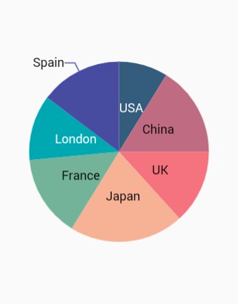
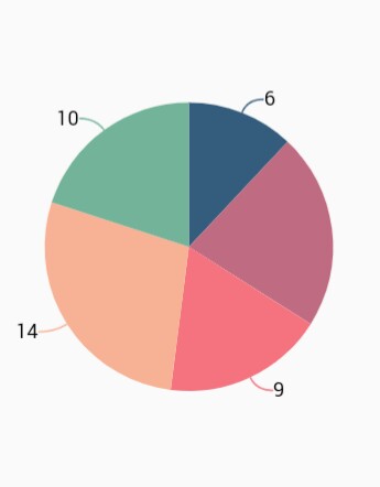
Label position
The labelAlignment property is used to position the Cartesian chart type data labels at top, bottom, auto, outer and middle position of the actual data point position. By default, labels are auto positioned. You can move the labels horizontally and vertically using OffsetX and OffsetY properties respectively.
The labelPosition property is used to place the circular series data labels either inside or outside. By default the label of circular chart is placed inside the series.
@override
    Widget build(BuildContext context) {
        return Scaffold(
            body: Center(
                child: Container(
                    child: SfCircularChart(
                        series: <CircularSeries>[
                            PieSeries<ChartData, double>(
                                dataSource: chartData,
                                xValueMapper: (ChartData data, _) => data.x,
                                yValueMapper: (ChartData data, _) => data.y,
                                dataLabelSettings: DataLabelSettings(
                                    isVisible: true,
                                    // Positioning the data label
                                    labelPosition: ChartDataLabelPosition.outside
                                )
                            )
                        ]
                    )
                )
            )
        );
    }
NOTE
The
labelAlignmentproperty is used to position the Cartesian chart labels whereaslabelPositionproperty is used to position the circular chart labels.
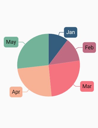
Smart labels
This feature is used to arrange the data labels smartly and avoid the intersection when there is overlapping of labels. The property enableSmartLabels in CircularSeries is used to arrange the data labels smartly. By default, this property is true.
@override
    Widget build(BuildContext context) {
        return Scaffold(
            body: Center(
                child: Container(
                    child:SfCircularChart(
                        series: <CircularSeries>[
                            PieSeries<ChartData, double>(
                                // Avoid labels intersection
                                enableSmartLabels: true,
                                dataSource: chartData,
                                xValueMapper: (ChartData data, _) => data.x,
                                yValueMapper: (ChartData data, _) =>  data.y,
                                dataLabelMapper: (ChartData data, _) => data.x,
                                dataLabelSettings: DataLabelSettings(
                                    isVisible: true,
                                    labelPosition: ChartDataLabelPosition.inside
                                )
                            )
                        ]
                    )
                )
            )
        );
    }
Apply series color
The useSeriesColor property is used to apply the series color to background color of the data labels. The default value of this property is false.
@override
    Widget build(BuildContext context) {
        return Scaffold(
            body: Center(
                child: Container(
                    child:SfCircularChart(
                        series: <CircularSeries>[
                            PieSeries<ChartData, double>(
                                dataSource: chartData,
                                xValueMapper: (ChartData data, _) => data.x,
                                yValueMapper: (ChartData data, _) => data.y,
                                dataLabelMapper: (ChartData data, _) => data.x,
                                dataLabelSettings: DataLabelSettings(
                                    isVisible: true,
                                    labelPosition: ChartDataLabelPosition.outside,
                                    // Renders background rectangle and fills it with series color
                                    useSeriesColor: true
                                )
                            )
                        ]
                    )
                )
            )
        );
    }
Connector line
This feature is used to connect label and data point using a line. It can be enabled for Pie and Doughnut chart types. The connectorLineSettings property used to customize the connector line.
-
color– used to change the color of the line -
width– used to change the stroke thickness of the line -
length– specifies the length of the connector line. -
type- specifies the shape of connector line eithercurveorline.
@override
    Widget build(BuildContext context) {
        return Scaffold(
            body: Center(
                child: Container(
                    child: SfCircularChart(
                        series: <CircularSeries>[
                            PieSeries<ChartData, double>(
                                enableSmartLabels: true,
                                dataSource: chartData,
                                xValueMapper: (ChartData data, _) => data.x,
                                yValueMapper: (ChartData data, _) => data.y,
                                dataLabelSettings: DataLabelSettings(
                                    isVisible: true,
                                    labelPosition: ChartDataLabelPosition.outside,
                                    connectorLineSettings: ConnectorLineSettings(
                                        // Type of the connector line
                                        type: ConnectorType.curve
                                    )
                                )
                            )
                        ]
                    )
                )
            )
        );
    }
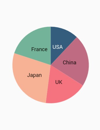
Point text mapping
The dataLabelMapper property is used to map the text from data source.
@override
    Widget build(BuildContext context) {
        final List<ChartData> chartData = [
            ChartData('USA', 17, '17%'),
            ChartData('China', 34, '34%'),
            ChartData('Japan', 24, '24%'),
            ChartData('Africa', 30, '30%'),
            ChartData('UK', 10, '10%')
        ];

        return Scaffold(
            body: Center(
                child: Container(
                    child:SfCircularChart(
                        series: <CircularSeries>[
                            PieSeries<ChartData, String>(
                                dataSource: chartData,
                                xValueMapper: (ChartData data, _) => data.x,
                                yValueMapper: (ChartData data, _) => data.y,
                                // Map the data label text for each point from the data source
                                dataLabelMapper: (ChartData data, _) => data.text,
                                dataLabelSettings: DataLabelSettings(
                                    isVisible: true
                                )
                            )
                        ]
                    )
                )
            )
        );
    }

    class ChartData {
        ChartData(this.x, this.y, this.text);
        final String x;
        final double y;
        final String text;
    }
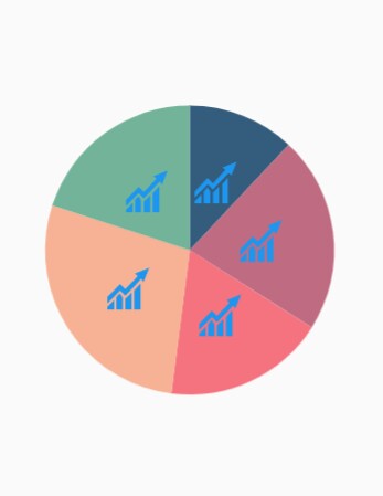
Label template
You can customize the appearance of the data label with your own template using the builder property of dataLabelSettings.
@override
    Widget build(BuildContext context) {
        return Scaffold(
            body: Center(
                child: Container(
                    child:SfCircularChart(
                        series: <CircularSeries>[
                            PieSeries<ChartData, String>(
                                dataSource: chartData,
                                xValueMapper: (ChartData data, _) => data.x,
                                yValueMapper: (ChartData data, _) => data.y,
                                dataLabelMapper: (ChartData data, _) => data.text,
                                dataLabelSettings: DataLabelSettings(
                                    isVisible: true,
                                    // Templating the data label
                                    builder: (dynamic data, dynamic point, dynamic series, int pointIndex, int seriesIndex) {
                                        return Container(
                                        height: 30,
                                        width: 30,
                                        child: Image.asset('images/livechart.png')
                                        );
                                    }
                                )
                            )
                        ]
                    )
                )
            )
        );
    }