Circular Chart Types
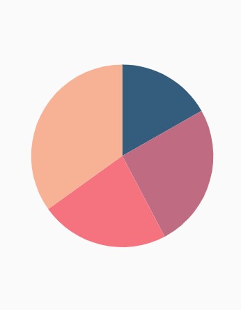
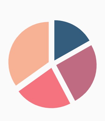
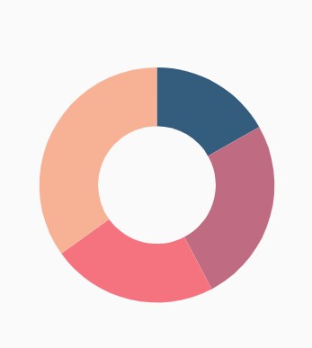
Pie chart
To render a pie chart, create an instance of PieSeries, and add it to the series collection property of SfCircularChart. The following properties are used to customize the appearance of pie segment:
-
opacity- Controls the transparency of the chart series. -
strokeWidth– Changes the stroke width of the series. -
strokeColor– Changes the stroke color of the series. -
pointColorMapper- Maps the color for individual points from the data source.
@override
    Widget build(BuildContext context) {
        final List<ChartData> chartData = [
            ChartData('David', 25),
            ChartData('Steve', 38),
            ChartData('Jack', 34),
            ChartData('Others', 52)
        ];
        return Scaffold(
            body: Center(
                child: Container(
                    child: SfCircularChart(series: <CircularSeries>[
                        // Render pie chart
                        PieSeries<ChartData, String>(
                            dataSource: chartData,
                            pointColorMapper:(ChartData data,  _) => data.color,
                            xValueMapper: (ChartData data, _) => data.x,
                            yValueMapper: (ChartData data, _) => data.y
                        )
                    ]
                )
            )
        )
    );
}

class ChartData {
    ChartData(this.x, this.y, [this.color]);
    final String x;
    final double y;
    final Color color;
}
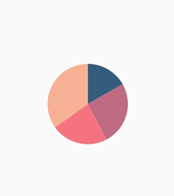
Changing pie size
You can use the radius property to change the diameter of the pie chart with respect to the plot area. The default value is 80%.
@override
    Widget build(BuildContext context) {
        return Scaffold(
            body: Center(
                child: Container(
                    child: SfCircularChart(
                        series: <CircularSeries>[
                            PieSeries<ChartData, String>(
                                dataSource: chartData,
                                xValueMapper: (ChartData data, _) => data.x,
                                yValueMapper: (ChartData data, _) => data.y,
                                // Radius of pie
                                radius: '50%'
                            )
                        ]
                    )
                )
            )
        );
    }
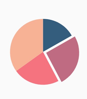
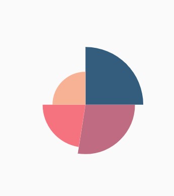
Exploding a segment
You can explode a pie segment by enabling the explode property. The following properties are used to customize the explode options:
-
explodeIndex- Specifies the index of the slice to explode it at the initial rendering. -
explodeOffset- Specifies the offset of exploded slice. The value ranges from 0% to 100%. -
explodeGesture- Gesture for activating the explode. Explode can be activated in single tap, double tap, and long press. The available gesture types aresingleTap,doubleTap,longPress, andnoneand the default value issingleTap.
@override
    Widget build(BuildContext context) {
        return Scaffold(
            body: Center(
                child: Container(
                    child: SfCircularChart(
                        series: <CircularSeries>[
                            PieSeries<ChartData, String>(
                                dataSource: chartData,
                                xValueMapper: (ChartData data, _) => data.x,
                                yValueMapper: (ChartData data, _) => data.y,
                                // Segments will explode on tap
                                explode: true,
                                // First segment will be exploded on initial rendering
                                explodeIndex: 1
                            )
                        ]
                    )
                )
            )
        );
    }
Exploding all the segments
Using the explodeAll property of PieSeries, you can explode all the pie segments.
@override
    Widget build(BuildContext context) {
        return Scaffold(
            body: Center(
                child: Container(
                    child: SfCircularChart(
                        series: <CircularSeries>[
                            PieSeries<ChartData, String>(
                                dataSource: chartData,
                                xValueMapper: (ChartData data, _) => data.x,
                                yValueMapper: (ChartData data, _) => data.y,
                                explode: true,
                                // All the segments will be exploded
                                explodeAll: true
                            )
                        ]
                    )
                )
            )
        );
    }
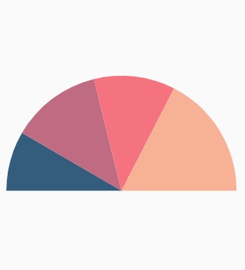
Angle of pie
SfCircularChart allows you to render all the data points or segments in semi-pie, quarter-pie, or in any sector using the startAngle and endAngle properties.
@override
    Widget build(BuildContext context) {
        return Scaffold(
            body: Center(
                child: Container(
                    child: SfCircularChart(
                        series: <CircularSeries>[
                            PieSeries<ChartData, String>(
                                dataSource: chartData,
                                xValueMapper: (ChartData data, _) => data.x,
                                yValueMapper: (ChartData data, _) => data.y,
                                startAngle: 270, // starting angle of pie
                                endAngle: 90 // ending angle of pie
                            )
                        ]
                    )
                )
            )
        );
    }
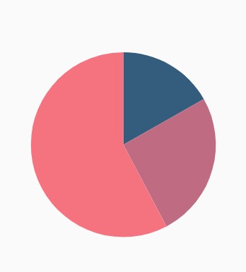
Grouping data points
The small segments in the pie chart can be grouped into others category using the groupTo and groupMode properties of PieSeries. The groupMode property specifies the grouping type based on the actual data point value or by points length, and the groupTo property sets the limit to group data points into a single slice. The grouped segment is labeled as Others in legend and toggled as any other segment. The default value of the groupTo property is null, and the default value of groupMode property is point.
@override
    Widget build(BuildContext context) {
        return Scaffold(
            body: Center(
                child: Container(
                    child: SfCircularChart(
                        series: <CircularSeries>[
                            PieSeries<ChartData, String>(
                                dataSource: chartData,
                                xValueMapper: (ChartData data, _) => data.x,
                                yValueMapper: (ChartData data, _) => data.y,
                                groupMode: CircularChartGroupMode.point,
                                // As the grouping mode is point, 2 points will be grouped
                                groupTo: 2
                            )
                        ]
                    )
                )
            )
        );
    }
Various radius for each slice
The pointRadiusMapper maps the field name, which will be considered for calculating the radius of the data points.
@override
    Widget build(BuildContext context) {
        final List<ChartData> chartData = [
            ChartData('USA', 10, '70%'),
            ChartData('China', 11, '60%'),
            ChartData('Russia', 9, '52%'),
            ChartData('Germany', 10, '40%')
        ];
        return Scaffold(
            body: Center(
                child: Container(
                    child: SfCircularChart(
                        series: <CircularSeries>[
                            PieSeries<ChartData, String>(
                                dataSource: chartData,
                                xValueMapper: (ChartData data, _) => data.x,
                                yValueMapper: (ChartData data, _) => data.y,
                                // Radius for each segment from data source
                                pointRadiusMapper: (ChartData data, _) => data.size
                            )
                        ]
                    )
                )
            )
        );
    }

    class ChartData {
        ChartData(this.x, this.y, this.size);
        final String x;
        final double y;
        final String size;
    }
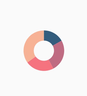
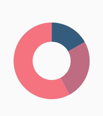
Doughnut chart
To render a doughnut chart, create an instance of DoughnutSeries, and add it to the series collection property of SfCircularChart. The following properties are used to customize the appearance of doughnut segment:
-
opacity- Controls the transparency of the chart series. -
strokeWidth– Changes the stroke width of the series. -
strokeColor– Changes the stroke color of the series. -
pointColorMapper- Maps the color for individual points from the data source.
@override
    Widget build(BuildContext context) {
        final List<ChartData> chartData = [
            ChartData('David', 25, Color.fromRGBO(9,0,136,1)),
            ChartData('Steve', 38, Color.fromRGBO(147,0,119,1)),
            ChartData('Jack', 34, Color.fromRGBO(228,0,124,1)),
            ChartData('Others', 52, Color.fromRGBO(255,189,57,1))
        ];
        return Scaffold(
            body: Center(
                child: Container(
                    child: SfCircularChart(
                        series: <CircularSeries>[
                            // Renders doughnut chart
                            DoughnutSeries<ChartData, String>(
                                dataSource: chartData,
                                pointColorMapper:(ChartData data,  _) => data.color,
                                xValueMapper: (ChartData data, _) => data.x,
                                yValueMapper: (ChartData data, _) => data.y
                            )
                        ]
                    )
                )
            )
        );
    }

    class ChartData {
        ChartData(this.x, this.y, [this.color]);
            final String x;
            final double y;
            final Color color;
    }
Rounded corners
The cornerStyle property specifies the corner type for doughnut chart. The corners can be customized using the bothFlat, bothCurve, startCurve, and endCurve options. The default value of this property is bothFlat.
@override
    Widget build(BuildContext context) {
        return Scaffold(
            body: Center(
                child: Container(
                    child: SfCircularChart(
                        series: <CircularSeries>[
                            DoughnutSeries<ChartData, String>(
                                dataSource: chartData,
                                xValueMapper: (ChartData data, _) => data.x,
                                yValueMapper: (ChartData data, _) => data.y,
                                // Corner style of doughnut segment
                                cornerStyle: CornerStyle.bothCurve
                            )
                        ]
                    )
                )
            )
        );
    }
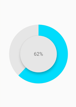
Doughnut with center elevation
You can use the Annotations property in charts, to provide center elevation text in doughnut charts as shown below:
@override
    Widget build(BuildContext context) {
        return Scaffold(
            body: Center(
                child: Container(
                    child: SfCircularChart(
                        annotations: <CircularChartAnnotation>[
                         CircularChartAnnotation(
                           child: Container(
                             child: PhysicalModel(
                              child: Container(),
                                shape: BoxShape.circle,
                                elevation: 10,
                                shadowColor: Colors.black,
                                color: const Color.fromRGBO(230, 230, 230, 1)))),
                                CircularChartAnnotation(
                                  child: Container(
                                  child: const Text('62%',
                                 style: TextStyle(
                                color: Color.fromRGBO(0, 0, 0, 0.5), fontSize: 25))))
                                   ],
                        series: <CircularSeries>[
                            DoughnutSeries<ChartData, String>(
                                dataSource: chartData,
                                xValueMapper: (ChartData data, _) => data.x,
                                yValueMapper: (ChartData data, _) => data.y,
                                // Radius of doughnut
                                radius: '50%'
                            )
                        ]
                    )
                )
            )
        );
    }
Doughnut with color mapping
you can use the pointColorMapper property to provide different color mappings to the doughnut charts as shown below:
@override
    Widget build(BuildContext context) {
        return Scaffold(
            body: Center(
                child: Container(
                    child: SfCircularChart(
                        series: <CircularSeries>[
                            DoughnutSeries<ChartData, String>(
                                dataSource: chartData,
                                xValueMapper: (ChartData data, _) => data.x,
                                yValueMapper: (ChartData data, _) => data.y,
                                pointColorMapper: (ChartSampleData data, _) => data.pointColor,
                                // Radius of doughnut
                                radius: '50%'
                            )
                        ]
                    )
                )
            )
        );
    }
Changing the doughnut size
You can use the radius property to change the diameter of the doughnut chart with respect to the plot area. The default value of this property is 80%.
@override
    Widget build(BuildContext context) {
        return Scaffold(
            body: Center(
                child: Container(
                    child: SfCircularChart(
                        series: <CircularSeries>[
                            DoughnutSeries<ChartData, String>(
                                dataSource: chartData,
                                xValueMapper: (ChartData data, _) => data.x,
                                yValueMapper: (ChartData data, _) => data.y,
                                // Radius of doughnut
                                radius: '50%'
                            )
                        ]
                    )
                )
            )
        );
    }
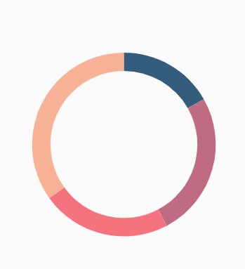
Changing doughnut inner radius
You can change the inner radius of doughnut chart using the innerRadius property with respect to the plot area. The value ranges from 0% to 100%.
@override
    Widget build(BuildContext context) {
        return Scaffold(
            body: Center(
                child: Container(
                    child: SfCircularChart(
                        series: <CircularSeries>[
                            DoughnutSeries<ChartData, String>(
                                dataSource: chartData,
                                xValueMapper: (ChartData data, _) => data.x,
                                yValueMapper: (ChartData data, _) => data.y,
                                // Radius of doughnut's inner circle
                                innerRadius: '80%'
                            )
                        ]
                    )
                )
            )
        );
    }
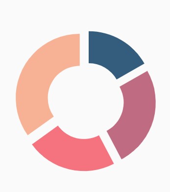
Exploding a segment
You can explode a doughnut segment by enabling the explode property. The following properties are used to customize the explode options:
-
explodeIndex- Specifies the index of the slice to explode it at the initial rendering. -
explodeOffset- Specifies the offset of exploded slice. The value ranges from 0% to 100%. -
explodeGesture- Gesture for activating the explode. Explode can be activated in single tap, double tap, and long press. The available gesture types aresingleTap,doubleTap,longPress, andnone. The default value issingleTap.
@override
    Widget build(BuildContext context) {
        return Scaffold(
            body: Center(
                child: Container(
                    child: SfCircularChart(
                        series: <CircularSeries>[
                            DoughnutSeries<ChartData, String>(
                                dataSource: chartData,
                                xValueMapper: (ChartData data, _) => data.x,
                                yValueMapper: (ChartData data, _) => data.y,
                                // Explode the segments on tap
                                explode: true,
                                explodeIndex: 1
                            )
                        ]
                    )
                )
            )
        );
    }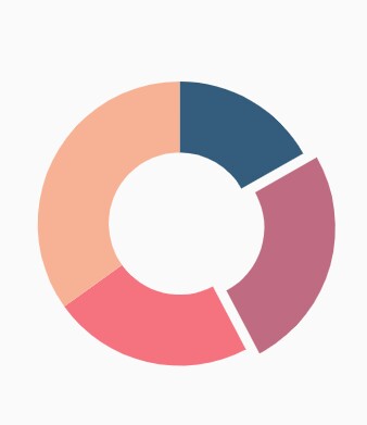
Exploding all the segments
Using the explodeAll property of DoughnutSeries, you can explode all the doughnut segments.
@override
    Widget build(BuildContext context) {
        return Scaffold(
            body: Center(
                child: Container(
                    child: SfCircularChart(
                        series: <CircularSeries>[
                            DoughnutSeries<ChartData, String>(
                                dataSource: chartData,
                                xValueMapper: (ChartData data, _) => data.x,
                                yValueMapper: (ChartData data, _) => data.y,
                                explode: true,
                                // Explode all the segments
                                explodeAll: true
                            )
                        ]
                    )
                )
            )
        );
    }
Angle of doughnut
SfCircularChart allows you to render all the data points or segments in semi-pie, quarter-pie, or in any sector using the startAngle and endAngle properties.
@override
    Widget build(BuildContext context) {
        return Scaffold(
            body: Center(
                child: Container(
                    child: SfCircularChart(
                        series: <CircularSeries>[
                            DoughnutSeries<ChartData, String>(
                                dataSource: chartData,
                                xValueMapper: (ChartData data, _) => data.x,
                                yValueMapper: (ChartData data, _) => data.y,
                                startAngle: 270, // Starting angle of doughnut
                                endAngle: 90 // Ending angle of doughnut
                            )
                        ]
                    )
                )
            )
        );
    }
Grouping data points
The small segments in the doughnut chart can be grouped into others category using the groupTo and groupMode properties of DoughnutSeries. The groupMode property is used to specify the grouping type based on the actual data point value or by points length, and the groupTo property is used to set the limit to group data points into a single slice. The grouped segment is labeled as Others in legend and toggled as any other segment. The default value of the groupTo property is null, and the default value of groupMode property is point.
@override
    Widget build(BuildContext context) {
        return Scaffold(
            body: Center(
                child: Container(
                    child: SfCircularChart(
                        series: <CircularSeries>[
                            DoughnutSeries<ChartData, String>(
                                dataSource: chartData,
                                xValueMapper: (ChartData data, _) => data.x,
                                yValueMapper: (ChartData data, _) => data.y,
                                // Mode of grouping
                                groupMode: CircularChartGroupMode.point,
                                groupTo: 2
                            )
                        ]
                    )
                )
            )
        );
    }
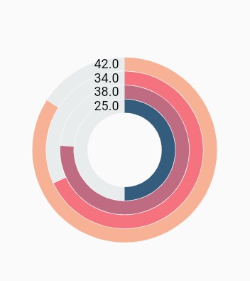
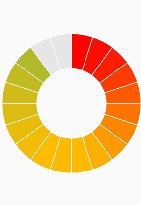
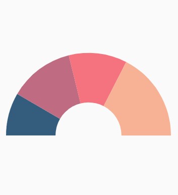
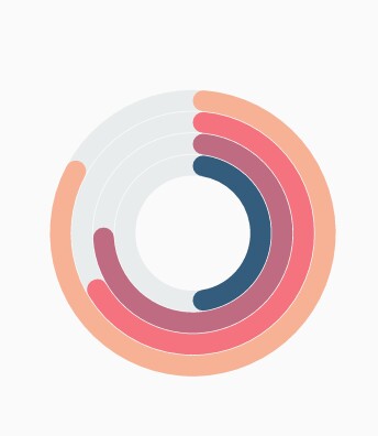
Radial bar chart
The radial bar chart is used for showing the comparisons among the categories using the circular shapes. To render a radial bar chart, create an instance of RadialBarSeries, and add to the series collection property of SfCircularChart. The following properties are used to customize the appearance of pie segment:
-
opacity- Controls the transparency of the chart series. -
strokeWidth– Changes the stroke width of the series. -
strokeColor– Changes the stroke color of the series. -
pointColorMapper- Maps the color for individual points from the data source. -
gap- Changes the spacing between two individual segments. The default value of spacing is 1%. -
maximumValue- Represents the entire span of an individual circle. The default value of the this property is null. -
trackColor- Changes the color of the track area. -
trackBorderColor- Changes the color of the track border. -
trackBorderWidth- Changes the width of the track border. -
trackOpacity- Controls the transparency of the track area. -
useSeriesColor- Uses the point color for filling the track area.
@override
    Widget build(BuildContext context) {
        return Scaffold(
            body: Center(
                child: Container(
                    child: SfCircularChart(
                        series: <CircularSeries>[
                            // Renders radial bar chart
                            RadialBarSeries<ChartData, String>(
                                dataSource: chartData,
                                xValueMapper: (ChartData data, _) => data.x,
                                yValueMapper: (ChartData data, _) => data.y
                            )
                        ]
                    )
                )
            )
        );
    }
Changing the radial bar size
You can use the radius property to change the diameter of the radial bar chart with respect to the plot area. The default value is 80%.
@override
    Widget build(BuildContext context) {
        return Scaffold(
            body: Center(
                child: Container(
                    child: SfCircularChart(
                        series: <CircularSeries>[
                            RadialBarSeries<ChartData, String>(
                                dataSource: chartData,
                                xValueMapper: (ChartData data, _) => data.x,
                                yValueMapper: (ChartData data, _) => data.y,
                                // Radius of the radial bar
                                radius: '50%'
                            )
                        ]
                    )
                )
            )
        );
    }
Changing the radial bar inner radius
You can change the inner radius of radial bar chart using the innerRadius property with respect to the plot area. The value ranges from 0% to 100%.
@override
    Widget build(BuildContext context) {
        return Scaffold(
            body: Center(
                child: Container(
                    child: SfCircularChart(
                        series: <CircularSeries>[
                            RadialBarSeries<ChartData, String>(
                                dataSource: chartData,
                                xValueMapper: (ChartData data, _) => data.x,
                                yValueMapper: (ChartData data, _) => data.y,
                                // Radius of the radial bar's inner circle
                                innerRadius: '80%'
                            )
                        ]
                    )
                )
            )
        );
    }
Rounded corners
The cornerStyle property specifies the corner type for radial bar chart. The corners can be customized using the bothFlat, bothCurve, startCurve, and endCurve options. The default value of this property is bothFlat.
@override
    Widget build(BuildContext context) {
        return Scaffold(
            body: Center(
                child: Container(
                    child: SfCircularChart(
                        series: <CircularSeries>[
                            RadialBarSeries<ChartData, String>(
                                dataSource: chartData,
                                xValueMapper: (ChartData data, _) => data.x,
                                yValueMapper: (ChartData data, _) => data.y,
                                // Corner style of radial bar segment
                                cornerStyle: CornerStyle.bothCurve
                            )
                        ]
                    )
                )
            )
        );
    }
Rendering data labels
Data labels can be enabled using the isVisible property of dataLabelSettings. The appearance of label can be customized using the following properties:
-
color- Changes the label background color. -
textStyle– Changes the text color, size, font family, fontStyle, and font weight. -
textStyle.color– Changes the color of the text. -
textStyle.fontFamily- Changes the font family for chart title. -
textStyle.fontStyle– Changes the font style for the chart title. -
textStyle.fontSize- Changes the font size for the chart title. -
opacity- Controls the transparency of the label background color. -
borderRadius- Customizes the data label border radius. -
angle- Rotates the labels. -
borderWidth– Changes the stroke width of the data label shape. -
borderColor– Changes the stroke color of the data label shape. -
useSeriesColor- Uses the series color for filling the data label shape.
@override
    Widget build(BuildContext context) {
        return Scaffold(
            body: Center(
                child: Container(
                    child: SfCircularChart(
                        series: <CircularSeries>[
                            RadialBarSeries<ChartData, String>(
                                dataSource: chartData,
                                xValueMapper: (ChartData data, _) => data.x,
                                yValueMapper: (ChartData data, _) => data.y,
                                dataLabelSettings: DataLabelSettings(
                                    // Renders the data label
                                    isVisible: true
                                )
                            )
                        ]
                    )
                )
            )
        );
    }