Axis customization in SfCartesianChart
Common axis features
Customization of features such as axis title, labels, grid lines and tick lines are common to all the axes. Each of these features are explained in this section.
Axis Visibility
Axis visibility can be controlled using the isVisible property of axis. Default value of isVisible is true. When the axis visibility is set to false, then the axis elements like ticks, labels, title, etc will be hidden.
@override
    Widget build(BuildContext context) {
        return Scaffold(
            body: Center(
                child: Container(
                    child: SfCartesianChart(
                        primaryXAxis: NumericAxis(
                            // X axis is hidden now
                            isVisible: false
                        )
                    )
                )
            )
        );
    }
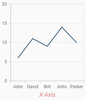
Axis title
The title property in axis provides options to customize the text and font of axis title. Axis does not display title by default. The title can be customized using following properties,
-
text– used to set the title for axis. -
textStyle– used to change the text color, size, font family, font style, and font weight. -
color– used to change the color of the label. -
fontFamily- used to change the font family for the axis title. -
fontStyle- used to change the font style for the axis title. -
fontWeight- used to change the font weight for the axis title. -
fontSize- used to change the font size for the axis title.
@override
    Widget build(BuildContext context) {
        return Scaffold(
            body: Center(
                child: Container(
                    child: SfCartesianChart(
                        primaryXAxis: CategoryAxis(
                            title: AxisTitle(
                                text: 'X-Axis',
                                textStyle: ChartTextStyle(
                                    color: Colors.deepOrange,
                                    fontFamily: 'Roboto',
                                    fontSize: 16,
                                    fontStyle: FontStyle.italic,
                                    fontWeight: FontWeight.w300
                                )
                            )
                        )
                    )
                )
            )
        );
    }
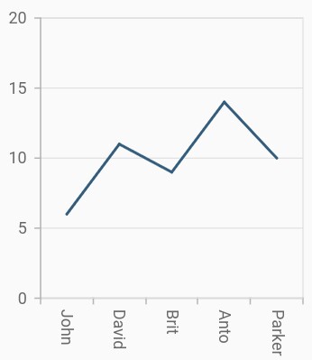
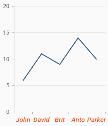
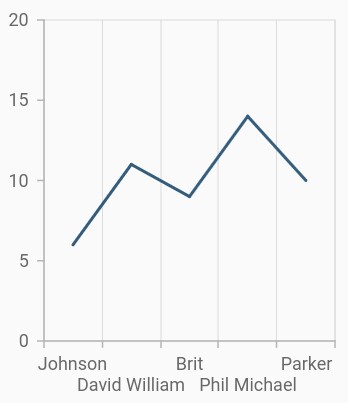
Axis label rotation
The labelRotation property of axis can be used to rotate the axis labels position. Default value of labelRotation property is 0d.
@override
    Widget build(BuildContext context) {
        return Scaffold(
            body: Center(
                child: Container(
                    child: SfCartesianChart(
                        primaryXAxis: CategoryAxis(
                            // Axis labels will be rotated to 90 degree
                            labelRotation: 90
                        )
                    )
                )
            )
        );
    }
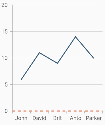
Axis line customization
SfCartesianChart provides support to customize the style of the axis line by defining the axisLine property as shown in the below code snippet.
-
color– used to change the stroke color of axis line. -
width– used to change the stroke width of axis line. -
dashArray- used to render axis line series with dashes.
@override
    Widget build(BuildContext context) {
        return Scaffold(
            body: Center(
                child: Container(
                    child: SfCartesianChart(
                        primaryXAxis: CategoryAxis(
                            axisLine: AxisLine(
                                color: Colors.deepOrange,
                                width: 2,
                                dashArray: <double>[5,5]
                            )
                        )
                    )
                )
            )
        );
    }
Axis label customization
The labelStyle property in axis provides options to customize the font of axis label. The axis label can be customized using following properties,
-
labelStyle– used to change the text color, size, font family, font style, and font weight. -
color– used to change the color of the axis label. -
fontFamily- used to change the font family for the axis label. -
fontStyle- used to change the font style for the axis label. -
fontWeight- used to change the font weight for the axis label. -
fontSize- used to change the font size for the axis label.
@override
    Widget build(BuildContext context) {
        return Scaffold(
            body: Center(
                child: Container(
                    child: SfCartesianChart(
                        primaryXAxis: NumericAxis(
                            labelStyle: ChartTextStyle(
                                color: Colors.deepOrange,
                                fontFamily: 'Roboto',
                                fontSize: 14,
                                fontStyle: FontStyle.italic,
                                fontWeight: FontWeight.w500
                            )
                        )
                    )
                )
            )
        );
    }
Formatting axis label content
The labelFormat property is used to add prefix or suffix with the axis label.
@override
    Widget build(BuildContext context) {
        return Scaffold(
            body: Center(
                child: Container(
                    child: SfCartesianChart(
                        primaryYAxis: NumericAxis(
                            // '°C' will be append to all the labels in Y axis
                            labelFormat: '{value}°C'
                        )
                    )
                )
            )
        );
    }
Also refer number format and date format for formatting the labels further.
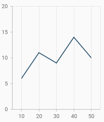
Label and tick positioning
Axis labels and ticks can be positioned inside or outside the chart area by using labelPosition and tickPosition properties of ChartAxis. By default labels and ticks will be positioned outside the chart area.
@override
    Widget build(BuildContext context) {
        return Scaffold(
            body: Center(
                child: Container(
                    child: SfCartesianChart(
                        primaryXAxis: CategoryAxis(
                            labelPosition: LabelPosition.inside,
                            tickPosition: TickPosition.inside
                        )
                    )
                )
            )
        );
    }
Edge label placement
Labels with long text at the edges of an axis may appear partially outside the chart. The edgeLabelPlacement property can be used to avoid the partial appearance of labels at the corners. Default value of this property is none. Other available options of edgeLabelPlacement are shift and hide. shift option will move the edge labels inside the axis bounds, where the hide option will hides the edge labels.
@override
    Widget build(BuildContext context) {
        return Scaffold(
            body: Center(
                child: Container(
                    child: SfCartesianChart(
                        primaryXAxis: NumericAxis(
                            // Edge labels will be shifted
                            edgeLabelPlacement: EdgeLabelPlacement.shift
                        )
                    )
                )
            )
        );
    }
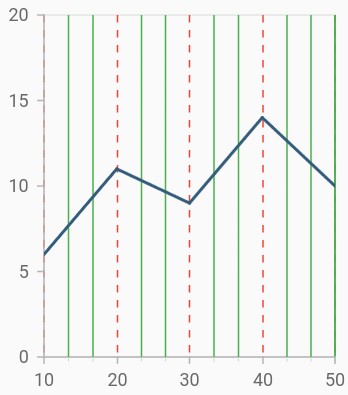
Grid lines customization
The width property is used to control the visibility of grid lines. majorGridLines and minorGridLines properties in axis are used to customize the major grid lines and minor grid lines of an axis respectively. We have provided options to change the width, dashes, color of grid lines. By default minor grid lines will not be visible.
@override
    Widget build(BuildContext context) {
        return Scaffold(
            body: Center(
                child: Container(
                    child: SfCartesianChart(
                        primaryXAxis: NumericAxis(
                            majorGridLines: MajorGridLines(
                                width: 1,
                                color: Colors.red,
                                dashArray: <double>[5,5]
                            ),
                            minorGridLines: MinorGridLines(
                                width: 1,
                                color: Colors.green,
                                dashArray: <double>[5,5]
                            ),
                            minorTicksPerInterval:2
                        )
                    )
                )
            )
        );
    }
Tick lines customization
The majorTickLines and minorTickLines properties in axis are used to customize the major tick lines of an axis and minor tick lines of an axis respectively. We have provided options to change the width, size, color and minorTicksPerInterval of tick lines. By default minor tick lines will not be visible.
@override
    Widget build(BuildContext context) {
        return Scaffold(
            body: Center(
                child: Container(
                    child: SfCartesianChart(
                        primaryXAxis: NumericAxis(
                            majorTickLines: MajorTickLines(
                                size: 6,
                                width: 2,
                                color: Colors.red
                            ),
                            minorTickLines: MinorTickLines(
                                size: 4,
                                width: 2,
                                color: Colors.blue
                            ),
                            minorTicksPerInterval:2
                        )
                    )
                )
            )
        );
    }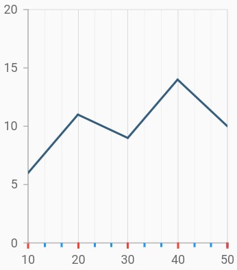
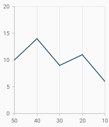
Inversing axis
Axis can be inversed using the isInversed property of an axis. Default value of isInversed property is false.
@override
    Widget build(BuildContext context) {
        return Scaffold(
            body: Center(
                child: Container(
                    child: SfCartesianChart(
                        primaryXAxis: NumericAxis(
                            // X axis will be inversed
                            isInversed: true
                        )
                    )
                )
            )
        );
    }
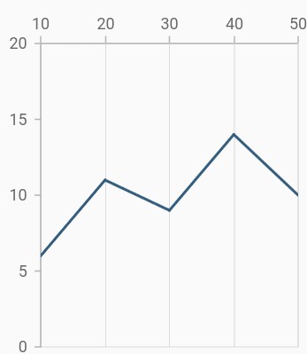
Placing axes at the opposite side
The opposedPosition property of axis can be used to place the axis at the opposite side of its default position. Default value of opposedPosition property is false.
@override
    Widget build(BuildContext context) {
        return Scaffold(
            body: Center(
                child: Container(
                    child: SfCartesianChart(
                        primaryXAxis: NumericAxis(
                            // X axis will be opposed
                            opposedPosition: true
                        )
                    )
                )
            )
        );
    }
Offset the rendering
The plotOffset property is used to offset the rendering of the axis at start and end position. The following code snippet demonstrates to apply the plot offset of an axis.
@override
    Widget build(BuildContext context) {
        return Scaffold(
            body: Center(
                child: Container(
                    child: SfCartesianChart(
                        primaryXAxis: NumericAxis(
                            // 20 logical pixels gap will be left at the start and end of the x axis
                            plotOffset: 20
                        )
                    )
                )
            )
        );
    }
Maximum number of labels per 100 logical pixels
By default, a maximum of 3 labels are displayed for each 100 logical pixels in axis. The maximum number of labels that should be present within 100 logical pixels length can be customized using the maximumLabels property of an axis. This property is applicable only for automatic range calculation and will not work if you set value for interval property of an axis.
@override
    Widget build(BuildContext context) {
        return Scaffold(
            body: Center(
                child: Container(
                    child: SfCartesianChart(
                        primaryXAxis: CategoryAxis(
                            maximumLabels: 3
                        )
                    )
                )
            )
        );
    }
Visible minimum
The visibleMinimum property is used to set the minimum visible range of an axis. When panning is enabled, you can pan to the actual minimum range of an axis.
@override
    Widget build(BuildContext context) {
        return Scaffold(
            body: Center(
                child: Container(
                    child: SfCartesianChart(
                        primaryXAxis: NumericAxis(
                            visibleMinimum: 2
                        )
                    )
                )
            )
        );
    }
Also refer minimum and maximum range of an axis.
Visible maximum
The visibleMaximum property is used to set the minimum visible range of an axis.When panning is enabled, you can pan to the actual maximum range of an axis.
@override
    Widget build(BuildContext context) {
        return Scaffold(
            body: Center(
                child: Container(
                    child: SfCartesianChart(
                        primaryXAxis: NumericAxis(
                            visibleMaximum: 4
                        )
                    )
                )
            )
        );
    }
Smart axis labels
Axis labels may overlap with each other based on chart dimensions and label size. The labelIntersectAction property of axis is used to avoid overlapping of axis labels. The default value of the labelIntersectAction is hide. Other available values are none, wrap, multipleRows, rotate45 and rotate90.
@override
    Widget build(BuildContext context) {
        return Scaffold(
            body: Center(
                child: Container(
                    child: SfCartesianChart(
                        primaryXAxis: CategoryAxis(
                            // Axis labels will be placed in multiple rows, if it is intersected
                            labelIntersectAction: AxisLabelIntersectAction.multipleRows
                        )
                    )
                )
            )
        );
    }
Axis crossing
Axis can be positioned anywhere in the plot area using the crossesAt property. This property specifies where the horizontal axis should intersect or cross the vertical axis, or vice-versa. The default value of the crossesAt property is null.
@override
    Widget build(BuildContext context) {
        return Scaffold(
            body: Center(
                child: Container(
                    child: SfCartesianChart(
                        primaryXAxis:NumericAxis(
                            crossesAt: 0
                        ),
                        primaryYAxis:NumericAxis(
                            crossesAt: 0
                        )
                    )
                )
            )
        );
    }
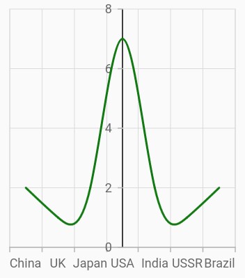
Crossing in category axis
For crossing in horizontal category axis, index value should be provided for the crossesAt property of vertical axis.
@override
    Widget build(BuildContext context) {
        return Scaffold(
            body: Center(
                child: Container(
                    child: SfCartesianChart(
                        primaryXAxis:CategoryAxis(),
                        primaryYAxis:NumericAxis(
                            crossesAt: 3
                        )
                    )
                )
            )
        );
    }
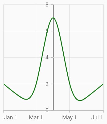
Crossing in date-time axis
For crossing in horizontal date-time axis, date value should be provided for the crossesAt property of vertical axis.
@override
    Widget build(BuildContext context) {
        return Scaffold(
            body: Center(
                child: Container(
                    child: SfCartesianChart(
                        primaryXAxis:DateTimeAxis(),
                        primaryYAxis:NumericAxis(
                            crossesAt: DateTime(2018, 4, 1)
                        )
                    )
                )
            )
        );
    }
Positioning the axis labels when crossing
The placeLabelsNearAxisLine property is used to determine whether the axis labels of crossed axis should be placed near to the axis line or not. The default value of placeLabelsNearAxisLine property is false.
@override
    Widget build(BuildContext context) {
        return Scaffold(
            body: Center(
                child: Container(
                    child: SfCartesianChart(
                        primaryXAxis:NumericAxis(
                            placeLabelNearToAxisLine: false
                        ),
                        primaryYAxis:NumericAxis(
                            placeLabelNearToAxisLine: false
                        )
                    )
                )
            )
        );
    }
Plot bands
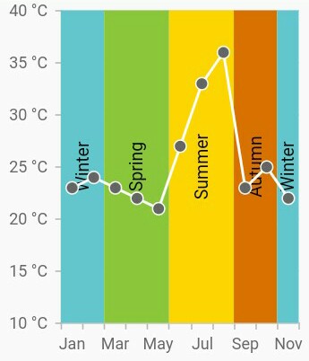
Plot bands are also known as strip lines, which are used to shade the different ranges in plot area with different colors to improve the readability of the chart. You can also add a text to indicate what that particular region indicates. You can enable the plot bands to be drawn repeatedly at regular intervals. This will be useful when you need to mark an event that occurs recursively along the timeline of the chart.
Since plot bands are drawn based on the axis, you have to add plot bands using the plotBands property of the respective axis. You can also add multiple plot bands to an axis.
The following properties are used to configure the plot bands:
-
start– Changes the start position of the plot band. -
end– Changes the end position of the plot band. -
size– Changes how long plot band should be expanded. This is applicable only when end is not specified. -
sizeType– Changes the date-time unit of the value specified in the size property. The values can be Year, Month, Day, Hour, Minute, Second, and Millisecond. -
text– Changes the text of the plot band. -
textAngle– Changes the angle of the text. -
color– Changes the color of the plot band. -
gradient– Applies gradient color for plot band. -
opacity– Changes the opacity of the plot band. -
borderWidth– Changes the stroke width of the plot band. -
borderColor– Changes the stroke color of the plot band. -
horizontalTextAlignment– Aligns the text horizontally. -
verticalTextAlignment– Aligns the text vertically. -
isVisible– Changes the visibility of the plot band in chart axis. -
shouldRenderAboveSeries– Changes the rendering order of the plot band.
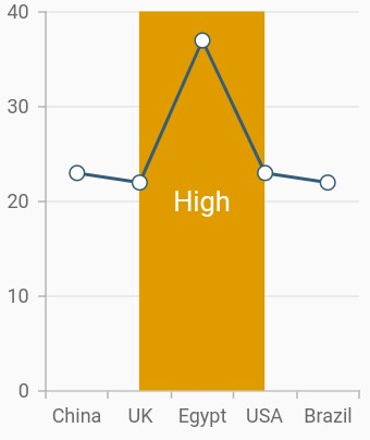
Add plot band for category axis
Plot band can be added to the category axis by specifying index values to the start and end properties.
@override
    Widget build(BuildContext context) {
        return Scaffold(
            body: Center(
                child: Container(
                    child: SfCartesianChart(
                        primaryXAxis:CategoryAxis(
                            plotBands: <PlotBand>[
                            PlotBand(
                            isVisible: true,
                            start: 1,
                            end: 2,
                        ),
                    )
                )
            )
        );
    }
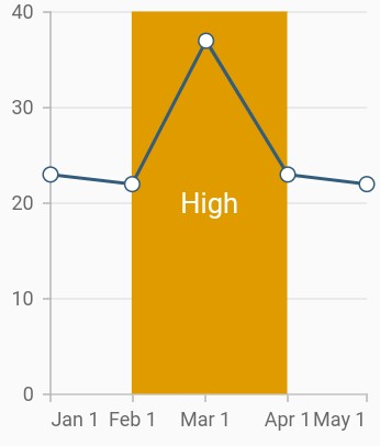
Add plot band for date-time axis
Plot band can be added to the date-time axis by specifying date values to the start and end properties.
@override
    Widget build(BuildContext context) {
        return Scaffold(
            body: Center(
                child: Container(
                    child: SfCartesianChart(
                        primaryXAxis:DateTimeAxis(
                            plotBands: <PlotBand>[
                            PlotBand(
                            isVisible: true,
                            start: DateTime(2018, 2, 1),
                            end:  DateTime(2018, 4, 1),
                        ),
                    )
                )
            )
        );
    }
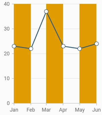
Recursive plot band
This feature is used to enable the plot bands to be drawn repeatedly at the regular intervals. This will be useful when you need to mark an event that occurs recursively along the timeline of the chart. The following properties are used to configure this feature:
-
repeatEvery– Changes the frequency of the plot band being repeated. -
repeatUntil– Specifies the end value at which point strip line has to stop repeating.
The following code snippet and screenshot demonstrate this feature by highlighting weekends.
@override
    Widget build(BuildContext context) {
        return Scaffold(
            body: Center(
                child: Container(
                    child: SfCartesianChart(
                        primaryXAxis:DateTimeAxis(
                            plotBands: <PlotBand>[
                            PlotBand(
                            isVisible: true,
                            isRepeatable: true,
                            repeatEvery: 2,
                            size: 1,
                            sizeType: DateTimeIntervalType.months,
                            repeatUntil: DateTime(2018, 6, 1),
                        ),
                    )
                )
            )
        );
    }
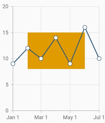
Segmented plot band
Typically, if you draw a plot band for a vertical axis, the height of the plot band is determined by the start and end properties, and the end of the plot band is equivalent to the end of its associated horizontal axis, i.e., plot band is drawn horizontally to the entire stretch of its associated horizontal axis. Similarly, for horizontal axis, width is determined by the Start and Width properties, and vertically, it is drawn to the entire stretch of the associated vertical axis.
Suppose, you need to draw a plot band that should not stretch along its associated axis, you have to set the associatedAxisStart and associatedAxisEnd properties. The values provided in these two properties correspond to its associated axis specified by the associatedAxisName property in the axis.
@override
    Widget build(BuildContext context) {
        return Scaffold(
            body: Center(
                child: Container(
                    child: SfCartesianChart(
                        primaryXAxis:DateTimeAxis(
                            plotBands: <PlotBand>[
                            PlotBand(
                            isVisible: true,
                            start: DateTime(2018,2,1),
                            end: DateTime(2018,6,1),
                            associatedAxisStart: 8,
                            associatedAxisEnd: 15,
                            shouldRenderAboveSeries: true,
                            color: const Color.fromRGBO(224, 155, 0, 1)
                        ),
                    )
                )
            )
        );
    }
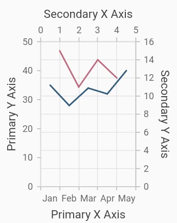
Multiple axes
By default, the chart is rendered with primary x axis and primary y axis. But, the users can add n number of axis to the chart. An additional horizontal or vertical axis can be added to the chart using the axes property, and then you can associate it to a series by specifying the name of the axis to the xAxisName or yAxisName property in the series.
@override
    Widget build(BuildContext context) {
        return Scaffold(
            body: Center(
                child: Container(
                    child: SfCartesianChart(
                        primaryXAxis: CategoryAxis(
                            title: AxisTitle(text: 'Primary X Axis')
                        ),
                        primaryYAxis: NumericAxis(
                            title: AxisTitle(
                                text: 'Primary Y Axis'
                            )
                        ),
                        // adding multiple axis
                        axes: <ChartAxis>[
                            NumericAxis(
                                name: 'xAxis',
                                opposedPosition: true,
                                interval:1,
                                minimum: 0,
                                maximum: 5,
                                title: AxisTitle(
                                    text: 'Secondary X Axis'
                                )
                            ),
                            NumericAxis(
                                name: 'yAxis',
                                opposedPosition: true,
                                title: AxisTitle(
                                    text: 'Secondary Y Axis'
                                )
                            )
                        ],
                        series: <ChartSeries>[
                            LineSeries<SalesData, String>(
                                dataSource: [
                                    SalesData('Jan', 35),
                                    SalesData('Feb', 28),
                                    SalesData('Mar', 34),
                                    SalesData('Apr', 32),
                                    SalesData('May', 40)
                                ],
                                xValueMapper: (SalesData sales, _) => sales.year,
                                yValueMapper: (SalesData sales, _) => sales.sales
                            ),
                            LineSeries<SalesData, double>(
                                dataSource: [
                                    SalesData('Jan', 15, 1),
                                    SalesData('Feb', 11, 2),
                                    SalesData('Mar', 14, 3),
                                    SalesData('Apr', 12, 4),
                                ],
                                xValueMapper: (SalesData sales, _) => sales.numeric,
                                yValueMapper: (SalesData sales, _) => sales.sales,
                                xAxisName: 'xAxis',
                                yAxisName: 'yAxis'
                            )
                        ]
                    )
                )
            )
        );
    }
Axis animation:
SfCartesianChart provide animation support for axis.Axis elements will be animated while changing the range values such as minimum or maximum in charts and also enable the legend toggle visibility.If you can apply animationDuration value 0,the axis will animated.