Action Button in Flutter AI AssistView (SfAIAssistView)
3 Apr 202514 minutes to read
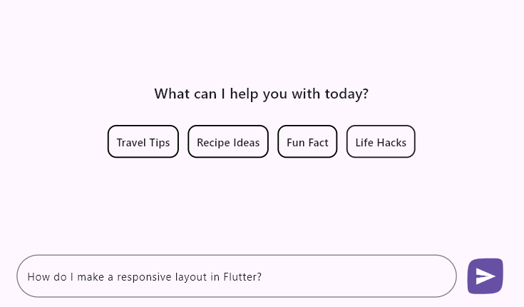
This section explains how to add and customize the action button using the various available options.
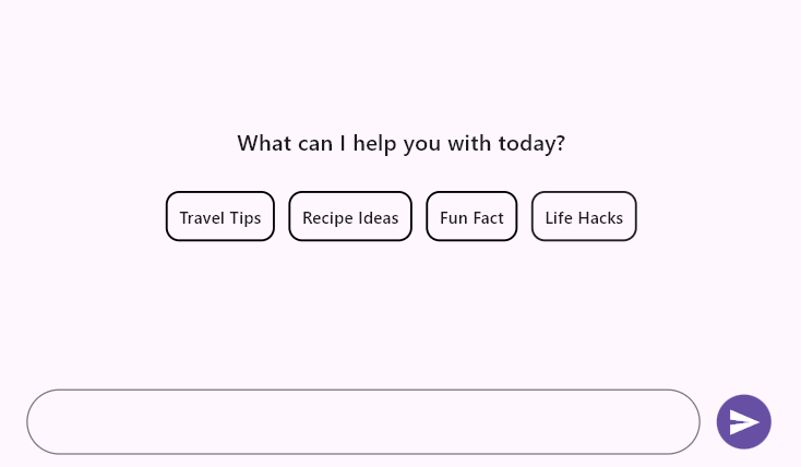
Action button
The actionButton represents the send button and is not included in the chat by default. To add it, create an instance of AssistActionButton and assign it to the actionButton property.
The default action button is a send button. Pressing or clicking this button triggers a callback, allowing the user to request a response to their composed message from their preferred AI service.
If the AssistComposer.builder is used, the onPressed parameter will always receive an empty string. When the onPressed property of AssistActionButton is set to null, the action button remains disabled. Additionally, if the default composer is disabled, the action button will also be disabled. However, if no composer is added by setting the composer property to null, the action button will always remain enabled.
final List<AssistMessage> _messages = <AssistMessage>[];

  @override
  Widget build(BuildContext context) {
    return Scaffold(
      body: SfAIAssistView(
        messages: _messages,
        actionButton: AssistActionButton(
          onPressed: (String data) {
            // Handle the send button click action here.
          },
        ),
      ),
    );
  }
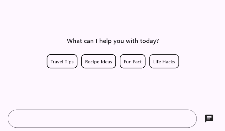
Child
The child property allows you to define a custom widget consisting of one or more interactive elements to serve as action buttons, such as a send button, microphone icon for voice input, file attachment button, or other interactive widgets.
final List<AssistMessage> _messages = <AssistMessage>[];

  @override
  Widget build(BuildContext context) {
    return Scaffold(
      body: SfAIAssistView(
        messages: _messages,
        actionButton: AssistActionButton(
          child: const Icon(Icons.chat),
          onPressed: (String data) {
            // Handle the send button click action here.
          },
        ),
      ),
    );
  }
onPressed callback
It is a callback that is invoked whenever the action button is pressed. Since the assist widget does not rebuild itself to update the newly composed message, it provides the default text from the composer as a parameter. The user can create a message object and include it in the existing messages list by rebuilding the assist widget to add the newly composed message to the conversational area.
final List<AssistMessage> _messages = <AssistMessage>[];

  void _generativeResponse(String data) async {
    final String response = await _getAIResponse(data);
    setState(() {
      _messages.add(AssistMessage.response(data: response));
    });
  }

  Future<String> _getAIResponse(String data) async {
    String response = '';
    // Connect with your preferred AI to generate a response to the request.
    return response;
  }

  @override
  Widget build(BuildContext context) {
    return Scaffold(
      body: SfAIAssistView(
        messages: _messages,
        actionButton: AssistActionButton(
          onPressed: (String data) {
            setState(() {
              _messages.add(AssistMessage.request(data: data));
              _generativeResponse(data);
            });
          },
        ),
      ),
    );
  }
Tooltip
The tooltip text describes the button’s action when pressed. It is displayed when the user long-presses on touch devices or hovers the mouse over it on desktop devices. By default, it is set to null, so no tooltip is shown.
final List<AssistMessage> _messages = <AssistMessage>[];

  @override
  Widget build(BuildContext context) {
    return Scaffold(
      body: SfAIAssistView(
        messages: _messages,
        actionButton: AssistActionButton(
          tooltip: 'Send Message',
          onPressed: (String data) {
            // Handle the send button click action here.
          },
        ),
      ),
    );
  }
Colors
The foregroundColor property is the color of the default send button icon. The default color is set to colorScheme.onPrimary.
The backgroundColor property is the color of the button’s background. The default color is set to colorScheme.primary.
The focusColor property will replace the background color when the button is in a focused state. The default color is set to colorScheme.primary.withOpacity(0.86).
The hoverColor property color will replace the background color when a pointer is hovering over the button. The default color is set to colorScheme.primary.withOpacity(0.91).
The splashColor property is the splash color of the button’s InkWell. The default color is set to colorScheme.primary.withOpacity(0.86).
final List<AssistMessage> _messages = <AssistMessage>[];

  @override
  Widget build(BuildContext context) {
    return Scaffold(
      body: SfAIAssistView(
        messages: _messages,
        actionButton: AssistActionButton(
          foregroundColor: Colors.white,
          backgroundColor: Colors.blue,
          focusColor: Colors.lightBlueAccent,
          hoverColor: Colors.blueAccent,
          splashColor: Colors.white.withOpacity(0.3),
          onPressed: (String data) {
            // Handle the send button click action here.
          },
        ),
      ),
    );
  }
Elevation
The elevation property is the size of the shadow below the action button in normal state. Defaults to 0.0.
The focusElevation property defines the elevation of the button when it has focus. Defaults to 0.0.
The hoverElevation property sets the elevation of the button when it is hovered over. Defaults to 0.0.
The highlightElevation property determines the elevation when the button is pressed. Defaults to 0.0.
final List<AssistMessage> _messages = <AssistMessage>[];

  @override
  Widget build(BuildContext context) {
    return Scaffold(
      body: SfAIAssistView(
        messages: _messages,
        actionButton: AssistActionButton(
          elevation: 2.0,
          focusElevation: 6.0,
          hoverElevation: 4.0,
          highlightElevation: 8.0,
          onPressed: (String data) {
            // Handle the send button click action here.
          },
        ),
      ),
    );
  }
Mouse cursor
The mouseCursor property defines the type of cursor that appears when hovering over the button. It can be set to different values to customize the cursor shape (e.g., SystemMouseCursors.click, SystemMouseCursors.forbidden, etc.). If not specified, the default cursor will be used.
final List<AssistMessage> _messages = <AssistMessage>[];

  @override
  Widget build(BuildContext context) {
    return Scaffold(
      body: SfAIAssistView(
        messages: _messages,
        actionButton: AssistActionButton(
          mouseCursor: SystemMouseCursors.forbidden,
          onPressed: (String data) {
            // Handle the send button click action here.
          },
        ),
      ),
    );
  }
Shape
The shape property sets the shape of the button’s border, such as rounded or circular. By default, it is set to RoundedRectangleBorder(borderRadius: BorderRadius.all(Radius.circular(20.0))).
final List<AssistMessage> _messages = <AssistMessage>[];

  @override
  Widget build(BuildContext context) {
    return Scaffold(
      body: SfAIAssistView(
        messages: _messages,
        actionButton: AssistActionButton(
          shape: const ContinuousRectangleBorder(
            borderRadius: BorderRadius.only(
              topLeft: Radius.circular(30.0),
              topRight: Radius.circular(15),
              bottomRight: Radius.circular(30.0),
              bottomLeft: Radius.circular(15)
            ),
          ),
          onPressed: (String data) {
            // Handle the send button click action here.
          },
        ),
      ),
    );
  }
Margin
The margin property defines the space inside the button between its border and the content. By default, it is set to EdgeInsetsDirectional.only(start: 8.0).
final List<AssistMessage> _messages = <AssistMessage>[];

  @override
  Widget build(BuildContext context) {
    return Scaffold(
      body: SfAIAssistView(
        messages: _messages,
        actionButton: AssistActionButton(
          margin: const EdgeInsetsDirectional.only(start: 8.0),
          onPressed: (String data) {
            // Handle the send button click action here.
          },
        ),
      ),
    );
  }
Size
The size property specifies the width and height of the button. By default, it is set to Size.square(40.0).
final List<AssistMessage> _messages = <AssistMessage>[];

  @override
  Widget build(BuildContext context) {
    return Scaffold(
      body: SfAIAssistView(
        messages: _messages,
        actionButton: AssistActionButton(
          size: const Size.square(40.0),
          onPressed: (String data) {
            // Handle the send button click action here.
          },
        ),
      ),
    );
  }
You can refer to our Flutter AI AssistView feature tour page for its groundbreaking feature representations. You can also explore our Flutter AI AssistView example which demonstrates interaction between users and AI services in a fully customizable layout and shows how to easily configure the AI AssistView with built-in support for creating stunning visual effects.
See Also
- You can also customize the above properties using
SfAIAssistViewThemeby wrapping withSfAIAssistView.