Getting Started
24 Nov 201717 minutes to read
Before we start with the Ribbon, please refer this page for general information regarding integrating Syncfusion widget’s.
Control Initialization
-
Open the command prompt in the folder ember-app or the folder in which the application is created.
-
Use the command ember generate route ribbon/default to create template
default.hbsfile in templates folder and routerdefault.jsfile in routes folder. It also add the routing content inrouter.js. -
Use below code in
default.hbsin templates folder to render the Ribbon.
{{ej-ribbon id="defaultribbon" e-width="500" e-applicationTab=model.applicationTab }}
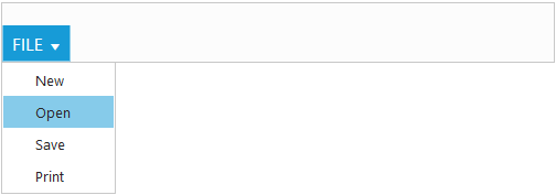
<ul id="ribbonmenu">
<li>
<a>FILE</a>
<ul>
<li><a>New</a></li>
<li><a>Open</a></li>
<li><a>Save</a></li>
<li><a>Print</a></li>
</ul>
</li>
</ul>- Use the below code in
default.jsin routes folder to bind the model to the Ribbon.
export default Ember.Route.extend({
      model() {
         return {
            applicationTab : {
              type: ej.Ribbon.ApplicationTabType.Menu,
              menuItemID: "ribbonmenu",
          }
         }
      }
    });
NOTE
Set the required
widthto Ribbon, else default parent container or window width will be considered
Running the application
- To run the application, execute below command.
ember serve- Browse to http://localhost:4200 to see the application. And navigate to Ribbon sample. The component is rendered as like the below screenshot. You can make changes in the code found under app folder and the browser should auto-refresh itself while you save files.
Adding Tabs
Tab is a set of related groups which are combined into single item. For creating Tab, id and text properties should be specified.
export default Ember.Route.extend({
    model() {
        return {
            applicationTab : {
              type: ej.Ribbon.ApplicationTabType.Menu,
              menuItemID: "ribbonmenu",
            },
            tabs: [{
                      id: "home",
                      text: "HOME"
                  }]
        }
    }
});{{ej-ribbon id="defaultribbon" e-width="500" e-applicationTab=model.applicationTab e-tabs=model.tabs}}
<ul id="ribbonmenu">
<li>
<a>FILE</a>
<ul>
<li><a>New</a></li>
<li><a>Open</a></li>
<li><a>Save</a></li>
<li><a>Print</a></li>
</ul>
</li>
</ul>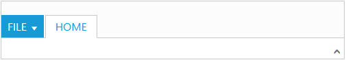
Configuring Groups
List of controls are combined as logical groups into Tab. Group alignment type as row/column, Default is row.
Create group item with text specified and add content group to Groups collection with ejButton control settings.
export default Ember.Route.extend({
    model() {
        return {
            applicationTab: {
                    type: ej.Ribbon.applicationTabType.menu,
                    menuItemID: "ribbonmenu"
            },
            // tab item defined here
            tabs: [{
                    id: "home",
                    text: "HOME",
                    // group with content & button settings
                    groups: [{
                        text: "New",
                        content: [{
                            groups: [{
                                id: "new",
                                text: "New",
                                buttonSettings: {
                                    contentType: ej.ContentType.ImageOnly,
                                    prefixIcon: "e-icon e-ribbon e-new",
                                }
                            }]
                        }]
                    }]
            }]
        }
    }
});{{ej-ribbon id="defaultribbon" e-width="500" e-applicationTab=model.applicationTab e-tabs=model.tabs}}
<ul id="ribbonmenu">
<li>
<a>FILE</a>
<ul>
<li><a>New</a></li>
<li><a>Open</a></li>
<li><a>Save</a></li>
<li><a>Print</a></li>
</ul>
</li>
</ul>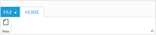
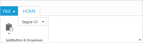
Adding Controls to Group
Syncfusion JavaScript Controls can be added to group’s content with corresponding type specified like button, split button, toggle button, dropdown list, gallery, custom, etc. Default type is button.
export default Ember.Route.extend({
    model() {
        var fontFamily = [{
                value: 1,
                text: "Segoe UI"
            }, {
                value: 2,
                text: "Arial"
            }];
        return {
            applicationTab: {
                        type: ej.Ribbon.applicationTabType.menu,
                        menuItemID: "ribbon"
            },
            tabs: [{
                        id: "home",
                        text: "HOME",
                        groups: [{
                            text: "SplitButton & Dropdown",
                            alignType: ej.Ribbon.alignType.columns,
                            content: [{
                                groups: [{
                                    id: "paste",
                                    text: "paste",
                                    // split button settings
                                    splitButtonSettings: {
                                        contentType: ej.ContentType.ImageOnly,
                                        targetID: "split",
                                        prefixIcon: "e-icon e-ribbon e-ribbonpaste",
                                        buttonMode: "dropdown",
                                        arrowPosition: "bottom"
                                    }
                                }],
                                defaults: {
                                    type: ej.Ribbon.type.splitButton,
                                    width: 50,
                                    height: 70
                                }
                            }, {
                                groups: [{
                                    id: "fontFamily",
                                    // dropdown list settings
                                    type: ej.Ribbon.type.dropDownList,
                                    dropdownSettings: {
                                        dataSource: fontFamily,
                                        value: "1",
                                        width: 100
                                    }
                                }]
                            }]
                        }]
                }]
        }
    }
});{{ej-ribbon id="defaultribbon" e-width="500" e-applicationTab=model.applicationTab e-tabs=model.tabs}}
<ul id="ribbon">
<li>
<a>FILE</a>
<ul>
<li><a>New</a></li>
</ul>
</li>
</ul>
<ul id="split">
<li><span>Paste</span></li>
</ul>