Theming and Styling in React PDF Viewer
24 Jun 202610 minutes to read
The React PDF Viewer supports a wide range of built-in themes and flexible UI customization to match your application’s design.
Supported Themes
The PDF Viewer applies styles to the toolbar, buttons, panels, annotations, and dialogs based on the selected theme. The available built-in Syncfusion themes are:
- Material 3
- Fluent 2
- Bootstrap 5
- Tailwind
How-to: Quick start
Step-1: Create a PDF Viewer sample by following the React PDF Viewer getting started guide.
Step-2: To change the theme to tailwind, add the imports to tailwind theme in app.css.
@import '../node_modules/@syncfusion/ej2-base/styles/tailwind3.css';
@import '../node_modules/@syncfusion/ej2-buttons/styles/tailwind3.css';
@import '../node_modules/@syncfusion/ej2-dropdowns/styles/tailwind3.css';
@import '../node_modules/@syncfusion/ej2-inputs/styles/tailwind3.css';
@import '../node_modules/@syncfusion/ej2-navigations/styles/tailwind3.css';
@import '../node_modules/@syncfusion/ej2-popups/styles/tailwind3.css';
@import '../node_modules/@syncfusion/ej2-splitbuttons/styles/tailwind3.css';
@import "../node_modules/@syncfusion/ej2-pdfviewer/styles/tailwind3.css";
Tutorial
This short, guided walkthrough shows a minimal end-to-end customization flow:
-
Create a new React app and install the viewer
-
Add the Tailwind theme imports to your global CSS (see Quick start).
-
Render the PDF Viewer in
src/Appand verify the default look. -
Add a theme switcher using the dark-mode logic in later shown in this file
-
Add additional CSS rules under
.e-custom-styleand load it after the theme CSS, and verify appearance and accessibility.
Theming for Dark Mode
To provide a better viewing experience in low-light environments, you can apply dark themes or allow users to switch between light and dark modes.
Apply Dark Theme
You can initialize the PDF Viewer with a dark theme by referencing the corresponding CSS:
- Material 3 Dark
- Bootstrap 5 Dark
- Fluent 2 Dark
- Tailwind Dark
- Fluent 2 High Contrast
Switch between Light and Dark Mode
You can dynamically change the theme in your application to toggle between light and dark modes.
NOTE
Ensure the background color of the PDF container is also updated to a dark shade when switching to a dark theme to maintain visual consistency.
How-to: Toggle Dark Mode
Below is an approach that can be copied into the app that switches themes by dynamically changing the link referenced in the style sheet in the head section of the document.
Link-swap approach:
type ThemeName = 'material3' | 'material3-dark';
const THEME_LINK_ID = 'e-current-theme';
function applyTheme(theme: ThemeName) {
    const path = `https://cdn.syncfusion.com/ej2/32.2.5/${theme}.css`;
    let primaryThemeLink = document.querySelector(`#${THEME_LINK_ID}`) as HTMLLinkElement;
    if (!primaryThemeLink) {
        primaryThemeLink = document.createElement('link');
        primaryThemeLink.id = THEME_LINK_ID;
        primaryThemeLink.rel = 'stylesheet';
        document.head.prepend(primaryThemeLink);
    }
    primaryThemeLink.href = path;
}
export function App() {
    const [theme, setTheme] = useState<ThemeName>('material3');
    useEffect(() => {
        applyTheme(theme);
    }, [theme]);
    // Simple memoized list for selector
    const options = useMemo(
        () => [
            { value: 'material3', label: 'Material 3 (Light)' },
            { value: 'material3-dark', label: 'Material 3 Dark' },
        ],
        []
    );
    return (<div>
        <label style={{ display: 'inline-flex', gap: 8, alignItems: 'center' }}>
            Theme:
            <select value={theme} onChange={(e) => setTheme(e.target.value as ThemeName)}>
                {options.map(o => (
                    <option key={o.value} value={o.value}>{o.label}</option>
                ))}
            </select>
        </label>
        <div className='control-section e-custom-style'>
            <PdfViewerComponent
                id="container"
                documentPath="https://cdn.syncfusion.com/content/pdf/pdf-succinctly.pdf"
                resourceUrl="https://cdn.syncfusion.com/ej2/32.2.5/dist/ej2-pdfviewer-lib"
                style={{ 'height': '640px' }}>

                <Inject services={[Toolbar, Magnification, Navigation, LinkAnnotation, BookmarkView, ThumbnailView, Print, TextSelection, TextSearch, Annotation, FormFields, FormDesigner, PageOrganizer]} />
            </PdfViewerComponent>
        </div>
    </div>);
}
Custom Styles
While built-in themes provide a comprehensive look and feel, you might need to apply specific style overrides for your application.
Implementation Guidelines
- Load Order: Always load the Syncfusion default theme CSS before applying any custom overrides.
-
Custom Classes: Prefer using
.e-custom-styleclasses for overrides to ensure your styles are applied correctly without conflicting with internal logic. - Avoid Deep Overrides: Do not override internal classes deeply, as this may break the component’s layout or responsiveness in future updates.
How-to: Apply Custom Styles
Apply overrides using a wrapper class so the rules are scoped and safe to maintain. The following example adds custom styles to signature form fields:
/* This rule sets a scoped, custom black background for the PDF viewer page container */
.e-custom-style .e-pv-page-container {
background: #0b1220;
}
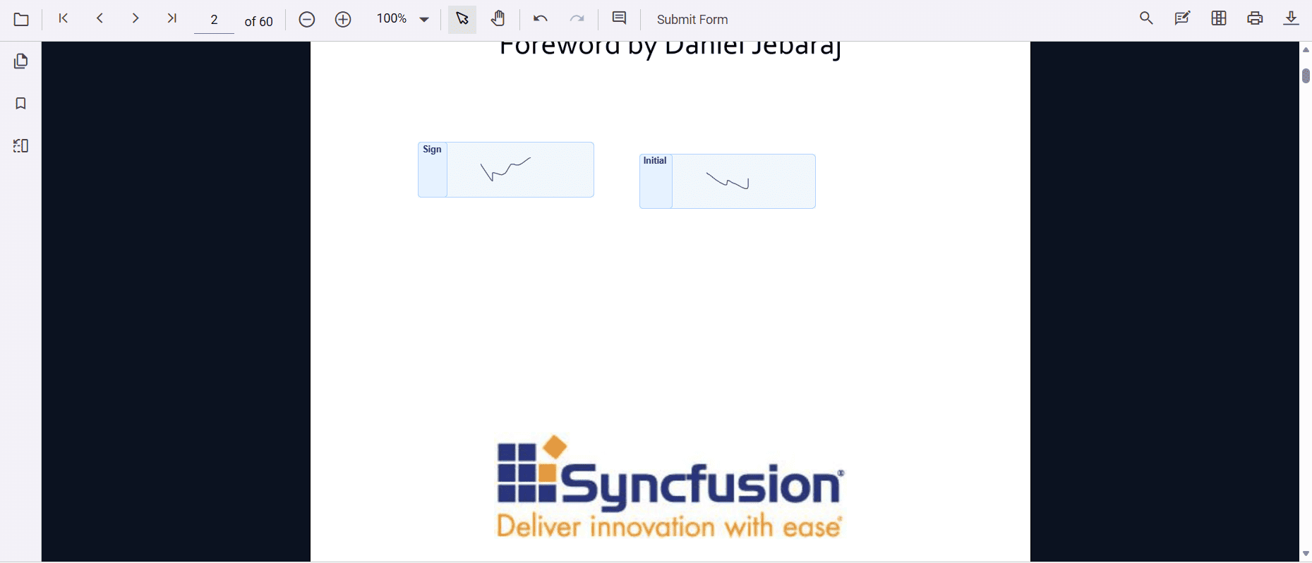
/* The following rules style the signature form fields with blue background. See screenshot below for more clarity */
.e-custom-style .e-pdfviewer-signatureformfields,
.e-custom-style .e-pdfviewer-signatureformfields-signature {
border: 1px solid #b3d1ff !important;
border-radius: 5px;
}
.e-custom-style span[id^='signIcon'] {
background-color: #e6f2ff !important;
border: 1px solid #b3d1ff !important;
border-radius: 4px !important;
font-weight: bold !important;
color: #003366 !important;
display: inline-block !important;
height: 100% !important;
text-align: center !important;
}
.e-custom-style span[id^='initialIcon'] {
background-color: #e6f2ff !important;
border: 1px solid #b3d1ff !important;
border-radius: 4px !important;
font-weight: bold !important;
color: #003366 !important;
display: inline-block !important;
height: 100% !important;
text-align: center !important;
}import './App.css';
import { PdfViewerComponent, Toolbar, Magnification, Navigation, LinkAnnotation, BookmarkView, ThumbnailView, Print, TextSelection, Annotation, TextSearch, FormFields, FormDesigner, PageOrganizer, Inject } from '@syncfusion/ej2-react-pdfviewer';
export function App() {
return (
<div className='control-section e-custom-style'>
<PdfViewerComponent
id="container"
documentPath="https://cdn.syncfusion.com/content/pdf/pdf-succinctly.pdf"
resourceUrl="https://cdn.syncfusion.com/ej2/32.2.5/dist/ej2-pdfviewer-lib"
style={{ 'height': '100%' }} >
<Inject services={[Toolbar, Magnification, Navigation, LinkAnnotation, BookmarkView, ThumbnailView, Print, TextSelection, TextSearch, Annotation, FormFields, FormDesigner, PageOrganizer]} />
</PdfViewerComponent>
</div>
);
}
Explanation
This section explains the rationale behind the recommendations and common pitfalls:
- Use a scoped wrapper class (for example
.e-custom-style) to avoid fragile, global overrides that can break when internal selectors change. - Load order is important: theme CSS provides base variables and components’ base rules; custom overrides must load after theme CSS to take effect reliably.
- Prefer toggling theme files or a small root class rather than deep selector overrides when implementing dark mode — this makes switching simpler and reduces maintenance.
- Avoid overusing
!important; reserve it for third-party widgets or unavoidable form-field styling where the library applies strong specificity. - Always verify color-contrast and keyboard focus styles after applying themes or overrides to preserve accessibility.