Create a custom toolbar in Blazor PDF Viewer
14 Aug 20268 minutes to read
Overview
The Blazor PDF Viewer component provides extensive APIs for user interaction through its built-in toolbar. However, if you need a custom toolbar that matches your application’s design and functionality requirements, you can hide the default toolbar and create your own using the Blazor Toolbar component.
A custom toolbar allows you to:
- Control which features are available to end users
- Match your application’s design language
- Organize toolbar items according to your workflow
- Bind custom behavior to toolbar button clicks
- Show or hide buttons based on application state
Key Concepts
Disabling Default Toolbars
The PDF Viewer has two built-in toolbars that can be disabled:
| Property | Purpose |
|---|---|
EnableToolbar |
Controls the main PDF Viewer toolbar (pagination, zoom, annotations, etc.) |
EnableNavigationToolbar |
Controls the navigation toolbar (typically at the top) |
Set both to false to create a completely custom toolbar experience.
Toolbar Component Architecture
The custom toolbar uses the SfToolbar component with individual ToolbarItem elements. Each toolbar item can:
- Display an icon, text, or both
- Be positioned on the left or right
- Execute custom methods when clicked
- Include tooltips for better UX
Available PDF Viewer Actions
Common actions you can wire to custom toolbar buttons:
| Method | Purpose | Async |
|---|---|---|
GoToNextPageAsync() |
Navigate to the next page | Yes |
GoToPreviousPageAsync() |
Navigate to the previous page | Yes |
ZoomInAsync() |
Increase zoom level | Yes |
ZoomOutAsync() |
Decrease zoom level | Yes |
PrintAsync() |
Print the PDF document | Yes |
DownloadAsync() |
Download the PDF document | Yes |
GetDocumentAsync() |
Retrieve the current PDF as a byte array, including annotations and form-field changes | Yes |
LoadAsync() |
Load a PDF document from a byte array, stream, or data URI | Yes |
ShowAnnotationToolbar(bool) |
Show or hide the annotation toolbar | Sync (void) |
Create Your First Custom Toolbar
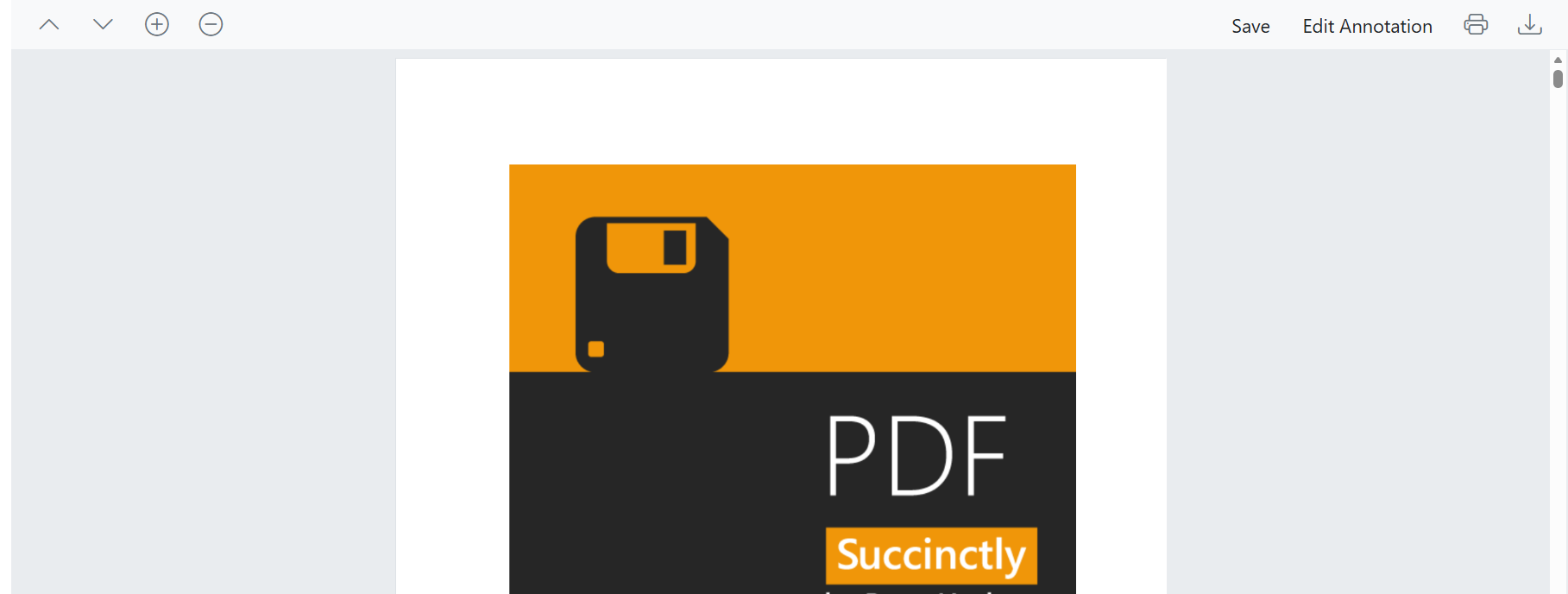
To create a custom toolbar for the PDF Viewer, disable the default toolbars and implement your own using the SfToolbar component. This allows you to customize toolbar items, their placement, and associated actions based on your application requirements.
Use the following code snippet to create a fully functional custom toolbar with navigation, zoom, and document management features:
@using Syncfusion.Blazor.Navigations
@using Syncfusion.Blazor.SfPdfViewer

<SfToolbar>
    <ToolbarItems>
        <ToolbarItem PrefixIcon="e-icons e-chevron-up" TooltipText="Previous Page" id="previousPage"
                     Align="@Syncfusion.Blazor.Navigations.ItemAlign.Left" OnClick="@previousClicked"></ToolbarItem>

        <ToolbarItem PrefixIcon="e-icons e-chevron-down" TooltipText="Next Page" id="nextPage"
                     Align="@Syncfusion.Blazor.Navigations.ItemAlign.Left" OnClick="@nextClicked"></ToolbarItem>

        <ToolbarItem PrefixIcon="e-icons e-circle-add" TooltipText="Zoom in" id="zoomIn" OnClick="@zoomInClicked"></ToolbarItem>

        <ToolbarItem PrefixIcon="e-icons e-circle-remove" TooltipText="Zoom out" id="zoomOut" OnClick="@zoomoutClicked"></ToolbarItem>

        <ToolbarItem Text="Save" TooltipText="Save Document" id="save"
                     Align="@Syncfusion.Blazor.Navigations.ItemAlign.Right" OnClick="@save"></ToolbarItem>

        <ToolbarItem Text="Edit Annotation" TooltipText="Annotation Toolbar" id="annotation"
                     Align="@Syncfusion.Blazor.Navigations.ItemAlign.Right" OnClick="@annotations"></ToolbarItem>

        <ToolbarItem PrefixIcon="e-icons e-print" TooltipText="Print" id="print"
                     Align="@Syncfusion.Blazor.Navigations.ItemAlign.Right" OnClick="@print"></ToolbarItem>

        <ToolbarItem PrefixIcon="e-icons e-download" TooltipText="Download" id="Download"
                     Align="@Syncfusion.Blazor.Navigations.ItemAlign.Right" OnClick="@download"></ToolbarItem>
    </ToolbarItems>
</SfToolbar>

<SfPdfViewer2 @ref="PDFViewer" DocumentPath="@DocumentPath" EnableNavigationToolbar="false" EnableToolbar="false" Height="100%" Width="100%"></SfPdfViewer2>

@code
{
    private SfPdfViewer2 PDFViewer;

    private string DocumentPath { get; set; } = "https://cdn.syncfusion.com/content/pdf/pdf-succinctly.pdf";

    private void nextClicked(ClickEventArgs args)
    {
        //Navigate to next page of the PDF document loaded in the SfPdfViewer.
        PDFViewer.GoToNextPageAsync();
    }

    private void previousClicked(ClickEventArgs args)
    {
        //Navigate to previous page of the PDF document.
        PDFViewer.GoToPreviousPageAsync();
    }

    MemoryStream stream;

    private async void save(ClickEventArgs args)
    {
        //Gets the loaded PDF document with the changes.
        byte[] data = await PDFViewer.GetDocumentAsync();
        //Save the PDF document to a MemoryStream.
        stream = new MemoryStream(data);
        //Load a PDF document from the MemoryStream.
        await PDFViewer.LoadAsync(stream);
    }

    private void annotations(ClickEventArgs args)
    {
        //Shows or hides the annotation toolbar in the SfPdfViewer.
        PDFViewer.ShowAnnotationToolbar(true);
    }

    private void print(ClickEventArgs args)
    {
        //Print the PDF document being loaded in the SfPdfViewer.
        PDFViewer.PrintAsync();
    }

    private void download(ClickEventArgs args)
    {
        //Downloads the PDF document being loaded in the SfPdfViewer.
        PDFViewer.DownloadAsync();
    }

    private void zoomInClicked(ClickEventArgs args)
    {
        //Scale the page to the next value in the zoom drop down list.
        PDFViewer.ZoomInAsync();
    }

    private void zoomoutClicked(ClickEventArgs args)
    {
        //Decreases the page to the previous value in the zoom drop down list.
        PDFViewer.ZoomOutAsync();
    }
}

<style>
    .e-pv-previous-page-navigation-icon::before {
        content: '\e70d';
    }

    .e-pv-next-page-navigation-icon::before {
        content: '\e76a';
    }

    .e-pv-download-document-icon::before {
        content: '\e75d';
    }

    .e-pv-print-document-icon::before {
        content: '\e743';
    }

    .e-pv-zoom-out-icon::before {
        content: '\e742';
    }

    .e-pv-zoom-in-icon::before {
        content: '\e755';
    }

    .e-pv-fit-page::before {
        content: '\e91b';
    }
</style>
Refer to the image below for the Custom Toolbar.