Modern navigation panel in SfPdfViewer
12 Feb 20268 minutes to read
The modern navigation panel consolidates thumbnails, bookmarks, comments, and custom panels into a single flexible side panel for streamlined navigation.
Enable the modern navigation panel by setting the EnableNavigationPanel property. You can toggle its visibility from the UI or programmatically.
Example — enable the modern navigation panel:
@using Syncfusion.Blazor.SfPdfViewer;

<SfPdfViewer2 DocumentPath="https://cdn.syncfusion.com/content/pdf/pdf-succinctly.pdf"
              Height="100%"
              Width="100%"
              EnableNavigationPanel="true">
</SfPdfViewer2>
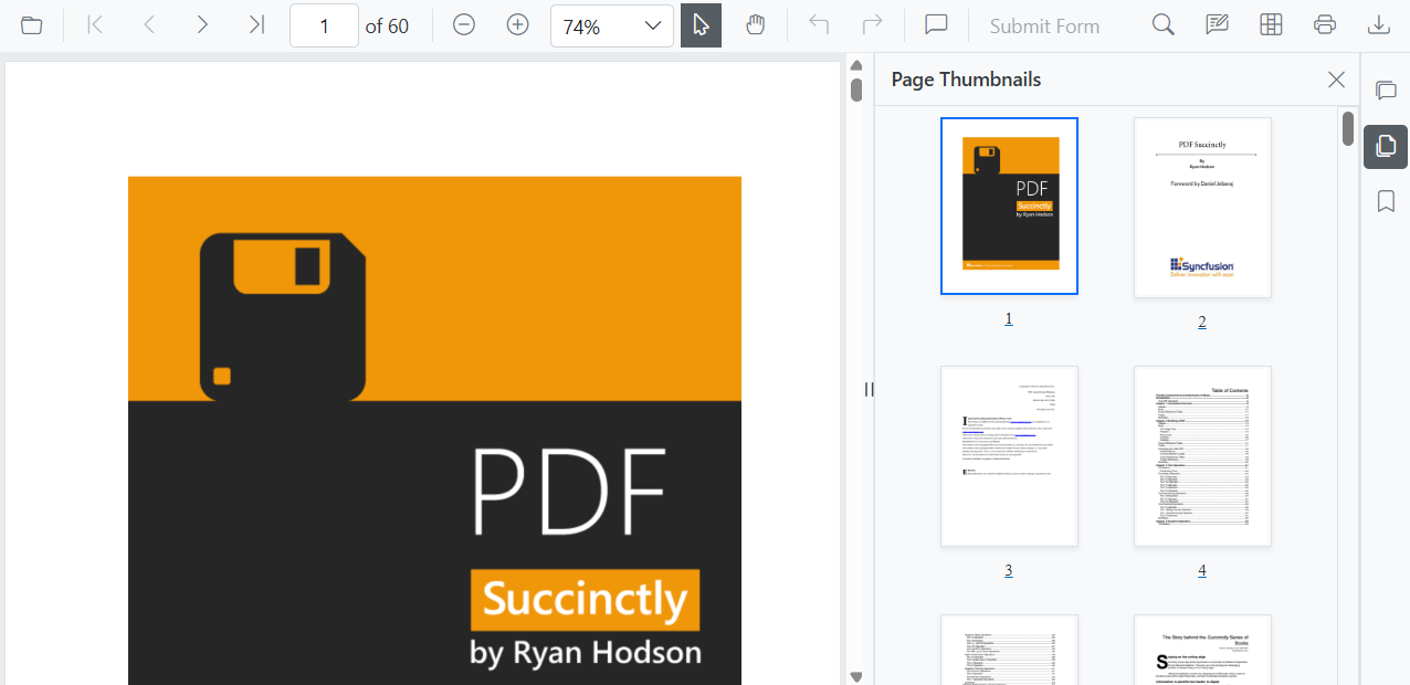
Default items in the navigation panel
The modern navigation panel contains the following built-in items:
- Comment panel
- Thumbnail panel
- Bookmark panel
Rearrange default items in the navigation panel
Use the BuiltInItems property, which accepts a list of NavigationToolbarItem enums. The viewer renders the navigation icons in the exact sequence provided.
Example — display Thumbnails first, followed by Bookmarks and the Comment panel.
@using Syncfusion.Blazor.SfPdfViewer;

<SfPdfViewer2 DocumentPath="https://cdn.syncfusion.com/content/pdf/pdf-succinctly.pdf"
              Height="100%"
              Width="100%"
              EnableNavigationPanel="true">
              <NavigationToolbarSettings BuiltInItems="navigationToolbarItems"></NavigationToolbarSettings>
</SfPdfViewer2>

@code {
    // Defines the list of built-in navigation items in the desired order.
    List<NavigationToolbarItem> navigationToolbarItems = new List<NavigationToolbarItem>()
    {
        NavigationToolbarItem.Thumbnails,
        NavigationToolbarItem.Bookmarks,
        NavigationToolbarItem.CommentPanel,
    };
}
Open or close the navigation panel programmatically
Open or close a navigation panel programmatically by calling the ToggleItemByIndex method. Indices are zero-based and apply to the combined sequence of built-in and custom items.
Example — toggle the navigation panel item at index 1:
@using Syncfusion.Blazor.SfPdfViewer;

<button id="toggle-custom-panel-visibility-api-btn" @onclick="OpenCustomPanel">OpenCustomPanel</button>
<SfPdfViewer2 DocumentPath="https://cdn.syncfusion.com/content/pdf/pdf-succinctly.pdf"
              @ref="pdfViewer"
              Height="100%"
              Width="100%"
              EnableNavigationPanel="true">
</SfPdfViewer2>

@code {
    private SfPdfViewer2? pdfViewer;
    private async Task OpenCustomPanel()
    {
        // Toggles the visibility of the navigation panel item at the specified index (1 in this case).
        await pdfViewer.ToggleItemByIndex(1);
    }
}
Add custom items to the navigation panel
You can add custom items to the SfPdfViewer navigation toolbar by creating a list of CustomNavigationToolbarItem objects and assigning it to the CustomItems property.
Each CustomNavigationToolbarItem object includes:
- Index: Position of the item in the toolbar.
- Name: Display name of the item.
- TooltipText: Text shown on hover.
- HeaderText: Header displayed at the top of the custom panel.
- IconCss: CSS class for the item’s icon.
- Template: Custom template for panel content.
- ItemType: Item type, such as NavigationToolbarItemType.Button or NavigationToolbarItemType.Separator.
Add a custom template for the navigation panel
Define a custom UI for a navigation panel by assigning a RenderFragment to the Template property of a CustomNavigationToolbarItem.
Example — add a default toolbar with a custom item that contains a small interactive panel and customized UI:
@using Syncfusion.Blazor.SfPdfViewer
<SfPdfViewer2 @ref="pdfViewer"
DocumentPath="https://cdn.syncfusion.com/content/pdf/pdf-succinctly.pdf"
Height="100%"
Width="100%" EnableNavigationPanel="true">
<PdfViewerToolbarSettings ToolbarItems="ToolbarItems"></PdfViewerToolbarSettings>
<NavigationToolbarSettings BuiltInItems="navigationToolbarItems" CustomItems="customNavigationToolbarItems"></NavigationToolbarSettings>
</SfPdfViewer2>
@code {
SfPdfViewer2 pdfViewer;
// List of standard toolbar items.
List<ToolbarItem> ToolbarItems = new List<ToolbarItem>()
{
ToolbarItem.OpenOption,
ToolbarItem.PageNavigationTool,
ToolbarItem.MagnificationTool,
ToolbarItem.CommentTool,
ToolbarItem.SelectionTool,
ToolbarItem.PanTool,
ToolbarItem.UndoRedoTool,
ToolbarItem.SubmitForm,
ToolbarItem.SearchOption,
ToolbarItem.PrintOption,
ToolbarItem.DownloadOption
};
// List of built-in navigation panel items.
List<NavigationToolbarItem> navigationToolbarItems = new List<NavigationToolbarItem>()
{
NavigationToolbarItem.Thumbnails,
NavigationToolbarItem.Bookmarks,
NavigationToolbarItem.CommentPanel,
};
// List to hold the custom navigation toolbar items.
List<CustomNavigationToolbarItem> customNavigationToolbarItems;
// Initializes the component and sets up the custom navigation items.
protected override void OnInitialized()
{
customNavigationToolbarItems = new List<CustomNavigationToolbarItem>()
{
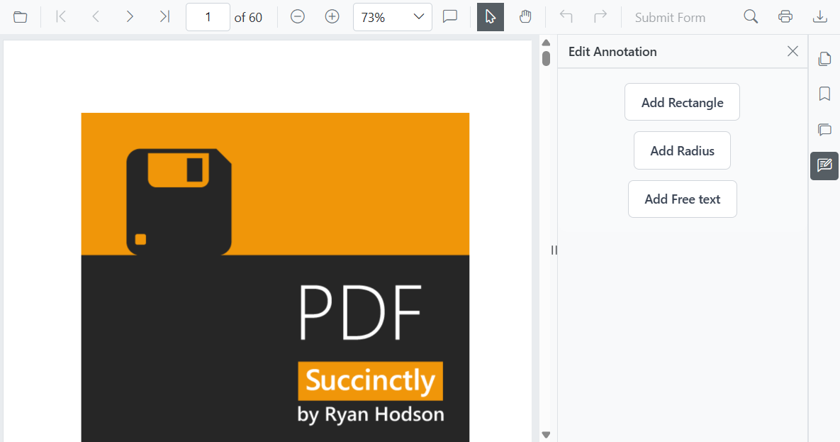
new CustomNavigationToolbarItem()
{
Name = "Edit Annotation",
HeaderText = "Edit Annotation",
IconCss = "e-pv-annotation-icon e-pv-icon",
Index = 4,
TooltipText = "Edit Annotation",
ItemType = NavigationToolbarItemType.Button,
Template = EditAnnotationTemplate()
}
};
}
// Defines the RenderFragment for the custom panel's content.
private RenderFragment EditAnnotationTemplate()
{
return @<div style="padding: 16px 24px; background-color: #f9fafb; border-top: 1px solid #e5e7eb; display: flex; flex-direction: column; align-items: center; gap: 12px; border-bottom-left-radius: 12px; border-bottom-right-radius: 12px;">
<button style="background: #ffffff; color: #374151; border: 1px solid #d1d5db; padding: 10px 18px; border-radius: 6px; font-size: 14px; font-weight: 500; cursor: pointer;" @onclick="AddRectangle">
Add Rectangle
</button>
<button style="background: #ffffff; color: #374151; border: 1px solid #d1d5db; padding: 10px 18px; border-radius: 6px; font-size: 14px; font-weight: 500; cursor: pointer;" @onclick="AddRadius">
Add Radius
</button>
<button style="background: #ffffff; color: #374151; border: 1px solid #d1d5db; padding: 10px 18px; border-radius: 6px; font-size: 14px; font-weight: 500; cursor: pointer;" @onclick="AddFreeText">
Add Free text
</button>
</div>;
}
// Sets the annotation mode to Rectangle.
private async Task AddRectangle()
{
await pdfViewer.SetAnnotationModeAsync(AnnotationType.Rectangle);
}
// Sets the annotation mode to Radius.
private async Task AddRadius()
{
await pdfViewer.SetAnnotationModeAsync(AnnotationType.Radius);
}
// Sets the annotation mode to FreeText.
private async Task AddFreeText()
{
await pdfViewer.SetAnnotationModeAsync(AnnotationType.FreeText);
}
}
Rendering strategies for the navigation panel
SfPdfViewer supports different loading strategies for navigation panel content to optimize performance:
- Dynamic: Content for a panel is loaded into the DOM only when that panel is selected. Switching panels replaces the previous content.
- Init: Content for all navigation panels is rendered during the initial load and remains in the DOM.
- Demand: Content for a panel is loaded into the DOM the first time it is selected and then retained.
Example — set the loading strategy to Demand:
@using Syncfusion.Blazor.SfPdfViewer;
@using Syncfusion.Blazor.Navigations;

<SfPdfViewer2 DocumentPath="https://cdn.syncfusion.com/content/pdf/pdf-succinctly.pdf"
              Height="100%"
              Width="100%"
              EnableNavigationPanel="true">
              <NavigationToolbarSettings LoadOn="ContentLoad.Demand"></NavigationToolbarSettings>
</SfPdfViewer2>
Modern navigation panel in mobile view
On mobile devices the navigation toolbar collapses into a toggle menu to save space. Custom items appear at the beginning of this menu.