Orthogonal Connectors in ej2-vue Diagram control
Orthogonal segments is used to create segments that are perpendicular to each other.
Set the segment type as orthogonal to create a default orthogonal segment and need to specify type. The following code example illustrates how to create a default orthogonal segment.
Multiple segments can be defined one after another. To create a connector with multiple segments, define and add the segments to connector.segments collection. The following code example illustrates how to create a connector with multiple segments.
The length and direction properties allow to define the flow and length of segment. The following code example illustrates how to create customized orthogonal segments.
<template>
    <div id="app">
        <ejs-diagram id="diagram" :width='width' :height='height' :connectors='connectors'></ejs-diagram>
    </div>
</template>
<script setup>
import { provide } from "vue";
import { DiagramComponent as EjsDiagram, ConnectorConstraints, ConnectorEditing } from '@syncfusion/ej2-vue-diagrams';

const connectors = [{
  id: "connector1",
  // Define the type of the segment
  type: 'Orthogonal',
  segments: [
      {
          type: 'Orthogonal',
          direction: 'Bottom',
          length: 150,
        },
        {
          type: 'Orthogonal',
          direction: 'Right',
          length: 150,
        },
        {
          type: 'Orthogonal',
          direction: 'Top',
          length: 100,
        },
        {
          type: 'Orthogonal',
          direction: 'Left',
          length: 100,
        },
  ],
  sourcePoint: {
      x: 300,
      y: 100,
    },
    targetPoint: {
      x: 350,
      y: 150,
    },
   constraints:ConnectorConstraints.Default | ConnectorConstraints.DragSegmentThumb,
},]
const width = "100%";
const height = "350px";

provide('diagram', [ConnectorEditing]);
</script>
<style>
@import "../node_modules/@syncfusion/ej2-vue-diagrams/styles/tailwind3.css";
@import "../node_modules/@syncfusion/ej2-base/styles/tailwind3.css";
@import "../node_modules/@syncfusion/ej2-popups/styles/tailwind3.css";
@import "../node_modules/@syncfusion/ej2-splitbuttons/styles/tailwind3.css";
@import "../node_modules/@syncfusion/ej2-navigations/styles/tailwind3.css";
</style><template>
<div id="app">
<ejs-diagram id="diagram" :width='width' :height='height' :connectors='connectors'></ejs-diagram>
</div>
</template>
<script>
import { DiagramComponent,ConnectorConstraints,ConnectorEditing } from '@syncfusion/ej2-vue-diagrams';
let connectors = [{
id: "connector1",
// Define the type of the segment
type: 'Orthogonal',
segments: [
{
type: 'Orthogonal',
direction: 'Bottom',
length: 150,
},
{
type: 'Orthogonal',
direction: 'Right',
length: 150,
},
{
type: 'Orthogonal',
direction: 'Top',
length: 100,
},
{
type: 'Orthogonal',
direction: 'Left',
length: 100,
},
],
sourcePoint: {
x: 300,
y: 100,
},
targetPoint: {
x: 350,
y: 150,
},
constraints:ConnectorConstraints.Default | ConnectorConstraints.DragSegmentThumb,
},]
export default {
name: "App",
components: {
"ejs-diagram": DiagramComponent
},
data() {
return {
width: "100%",
height: "350px",
connectors: connectors
}
}, provide: {
diagram: [ConnectorEditing]
}
}
</script>
<style>
@import "../node_modules/@syncfusion/ej2-vue-diagrams/styles/tailwind3.css";
@import "../node_modules/@syncfusion/ej2-base/styles/tailwind3.css";
@import "../node_modules/@syncfusion/ej2-popups/styles/tailwind3.css";
@import "../node_modules/@syncfusion/ej2-splitbuttons/styles/tailwind3.css";
@import "../node_modules/@syncfusion/ej2-navigations/styles/tailwind3.css";
</style>NOTE
You need to mention the segment type as same as what you mentioned in connector type. There should be no contradiction between connector type and segment type.
Orthogonal segment editing
- Orthogonal thumbs allow you to adjust the length of adjacent segments by clicking and dragging them.
- When necessary, some segments are added or removed automatically, while dragging the segment.
- This is to maintain proper routing of orthogonality between segments.
<template>
    <div id="app">
        <ejs-diagram id="diagram" :width='width' :height='height' :connectors='connectors'></ejs-diagram>
    </div>
</template>
<script setup>
import { provide } from "vue";
import { DiagramComponent as EjsDiagram, ConnectorConstraints, ConnectorEditing } from '@syncfusion/ej2-vue-diagrams';

const connectors = [{
  id: "connector1",
  // Define the type of the segment
  type: 'Orthogonal',
  segments: [
      {
          type: 'Orthogonal',
          direction: 'Bottom',
          length: 150,
        },
        {
          type: 'Orthogonal',
          direction: 'Right',
          length: 150,
        },
        {
          type: 'Orthogonal',
          direction: 'Top',
          length: 100,
        },
        {
          type: 'Orthogonal',
          direction: 'Left',
          length: 100,
        },
  ],
  sourcePoint: {
      x: 300,
      y: 100,
    },
    targetPoint: {
      x: 350,
      y: 150,
    },
   constraints:ConnectorConstraints.Default | ConnectorConstraints.DragSegmentThumb,
},]
const width = "100%";
const height = "350px";

provide('diagram', [ConnectorEditing]);
</script>
<style>
@import "../node_modules/@syncfusion/ej2-vue-diagrams/styles/tailwind3.css";
@import "../node_modules/@syncfusion/ej2-base/styles/tailwind3.css";
@import "../node_modules/@syncfusion/ej2-popups/styles/tailwind3.css";
@import "../node_modules/@syncfusion/ej2-splitbuttons/styles/tailwind3.css";
@import "../node_modules/@syncfusion/ej2-navigations/styles/tailwind3.css";
</style><template>
<div id="app">
<ejs-diagram id="diagram" :width='width' :height='height' :connectors='connectors'></ejs-diagram>
</div>
</template>
<script>
import { DiagramComponent } from '@syncfusion/ej2-vue-diagrams';
let connectors = [{
id: "connector1",
type: 'Orthogonal',
segments: [{
type: 'Orthogonal',
// Defines the direction for the segment lines
direction: 'Right',
// Defines the length for the segment lines
length: 50
}],
style: {
strokeColor: '#6BA5D7',
fill: '#6BA5D7',
strokeWidth: 2
},
targetDecorator: {
style: {
fill: '#6BA5D7',
strokeColor: '#6BA5D7'
}
},
sourcePoint: {
x: 100,
y: 100
},
targetPoint: {
x: 200,
y: 200
}
},
{
id: "connector2",
type: 'Orthogonal',
// Defines multile segemnts for the connectors
segments: [{
type: 'Orthogonal',
direction: 'Bottom',
length: 150
},
{
type: 'Orthogonal',
direction: 'Right',
length: 150
}
],
style: {
strokeColor: '#6BA5D7',
fill: '#6BA5D7',
strokeWidth: 2
},
targetDecorator: {
style: {
fill: '#6BA5D7',
strokeColor: '#6BA5D7'
}
},
sourcePoint: {
x: 300,
y: 100
},
targetPoint: {
x: 400,
y: 200
}
}
]
export default {
name: "App",
components: {
"ejs-diagram": DiagramComponent
},
data() {
return {
width: "100%",
height: "350px",
connectors: connectors
}
}
}
</script>
<style>
@import "../node_modules/@syncfusion/ej2-vue-diagrams/styles/tailwind3.css";
@import "../node_modules/@syncfusion/ej2-base/styles/tailwind3.css";
@import "../node_modules/@syncfusion/ej2-popups/styles/tailwind3.css";
@import "../node_modules/@syncfusion/ej2-splitbuttons/styles/tailwind3.css";
@import "../node_modules/@syncfusion/ej2-navigations/styles/tailwind3.css";
</style>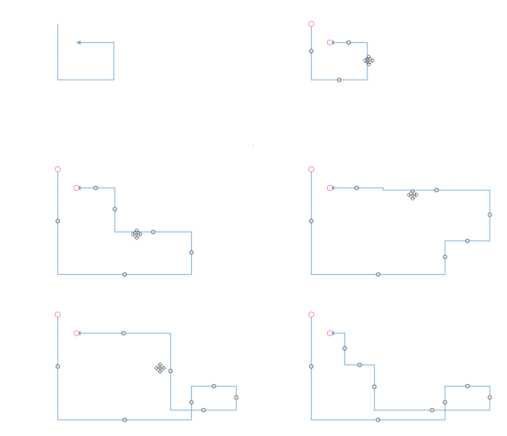
Avoid overlapping
Orthogonal segments are automatically re-routed, in order to avoid overlapping with the source and target nodes. The following preview illustrates how orthogonal segments are re-routed.
<template>
    <div id="app">
        <ejs-diagram id="diagram" :width='width' :height='height' :nodes='nodes' :connectors='connectors'
            :getNodeDefaults='getNodeDefaults'></ejs-diagram>
    </div>
</template>
<script setup>
import { DiagramComponent as EjsDiagram, PortVisibility } from '@syncfusion/ej2-vue-diagrams';

const nodeport = {
    style: {
        strokeColor: '#366F8C',
        fill: '#366F8C'
    }
};
nodeport.shape = 'Circle';
nodeport.visibility = PortVisibility.Visible
nodeport.id = 'port';
nodeport.offset = {
    x: 0,
    y: 0.5
};
const port2 = {
    style: {
        strokeColor: '#366F8C',
        fill: '#366F8C'
    }
}
port2.offset = {
    x: 0,
    y: 0.5
};
port2.id = 'port1';
port2.visibility = PortVisibility.Visible
port2.shape = 'Circle';
const nodes = [{
    id: 'node',
    width: 100,
    height: 100,
    offsetX: 100,
    offsetY: 100,
    ports: [nodeport]
},
{
    id: 'node1',
    width: 100,
    height: 100,
    offsetX: 300,
    offsetY: 100,
    ports: [port2]
},
];
const connectors = [{
    id: "connector1",
    type: 'Orthogonal',
    sourcePoint: {
        x: 100,
        y: 100
    },
    targetPoint: {
        x: 200,
        y: 200
    },
    sourceID: 'node',
    targetID: 'node1',
    sourcePortID: 'port',
    targetPortID: 'port1'
}]

const width = "100%";
const height = "350px";
const getNodeDefaults = (node) => {
    node.height = 100;
    node.width = 100;
    node.style.fill = '#6BA5D7';
    node.style.strokeColor = 'white';
    return node;
}
</script>
<style>
@import "../node_modules/@syncfusion/ej2-vue-diagrams/styles/tailwind3.css";
@import "../node_modules/@syncfusion/ej2-base/styles/tailwind3.css";
@import "../node_modules/@syncfusion/ej2-popups/styles/tailwind3.css";
@import "../node_modules/@syncfusion/ej2-splitbuttons/styles/tailwind3.css";
@import "../node_modules/@syncfusion/ej2-navigations/styles/tailwind3.css";
</style><template>
<div id="app">
<ejs-diagram id="diagram" :width='width' :height='height' :nodes='nodes' :connectors='connectors'
:getNodeDefaults='getNodeDefaults'></ejs-diagram>
</div>
</template>
<script>
import { DiagramComponent, PortVisibility } from '@syncfusion/ej2-vue-diagrams';
let nodeport = {
style: {
strokeColor: '#366F8C',
fill: '#366F8C'
}
};
nodeport.shape = 'Circle';
nodeport.visibility = PortVisibility.Visible
nodeport.id = 'port';
nodeport.offset = {
x: 0,
y: 0.5
};
let port2 = {
style: {
strokeColor: '#366F8C',
fill: '#366F8C'
}
}
port2.offset = {
x: 0,
y: 0.5
};
port2.id = 'port1';
port2.visibility = PortVisibility.Visible
port2.shape = 'Circle';
let nodes = [{
id: 'node',
width: 100,
height: 100,
offsetX: 100,
offsetY: 100,
ports: [nodeport]
},
{
id: 'node1',
width: 100,
height: 100,
offsetX: 300,
offsetY: 100,
ports: [port2]
},
];
let connectors = {
id: "connector1",
type: 'Orthogonal',
sourcePoint: {
x: 100,
y: 100
},
targetPoint: {
x: 200,
y: 200
},
sourceID: 'node',
targetID: 'node1',
sourcePortID: 'port',
targetPortID: 'port1'
}
export default {
name: "App",
components: {
"ejs-diagram": DiagramComponent
},
data() {
return {
width: "100%",
height: "350px",
nodes: nodes,
connectors: [connectors],
getNodeDefaults: (node) => {
node.height = 100;
node.width = 100;
node.style.fill = '#6BA5D7';
node.style.strokeColor = 'white';
return node;
},
}
}
}
</script>
<style>
@import "../node_modules/@syncfusion/ej2-vue-diagrams/styles/tailwind3.css";
@import "../node_modules/@syncfusion/ej2-base/styles/tailwind3.css";
@import "../node_modules/@syncfusion/ej2-popups/styles/tailwind3.css";
@import "../node_modules/@syncfusion/ej2-splitbuttons/styles/tailwind3.css";
@import "../node_modules/@syncfusion/ej2-navigations/styles/tailwind3.css";
</style>How to customize Orthogonal Segment Thumb Shape
The orthogonal connector can have any number of segments in between the source and the target point. Segments are rendered with the circle shape by default. The segmentThumbShape property allows you to change the default shape of the segment thumb. The following predefined shapes are provided:
| Shape name | Shape |
|---|---|
| Rhombus | 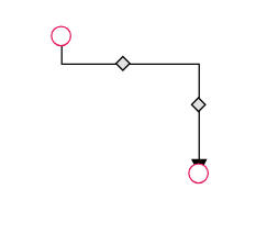 |
| Square | 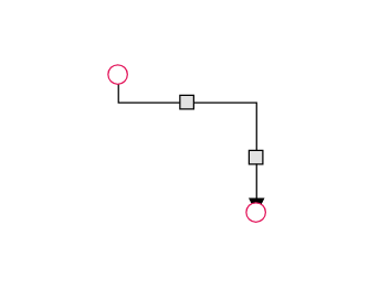 |
| Rectangle | 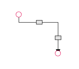 |
| Ellipse | 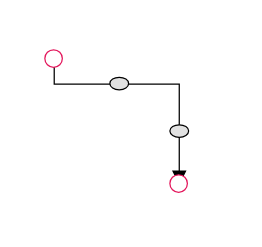 |
| Arrow | 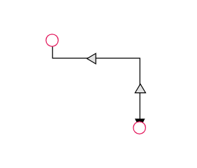 |
| OpenArrow | 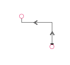 |
| Circle | 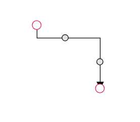 |
| Fletch | 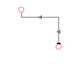 |
| OpenFetch | 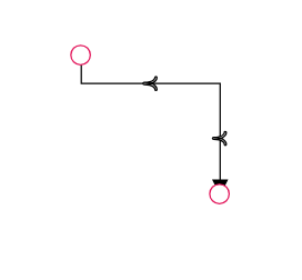 |
| IndentedArrow | 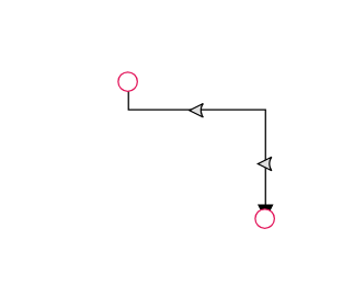 |
| OutdentedArrow | 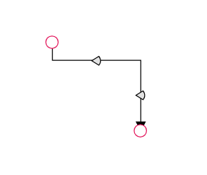 |
| DoubleArrow | 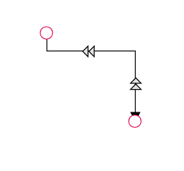 |
You can customize the style of the thumb shape by overriding the class e-orthogonal-thumb.
<template>
    <div id="app">
        <ejs-diagram id="diagram" :width='width' :height='height' :connectors='connectors'
            :getConnectorDefaults='getConnectorDefaults' :segmentThumbShape="segmentThumbShape">
        </ejs-diagram>
    </div>
</template>
<script setup>
import { provide } from "vue";
import { DiagramComponent as EjsDiagram, ConnectorConstraints, ConnectorEditing } from '@syncfusion/ej2-vue-diagrams';

let connectors = [{
    id: 'connector',
    // Define the type of the segment
    type: 'Orthogonal',
    sourcePoint: { x: 250, y: 250 },
    targetPoint: { x: 350, y: 350 },
    segments: [
        {
            type: 'Orthogonal',
            // Defines the direction for the segment lines
            direction: "Right",
            // Defines the length for the segment lines
            length: 70
        },
        {
            type: 'Orthogonal',
            direction: "Bottom",
            length: 20
        }],
}]

const width = "900px";
const height = "500px";
const segmentThumbShape = 'Arrow';
const getConnectorDefaults = (connector) => {
    connector.constraints = ConnectorConstraints.Default | ConnectorConstraints.DragSegmentThumb;
}

provide('diagram', [ConnectorEditing]);
</script>
<style>
@import "../node_modules/@syncfusion/ej2-vue-diagrams/styles/tailwind3.css";
@import "../node_modules/@syncfusion/ej2-base/styles/tailwind3.css";
@import "../node_modules/@syncfusion/ej2-popups/styles/tailwind3.css";
@import "../node_modules/@syncfusion/ej2-splitbuttons/styles/tailwind3.css";
@import "../node_modules/@syncfusion/ej2-navigations/styles/tailwind3.css";
</style><template>
<div id="app">
<ejs-diagram id="diagram" :width='width' :height='height' :connectors='connectors'
:getConnectorDefaults='getConnectorDefaults' :segmentThumbShape="segmentThumbShape">
</ejs-diagram>
</div>
</template>
<script>
import { DiagramComponent, ConnectorConstraints, ConnectorEditing } from '@syncfusion/ej2-vue-diagrams';
let connectors = [{
id: 'connector',
// Define the type of the segment
type: 'Orthogonal',
sourcePoint: { x: 250, y: 250 },
targetPoint: { x: 350, y: 350 },
segments: [
{
type: 'Orthogonal',
// Defines the direction for the segment lines
direction: "Right",
// Defines the length for the segment lines
length: 70
},
{
type: 'Orthogonal',
direction: "Bottom",
length: 20
}],
}]
export default {
name: "App",
components: {
"ejs-diagram": DiagramComponent
},
data() {
return {
width: "900px",
height: "500px",
connectors: connectors,
segmentThumbShape: 'Arrow',
getConnectorDefaults: (connector) => {
connector.constraints = ConnectorConstraints.Default | ConnectorConstraints.DragSegmentThumb;
}
}
},
provide: {
diagram: [ConnectorEditing]
}
}
</script>
<style>
@import "../node_modules/@syncfusion/ej2-vue-diagrams/styles/tailwind3.css";
@import "../node_modules/@syncfusion/ej2-base/styles/tailwind3.css";
@import "../node_modules/@syncfusion/ej2-popups/styles/tailwind3.css";
@import "../node_modules/@syncfusion/ej2-splitbuttons/styles/tailwind3.css";
@import "../node_modules/@syncfusion/ej2-navigations/styles/tailwind3.css";
</style>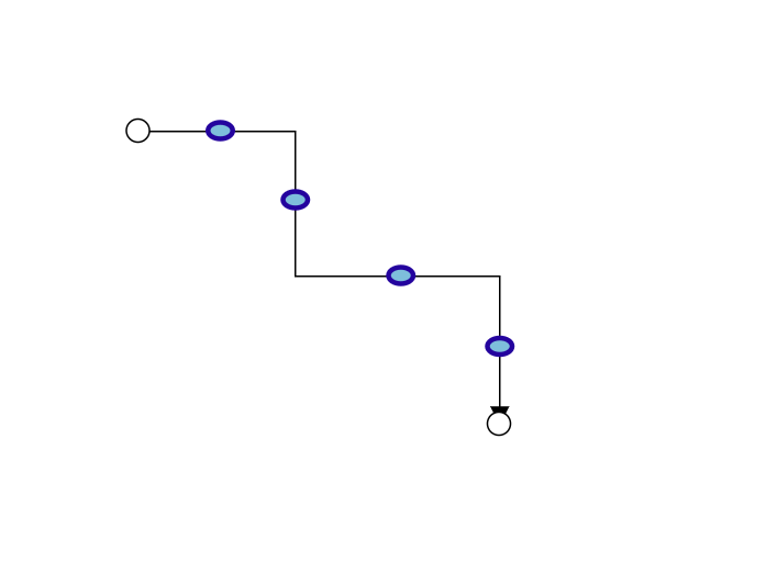
Use the following CSS to customize the segment thumb shape.
 .e-orthogonal-thumb {

            stroke:#24039e;

            fill:rgb(126, 190, 219);

            stroke-width: 3px;

            }
How to customize Orthogonal Segment Thumb Size
Orthogonal segment thumbs default to size 10. This can be adjusted globally or for individual connectors using the segmentThumbSize property.
To change the thumb size for all Orthogonal connectors, set the segmentThumbSize property in the diagram’s model.
To customize the thumb size for a specific connector, disable the InheritSegmentThumbSize constraint, then set the desired segmentThumbSize.
<template>
    <div id="app">
        <ejs-diagram id="diagram" :width='width' :height='height' :nodes='nodes' :connectors='connectors' :segmentThumbSize='segmentThumbSize'></ejs-diagram>
    </div>
</template>
<script setup>
import { provide } from "vue";
import { DiagramComponent as EjsDiagram, ConnectorConstraints, ConnectorEditing } from '@syncfusion/ej2-vue-diagrams';
const nodes = [{
    id: 'node1',
    offsetX: 200,
    offsetY: 200,
    width: 100,
    height: 100,
    style: {
        fill: '#6BA5D7',
        strokeColor: 'white'
    },

},
{
    id: 'node2',
    offsetX: 400,
    offsetY: 400,
    width: 100,
    height: 100,
    style: {
        fill: '#6BA5D7',
        strokeColor: 'white'
    },

},
{
    id: 'node3',
    offsetX: 600,
    offsetY: 200,
    width: 100,
    height: 100,
    style: {
        fill: '#6BA5D7',
        strokeColor: 'white'
    },

},
{
    id: 'node4',
    offsetX: 800,
    offsetY: 400,
    width: 100,
    height: 100,
    style: {
        fill: '#6BA5D7',
        strokeColor: 'white'
    },

}]
const connectors =[
    {
        id: 'connector1',
        type: 'Orthogonal',
        sourceID: 'node1',
        targetID: 'node2',
        segments: [
            {
                type: 'Orthogonal',
                direction: "Right",
                length: 70
            },
            {
                type: 'Orthogonal',
                direction: "Bottom",
                length: 50
            }
        ],
        constraints: ConnectorConstraints.Default | ConnectorConstraints.DragSegmentThumb,
    },
    {
        id: 'connector2',
        type: 'Orthogonal',
        sourceID: 'node3',
        targetID: 'node4',
        segments: [
            {
                type: 'Orthogonal',
                direction: "Right",
                length: 70
            },
            {
                type: 'Orthogonal',
                direction: "Bottom",
                length: 50
            }
        ],
        constraints:ConnectorConstraints.Default & ~(ConnectorConstraints.InheritSegmentThumbSize) | ConnectorConstraints.DragSegmentThumb,
        segmentThumbSize: 20
    },
];

const width = "100%";
const height = "550px";
const segmentThumbSize = 15;

provide('diagram', [ConnectorEditing]);
</script>
<style>
@import "../node_modules/@syncfusion/ej2-vue-diagrams/styles/tailwind3.css";
@import "../node_modules/@syncfusion/ej2-base/styles/tailwind3.css";
@import "../node_modules/@syncfusion/ej2-popups/styles/tailwind3.css";
@import "../node_modules/@syncfusion/ej2-splitbuttons/styles/tailwind3.css";
@import "../node_modules/@syncfusion/ej2-navigations/styles/tailwind3.css";
</style><template>
<div id="app">
<ejs-diagram id="diagram" :width='width' :height='height' :nodes='nodes' :connectors='connectors' :segmentThumbSize='segmentThumbSize'></ejs-diagram>
</div>
</template>
<script>
import { DiagramComponent, ConnectorConstraints, ConnectorEditing } from '@syncfusion/ej2-vue-diagrams';
let nodes = [{
id: 'node1',
offsetX: 200,
offsetY: 200,
width: 100,
height: 100,
style: {
fill: '#6BA5D7',
strokeColor: 'white'
},
},
{
id: 'node2',
offsetX: 400,
offsetY: 400,
width: 100,
height: 100,
style: {
fill: '#6BA5D7',
strokeColor: 'white'
},
},
{
id: 'node3',
offsetX: 600,
offsetY: 200,
width: 100,
height: 100,
style: {
fill: '#6BA5D7',
strokeColor: 'white'
},
},
{
id: 'node4',
offsetX: 800,
offsetY: 400,
width: 100,
height: 100,
style: {
fill: '#6BA5D7',
strokeColor: 'white'
},
}]
let connectors = [
{
id: 'connector1',
type: 'Orthogonal',
sourceID: 'node1',
targetID: 'node2',
segments: [
{
type: 'Orthogonal',
direction: "Right",
length: 70
},
{
type: 'Orthogonal',
direction: "Bottom",
length: 50
}
],
constraints: ConnectorConstraints.Default | ConnectorConstraints.DragSegmentThumb,
},
{
id: 'connector2',
type: 'Orthogonal',
sourceID: 'node3',
targetID: 'node4',
segments: [
{
type: 'Orthogonal',
direction: "Right",
length: 70
},
{
type: 'Orthogonal',
direction: "Bottom",
length: 50
}
],
constraints:ConnectorConstraints.Default & ~(ConnectorConstraints.InheritSegmentThumbSize) | ConnectorConstraints.DragSegmentThumb,
segmentThumbSize: 20
},
];
export default {
name: "App",
components: {
"ejs-diagram": DiagramComponent
},
data() {
return {
width: "100%",
height: "550px",
nodes:nodes,
connectors: connectors,
segmentThumbSize : 15
}
},
provide: {
diagram: [ConnectorEditing]
}
}
</script>
<style>
@import "../node_modules/@syncfusion/ej2-vue-diagrams/styles/tailwind3.css";
@import "../node_modules/@syncfusion/ej2-base/styles/tailwind3.css";
@import "../node_modules/@syncfusion/ej2-popups/styles/tailwind3.css";
@import "../node_modules/@syncfusion/ej2-splitbuttons/styles/tailwind3.css";
@import "../node_modules/@syncfusion/ej2-navigations/styles/tailwind3.css";
</style>