- Custom Theme
- EnableCustomTheming
- customThemeSettings
- customThemeSettings.dashboard
- customThemeSettings.fontSettings
- customThemeSettings.banner
- How to hide the banner in the dashboard?
- customThemeSettings.Container
- customThemeSettings.menuSettings
- customThemeSettings.descriptionSettings
- customThemeSettings.popupSettings
- customThemeSettings.buttonSettings
- customThemeSettings.maximizationSettings
- customThemeSettings.filterOverviewSettings
- customThemeSettings.passiveErrorSettings
- customThemeSettings.erroredContainer
- customThemeSettings.tooltipSettings
- customThemeSettings.multitabSettings
- customThemeSettings.filterPanelSettings
- Customized appearance of Dashboard Viewer
- Apply Custom Theme to Widget
- How to apply custom theme to widget
- Grid
- PivotGrid
- Card
- FilterComboBox
- Checkbox
- RangeSlider
- Listbox
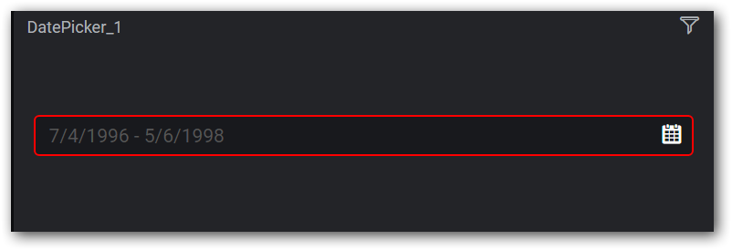
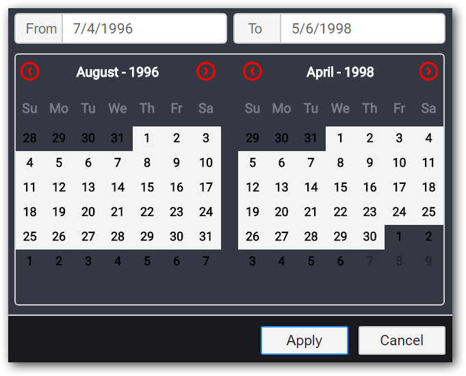
- Datepicker
- Bubble map
- ChoroplethMap
- TreeMap
- RangeNavigator
- Gauge
- Chart
- ComboChart
- Label
Contact Support
Custom Theme
Custom theme settings allow you to customize the appearance of the dashboard viewer. The user can achieve this theme customization using JSON settings which have separate properties to customize the dashboard viewer. The JSON settings can be given as input for API member “customThemeSettings”.
EnableCustomTheming
EnableCustomTheming property will enable the customization of Dashboard Viewer appearance. After enable this the user can modify the appearance of Dashboard Viewer.
Default Value
False.
Example
$("#container").ejDashboardViewer({
enableCustomTheming: true
});
customThemeSettings
customThemeSettings contains JSON input which is used to customize the appearance of Dashboard Viewer.
Default Value
“”
Example
$("#container").ejDashboardViewer({
customThemeSettings: {
        "dashboard": {},
        "fontSettings": {},
        "banner": {},
        "container": {},
        "menuSettings": {},
    };
});
customThemeSettings.dashboard
Used for customizing the background color, background image, hovering color and menu hovering color of Dashboard Viewer.. User can set background image for Dashboard Viewer also. User can set either background- color or background image for Dashboard Viewer.
Example
$("#container").ejDashboardViewer({
customThemeSettings: {
        "dashboard": {
            "background-color": "#0c0d0f",
            "background-image": "",
            "menu-hover-color": "#262A33",
            "icon-hover-color": "#F2F2F2",
        },
    };
});
customThemeSettings.fontSettings
Used for customizing the font family, font size used in Dashboard Viewer. The user can use external fonts by specifying the source path of the along with format type. For using the external fonts need to give the source path where the external font is placed and need to give the format type.
Example
$("#container").ejDashboardViewer({
customThemeSettings: {
        "fontSettings": {
            "font-family": 'Roboto',
            "src": "",
            "format": "",
            "font-size": "20px"
        },
    };
});
NOTE
font size should not exceed 26px to view the title without any distortion.
customThemeSettings.banner
Used for customizing the background color, title color, title font size, border color and icons color of dashboard banner. Using this settings user can customize the background color, title color and icons color.
Example
$("#container").ejDashboardViewer({
customThemeSettings: {
        "banner": {
            "background-color": "linear-gradient(to bottom, rgba(35,36,40,1) 0%, rgba(24,25,29,1) 100%)",
            "title-color": "#aeb2b7",
            "icons-color": "#aeb2b7",
            "banner-top-border-color": "rgba(35,36,40,1)",
            "font-size": "20px"
        },
    };
});
NOTE
font size should not exceed 26px to view the title without any distortion.
How to hide the banner in the dashboard?
Hide banner in the Dashboard by customizing CSS class “.e-dbrd-banner”
Example
<!DOCTYPE html>
    <html xmlns="http://www.w3.org/1999/xhtml" style="width:100%; height:100%;">
    <head>
        <style>
            .e-dbrd-banner {
                display: none !important;
                height: 0px !important;
            }
        </style>
        <title>Dashboard Viewer</title>
        <meta name="viewport" content="width=device-width, initial-scale=1.0">
    </head>
    <body style="width: 100%;height: 100%">
    <script type="text/javascript">
    $(function (e) {
        $("#container").ejDashboardViewer({
            serviceUrl: 'service URL',
            dashboardPath: 'Path of the dashboard'
        });
    });
    </script>
    <div id="container" style="width: 100%; height: 100%"></div>
    </body>
</html>
customThemeSettings.Container
Used to customize the widget container. Using this settings user can customize the background color, border, box shadow, border radius, header background color, title color, title font size and icons color.
Example
$("#container").ejDashboardViewer({
customThemeSettings: {
        "container": {
            "background-color": "#232428",
            "header-background-color": "#232428",
            "title-color": "#aeb2b7",
            "icons-color": "#aeb2b7",
            "border-radius": "2px",
            "box-shadow": "none",
            "font-size": "20px"
        },
    };
});
NOTE
font size should not exceed 26px to view the title without any distortion.
customThemeSettings.menuSettings
Used to customize the widget menu. Using this settings user can customize the background color, border color, text color and font size for menu popup of Dashboard Viewer.
Example
$("#container").ejDashboardViewer({
customThemeSettings: {
        "menuSettings": {
            "background-color": "#333842",
            "border-color": "none",
            "font-color": "#f9f9f9",
            "font-size": "20px"
        },
    };
});
customThemeSettings.descriptionSettings
Used for customizing the background color, border color , font color and font size of description popup of Dashboard Viewer. Using this settings user can customize the background color, border color and font color of description popup.
Example
$("#container").ejDashboardViewer({
customThemeSettings: {
        "descriptionSettings": {
            "background-color": "#ff0000",
            "border-color": "rgb(238, 72, 163)",
            "font-color": "rgb(255, 255, 255)",
            "font-size": "20px"
        },
    };
});
customThemeSettings.popupSettings
Used for customizing the dialogs in the Dashboard Viewer such as export dialog, error detail dialog etc. The user can customize the background color, container background color, title color, font color, icons color, input box background, border and font color, error message color, hyperlink color and font size.
Example
$("#container").ejDashboardViewer({
customThemeSettings: {
        "popupSettings": {
            "popup-background-color": "rgba(0, 0, 0, 0.5)",
            "popup-container-background-color": "#333842",
            "popup-title-color": "rgb(255, 255, 255)",
            "popup-font-color": "rgb(255, 255, 255)",
            "popup-icons-color": "#ffffff",
            "input-box-background-color": "#2a2f38",
            "input-box-border-color": "#5a5f66",
            "inputbox-font-color": "#f9f9f9",
            "hyperlink-color": "rgb(255, 255, 255)",
            "error-msg-color": "rgb(255,255,255)",
            "font-size": "20px"
        },
    };
});
customThemeSettings.buttonSettings
Used for customizing the buttons in the Dashboard Viewer such as Export, Cancel, Reset, OK etc. The user can customize the background color and font color of buttons. The buttons in Dashboard Viewer are categorized as success button, cancel button, close button, reset button, disable button and font size.
Example
$("#container").ejDashboardViewer({
customThemeSettings: {
        "buttonSettings": {
            "success-background-color": "#009aef",
            "success-font-color": "#fff",
            "close-background-color": "#1f252d",
            "close-font-color": "#78a",
            "cancel-background-color": "#f4f4f4",
            "cancel-font-color": "#161616",
            "reset-background-color": "#f4f4f4",
            "reset-font-color": "#161616",
            "disabled-btn-background-color": "rgb(0, 0, 0)",
            "disabled-btn-font-color": "rgb(255, 255, 255)",
            "font-size": "20px"
        },
    };
});
customThemeSettings.maximizationSettings
Used for customizing the background color, header background color, container background color, footer background color, title color, icons color, description font color and font size of widgets in maximized view.
Example
$("#container").ejDashboardViewer({
customThemeSettings: {
        "maximizationSettings": {
            "max-background-color": "rgba(0, 0, 0, 0.5)",
            "max-header-background-color": "#232428",
            "max-container-background-color": "#232428",
            "max-footer-background-color": "#232428",
            "max-title-color": "#ffffff",
            "max-icons-color": "#ffffff",
            "description-font-color": "#ffffff",
            "font-size": "20px"
        },
    };
});
customThemeSettings.filterOverviewSettings
Used for customizing the background color, footer background color, title color, icons color, back icon color, clear all font color and font size of filter overview popup in Dashboard Viewer.
Example
$("#container").ejDashboardViewer({
customThemeSettings: {
        "filterOverviewSettings": {
            "background-color": "#333842",
            "border-color": "#3c3d42",
            "footer-background-color": "#009aef",
            "font-color": "#f9f9f9",
            "icons-color": "#f9f9f9",
            "back-icon-color": "#ffffff",
            "clear-all-font-color": "#009aef",
            "font-size": "20px"
        },
    };
});
customThemeSettings.passiveErrorSettings
Used for customizing the passive error banner that displays the error messages that occur while rendering dashboard. Using this settings user can customize the background color, font color, icons color, link color and font size of passive error.
Example
$("#container").ejDashboardViewer({
customThemeSettings: {
        "passiveErrorSettings": {
            "background-color": "#fbcb43",
            "font-color": "#1c1c1c",
            "icons-color": "#af8423",
            "link-color": "#996f07",
            "font-size": "20px"
        },
    };
});
customThemeSettings.erroredContainer
Used for customizing the errors/warnings shown in widget container that prevents the widget from rendering in the viewer. Using this settings user can customize the background color, font color, link color and font size of error container.
Example
$("#container").ejDashboardViewer({
customThemeSettings: {
        "erroredContainer": {
            "background-color": "#232428",
            "font-color": "#7a7e89",
            "link-color": "#3b99fc",
            "font-size": "20px"
        },
    };
});
customThemeSettings.tooltipSettings
Used for customizing the dashboard tooltip, that appears upon hovering on dashboard or widget title, maximizing icon, menu icon etc. Using this settings user can customize the background color, font color, border radius and font size of tooltip.
Example
$("#container").ejDashboardViewer({
customThemeSettings: {
        "tooltipSettings": {
            "background-color": "#2a2f38",
            "font-color": "#ffffff",
            "border-radius": "2px",
            "font-size": "20px"
        },
    };
});
customThemeSettings.multitabSettings
Used for customizing the background color, font color, tab hovering color, tab hovering font color, selected tab color, font-size etc. Using this settings user can customize the theme in multi tab container.
Example
$("#container").ejDashboardViewer({
customThemeSettings: {
        "multitabSettings": {
            "background-color": "#0c0d0f",
            "font-color": "rgb(174, 178, 183)",
            "tab-hover-color": "#aeb2b7",
            "tab-hover-font-color": "#fff",
            "selected-tab-color": "#179bd7",
            "selected-font-color": "#fff",
            "multitab-export-button-background-color": "#0c0d0f",
            "multitab-export-button-font-color": "rgb(174, 178, 183)",
            "multitab-mobile-popup-border-color": "rgb(174, 178, 183)",
            "arrow-icons-background-color": "#0c0d0f",
            "arrow-icons-color": "#aeb2b7",
            "font-size": "20px"
        },
    };
});
customThemeSettings.filterPanelSettings
Used for customizing the filter panel banner and container element. User can customize the filter panel background color, banner color, banner background color, banner title font size, container background color, container color, container font size etc.
Example
$("#container").ejDashboardViewer({
customThemeSettings: {
        "filterPanelSettings": {
            "filterPanel": {
                "background-color": "#0c0d0f",
                "separator-color": "#F2F2F2",
            },
            "bannerSettings": {
                "background-color": "linear-gradient(to bottom, rgba(35,36,40,1) 0%, rgba(24,25,29,1) 100%)",
                "title-color": "#aeb2b7",
                "icons-color": "#F2F2F2",
                "font-size": "14px"
            },
            "fontSettings": {
                "src": "fonts/GreatVibes-Regular.otf",
                "format": "opentype",
                "font-size": "14px"
            },
            "container": {
                "background-color": "#232428",
                "header-background-color": "#232428",
                "title-color": "#aeb2b7",
                "icons-color": "#aeb2b7"
                "font-size": "17px"
            }
        },
    };
});
Customized appearance of Dashboard Viewer

Apply Custom Theme to Widget
Through custom theme support we can apply user defined theme values to widgets in the dashboard.
How to apply custom theme to widget
The following steps illustrates how to define a theme and apply the theme to widgets
- In Custom theme demo sample, open the “index.cshtml” in the following the location.

- We can customize theme of widget under “widgetThemeSettings” section in the file.
CSS properties
We have customized the below CSS properties by using custom theme support.
- background-color
- font-color
- font-family
- border-color
- font-size
Grid
Sections
We can customize the below sections in grid widget.
- Header
- Content
- Hover
- Border
- Selection
- FontSettings
Header
We can customize the below properties in header section.
- background-color
- font-color
- font-family
For example, we can change the background color for grid header. Below code snippet represent to change the background color of grid header.
"header":
{
  "background-color": "red",
  "font-color": "#7a7e89",
  "font-family": "Roboto",
},
The following image illustrates the applied background color for grid header.

Content
We can customize the below properties in content section.
- background-color
- font-family
- font-color
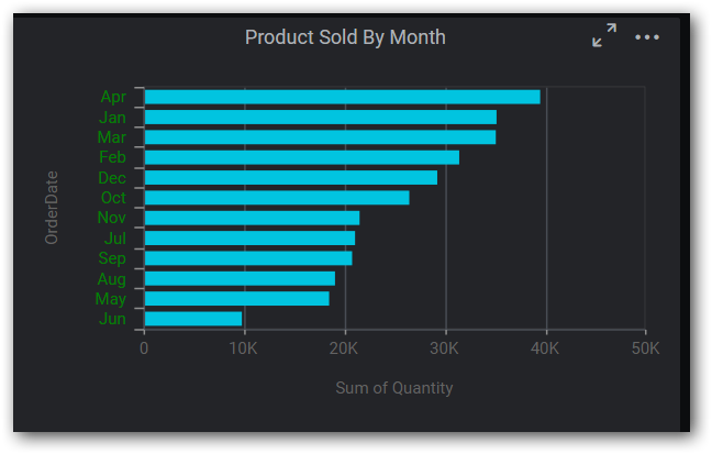
For example, we can change the background color for grid content. Below code snippet represent the to change background color of the grid content.
"content":
 {
   "background-color": "pink",
   "font-color": "#7a7e89",
   "font-family": "Roboto",
 },
The following image illustrates the applied background color for grid content.

Hover
We can customize the ‘background-color’ for hover section.
For example, while hovering on grid widget background color will be changed as red color. Below code snippet represent the background color for the hover effect.
"hover":
{
   "background-color": "red",
},
The following image illustrates the applied background color for grid hover.

Border
We can customize the border-color for the grid border. Below code snippet represent the border color for grid border.
"border":
 {
   "border-color": "white",
 },
The following image illustrates the applied border color for grid border.

Selection
We can customize the below properties for selection appearance of grid.
- background-color
- font-color
For example, we can change the font-color for grid selection. Below code snippet represents to change the font color for grid while selection.
"selection":
 {
   "background-color": "#80284d",
   "font-color": "red",
 },
The following image illustrates the applied font color for grid selection.

FontSettings
We can customize the ‘font-size’ property in header, content, paging and summary row section.
For example, we can change the font-size it reflect the grid content, header. Below code snippet represent to change the font size for grid content, header.
"fontSettings":
 {
   "font-size": "16px",
 },
The following image illustrates the applied font color for grid selection.

PivotGrid
Sections
We can customize the below sections in PivotGrid widget.
- Grouping bar
- Grouping button
- Icon
- Header
- Content
- Summary
- Hover
- FontSettings
Grouping bar
We can customize the below properties in grouping bar section.
- background-color
- border-color
- font-family
- font-color
For example, we can customize the background color of grouping bar. Below code snippet represent to change the background color of grouping bar.
"grouping-bar":
{
   "background-color": "pink",
   "border-color": "#33353a",
   "font-color": "#aeb2b7",
   "font-family": "Roboto"
},
The following image illustrates the applied background color for PivotGrid grouping bar.

Grouping button
We can customize the below properties in grouping button section.
- background-color
- font-color
- font-family
For example, we can customize the background color for grouping button. Below code snippet represents to change the background color of grouping button.
"grouping-button":
   {
     "background-color": "pink",
     "font-color": "#fff",
     "font-family": "Roboto"
   },
The following image illustrates the applied background color for PivotGrid grouping button.

Icon
We can customize the below properties in icon section.
- filter-icon-color
- sort-icon-color
- expand-icon-color
- collapse-icon-color
For example, we can change the filter icon color. Below code snippet represents to change the filter icon color of PivotGrid widget.
"icon":
{
   "filter-icon-color": "orange",
   "sort-icon-color": "#19191c",
   "expand-icon-color": "#19191c",
   "collapse-icon-color": "#19191c"
},
The following image illustrates the applied filter icon color for PivotGrid.
Header
We can customize the below properties in header section
- background-color
- border-color
- font-family
- font-color
For example, we can customize the border color of header. Below code snippet represents to change the border color of header.
"header":
{
  "background-color": "#171819",
  "border-color": "orange",
  "font-color": "#aeb2b7",
  "font-family": "Roboto",
},
The following image illustrates the applied border color for PivotGrid header.

Content
We can customize the below properties in content section.
- background-color
- border- color
- font -color
- font-family
For example, we can customize the background color for content. Below code snippet represents to change the background color of content.
"content":
{
  "background-color": "pink",
  "border-color": "#33353a",
  "font-color": "#aeb2b7",
  "font-family": "Roboto",
},
The following image illustrates the applied background color for PivotGrid content.

Summary
We can customize the below properties for summary section.
- background-color
- border- color
- font-color
- font-family
For example, we can change the font color of summary. Below code snippet represent to change the font color for summary.
"summary":
{
  "background-color": "#0b0c0c",
  "border-color": "#33353a",
  "font-color": "blue",
  "font-family": "Roboto",
},
The following image illustrates the applied font color for PivotGrid summary.

Hover
We can customize the ‘background-color’ of hover for PivotGrid widget.
For example, we can customize the background color of hover. Below code snippet represents to change the background color of hover effect.
"hover":
{
  "background-color": "green",
},
The following image illustrates the applied background color for pivotgrid hover.

FontSettings
We can customize the ‘font-size’ for header, content, tooltip, grouping button text and summary.
For example, we can customize the font size of pivot grid. Below code snippet represents to change the font size of header, content, tooltip, grouping button text and summary.
"fontSettings":
{
  "font-size":"16px"
},
The following image illustrates the applied font size for pivotgrid hover.

Card
Sections
We can customize the below sections in card widget.
- Card
- Title
- Value
- Variation
- Selection
- FontSettings
Card
We can customize the below properties in card widget.
- background-color
- border-color
For example, we can customize the background color of card widget. Below code snippet represent to change the background color of card widget.
"card":
  {
   "background-color": "pink",
   "border-color": "#3c3d42",
  },
The following image illustrates the applied background color for card.

Title
We can customize the below properties in title section
- font-color
- font-family
For example, we can customize the font color of title. Below code snippet represent to change the font color of title.
"title":
{
  "font-color": "blue",
  "font-family": "Roboto",
},
The following image illustrates the applied font color for card title.

Value
We can customize the below properties in value section
- font-color
- font-family
For example, we can customize the font family for value section. Below code snippet represent to change the font family.
"value":
{
   "font-color": "#01c4e0",
   "font-family": "Times New Roman"
},
The following image illustrates the applied font family for card value.

Variation
We can customize the below properties in variation section.
- font-color
- font-family
For example, we can customize the font color for variation section. Below code snippet represent to change the font color.
"variation":
{
  "font-color": "green",
  "font-family": "Roboto",
},
The following image illustrates the applied font color for card variation.

Selection
We can customize the highlight-color property in selection section.
For example, we can customize the highlight color for selection. Below code snippet represent to change the highlight color.
"selection":
{
 "highlight-color": "blue"
},
The following image illustrates the applied highlight color for card selection appearance.

FontSettings
We can customize the font-size property in card widget.
For example, we can customize the font-size of value, variation section of card widget. Below code snippet represent to change the font size.
"fontSettings":
{
  "font-size":"45px"
},
The following image illustrates the applied font size for card.

FilterComboBox
Sections
We can customize the below sections in FilterComboBox widget.
- Combobox
- Button
- DropDownList
- Icon
- Hover
- SearchBox
- Selection
- FontSettings
Combobox
We can customize the below properties in combobox section.
- background-color
- border-color
- font-color
- font-family
For example, we can customize the background color for combobox. Below code snippet represent to change the background color.
"combobox":
{
  "background-color": "green",
  "border-color": "#3c3d42",
  "font-color": "#f9f9f9",
  "font-family": "Roboto",
 },
The following image illustrates the applied background color for combobox

Button
We can customize the below properties in button section.
- background-color
- font-color
- border-color
For example, we can customize the background color for combobox. Below code snippet represent to change the background color.
"button":
{
  "background-color": "blue",
  "font-color": "#ffffff",
  "border-color": "none",
},
The following image illustrates the applied background color for dropdown button.

DropDownList
We can customize the below properties in dropdownlist section.
- background-color
- font-color
- font-family
For example, we can customize the font color for DropDownList. Below code snippet represent to change the font color.
"dropdownlist":
{
  "background-color": "#232428",
  "font-color": "pink",
  "font-family": "Roboto",
},
The following image illustrates the applied font color for DropDownList

Icon
We can customize the below properties in icon section. This section is used for multi selection.
- Background-color
- Border-color
- tick-color
- search-icon-color
For example, we can customize the background color for icon. Below code snippet represent to change the background color.
"icon":
{
  "background-color": "green",
  "border-color": "#ffffff",
  "tick-color": "#ffffff",
  "search-icon-color": "white"
},
The following image illustrates the applied background color for dropdown icon.
Hover
We can customize the ‘background-color’ property while hovering.
For example, we can customize the background color while hovering. Below code snippet represent to change the background color.
"hover":
{
  "background-color": "red"
},
The following image illustrates the applied background color for DropDownList hovering effect.

SearchBox
We can customize the ‘background-color’ property in searchbox section
For example, we can customize the background-color in searchbox section. Below code snippet represent to change the background color.
"searchbox":
{
  "background-color": "blue"
},
The following image illustrates the applied background color DropDownList search box

Selection
We can customize the ‘background color’ property in selection
For example, we can customize the background color in selection. Below code snippet represent to change the background color.
"selection":
{
  "background-color": "red"
},
The following image illustrates the applied background color for selection appearance in DropDownList.

FontSettings
We can customize the ‘font size’ property in combobox section.
For example, we can customize the font size of combobox dropdown list and default selected value. Below code snippet represent to change the font size.
"fontSettings":
{
  "font-size": "16px"
},
The following image illustrates the applied font size for combobox.

Checkbox
Sections
We can customize the below sections in checkbox widget.
- Label
- Icon
- FontSettings
Label
We can customize the below properties in label section
- font-color
- font-family
For example, we can customize the font color in label. Below code snippet represent to change the font color.
"label":
 {
   "font-color": "red",
   "font-family": "Roboto",
 },
The following image illustrates the applied font color for checkbox label.

Icon
We can customize the below properties in icon section.
- tick-color
- border-color
- background-color
For example, we can customize the tick color in checkbox icon. Below code snippet represent to change the tick color.
"icon":
{
  "tick-color": "red",
  "background-color": "white",
  "border-color": "#232428",
},
The following image illustrates the applied tick color for icon.
FontSettings
We can customize the ‘font size’ property in label.
For example, we can customize the font size in label. Below code snippet represent to change the font size.
"fontSettings":
{
  "font-size": "16px"
},
The following image illustrates the applied font size for checkbox label.

NOTE
Same theme settings was applied for RadioButton also.
RangeSlider
Sections
We can customize the below sections in range slider.
- Container
- Range
- Handle
- Label
- FontSettings
Container
We can customize the background-color property in container section.
For example, we can customize the background color for range slider container. Below code snippet represent to change the background color.
"container":
 {
   "background-color": "red",
 },
The following image illustrates the applied background color RangeSlider container.

Range
We can customize the below properties in range section.
- Range-color
- Background-color
For example, we can customize the range color for range section. Below code snippet represent to change the range color.
"range":
{
  "range-color": "blue",
  "background-color": "#2f3035"
},
The following image illustrates the applied range color for range slider.

Handle
We can customize the below properties in handle section.
- background-color
- border-color
For example, we can customize the background color for handle in range slider. Below code snippet represent to change the background color.
"handle":
{
  "background-color": "red",
  "border-color": "#353535",
},
The following image illustrates the applied background color for range slider handle.

Label
We can customize the font-color for the label.
Below code snippet represent to change the font color.
"label":
{
 "font-color": "green"
},
The following image illustrates the applied font color for range slider label.

FontSettings
We can customize the ‘font-size’ property in range section.
For example, we can customize the font size for range section. Below code snippet represent to change the font size.
"fontSettings":
{
  "font-size": "16px"
},
The following image illustrates the applied font size for range slider.

Listbox
Sections
We can customize the below sections in listbox widget.
- Listbox
- Icon
- Hover
- FontSettings
Listbox
We can customize the below properties in listbox section
- background-color
- color
For example, we can customize the background color for listbox. Below code snippet represent to change the background color.
"listbox":
{
 "background-color": "pink",
 "color": "#7a7e89",
},
The following image illustrates the applied background color for listbox.

Icon
We can customize the below properties in icon section.
- background-color
- border-color
- tick-color
For example, we can customize the background color for listbox icon while enable multi selection. Below code snippet represent to change the background color.
"icon":
{
 "background-color": "green",
 "border-color": "#232428",
 "tick-color": "#232428",
},
The following image illustrates the applied background color for listbox multi select icon.
Hover
We can customize the ‘background-color’ while hovering.
For example, we can customize the background color for listbox while hovering. Below code snippet represent to change the background color.
"hover":
{
  "background-color": "red",
},
The following image illustrates the applied background color for listbox hover.

FontSettings
We can customize the ‘font-size’ property in listbox section
For example, we can customize the font size for listbox. Below code snippet represent to change the font size.
"fontSettings":
{
 "font-size": "16px"
},
The following image illustrates the applied font size for listbox.

Datepicker
Sections
We can customize the below sections in datepicker widget.
- Textbox
- Calendar
- Selection
- Hover
- Icon
- Footer
- Button
- FontSettings
TextBox
We can customize the below properties in textbox section.
- background-color
- border-color
- font-color
For example, we can customize the border color for textbox in datepicker. Below code snippet represent to change the border color.
"textbox":
{
 "background-color": "#18191d",
 "border-color": "red",
 "font-color": "f9f9f9"
},
The following image illustrates the applied border color for datepicker textbox.
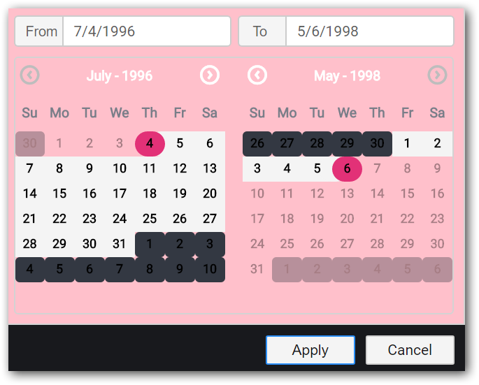
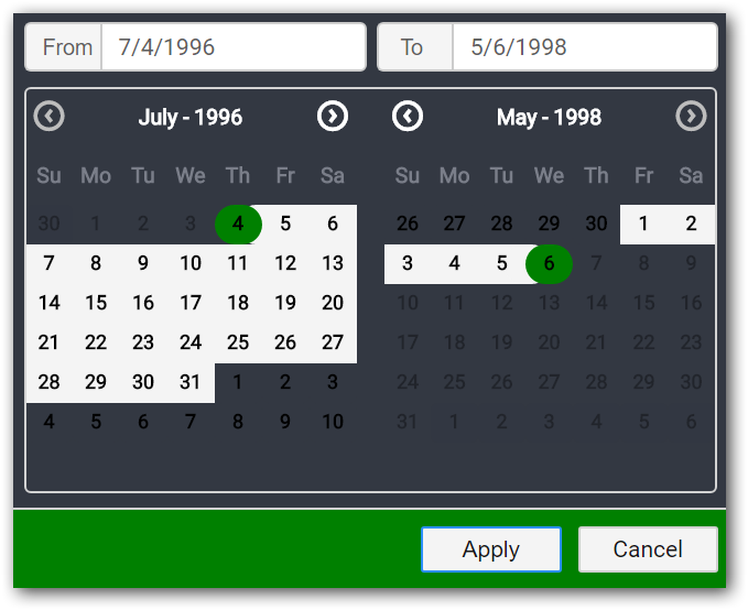
Calendar
We can customize the below properties in calendar section.
- background-color
- border-color
- currentmonth-font-color
- week-header-color
- days-color
- othermonth-font-color
For example, we can customize the background color for calendar in datepicker. Below code snippet represent to change the background color.
"calendar":
{
 "background-color": "pink",
 "border-color": "#333842",
 "currentmonth-font-color": "white",
 "week-header-color": "#7a7e89",
 "days-color": "white",
 "othermonth-font-color": "#333842"
},
The following image illustrates the applied background color for calendar.
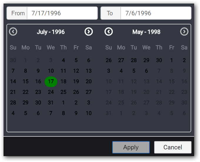
Selection
We can customize the ‘background-color’ for selection
For example, we can customize the background color for selection in datepicker. Below code snippet represent to change the background color.
"selection":
{
  "background-color": "green"
},
The following image illustrates the applied background color for selection appearance .
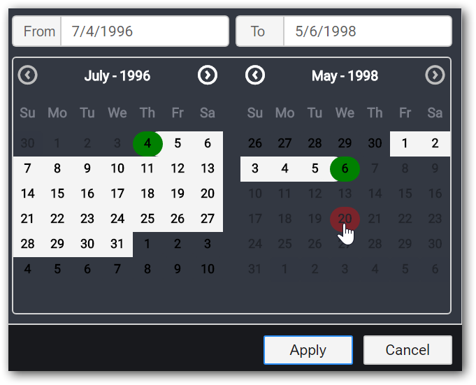
Hover
We can customize the ‘background-color’ for hovering.
For example, we can customize the background color while hovering in datepicker. Below code snippet represent to change the background color.
"hover":
{
  "background-color": "red"
},
The following image illustrates the applied background color for hovering effect.
Icon
We can customize the below properties in icon section
- arrow-color
- background-color
For example, we can customize the arrow color in datepicker. Below code snippet represent to change the arrow color.
"icon":
{
  "arrow-color": "red",
  "calendar-color": "#ffffff",
},
The following image illustrates the applied arrow color for datepicker.
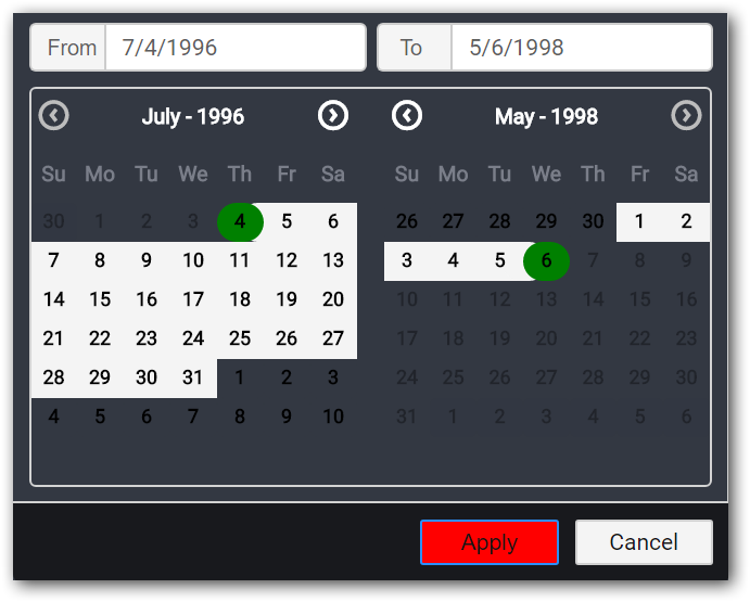
Footer
We can customize the ‘background-color’ for footer.
For example, we can customize the background color for footer in datepicker widget. Below code snippet represent to change the background color.
"footer":
{
  "background-color": "green",
},
The following image illustrates the applied footer color for datepicker.
Button
We can customize the below properties in button section.
- applybutton-color
- applybutton-font-color
- cancelbutton-color
- cancelbutton-font-color
For example, we can customize the apply button color. Below code snippet represent to change the apply font color.
"button":
{
  "applybutton-color": "red",
  "applybutton-font-color": "white",
  "cancelbutton-color": "#f4f4f4",
  "cancelbutton-font-color": "#161616"
},
The following image illustrates the applied apply button color for datepicker.
FontSettings
We can customize the ‘font-size’ property in datepicker section.
For example, we can customize the font size for textbox and calendar in datepicker. Below code snippet represent to change the font size.
"fontSettings":
{
 "font-size": "16px"
},
The following image illustrates the applied font size for datepicker.

Bubble map
Sections
We can customize the below sections in bubble map.
- Shape
- Hover
- Bubble
- FontSettings
Shape
We can customize the below properties in shape section.
- background-color
- border-color
For example, we can customize the background color for shape. Below code snippet represent to change the background color.
"shape":
{
  "background-color": "green",
   "border-color": "#181a1e",
},
The following image illustrates the applied background color for map shape

Hover
We can customize the below properties while hovering
- background-color
- border-color
For example, we can customize the border color while hovering. Below code snippet represent to change the border color.
"hover":
{
  "background-color": "red",
  "border-color": "blue",
},
The following image illustrates the applied border color for hovering effect.

Bubble
We can customize the ‘background-color’ for bubble.
For example, we can customize the background color. Below code snippet represent to change the background color.
"bubble":
{
  "background-color": "green",
},
The following image illustrates the applied background color for map bubbles.

FontSettings
We can customize the ‘font-size’ property in bubble map section.
For example, we can customize the font size for value label and tooltip. Below code snippet represent to change the font size.
"fontSettings":
{
  "font-size": "16px"
},
The following image illustrates the applied font size for bubble map

ChoroplethMap
Sections
We can customize the below sections in ChoroplethMap widget.
- Shape
- Hover
- Range
- Legend
- FontSettings
Shape
We can customize the below properties in shape section.
- background-color
- border-color
For example, we can customize the background color for shape. Below code snippet represent to change the background color.
"shape":
{
  "background-color": "pink",
  "border-color": "#181a1e",
},
The following image illustrates the applied background color for map shape.

Hover
We can customize the below properties while hovering.
- Background-color
- Border-color
For example, we can customize the border color while hovering. Below code snippet represent to change the border color.
"hover":
{
  "background-color": "red",
  "border-color": "green",
},
The following image illustrates the applied border color for hovering.

Range
We can customize the ‘background-color’ for range. For this we need to enable equal color mapping option.
For example, we can customize the background color for range. Below code snippet represent to change the background color.
"range":
{
  "background-color": ["red", "blue", "green", "pink"]
},
The following image illustrates the applied background color for range.

Legend
We can customize the font color property for treemap legend.
For example, we can customize the font color for legend. Below code snippet represent to change the font color.
"legend":
{
  "legendfont-color":"yellow"
},
The following image illustrates the applied font color for legend.

FontSettings
We can customize the ‘font-size’ property in map section.
For example, we can customize the font size for value label, tooltip and legend settings. Below code snippet represent to change the font size.
"fontSettings":
{
  "font-size": "16px"
},
The following image illustrates the applied font size for map.

TreeMap
Sections
We can customize the below sections in TreeMap widget.
- DrillDownHover
- Select
- DrillDownHeader
- RangeColorMap
- DesaturateColor
- FontSettings
DrillDownHover
We can customize the ‘background color’ property in drilldownhover section.
For example, we can customize the background color for drilldown hover. Below code snippet represent to change the background color.
"drilldownhover":
{
  "background-color": "red",
},
The following image illustrates the applied background color for TreeMap drilldown hover.

Select
We can customize the ‘border-color’ property for selection appearance.
For example, we can customize the border color. Below code snippet represent to change the border color.
"select":
{
  "border-color": "red",
},
The following image illustrates the applied border color for selection appearance.

DrillDownHeader
We can customize the ‘background-color’ property for drilldown header.
For example, we can customize the background color. Below code snippet represent to change the background color.
"drilldownheader":
{
  "background-color": "pink",
},
The following image illustrates the applied background color for drilldown header.

RangeColorMap
We can customize the ‘background-color’ for range color map.
For example, we can customize the background color. Below code snippet represent to change the background color.
"rangecolormap":
{
  "background-color": ["pink", "yellow", "orange"],
},
The following image illustrates the applied background color for range color map.

DesaturateColor
We can customize the ‘background-color’ for desaturated color in TreeMap widget.
For example, we can customize the background color. Below code snippet represent to change the background color.
"desaturatecolor":
{
  "background-color": "pink"
},
The following image illustrates the applied background color for desaturated color.

FontSettings
We can customize the ‘font-size’ property for treemap.
For example, we can customize the font size for drill down header, tooltip, legend and label text. Below code snippet represent to change the font size.
"fontSettings":
{
  "font-size": "16px",
},
The following image illustrates the applied font size for treemap.

RangeNavigator
Sections
We can customize the below sections in RangeNavigator widget.
- Tooltip
- Selected
- Unselected
- Border
- FontSettings
Tooltip
We can customize the below properties in tooltip section.
- Background-color
- font-color
For example, we can customize the background color for tooltip. Below code snippet represent to change the background color.
"tooltip":
{
 "background-color": "green",
 "font-color": "red"
},
The following image illustrates the applied background color for tooltip.

Selected
We can customize the ‘background-color’ for selected portion in RangeNavigator.
For example, we can customize the background color. Below code snippet represent to change the background color.
"selected":
{
  "background-color": "pink",
},
The following image illustrates the applied background color for selected region.

Unselected
We can customize the background-color for unselected region in RangeNavigator.
For example, we can customize the background color. Below code snippet represent to change the background color.
"unselected":
{
  "background-color": "green",
},
The following image illustrates the applied background color for unselected region.
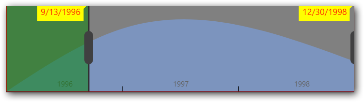
Border
We can customize the border-color for RangeNavigator.
For example, we can customize the border color. Below code snippet represent to change the border color.
"border":
{
  "border-color": "red",
},
The following image illustrates the applied border color for border.

FontSettings
We can customize the ‘font-size’ property in range navigator.
For example, we can customize the font size for tooltip, range text. Below code snippet represent to change the font size.
"fontSettings":
{
 "font-size": "16px"
},
The following image illustrates the applied font size for range navigator.

Gauge
Sections
We can customize the below sections in gauge widget.
- Range1
- Range2
- Data
- FontSettings
Range1
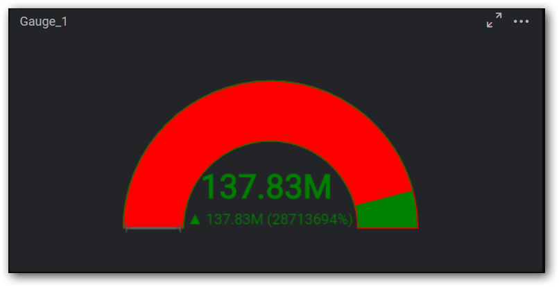
We can customize the below properties in range1 section.
- background-color
- border-color
For example, we can customize the background color. Below code snippet represent to change the background color.
"range1":
{
"background-color": "green",
"border-color": "red"
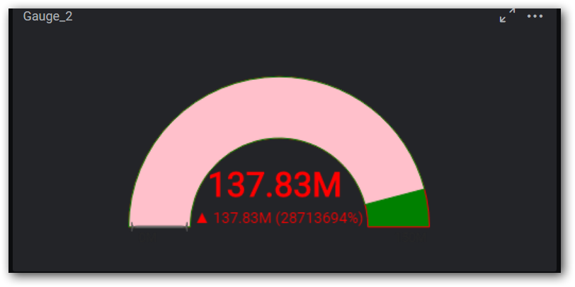
},The following image illustrates the applied background color for range1.

Range2
We can customize the below properties in range2 section.
- Background-color
- border-color
For example, we can customize the border color. Below code snippet represent to change the border color.
"range2":
{
"background-color": "yellow",
 "border-color": "blue"
},
The following image illustrates the applied background color for range2.
Data
We can customize the font-color in data section.
Below code snippet represent to change the font color.
"data":
{
  "font-color": "green"
},
The following image illustrates the applied font color for data.
FontSettings
We can customize the ‘font-size’ property in gauge.
For example, we can customize the font size for data section, tooltip and range value. Below code snippet represent to change the font size.
"fontSettings":
{
  "font-size": "16px"
},
The following image illustrates the applied font size for gauge.

Chart
Sections
We can customize the below sections in chart widget.
- X-axis
- Y-axis
- Axes
- Series
- Tick
- Legend
- FontSettings
X-axis
We can customize the below properties in x-axis section
- xaxisline-color
- primaryxaxis-majorgridlines
- primaryxaxis-fontcolor
- primaryxaxis-titlecolor
- primaryxaxisfont-size
For example, we can customize the primary x-axis font color and font size for x-axis. Below code snippet represent to change the font color.
"x-axis":
{
  "xaxisline-color": "#484c54",
  "primaryxaxis-majorgridlines": "yellow",
  "primaryxaxis-fontcolor": "green",
  "primaryxaxis-titlecolor": "#636363",
  "primaryxaxisfont-size": "14px"
},
The following image illustrates the primary x-axis font color.
Y-axis
we can customize the below properties in y-axis section.
- yaxisline – color
- primaryyaxis-majorgridlines
- primaryyaxis -fontcolor
- primaryyaxis- titlecolor
- primartyyaxixfont-size
For example, we can customize the primary y-axis font color and font-size for y-axis. Below code snippet represent to change the font color, font size.
"y-axis":
{
  "yaxisline-color": "#484C54",
  "primaryyaxis-majorgridlines": "#484C54",
  "primaryyaxis-fontcolor": "blue",
  "primaryyaxis-titlecolor": "#636363",
  "primartyyaxixfont-size": "14px"
},
The following image illustrates the primary y-axis font color.
Axes
we can customize the axis line color for secondary axis.
Below code snippet represent to change the axis line color.
"axes":
{
  "axisline-color": "red"
},
The following image illustrates applied axis line color.

Series
We can customize the below properties in series section.
- Background-color
- font-color
- font-size
For example, we can customize the background color, font color and font size. Below code snippet represent to change the series color and font size.
"series":
{
  "background-color": ["green"],
  "font-color": "red",
  "font-size":"15px"
},
The following image illustrates the applied series font-color and font-size.

Tick
We can customize the major tick color in tick section.
Below code snippet represent to change the tick color.
"tick":
{
  "majortick-color": "red",
},
The following image illustrates the applied tick color.

Legend
We can customize the legend font color property in legend section.
For example, we can customize the legend font color. Below code snippet represent to change the legend font color.
"legend":
{
  "legendfont-color": "red"
},
The following image illustrates the applied legend font color.

FontSettings
We can customize the ‘font-size’ property for chart.
For example, we can customize the font size for x-axis label, y-axis label, tooltip, legend, data label. Below code snippet represent to change the font size.
"fontSettings":
{
  "font-size": "16px"
},
The following image illustrates the font size for chart.

ComboChart
Sections
We can customize the below sections in ComboChart widget.
- X-axis
- y-axis
- Series
- Points
- Legend
- FontSettings
X-axis
We can customize the below properties in x-axis section
- font-color
- title-color
- primaryxaxisfont-size
For example, we can customize the font color and font size. Below code snippet represent to change the font color and font size.
"x-axis":
{
 "font-color": "blue",
 "title-color": "blue",
 "primaryxaxisfont-size": "14px"
},
The following image illustrates the applied x-axis title color, font-color and font size.

Y-axis
We can customize the below properties in y-axis section
- font-color
- title-color
- primartyyaxixfont-size
For example, we can customize the title color, font color and font size. Below code snippet represent to change the title color, font color and font size.
"y-axis":
{
  "font-color": "green",
  "title-color": "red",
  "primartyyaxixfont-size": "15px"
},
The following image illustrates the applied y-axis title color and font size.

Series
We can customize the below properties in series section
- background-color
- font-color
- font-size
For example, we can customize the background color and font size for series and line. Below code snippet represent to change the background color and font size. First one is bar color and second one is line color.
"series":
{
"background-color": ["pink", "red"],
"font-color": "yellow",
"font-size": "15px"
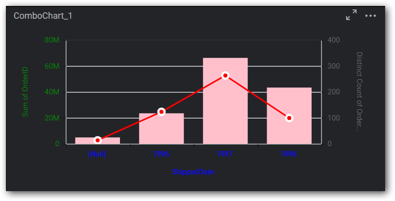
},The following image illustrates the applied series background color and font size.
Legend
We can customize the legend font color property in legend section.
For example, we can customize the legend font color. Below code snippet represent to change the legend font color.
"legend":
{
  "legendfont-color": "red"
},
The following image illustrates the applied legend font color.

FontSettings
We can customize the ‘font-size’ property for chart.
For example, we can customize the font size for x-axis label, y-axis label, tooltip, legend, data label. Below code snippet represent to change the font size.
"fontSettings":
{
  "font-size": "16px"
},
The following image illustrates the font size for chart.

Label
Sections
We can customize the below sections in Label widget.
- Content
Content
We can customize the below properties in label text section
- font-color
- font-size
For example, we can customize the font color and font size in label. Below code snippet represent to change the font color and font size.
"label":
 {
   "font-color": "red",
   "font-size": "16px",
 },
The following image illustrates the applied font color and font size for label widget.

NOTE
We did not provide API for height and width customization due to consideration on view of the layout.
- By using the API “beforeWidgetRender” we can apply customized theme to the widgets.
$('#dashboard').ejDashboardViewer(
        {
            serviceUrl: '@ViewBag.ServiceUrl.ToString()',
            dashboardPath: '@ViewBag.FirstDashboardPath',
            filterParameters: location.search.substr(1),
            enableCustomTheming: true,
            customThemeSettings: themes,
            beforeWidgetRender: ApplyTheme
});- We can apply specific theme which we defined in “widgetThemeSettings” to a widget using the following code snippet.
function ApplyTheme(e) {
        	if (e != null && e.data != null) {
            	if (e.data.controlType == "Grid") {
                		this.applyCustomTheme(e.data, "Theme1");
           		 }
       		}
};- The following image represents “Theme1” settings is applied to Grid widget in dashboard.

How to apply different themes to same widget type
-
We can create multiple theme settings for a widget likewise “Theme1” generate under “widgetThemeSettings”.
-
Different themes can be applied to same type of widgets by using the following code snippet.
function ApplyTheme(e) {
if (e != null && e.data != null) {
if (e.data.controlType == "Grid" && e.data.reportName == "Grid_1") {
this.applyCustomTheme(e.data, "Theme1");
}
if (e.data.controlType == "Grid" && e.data.reportName == "Grid_2") {
this.applyCustomTheme(e.data, "Theme2");
}
}
};- The following image represents “Theme1” and “Theme2” settings is applied to Grid widget. Grid showcased with different font style in the dashboard.

