Tooltip in WPF Sunburst Chart (SfSunburstChart)
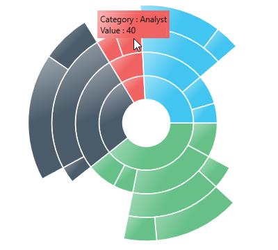
The ToolTip allows you to display any information over a sunburst segment. It appears when the mouse is hovered over or touches any chart segment. By default, it displays the corresponding segment category name and its value. The visibility of the tooltip can be controlled using the ShowToolTip property.
<sunburst:SfSunburstChart.Behaviors>
    <sunburst:SunburstToolTipBehavior ShowToolTip="True"/>
</sunburst:SfSunburstChart.Behaviors>
SunburstToolTipBehavior tooltip = new SunburstToolTipBehavior();
tooltip.ShowToolTip = true;
chart.Behaviors.Add(tooltip);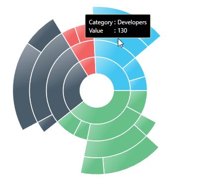
Aligning the ToolTip
The tooltip position can be aligned with respect to the cursor position by using the HorizontalAlignment and VerticalAlignment properties.
HorizontalAlignment
The following code shows how to position the tooltip to the right of the cursor:
<sunburst:SfSunburstChart.Behaviors>
    <sunburst:SunburstToolTipBehavior HorizontalAlignment="Right"/>
</sunburst:SfSunburstChart.Behaviors>
SunburstToolTipBehavior tooltip = new SunburstToolTipBehavior();
tooltip.HorizontalAlignment = HorizontalAlignment.Right;
sunburstChart.Behaviors.Add(tooltip);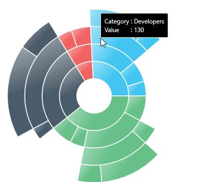
VerticalAlignment
The following code shows how to position the tooltip to the bottom of the cursor:
<sunburst:SfSunburstChart.Behaviors>
    <sunburst:SunburstToolTipBehavior VerticalAlignment="Bottom"/>
</sunburst:SfSunburstChart.Behaviors>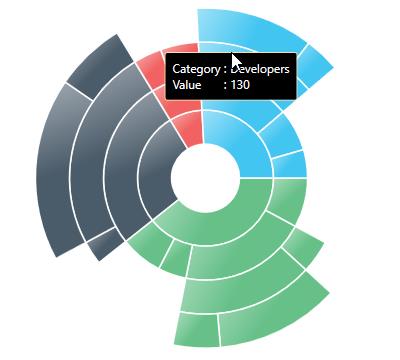
VerticalOffset and HorizontalOffset
The tooltip position can be customized to a custom position from the cursor using the HorizontalOffset and VerticalOffset properties:
<sunburst:SfSunburstChart.Behaviors>
    <sunburst:SunburstToolTipBehavior HorizontalOffset="50" VerticalOffset="50"/>
</sunburst:SfSunburstChart.Behaviors>
SunburstToolTipBehavior tooltip = new SunburstToolTipBehavior();
tooltip.HorizontalOffset = 50;
tooltip.VerticalOffset = 50;
sunburstChart.Behaviors.Add(tooltip);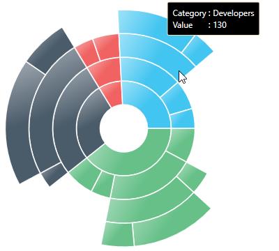
TooltipDuration
You can set the display duration for the tooltip by using the ShowDuration property:
<sunburst:SfSunburstChart.Behaviors>
    <sunburst:SunburstToolTipBehavior ShowDuration="6000"/>
</sunburst:SfSunburstChart.Behaviors>
SunburstToolTipBehavior tooltip = new SunburstToolTipBehavior();
tooltip.ShowDuration = 6000;
chart.Behaviors.Add(tooltip);Show Delay
You can set the initial display delay for the Tooltip by using the InitialShowDelay property as shown in the below code:
<sunburst:SfSunburstChart.Behaviors>
    <sunburst:SunburstToolTipBehavior InitialShowDelay="500"/>
</sunburst:SfSunburstChart.Behaviors>
SunburstToolTipBehavior tooltip = new SunburstToolTipBehavior();
tooltip.InitialShowDelay = 500;
sunburstChart.Behaviors.Add(tooltip);Animation for Tooltip
You can enable the translate animation for the Tooltip by using the EnableAnimation and AnimationDuration properties:
<sunburst:SfSunburstChart.Behaviors>
    <sunburst:SunburstToolTipBehavior EnableAnimation="True" AnimationDuration="5000"/>
</sunburst:SfSunburstChart.Behaviors>
SunburstToolTipBehavior tooltip = new SunburstToolTipBehavior();
tooltip.EnableAnimation = true;
tooltip.AnimationDuration = 5000;
sunburstChart.Behaviors.Add(tooltip);Customize the Tooltip
You can customize the default appearance of the tooltip by applying the TooltipTemplate property:
<sunburst:SunburstToolTipBehavior.ToolTipTemplate>
    <DataTemplate>
        <Border
            Background="{Binding Interior}"
            BorderBrush="{Binding Interior}"
            BorderThickness="4">
            <StackPanel>
                <StackPanel Orientation="Horizontal">
                    <TextBlock Text="Category : "/>
                    <TextBlock Text="{Binding Category}"/>
                </StackPanel>
                <StackPanel Orientation="Horizontal">
                    <TextBlock Text="Value : "/>
                    <TextBlock Text="{Binding Value}"/>
                </StackPanel>
            </StackPanel>
        </Border>
    </DataTemplate>
</sunburst:SunburstToolTipBehavior.ToolTipTemplate>