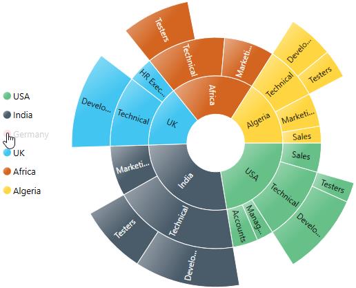
Legend in WPF Sunburst Chart (SfSunburstChart)
The Legend is used to represent the first level of categories in the Sunburst Chart.
You can initialize the legend as in the below code snippet:
<sunburst:SfSunburstChart.Legend>
    <sunburst:SunburstLegend/>
</sunburst:SfSunburstChart.Legend>
SunburstLegend legend = new SunburstLegend();
chart.Legend = legend;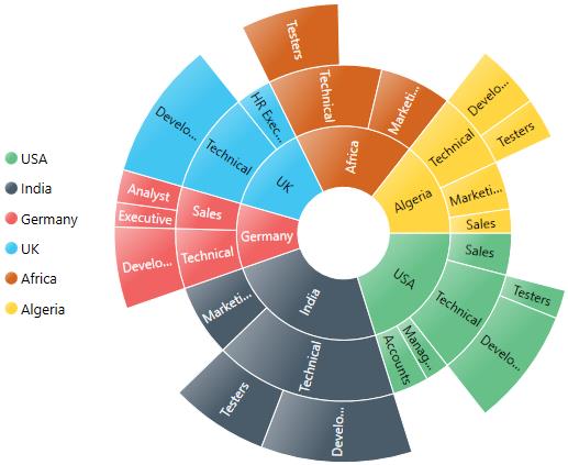
Legend Icon
You can specify different shapes of legend icon by using the LegendIcon property. By default, the legend icon is Circle. The Sunburst Chart has some predefined shapes such as:
- Circle
- Cross
- Diamond
- Pentagon
- Rectangle
- Triangle
<sunburst:SfSunburstChart.Legend>
    <sunburst:SunburstLegend LegendIcon="Pentagon"/>
</sunburst:SfSunburstChart.Legend>
SunburstLegend legend = new SunburstLegend()
{
LegendIcon = SunburstLegendIcon.Pentagon
};
chart.Legend = legend;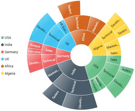
The following properties are used to customize the legend icon size:
-
IconHeight– Gets or sets the double value that represents the icon(s) height. -
IconWidth– Gets or sets the double value that represents the icon(s) width.
You can customize your own legend shape by applying a custom template using the LegendIconTemplate property as shown in the below code:
<Grid.Resources>
    <DataTemplate x:Key="legendTemplate">
        <Path
            Stroke="{Binding Stroke}"
            Stretch="Fill"
            Fill="{Binding Interior}"
            StrokeThickness="{Binding StrokeThickness}"
            Data="F1 M 133.133,45.7109L 154.307,24.5363L 175.482,45.7109L 154.307,66.8856L 175.482,88.0603L 154.307,109.235L 133.133,88.0603L 111.958,109.235L 90.7835,88.0603L 111.958,66.8856L 90.7835,45.7109L 111.958,24.5363L 133.133,45.7109 Z"/>
    </DataTemplate>
</Grid.Resources>

<sunburst:SfSunburstChart.Legend>
    <sunburst:SunburstLegend LegendIcon="Custom" LegendIconTemplate="{StaticResource legendTemplate}"/>
</sunburst:SfSunburstChart.Legend>this.DataContext = new ViewModel();
SfSunburstChart sunburst = new SfSunburstChart();
sunburst.ValueMemberPath = "EmployeesCount";
sunburst.SetBinding(SfSunburstChart.ItemsSourceProperty, "Data");
sunburst.Levels.Add(new SunburstHierarchicalLevel()
{
GroupMemberPath = "Country"
});
sunburst.Levels.Add(new SunburstHierarchicalLevel()
{
GroupMemberPath = "JobDescription"
});
sunburst.Levels.Add(new SunburstHierarchicalLevel()
{
GroupMemberPath = "JobGroup"
});
sunburst.Levels.Add(new SunburstHierarchicalLevel()
{
GroupMemberPath = "JobRole"
});
SunburstLegend legend = new SunburstLegend()
{
LegendIcon = SunburstLegendIcon.Custom,
LegendIconTemplate = this.Resources["legendTemplate"] as DataTemplate
};
sunburst.Legend = legend;
grid.Children.Add(sunburst);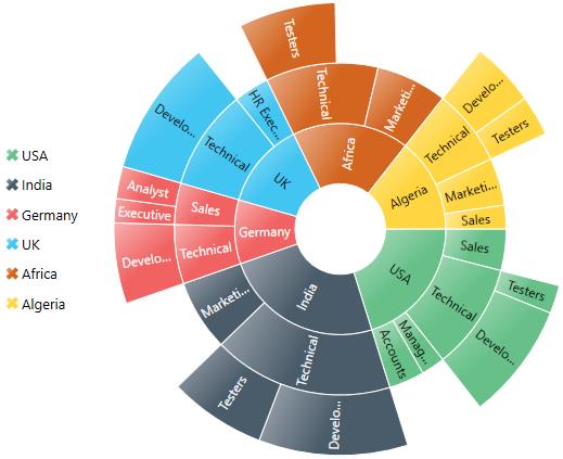
NOTE
You need to set the
LegendIconvalue as Custom in order to apply a custom template.
Positioning the Legend
You can customize the position to left, right, top, bottom for the legend using the DockPosition property as shown in the below code snippet:
<sunburst:SfSunburstChart.Legend>
    <sunburst:SunburstLegend DockPosition="Top"/>
</sunburst:SfSunburstChart.Legend>
SunburstLegend legend = new SunburstLegend()
{
DockPosition = ChartDock.Top
};
chart.Legend = legend;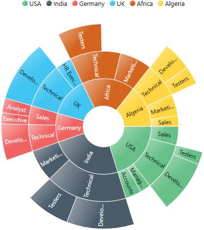
Customize the Legend
You can arrange the legend items smartly by using the ItemPanelTemplate and ItemTemplate properties. The following code shows how to arrange the legend items smartly:
<sunburst:SfSunburstChart.Legend>
    <sunburst:SunburstLegend DockPosition="Top" Margin="0,25,0,0">
        <sunburst:SunburstLegend.ItemsPanel>
            <ItemsPanelTemplate>
                <WrapPanel Height="100" Width="250"/>
            </ItemsPanelTemplate>
        </sunburst:SunburstLegend.ItemsPanel>

        <sunburst:SunburstLegend.ItemTemplate>
            <ItemContainerTemplate>
                <StackPanel
                    Width="75"
                    Height="30"
                    Orientation="Horizontal">

                    <Ellipse
                        Stroke="{Binding Interior}"
                        StrokeThickness="2"
                        Fill="White"
                        Height="10"
                        Width="10"
                        Margin="5">
                    </Ellipse>

                    <TextBlock
                        Text="{Binding Label}"
                        HorizontalAlignment="Center"
                        VerticalAlignment="Center">
                    </TextBlock>
                </StackPanel>
            </ItemContainerTemplate>
        </sunburst:SunburstLegend.ItemTemplate>

    </sunburst:SunburstLegend>
</sunburst:SfSunburstChart.Legend>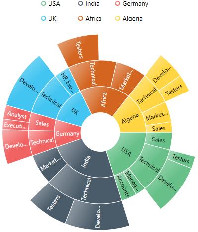
Legend Interactivity
You can select a specific category while clicking on the corresponding legend item through the ClickAction property. It has three types of action:
- ToggleSegmentSelection
- ToggleSegmentVisibility
- None
ToggleSegmentSelection
Used to highlight a specific category while clicking on a legend item:
<sunburst:SfSunburstChart.Legend>
    <sunburst:SunburstLegend ClickAction="ToggleSegmentSelection"/>
</sunburst:SfSunburstChart.Legend>
SunburstLegend legend = new SunburstLegend()
{
ClickAction = LegendClickAction.ToggleSegmentSelection
};
chart.Legend = legend;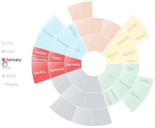
ToggleSegmentVisibility
Used to disable a specific category while clicking on a legend item:
<sunburst:SfSunburstChart.Legend>
    <sunburst:SunburstLegend ClickAction="ToggleSegmentVisibility"/>
</sunburst:SfSunburstChart.Legend>
SunburstLegend legend = new SunburstLegend()
{
ClickAction = LegendClickAction.ToggleSegmentVisibility
};
chart.Legend = legend;