Key Features in WPF Bullet Graph (SfBulletGraph)
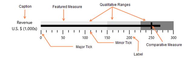
SfBulletGraph is a composite UI element with the following sub-parts:
- Ticks
- Labels
- Caption
- Ranges
- Featured Measure
Ticks
Ticks are scale indicators used to specify the values on the quantitative scale.
Labels
A quantitative scale label specifies the numeric value according to the major ticks in the range of the scale.
Caption
The Caption property of the bullet graph is used to specify a unique label describing the value represented in the bullet graph.
Ranges
A qualitative range is a visual element that ends at a specified RangeEnd at the beginning of the previous range’s RangeEnd. The qualitative ranges are arranged according to each RangeEnd value.
Performance measures
Featured measure
FeaturedMeasure is used to display the primary data, or the current value of the data that you are measuring. It should usually be encoded as a bar, like the bar on a bar graph, and be prominent.
Comparative measure
ComparativeMeasure should be less visually dominant than the featured measure. It should always be encoded as a short line that runs perpendicular to the orientation of the graph. A good example would be a target for YTD revenue. Whenever the featured measure intersects a comparative measure, the comparative measure should appear behind the featured measure.
Bullet graph types
The bullet graph types can be differentiated by their orientation. The control direction may be horizontal or vertical.
Easy to use
SfBulletGraph is available in the Visual Studio toolbox itself, so you can easily drag and drop the control from the toolbox.
Data Binding Support
The control can be bound to your application data from a variety of data sources in the form of a binding declaration or by setting its properties directly.
MVVM support
The Model-View-ViewModel (MVVM) pattern should be followed to get better control customization.
SfBulletGraph Elements