Blazor TreeMap Style and Appearance
Style and Appearance provide options to customize the visual design of the Syncfusion Blazor TreeMap component, ensuring consistency with your application’s branding and theme.
By using CSS selectors and ID-based styling, you can customize colors, typography, spacing, borders, and other visual properties of TreeMap items, labels, and SVG elements.
Basic TreeMap Setup
@using Syncfusion.Blazor.TreeMap

<SfTreeMap DataSource="GrowthReports"
           TValue="GDPReport"
           WeightValuePath="GDP">
    <TreeMapLeafItemSettings LabelPath="CountryName">
        <TreeMapLeafLabelStyle Color="#000000" />
        <TreeMapLeafBorder Color="#000000" Width="0.5" />
    </TreeMapLeafItemSettings>
</SfTreeMap>

@code {
    public class GDPReport
    {
        public string CountryName { get; set; }
        public double GDP { get; set; }
        public double Percentage { get; set; }
        public int Rank { get; set; }
    }

    public List<GDPReport> GrowthReports = new()
    {
        new GDPReport { CountryName = "United States", GDP = 17946, Percentage = 11.08, Rank = 1 },
        new GDPReport { CountryName = "China", GDP = 10866, Percentage = 28.42, Rank = 2 },
        new GDPReport { CountryName = "Japan", GDP = 4123, Percentage = -30.78, Rank = 3 },
        new GDPReport { CountryName = "Germany", GDP = 3355, Percentage = -5.19, Rank = 4 },
        new GDPReport { CountryName = "United Kingdom", GDP = 2848, Percentage = 8.28, Rank = 5 },
        new GDPReport { CountryName = "France", GDP = 2421, Percentage = -9.69, Rank = 6 },
        new GDPReport { CountryName = "India", GDP = 2073, Percentage = 13.65, Rank = 7 },
        new GDPReport { CountryName = "Italy", GDP = 1814, Percentage = -12.45, Rank = 8 },
        new GDPReport { CountryName = "Brazil", GDP = 1774, Percentage = -27.88, Rank = 9 },
        new GDPReport { CountryName = "Canada", GDP = 1550, Percentage = -15.02, Rank = 10 }
    };
}
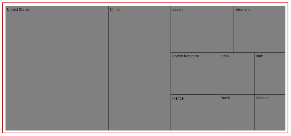
Customize TreeMap Root Element
You can apply global styles such as borders, padding, and background color to the TreeMap container:
[id] {
    border: 2px solid red;
}
Customize TreeMap Item Rectangles (RectPath)
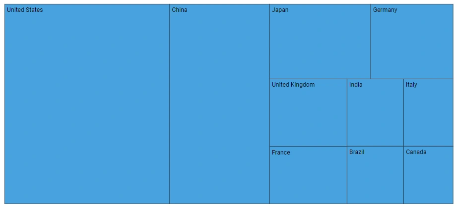
Each TreeMap item rectangle is rendered as an SVG path element. These elements contain RectPath in their ID, allowing targeted customization.
Item Rectangle Styling
[id*="RectPath"] {
    fill: #3498db;
    stroke: #2c3e50;
    stroke-width: 1;
    opacity: 0.9;
}
Level-Based Rectangle Styling
/* Level 0 items */
[id*="_Level_Index_0_"] [id*="RectPath"] {
    fill: #e74c3c;
    opacity: 0.85;
}

/* Level 1 items */
[id*="_Level_Index_1_"] [id*="RectPath"] {
    fill: #3498db;
    opacity: 0.8;
}

/* Level 2 items */
[id*="_Level_Index_2_"] [id*="RectPath"] {
    fill: #2ecc71;
    opacity: 0.75;
}
Item Index-Based Rectangle Styling
/* First item in each level */
[id*="_Item_Index_0_RectPath"] {
    fill: #f39c12;
}

/* Second item in each level */
[id*="_Item_Index_1_RectPath"] {
    fill: #9b59b6;
}

/* Third item in each level */
[id*="_Item_Index_2_RectPath"] {
    fill: #1abc9c;
}
Combined Level and Item Styling
Apply styles to specific combinations of level and item indices:
/* Level 0, Item 0 - Featured item */
[id*="_Level_Index_0_Item_Index_0_RectPath"] {
    fill: #f39c12;
    stroke: #d68910;
    stroke-width: 3;
    filter: drop-shadow(0 4px 8px rgba(0,0,0,0.3));
}

/* Level 1, Item 1 - Secondary featured */
[id*="_Level_Index_1_Item_Index_1_RectPath"] {
    fill: #e74c3c;
    stroke: #c0392b;
    stroke-width: 2;
}
Customize TreeMap Item Text
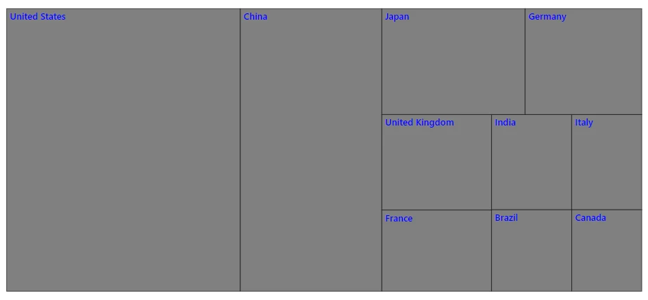
TreeMap text elements contain Text in their IDs and can be styled independently.
Item Text Styling
[id*="Text"] {
    fill: #2c3e50;
    font-size: 14px;
    font-weight: 500;
    font-family: "Segoe UI", Arial, sans-serif;
}
Level-Based Text Styling
/* Level 0 text */
[id*="_Level_Index_0_"] [id*="Text"] {
    fill: #ffffff;
    font-size: 16px;
    font-weight: 700;
}

/* Level 1 text */
[id*="_Level_Index_1_"] [id*="Text"] {
    fill: #2c3e50;
    font-size: 13px;
    font-weight: 600;
}

/* Level 2 text */
[id*="_Level_Index_2_"] [id*="Text"] {
    fill: #34495e;
    font-size: 11px;
    font-weight: 400;
}
Item Index-Based Text Styling
/* First item text in each level */
[id*="_Item_Index_0_Text"] {
    fill: #ffffff;
    font-weight: 700;
}

/* Second item text in each level */
[id*="_Item_Index_1_Text"] {
    fill: #ecf0f1;
    font-weight: 600;
}

/* Third item text in each level */
[id*="_Item_Index_2_Text"] {
    fill: #95a5a6;
    font-weight: 500;
}
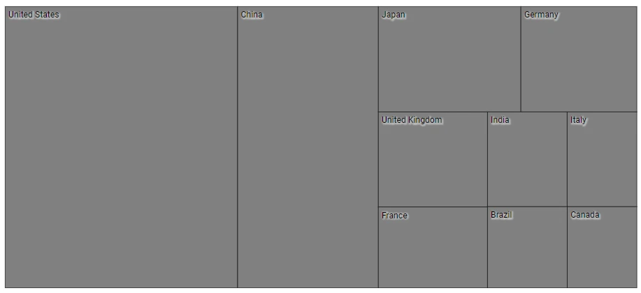
Text Contrast Enhancement
[id*="Text"] {
    text-shadow: 1px 1px 2px rgba(255, 255, 255, 0.5);
    paint-order: stroke;
    stroke: rgba(0, 0, 0, 0.1);
    stroke-width: 3px;
}
Hover and Interactive States
You can improve interactivity by styling hover states:
/* Hover effect on rectangles */
[id*="RectPath"]:hover {
    opacity: 1;
    filter: brightness(1.15);
    transition: all 0.3s ease;
}

/* Text visibility on hover */
[id*="RectPath"]:hover ~ [id*="Text"] {
    font-weight: 700;
    fill: #ffffff;
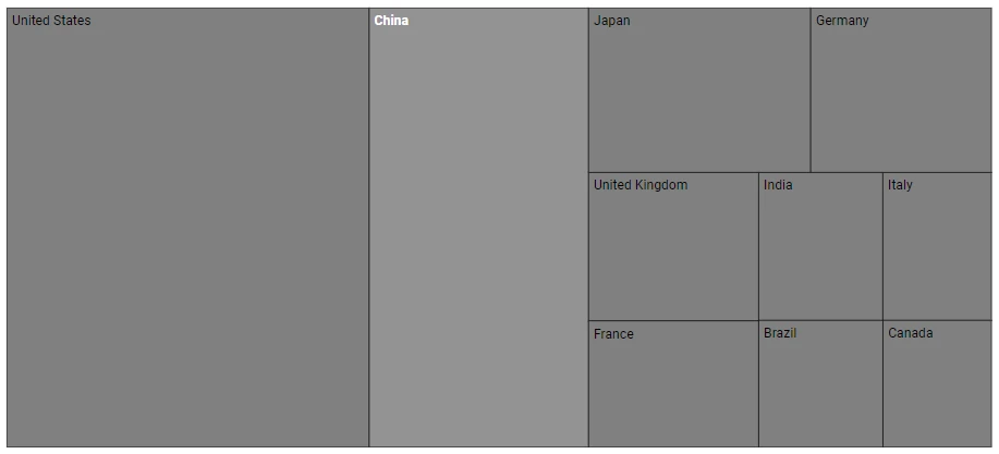
}
NOTE
SVG presentation attributes such as fill, stroke, and font-size may require !important when overridden by inline SVG styles.