Getting Started with Blazor Circular Gauge in Server App
This section briefly explains how to include the Blazor Circular Gauge component in a Blazor Server App using Visual Studio, Visual Studio Code, and the .NET CLI.
Create a new Blazor Server App
Create a Blazor Server App by using the Blazor Web App template in Visual Studio via Microsoft Templates or the Blazor Extension.
Run the following command to create a new Blazor Server App.
dotnet new blazor -o BlazorApp --interactivity Server
cd BlazorApp
Alternatively, create a Blazor Server App using Visual Studio Code via Microsoft Templates or the Blazor Extension, or the C# Dev Kit extension.
Run the following command to create a new Blazor Server App.
dotnet new blazor -o BlazorApp --interactivity Server
cd BlazorApp
NOTE
Configure the appropriate Interactive render mode and Interactivity location while creating a Blazor Server App. For detailed information, refer to the interactive render mode documentation.
Install the required Blazor package
Install the Syncfusion.Blazor.CircularGauge NuGet package. All Syncfusion Blazor packages are available on nuget.org. See the NuGet packages topic for details.
- Go to Tools → NuGet Package Manager → Manage NuGet Packages for Solution.
- Search the required NuGet package (
Syncfusion.Blazor.CircularGauge) and install it.
Alternatively, you can install the same package using the Package Manager Console with the following commands.
Install-Package Syncfusion.Blazor.CircularGauge -Version 34.2.2Open the terminal and run the following commands.
dotnet add package Syncfusion.Blazor.CircularGauge -v 34.2.2Open the command prompt and run the following commands.
dotnet add package Syncfusion.Blazor.CircularGauge -v 34.2.2Add import namespaces
After the package is installed, open the ~/Components/_Imports.razor file and import the Syncfusion.Blazor and Syncfusion.Blazor.CircularGauge namespaces.
@using Syncfusion.Blazor
@using Syncfusion.Blazor.CircularGauge
Register the Blazor service
Open the Program.cs file in Blazor Server App and register the Blazor service.
....
using Syncfusion.Blazor;
....
builder.Services.AddSyncfusionBlazor();
....
Add script resource
The script can be accessed from NuGet through Static Web Assets. Include the script references in the ~/Components/App.razor file.
<script src="_content/Syncfusion.Blazor.Core/scripts/syncfusion-blazor.min.js" type="text/javascript"></script>Add Blazor Circular Gauge component
Open a Razor file located in the ~/Components/Pages/*.razor (for example, Home.razor) and add the Blazor Circular Gauge component inside the razor file.
NOTE
If the interactivity location is set to
Per page/component, define a render mode at the top of the razor file. (For exampleInteractiveServer). If the Interactivity is set toGlobal, the render mode is automatically configured in theApp.razorfile by default.
@rendermode InteractiveServer

<SfCircularGauge>
    <CircularGaugeAxes>
        <CircularGaugeAxis>
            <CircularGaugePointers>
                <CircularGaugePointer></CircularGaugePointer>
            </CircularGaugePointers>
        </CircularGaugeAxis>
    </CircularGaugeAxes>
</SfCircularGauge>
Run the application
Press Ctrl+F5 (Windows) or ⌘+F5 (macOS) to launch the application. The Blazor Circular Gauge component will render in your default web browser.
Open the terminal and run the following command.
dotnet runOpen the command prompt and run the following command.
dotnet run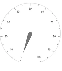
Set pointer value
Pointers are used to indicate values on an axis. You can change the pointer value using the Value property in Circular Gauge Pointer.
NOTE
In Circular Gauge, you can configure multiple axes. On each axis, you can add a pointer.
<SfCircularGauge>
    <CircularGaugeAxes>
        <CircularGaugeAxis>
            <CircularGaugePointers>
                <CircularGaugePointer Value="35">
                </CircularGaugePointer>
            </CircularGaugePointers>
        </CircularGaugeAxis>
    </CircularGaugeAxes>
</SfCircularGauge>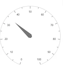
Adding title for Blazor Circular Gauge
Title can be added to the Circular Gauge to provide quick information to the users about the context of the rendered Circular Gauge. You can add a title using Title property in SfCircularGauge.
<SfCircularGauge Title="Speedometer">
    <CircularGaugeTitleStyle Color="blue" FontWeight="bold" Size="25"></CircularGaugeTitleStyle>
    <CircularGaugeAxes>
        <CircularGaugeAxis>
            <CircularGaugePointers>
                <CircularGaugePointer>
                </CircularGaugePointer>
            </CircularGaugePointers>
        </CircularGaugeAxis>
    </CircularGaugeAxes>
</SfCircularGauge>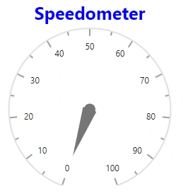
Adding ranges in the Blazor Circular Gauge
Range is used to specify a group of scale values in the gauge. You can set the range start and end using Start and End properties in the Circular Gauge Range.
<SfCircularGauge>
    <CircularGaugeAxes>
        <CircularGaugeAxis>
            <CircularGaugeRanges>
                <CircularGaugeRange Start="40" End="80">
                </CircularGaugeRange>
            </CircularGaugeRanges>
            <CircularGaugePointers>
                <CircularGaugePointer>
                </CircularGaugePointer>
            </CircularGaugePointers>
        </CircularGaugeAxis>
    </CircularGaugeAxes>
</SfCircularGauge>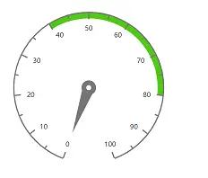
NOTE