Getting started
1 Nov 20166 minutes to read
Preparing HTML document
The Tooltip control has the following list of external JavaScript dependencies.
-
jQuery 1.7.1 and later versions
-
jQuery.easing - to support animation effects in the components
Refer to the internal dependencies in the following table.
| File | Description/Usage |
|---|---|
| ej.core.min.js | It is referred always before using all the JS controls. |
| ej.tooltip.min.js | The Tooltip's main file. |
To get started, you can use the ej.web.all.min.js file that encapsulates all the ej controls and frameworks in one single file.
Create a Tooltip
Before we start with Tooltip, please refer this page page for general information regarding integrating Syncfusion widget’s.
For quick start, we already configured a template project in GitHub repository syncfusion-template-repository. Run the below set of commands to clone the repository and install the required packages for Syncfusion Aurelia application.
> git clone "https://github.com/aurelia-ui-toolkits/syncfusion-template-repository"
    > cd syncfusion-template-repository
    > npm install
    > jspm install
The below steps describes to create Syncfusion Aurelia Tooltip component.
Create Tooltip folder inside src/samples/ location.
Create Tooltip.html file inside src/samples/Tooltip folder and use the below code example to render the Tooltip component.
The Tooltip can be created from any HTML element with the HTML id attribute and pre-defined options set to it. To create the Tooltip, you should call the ejTooltip jQuery plug-in function with the options as parameter. Refer to the following code example.
<template>
<div>
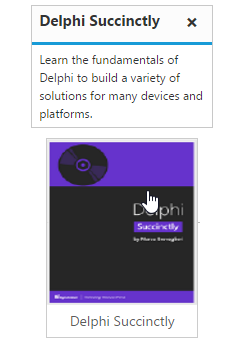
<div class="img" id="sample" ej-tooltip="e-content.bind:content;">
<img src="http://js.syncfusion.com/demos/web/images/tooltip/template-05.png" alt="Delphi">
<div class="desc">Delphi Succinctly</div>
</div>
</template>export class Tooltip {
constructor() {
this.content = "Learn the fundamentals of Delphi to build a variety of solutions for many devices and platforms.";
}
}Apply the following style sheet
<style>
       div.img {
        border: 1px solid #ccc;
        width: 159px;
        height: 213px;
        left: 35%;
        position: relative;
        top: 20%;
      }
     div.img img {
        width: 159px;
        height: 179px;
       }
     div.desc {
        padding: 8px;
        text-align: center;
       }
    </style>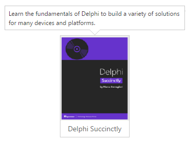
Setting Dimensions
Tooltip dimensions can be set using width and height API.
<template>
        <div>
	     TypeScript lets you write <a  id="link1" ej-tooltip="e-content.bind:content;e-width:200px;e-height:100px"><u>JavaScript</u> </a>the way you really want to.
         </div>
	 </template>
// Creates the Tooltipexport class Tooltip {
constructor() {
this.content = "JavaScript is the programming language of HTML and the Web.";
}
}Tooltip Appearance
You can configure the appearance of the Tooltip with the title, close button and call out as your application requires.
<template>
          <div>
          <div class="img" id="sample" ej-tooltip="e-content.bind:content;e-width:200px;e-height:100px;e-title:Delphi Succintly;e-close-mode:sticky;e-is-balloon:false">
          <img src="http://js.syncfusion.com/demos/web/images/tooltip/template-05.png" alt="Delphi">
          <div class="desc">Delphi Succinctly</div>
          </div>
	  </template>

// Creates the Tooltip
Apply the following styles to show the Tooltip.
<style>
       div.img {
        border: 1px solid #ccc;
        float: left;
        box-sizing: border-box;
        height: 200px;
        width: 146px;
         }
        div.img img{
        width: 100%;
        height: 166px;
        }
       div.desc {
        padding: 6px;
        text-align: center;
         }
    </style>