Getting Started
12 Jun 201814 minutes to read
Before we start with the Ribbon, please refer this page page for general information regarding integrating Syncfusion widget’s.
For quick start, we already configured a template project in GitHub repository syncfusion-template-repository. Run the below set of commands to clone the repository and install the required packages for Syncfusion Aurelia application.
> git clone "https://github.com/aurelia-ui-toolkits/syncfusion-template-repository"
    > cd syncfusion-template-repository
    > npm install
    > jspm install
The below steps describes to create Syncfusion Aurelia Ribbon component.
Create ribbon folder inside src/samples/ location.
Create ribbon.html file inside src/samples/ribbon folder and use the below code example to render the Ribbon component.
<template>
    <require from="syncfusion-javascript/Content/ej/web/ribbon-css/ej.icons.css!"></require>
    <div>
      <ej-ribbon id="Ribbon">      </ej-ribbon>
    </div>
</template>- Create
ribbon.jsfile insidesrc/samples/ribbonfolder with below code snippet.
export class Ribbon {

            constructor() {}

    }
NOTE
- Ribbon’s sample level icons can be loaded using
ej.icons.CSSfrom the location “syncfusion-javascript/Content/ej/web/ribbon-css”.
Control Initialization
Ribbon can be initialized with Application Tab and UL list is needed for binding menu to application menu which can be specified through menuItemID which denotes id of UL.
Define the Application Tab with type as menu to render simple Ribbon control. Add the template contents which is required for rendering application menu and split button.
<template>
    <require from="syncfusion-javascript/Content/ej/web/ribbon-css/ej.icons.css!"></require>
    <div>
      <ej-ribbon id="Ribbon" e-width="500px" e-application-tab.bind="ApplicationTab">      </ej-ribbon>
      <ul id="ribbonMenu">
         <li>
            <a>FILE</a>
            <ul>
               <li><a>New</a></li>
               <li><a>Open</a></li>
               <li><a>Save</a></li>
               <li><a>Print</a></li>
            </ul>
         </li>
      </ul>
       <ul id="split">
        <li><span>Paste</span></li>
      </ul>
    </div>
    </template>
Configure the e-application-tab bind value this.ApplicationTab in Aurelia view-model as shown in the following code.
export class Ribbon {
        constructor() {
            this.ApplicationTab = {  type: ej.Ribbon.ApplicationTabType.Menu , menuItemID:"ribbonMenu" };
        }
    }
NOTE
Set the required
widthto Ribbon, else default parent container or window width will be considered.
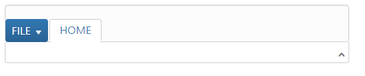
Adding Tabs
Tab is a set of related groups which are combined into single item. For creating Tab, id and text properties should be specified.
<template>
    <require from="syncfusion-javascript/Content/ej/web/ribbon-css/ej.icons.css!"></require>
    <div>
      <ej-ribbon id="Ribbon" e-width="500px" e-application-tab.bind="ApplicationTab" e-tabs.bind="Tabs">      </ej-ribbon>
      <ul id="ribbonMenu">
         <li>
            <a>FILE</a>
            <ul>
               <li><a>New</a></li>
               <li><a>Open</a></li>
               <li><a>Save</a></li>
               <li><a>Print</a></li>
            </ul>
         </li>
      </ul>
      <ul id="split">
        <li><span>Paste</span></li>
      </ul>
    </div>
    </template>
Configure the e-tabs bind value this.Tabs in Aurelia view-model as shown in the following code.
export class Ribbon {
        constructor() {
            this.ApplicationTab = {  type: ej.Ribbon.ApplicationTabType.Menu , menuItemID:"ribbonMenu" };
            this.Tabs = [{ id: 'home', text: 'HOME'}];
        }
    }
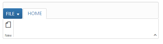
Configuring Groups
List of controls are combined as logical groups into Tab. Group alignment type as row/column, Default is row.
Create group item with text specified and add content group to Groups collection with ejButton control settings.
Configure the e-tabs bind value this.Tabs with group and button named as New.
export class Ribbon {
        constructor() {
            this.ApplicationTab = {  type: ej.Ribbon.ApplicationTabType.Menu , menuItemID:"ribbonMenu" };
            this.Tabs = [{ id: 'home', text: 'HOME',groups: [{
                text: "New",
                content: [{
                    groups: [{
                        id: "new",
                        text: "New",
                        buttonSettings: {
                            contentType: ej.ContentType.ImageOnly,
                            prefixIcon: "e-icon e-ribbon e-new",
                        }
                    }]
                }]
            }]
            }];
        }
    }
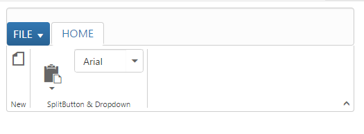
Adding Controls to Group
Syncfusion JavaScript Controls can be added to group’s content with corresponding type specified like button, split button, toggle button, dropdown list, gallery, custom, etc. Default type is button.
Configure the e-tabs bind value this.Tabs with groups, button , split button and dropdown controls.Also the datasource to dropdown control is configured with bind name fontFamily.Please refer to the following code snippets.
export class Ribbon {
        constructor() {
            let fontFamily = [{ value: 1, text: "Segoe UI" }, { value: 2, text: "Arial" }];
            this.ApplicationTab = {  type: ej.Ribbon.ApplicationTabType.Menu , menuItemID:"ribbonMenu" };
            this.Tabs = [{ id: 'home', text: 'HOME',groups: [{
                text: "New",
                content: [{
                    groups: [{
                        id: "new",
                        text: "New",
                        buttonSettings: {
                            contentType: ej.ContentType.ImageOnly,
                            prefixIcon: "e-icon e-ribbon e-new",
                        }
                    }]
                }]
            },{
                text: "SplitButton & Dropdown",
                alignType: ej.Ribbon.alignType.columns,
                content: [{
                    groups: [{
                        id: "paste",
                        text: "paste",
                        // split button settings
                        splitButtonSettings: {
                            contentType: ej.ContentType.ImageOnly,
                            targetID: "split",
                            prefixIcon: "e-ribbon e-ribbonpaste",
                            buttonMode: "dropdown",
                            arrowPosition: "bottom"
                        }
                    }],
                    defaults: {
                        type: ej.Ribbon.type.splitButton,
                        width: 50,
                        height: 70
                    }
                }, {
                    groups: [{
                        id: "fontFamily",
                        // dropdown list settings
                        type: ej.Ribbon.type.dropDownList,
                        dropdownSettings: {
                            dataSource: fontFamily,
                            value: "1",
                            width: 100
                        }
                    }]
                }]
            }]
            }];
        }
    }