How can I help you?
Getting Started
Before we start with the Grid, please refer this page page for general information regarding integrating Syncfusion widget’s.
For quick start, we already configured a template project in GitHub repository syncfusion-template-repository. Run the below set of commands to clone the repository and install the required packages for Syncfusion Aurelia application.
> git clone "https://github.com/aurelia-ui-toolkits/syncfusion-template-repository"
    > cd syncfusion-template-repository
    > npm install
    > jspm install
The below steps describes to create Syncfusion Aurelia Grid component.
Create grid folder inside src/samples/ location.
Create grid.html file inside src/samples/grid folder and use the below code example to render the Grid component.
Properties can be defined with `e-` prefix and long text properties needs to separated by `-`. E.g. ( `e-field` , `e-header-text`).
<template>
    <div>
        <ej-grid e-data-source.bind="shipDetails" >

        </ej-grid>
    </div>
</template>- Create
grid.jsfile insidesrc/samples/gridfolder with below code snippet.
export class Grid {

            constructor() {
			    this.shipDetails = [
				       { Name: 'Hanari Carnes', City: 'Brazil' },
                       { Name: 'Split Rail Beer & Ale', City: 'USA' },
                       { Name: 'Ricardo Adocicados', City: 'Brazil' }
			    ]
			}

    }
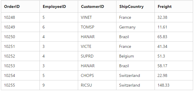
Data binding
Data binding in the grid is achieved by assigning an array of JavaScript objects to the dataSource property. Refer to the following code example.
<template>
    <div>
        <ej-grid e-data-source.bind="gridData" e-columns.bind="cols">
        </ej-grid>
    </div>
    </template>
Configure the e-data-source bind value this.gridData in Aurelia view-model as shown in the following code.
import 'http://js.syncfusion.com/demos/web/scripts/jsondata.min.js';
    export class Grid {

            constructor() {
			    this.gridData = window.gridData;
                this.cols = ["OrderID", "EmployeeID", "CustomerID", "ShipCountry", "Freight"];
			}
    }
Enable Paging
Paging can be enabled by setting the e-allow-paging to true. This adds the pager in the bottom of the grid and page size can be customized by using the e-page-settings property.
<template>
    <div>
        <ej-grid e-data-source.bind="gridData" e-columns.bind="cols" e-allow-paging=true e-page-settings.bind="pageSettings">

        </ej-grid>
    </div>
    </template>
Configure the e-page-settings bind value this.pageSettings in Aurelia view-model as shown in the following code.
import 'http://js.syncfusion.com/demos/web/scripts/jsondata.min.js';
    export class Grid {

            constructor() {
			    this.gridData = window.gridData;
                this.cols = ["OrderID", "EmployeeID", "CustomerID", "ShipCountry", "Freight"];
				this.pageSettings = { pageSize: 8 };
			}
    }
NOTE
Pager settings can be customized by using the
e-page-settingsproperty. When it is not given the default values fore-page-sizeande-page-countare 12 and 8 respectively.

Enable Filtering
Filtering can be enabled by setting the e-allow-filtering to true. By default, the filter bar row is displayed to perform filtering, you can change the filter type by using the e-filter-setting property.
<template>
    <div>
        <ej-grid e-data-source.bind="gridData" e-columns.bind="cols" e-allow-paging=true e-page-settings.bind="pageSettings" e-allow-filtering=true>

        </ej-grid>
    </div>
</template>import 'http://js.syncfusion.com/demos/web/scripts/jsondata.min.js';
export class Grid {
constructor() {
this.gridData = window.gridData;
this.cols = ["OrderID", "EmployeeID", "CustomerID", "ShipCountry", "Freight"];
this.pageSettings = { pageSize: 8 };
}
}
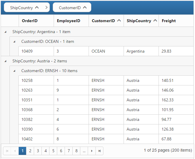
Enable Grouping
Grouping can be enabled by setting the e-allow-grouping to true. Columns can be grouped dynamically by drag and drop the grid column header to the group drop area. The initial grouping can be done by adding required column names in the e-group-settings property.
<template>
    <div>
        <ej-grid e-data-source.bind="gridData" e-columns.bind="cols" e-allow-paging=true e-page-settings.bind="pageSettings" e-allow-grouping=true>

        </ej-grid>
    </div>
</template>import 'http://js.syncfusion.com/demos/web/scripts/jsondata.min.js';
export class Grid {
constructor() {
this.gridData = window.gridData;
this.cols = ["OrderID", "EmployeeID", "CustomerID", "ShipCountry", "Freight"];
this.pageSettings = { pageSize: 8 };
}
}
Refer to the following code example for initial grouping.
<template>
    <div>
        <ej-grid e-data-source.bind="gridData" e-columns.bind="cols" e-allow-paging=true e-page-settings.bind="pageSettings" e-allow-grouping=true e-group-settings.bind="groupSettings">

        </ej-grid>
    </div>
    </template>
Configure the e-group-settings bind value this.groupSettings in Aurelia view-model as shown in the following code.
import 'http://js.syncfusion.com/demos/web/scripts/jsondata.min.js';
    export class Grid {

            constructor() {
			    this.gridData = window.gridData;
                this.cols = ["OrderID", "EmployeeID", "CustomerID", "ShipCountry", "Freight"];
				this.pageSettings = { pageSize: 8 };
				this.groupSettings= { groupedColumns: ['ShipCountry', 'CustomerID'] };
			}
    }
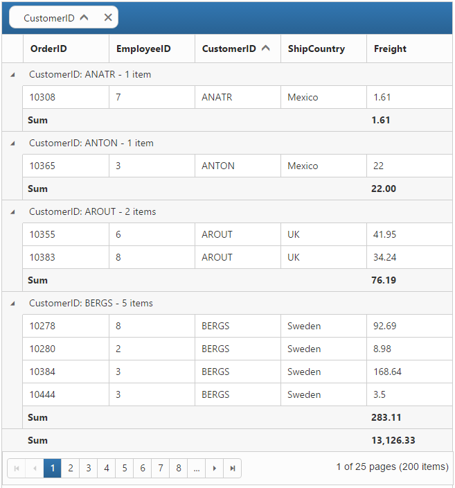
Add Summaries
Summaries can be added by setting the e-show-summary to true and adding required summary rows and columns in the e-summary-rows property. For demonstration, Stock column’s sum value is displayed as summary.
<template>
    <div>
        <ej-grid e-data-source.bind="gridData" e-columns.bind="cols" e-allow-paging=true e-page-settings.bind="pageSettings" e-allow-grouping=true e-group-settings.bind="groupSettings" e-show-summary=true e-summary-rows.bind="summaryRows">

        </ej-grid>
    </div>
    </template>
Configure the e-summary-rows bind value this.summaryRows in Aurelia view-model as shown in the following code.
import 'http://js.syncfusion.com/demos/web/scripts/jsondata.min.js';
    export class Grid {

            constructor() {
			    this.gridData = window.gridData;
                this.cols = ["OrderID", "EmployeeID", "CustomerID", "ShipCountry", "Freight"];
				this.pageSettings = { pageSize: 8 };
				this.groupSettings = { groupedColumns: ["CustomerID"] },
				this.summaryRows = [
				     {
                  	     title: "Sum",
                  	     summaryColumns: [{ summaryType: ej.Grid.SummaryType.Sum, displayColumn: "Freight", dataMember: "Freight" }]
              	     }
				];
			}
    }