Getting Started with Aurelia DropDownList
14 Sep 20235 minutes to read
The external script dependencies of the DropDownList widget are,
- jQuery 1.7.1 and later versions.
- jQuery.easing - to support the animation effects.
And the internal script dependencies of the DropDownList widget are:
| File | Description / Usage |
|---|---|
| ej.core.min.js | Must be referred always before using all the JS controls. |
| ej.data.min.js | Used to handle data operation and should be used while binding data to JS controls. |
| ej.dropdownlist.min.js | The dropdownlist’s main file |
| ej.checkbox.min.js | Should be referred when using checkbox functionalities in DropDownList. |
| ej.scroller.min.js | Should be referred when using scrolling in DropDownList. |
| ej.draggable.min.js | Should be referred when using popup resize functionality in DropDownList. |
For getting started you can use the ‘ej.web.all.min.js’ file, which encapsulates all the ‘ej’ controls and frameworks in one single file.
For themes, you can use the ‘ej.web.all.min.css’ CDN link from the snippet given. To add the themes in your application, please refer this link.
Creating DropDownList in Aurelia
Before we start with DropDownList, please refer this page page for general information regarding integrating Syncfusion widget’s.
For quick start, we already configured a template project in GitHub repository syncfusion-template-repository. Run the below set of commands to clone the repository and install the required packages for Syncfusion Aurelia application.
> git clone "https://github.com/aurelia-ui-toolkits/syncfusion-template-repository"
    > cd syncfusion-template-repository
    > npm install
    > jspm install
The below steps describes to create Syncfusion Aurelia DropDownList component.
Create DropDownList folder inside src/samples/ location.
Create DropDownList.html file inside src/samples/DropDownList folder and use the below code example to render the DropDownList component.
The DropDownList can be created from a HTML ‘input’ element with the HTML ‘id’ attribute and pre-defined options set to it. To create the DropDownList, you should call the ‘ejDropDownList’ jQuery plug-in function.
<template>
      <div>
        <input type="text" id="dropdown1" ej-drop-down-list="e-data-source.bind:dataSource;e-fields.bind:fields;"/>
      </div>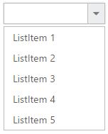
</template>export class DDL{
items= [
{item: 'ListItem 1' }, { item: 'ListItem 2' }, { item: 'ListItem 3' },
{ item: 'ListItem 4' }, { item: 'ListItem 5' }
];
constructor() {
this.fields = {text: 'item'};
this.dataSource = this.items;
}
}
Populating data
The DropDownList can be bounded to both local array and remote data services .You can bind data to DropDownList through services using dataSource property
<template>
      <div>
        <input type="text" id="dropdown1" ej-drop-down-list="e-data-source.bind:dataSource;e-fields.bind:fields;"/>
      </div>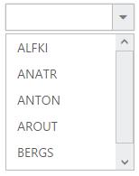
</template>export class DDL{
customers= [
{ id: "1", text: "ALFKI" }, { id: "2", text: "ANATR" }, { id: "3", text: "ANTON" },
{ id: "4", text: "AROUT" }, { id: "5", text: "BERGS" }, { id: "6", text: "BLAUS" }
];
constructor() {
this.fields = {text: 'text',id:'id',value:'text'};
this.dataSource = ej.DataManager(this.customers);
}
}
Setting Dimensions
DropDownList dimensions can be set using width and height API.
<template>
      <div>
        <input type="text" id="dropdown1" ej-drop-down-list="e-data-source.bind:dataSource;e-fields.bind:fields;e-width:200px;e-height:50px"/>
     </div>
   </template>
Setting dimensions to Popup list
PopupWidth and popupHeight can be used to create a fixed size popup list.
<template>
      <div>
        <input type="text" id="dropdown1" ej-drop-down-list="e-data-source.bind:dataSource;e-fields.bind:fields;e-popup-width:200px;e-popup-height:100px"/>
      </div>
  </template>
Setting and Getting Value
You can select single or multiple values from DropDownList widget. To assign a value initially to the DropDownList, you can use value property.
NOTE
To select multiple items based on index, refer here.
<template>
      <div>
        <input type="text" id="dropdown1" ej-drop-down-list="e-data-source.bind:dataSource;e-fields.bind:fields;e-popup-width:200px;e-popup-height:100px;e-value.bind:value" e-on-change.trigger="change($event)" />
     </div>
</template>export class DDL{
items= [
{item: 'ListItem 1', value:"item 1"}, { item: 'ListItem 2',value:"item 2" }, { item: 'ListItem 3',value:"item 3" },
{ item: 'ListItem 4',value:"item 4" }, { item: 'ListItem 5',value:"item 5"}
];
constructor() {
this.fields = {text: 'item' ,value:'value'};
this.dataSource = this.items;
this.value="item 3";
}
change(event) {
var obj=$("#dropdown1").data("ejDropDownList");
console.log("Selected Item's Text - " + obj.option("text"));
console.log("selected Item's Value - " + obj.option("value"));
}
}