Getting Started with ASP.NET Core SplitButton
30 Apr 20211 minute to read
This section explains briefly about how to create a Split Button in ASP.NET Core application.
Create your first Split Button in ASP.NET Core
The HTML button element and the <UL>, <LI> can be easily configured as Essential ASP.NET Core Split Button control. The basic rendering of Essential ASP.NET Core Split Button is achieved by using default functionality. Initially the TargetID is a mandatory one, without this field it acts as normal button on two sides.
Create Split Button Control in ASP.NET Core
Essential ASP.NET Core Split Button control contains built-in features such as Click and different option choosing. You can easily create the Split Button control by using Tag helper as follows.
- You can create a .NetCore Project with the help of the given ASP.NET Core-Getting Started documentation.
-
Add the following code to the corresponding View page to render Split Button.
~~~ cshtml
/ej-Tag Helper code to render SplitButton/
<ej-split-button id="sbutton" text="Save" show-rounded-corner="true" size="Large" target-id="target" />
<li role="presentation" class=""><a data-target="#podj8uxaxryamqpdxqwz968z0y6pocbu-aspx-cs" aria-controls="home" role="tab" data-toggle="tab" data-original-lang="razor">CSHTML</a></li><div role="tabpanel" class="tab-pane" id="podj8uxaxryamqpdxqwz968z0y6pocbu-aspx-cs" data-original-lang = "razor" ><div class="highlight"><pre><code class="language-aspx-cs" data-lang="aspx-cs"><span></span>/*Razor code to render SplitButton*/
@{Html.EJ().SplitButton("sbutton").Text("Save").ShowRoundedCorner(true).Size(ButtonSize.Large).TargetID("target").Render();}</code></pre></div>
</div>
N> To render the SplitButton Control you can use either Razor or Tag helper code as given in the above code snippet.
3. Add the following <UL>, <LI> elements to render Split Button with popup option.
~~~ cshtml
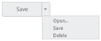
<ul id="target">
<li><span>Open</span></li>
<li><span>Save</span></li>
<li><span>Delete</span></li>
</ul>
Output of the above scripts,