How can I help you?
Getting Started with ASP.NET Core ProgressBar
This section briefly describes how to create a Progress Bar control using ASP.NET Core and learn its features.
Create your first ProgressBar in ASP.NET Core
ASP.NET Core Progress Bar control provides support to display a ProgressBar that allows you to change the process of the ProgressBar animations and flexible APIs. Using the following guidelines, you can create the ProgressBar to validate the Password strength.
The following screenshot illustrates the functionality of a Progress Bar and displays the final result of the Password Strength Validation for your password using Progress Bar.

Progress Bar
Create a Textbox and Progress Bar
ASP.NET Core Progress Bar control indicates the current progress of an operation like uploading a document through a simple interface. You can easily create the Progress bar control using simple Razor code or ej-tag helper as follows.
1.Create an ASP.NET Core Project as given in ASP.NET Core documentation
2.Add the following code to the corresponding view page to render Progress Bar.
<!--ej-Tag Helper code to render Progressbar-->

	  <div class="start">

        <label for="start">Password</label>

       <input type="password" id="password" />

       <ej-progress-bar id="progressBar"value="20" height="20px" width="180px"/>

</div><!--Razor code to render Progressbar-->
<div class="start">
<label for="start">Password</label>
<input type="password" id="password" />
@{Html.EJ().ProgressBar("progressBar").Value(20).Height("20px").Width("180px").Render();
}
</div>NOTE
To render the ProgressBar Control you can use either Razor or Tag helper code as given in the above code snippet.
3.Add the following styles to show the Progress Bar and Textbox.
<style>

	.start
	{

		margin-left: 105px;

		color: green;

		font-size: 18px;

	}

	.control

	{

		margin-bottom: 5px;

		 margin-left: 230px;

	}
	#progressBar

	{

	margin-top: 10px;

	}

	</style>
4.Execute the above code to render the following output.
Find the Strength of the Password
In this scenario, the advancement of the Progress Bar is changed according to the length and special characters present in the text of the password field. This is achieved by binding the change in the properties of your control and by checking the length of the password field.
<script>

	var progresObj, k = 10, i = 0;

	$(document).keydown(function() {

		i = $("#password").val().length;

		if (i < 4)
		{

			progress2();

			$('.e-progress').css({ background: 'red' });

		}
		else if (i > 4 && i < 7)
		{

			progress1();

			$('.e-progress').css({ background: 'yellow' });

		}
		else if (i > 7)
		{

			var pwd = $("#password").val();

			if (/^[a-zA-Z0-9- ]*$/.test(pwd) == false)
			{

				progress();

				$('.e-progress').css({ background: 'green' });

			}

		}

	});

	$(function ()
	{

		progresObj = $("#progressBar").data("ejProgressBar");

	});

	function progress()
	{

		progresObj.option("text", " verystrong");

		progresObj.option("percentage", k + 90);

	}

	function progress1()
	{

		progresObj.option("text", "strong");

		progresObj.option("percentage", k + 50);

	}

	function progress2()
	{

		progresObj.option("percentage", k + 10);

		progresObj.option("text", "weak");

	}
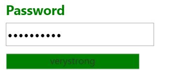
</script>- The progress() function changes the text inside the Progress Bar to Very Strong and percentage to 100, and it is invoked when the length of the text is more than 7 and the text contains a symbol in it. Then it shows the Progress Bar in green color.
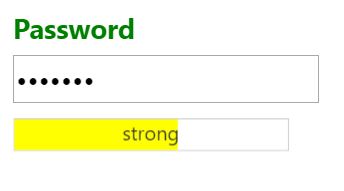
- The progress1() function changes the text inside the Progress Bar to Strong and percentage to 60, and it is invoked when the length of the text is more than 4. Then it shows the Progress Bar in yellow color
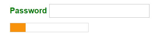
- The progress 2() function changes the text inside the Progress Bar to Weak and percentage to 30, and it is invoked when the length of the text is less than 4. Then it shows the ProgressBar in red color.
The following screenshots displays a Progress Bar control for the above scenario.