How can I help you?
Interaction
Selection
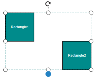
Selector provides a visual representation of selected elements. It behaves like a container and enables you to update the size, position, and rotation angle of the selected elements through interaction and programmatically. Single or multiple elements can be selected at a time.
Single selection
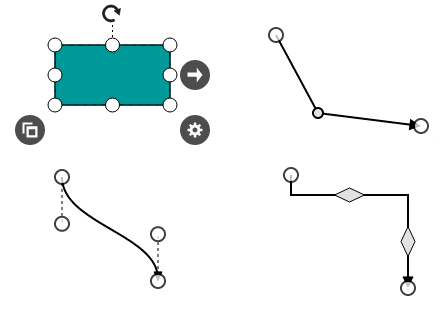
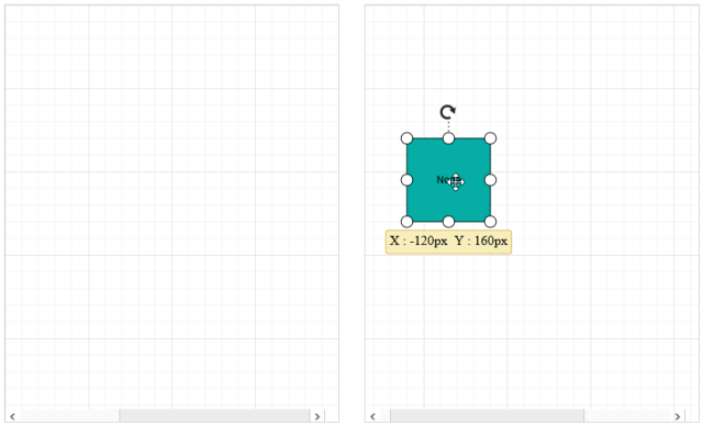
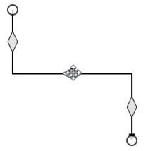
An element can be selected by clicking that element. During single click, all previously selected items are cleared. The following image shows how the selected elements are visually represented.
Selecting a group
When a child element of any group is clicked, its contained group is selected instead of the child element. With consecutive clicks on the selected element, selection is changed from top to bottom in the hierarchy of parent group to its children.
Multiple selection
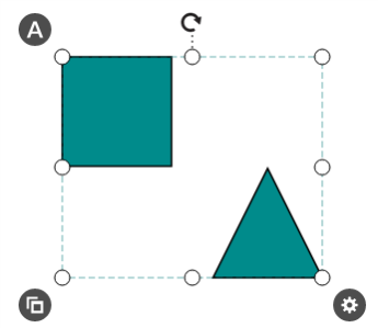
Multiple elements can be selected with the following ways.
-
Ctrl+Click
During single click, any existing item in the selection list be cleared, and only the item clicked recently is there in the selection list. To avoid cleaning the old selected item, Ctrl key must be on hold when clicking.
-
Selection rectangle / Rubber band selection
Clicking and dragging the Diagram area allows to create a rectangular region. The elements that are covered under the rectangular region are selected at the end.
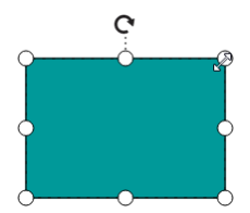
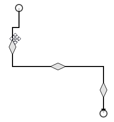
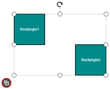
Multiple selected elements are visually represented as shown.
Select/Unselect elements programmatically
The client side methods addSelection, clearSelection and removeSelection help select/unselect elements at runtime. The following code example illustrates how to select/unselect an item through programmatically.
var diagram = $("#DiagramContent").ejDiagram("instance");
var node = diagram.findNode("node1");

//Selects an element
diagram.addSelection(node);

//Clears the current selection
diagram.clearSelection();

//Unselects a particular object
diagram.removeSelection(node);
You can get the current selected items from the children collection of selectedItems property of the Diagram model.
The client side method updateSelector helps you to change the size, position, and rotation angle of the selected elements at runtime. The following code example illustrates how to read the selected items and how to update the position, size, and rotation angle.
var diagram = $("#DiagramContent").ejDiagram("instance");

//Updates the size, position and rotateAngle of selected elements.

diagram.updateSelector({
	offsetX: 200,
	offsetY: 200,
	width: 200,
	height: 200,
	rotateAngle: 200
});

//Iterates the selected elements
for (var i = 0; i < diagram.model.selectedItems.children.length; i++) {
	var child = diagram.model.selectedItems.children[i];
}
NOTE
SelectedItems’s children is a read-only property. You cannot change the children collection at run time.
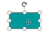
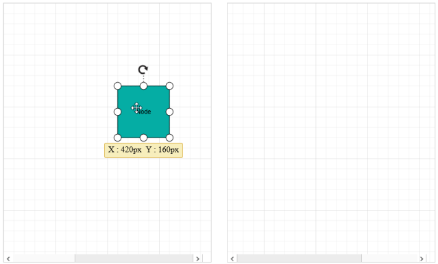
Drag
- An object can be dragged by clicking and dragging it. When multiple elements are selected, dragging any one of the selected elements move every selected element.
- While dragging, the objects are snapped towards the nearest objects to make better alignments. For better alignments, refer to Snapping.
Working with multiple diagrams
Diagram provides support to drag diagram elements from one diagram to another.
If you enable FloatElements constraints to any diagram, it will allow you to drag elements from it and the elements can be dropped into any other diagram.
The following code illustrates how to drag nodes over multiple diagrams.
<body>

        <div id="sourceDiagram">

        </div>


        <div id="targetDiagram">

        </div>

</body>//Enables the FloatElements constraints
var constraints = ej.datavisualization.Diagram.DiagramConstraints.Default | ej.datavisualization.Diagram.DiagramConstraints.FloatElements;
var node = { name: "node1", height: 100, width: 100, offsetX: 100, offsetY: 100, fillColor: "#05ADA4", labels: [{ text: "Node" }] };
//Creates the source
syncApp.controller('sourceDiagram', function ($scope) {
height: "500px",
width: "400px",
$scope.nodes = nodes;
constraints: constraints
});
//Creates the target diagram
syncApp.controller('targetDiagram', function ($scope) {
height: "500px",
width: "400px",
$scope.nodes = nodes;
constraints: constraints
});The following screen short illustrates how the nodes are dragged from one diagram to another.
Resize
- Selector is surrounded by eight thumbs. When dragging these thumbs, selected items can be resized smaller or larger.
- When one corner of the selector is dragged, opposite corner is in a static position.
- While resizing, the objects are snapped towards the nearest objects to make better alignments. For better alignments, refer to Snapping.
Rotate
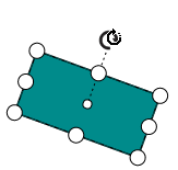
- A rotate handler is placed above the selector. Clicking and dragging the handler in a circular direction lead to rotate the node.
- The node is rotated with reference to the static pivot point.
- Pivot thumb (thumb at the middle of the node) appears while rotating the node to represent the static point.
- For more information about pivot, refer to Position.
Connection editing
- Each segment of a selected connector is editable with some specific handles/thumbs.
End point handles
Source and target points of the selected connectors are represented with two handles. Clicking and dragging those handles help you to adjust the source and target points.
Straight segment editing
- End point of each straight segment is represented by a thumb that enables to edit the segment.
- Any number of new segments can be inserted into a straight line by clicking that when shift and ctrl keys are pressed. (Ctrl+Shift+Click).
- Straight segments can be removed by clicking the segment end point, when ctrl and shift keys are pressed. (Ctrl+Shift+Click).
Orthogonal thumbs
- Orthogonal thumbs allow to adjust the length of adjacent segments by clicking and dragging it.
- When necessary, some segments are added or removed automatically, when dragging the segment. This is to maintain proper routing of orthogonality between segments.
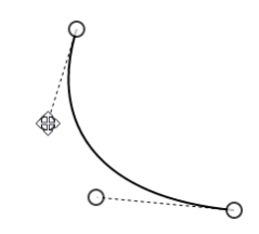
Bezier thumbs
- Bezier segments are annotated with two thumbs to represent the control points. Control points of the curve can be configured by clicking and dragging the control thumbs.
Drag and drop nodes over other elements
Diagram provides support to drop a node/connector over another node/connector. Drop event is raised to notify that an element is dropped over another one and it is disabled by default. It can enabled with the constraints property. The following code illustrates how to enable dropping.
export class ShapesComponent {
    nodes: Array<any>;
	connectors: Array<any>;
    constructor() {
        let nodes = [
            {
                name: "node",
                offsetX: 100,
                offsetY: 100,
                width: 100,
                height: 100,
                fillColor: "#1BA0E2",
                //Enables allow drop for node.
                constraints: ej.datavisualization.Diagram.NodeConstraints.Default | ej.datavisualization.Diagram.NodeConstraints.AllowDrop
            }
        ];
		let connectors = [{
				name: "connector1",
				sourcePoint: { x: 200, y: 50 },
				targetPoint: { x: 300, y: 150 },
				segments: [{ type: "orthogonal", length: 50, direction: "bottom" }],
				//Enables allow drop for connector.
				constraints: ej.datavisualization.Diagram.ConnectorConstraints.Default | ej.datavisualization.Diagram.ConnectorConstraints.AllowDrop,
			}];
        this.nodes = nodes;
		this.connectors = connectors;
    }
}
The following code example illustrates how to insert a child to a group interactively.
export class OndropComponent {
    ondrop: Function;
    constructor() {
        this.drop = function (args) {
			if (args.target && args.element) {
				//Element that is being dropped
				var node = args.element;
				//Element over which another element is dropped
				var target = args.target;
				if (diagram.getObjectType(target) == "group" && diagram.getObjectType(node) == "node") {
					//Inserts the node into group
					node.parent = target.name;
					target.children.push(node.name);
				}
			}
		};
    }
}
User handles
User handles are used to add some frequently used commands around the selector. To create user handles, define and add them to the userHandles collection of selectedItems property.
The tool property of user handle should be set with any appropriate tool to enable interaction.
The following code example illustrates how to draw a user handle.
// Defines a tool to interact with the user handle
var CloneTool = (function (base) {
	ej.datavisualization.Diagram.extend(CloneTool, base);
	// Initializes the tool
	function CloneTool(name) {
		base.call(this, name);
	}
	// Defines the required events
	CloneTool.prototype.mouseup = function (evt) {
		//clones the selected elements when the custom handle is clicked.
		this.diagram.copy();
		//Pastes the cloned elements.
		this.diagram.paste();
		base.prototype.mouseup.call(this, evt);
	};
	return CloneTool;
})(ej.datavisualization.Diagram.ToolBase);

var userHandles = [];
//Initializes the handles
var cloneHandle = ej.datavisualization.Diagram.UserHandle();
// Name of the user handle.
cloneHandle.name = "Clone";
// Sets the tool that you have defined to interact with handle.
cloneHandle.tool = new CloneTool(cloneHandle.name);
userHandles.push(cloneHandle);
//Initializes Diagram
syncApp.controller('diagramCtrl', function ($scope) {
    $scope.selectedItems = {
		userHandles: userHandles
	};
});
Appearance
Position, size, and style of the user handle can be customized with a set of predefined properties.
The following code example illustrates how to customize the appearance of the user handle.
var UserHandlePositions = ej.datavisualization.Diagram.UserHandlePositions;
var userHandles = [];
var cloneHandle = ej.datavisualization.Diagram.UserHandle();
cloneHandle.name = "Clone";
// Sets the position of the user handle.
cloneHandle.position = UserHandlePositions.BottomLeft;
// Sets the user handle visibility.
cloneHandle.visible = true;
// Defines whether user handle should be enabled for multiple selection or not.
cloneHandle.enableMultiSelection = true;
// Sets the size of the user handle.
cloneHandle.size = 30;
// Customizes the appearance of user handle
cloneHandle.backgroundColor = "#4D4D4D";
cloneHandle.pathColor = "white";
cloneHandle.borderColor = "red";
cloneHandle.borderWidth = "2";
cloneHandle.pathData = "M4.6350084,4.8909971 L4.6350084,9.3649971 9.5480137,9.3649971 9.5480137,4.8909971 z M3.0000062,2.8189973 L11.184016,2.8189973 11.184016,10.999997 3.0000062,10.999997 z M0,0 L7.3649998,0 7.3649998,1.4020001 1.4029988,1.4020001 1.4029988,8.0660002 0,8.0660002 0,1.4020001 0,0.70300276 z";
userHandles.push(cloneHandle);

syncApp.controller('diagramCtrl', function ($scope) {
    $scope.selectedItems = {
		userHandles: userHandles
	};
});
Zoom pan
- When a large Diagram is loaded, only certain portion of the Diagram is visible. The remaining portions are clipped. Clipped portions can be explored by scrolling the scrollbars or panning the Diagram.
- Diagram can be zoomed in or out by using Ctrl + mouse wheel.
Keyboard
Diagram provides support to interact with the elements with key gestures. By default, some in-built commands are bound with a relevant set of key combinations.
The following table illustrates those commands with the associated key values.
| Shortcut Key | Command | Description |
|---|---|---|
| Ctrl + A | selectAll | Select all nodes/connectors in diagram |
| Ctrl + C | copy | Copy the diagram selected elements |
| Ctrl + V | paste | Paste the copied elements |
| Ctrl + X | cut | Cut the selected elements |
| Ctrl + Z | undo | Undo(Reverse the last editing action performed on diagram) |
| Ctrl + Y | redo | Redo(Restores the last editing action when no other actions have occurred since the last undo on diagram) |
| Delete | delete | Delete the selected elements |
| Ctrl /Shift+ Click on object | Multiple selection(Selector binds all selected nodes/connectors) | |
| Up Arrow | nudge(“up”) | nudgeUp(move the selected elements towards up by one pixel) |
| Down Arrow | nudge(“down”) | nudgeDown(move the selected elements towards down by one pixel) |
| Left Arrow | nudge(“left”) | nudgeLeft(move the selected elements towards left by one pixel) |
| Right Arrow | nudge(“right”) | nudgeRight(move the selected elements towards right by one pixel) |
| Ctrl+MouseScroll | zoom | Zoom(Zoom in/Zoom out the diagram) |
| F2 | startLabelEditing | Starts to edit the label of selected element |
| Esc | endLabelEditing | Sets the label mode as View and stops editing. |
| Tab | focusToNextItem | Focus the next node/connector based on z-order |
| Shift + Tab | focusToPreviousItem | Focus the previous node/connector based on z-order |
| Enter | selectFocusedItem | Select the focussed node/connector |
To add custom commands, configure or modify key/mouse gesture through Command Manager.