How can I help you?
Selection
Selection provides an interactive support to highlight the row, cell or column that you select. Selection can be done through simple Mouse down or Keyboard interaction. To enable selection, set allowSelection as true.
Types of Selection
There are two types of selections available in grid. They are
- Single
- Multiple
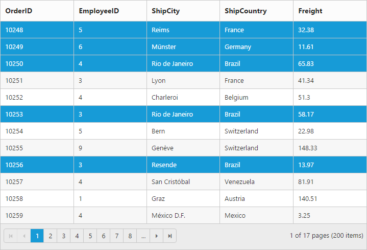
Single Selection
Single selection is an interactive support to select a specific row, cell or column in grid by mouse or keyboard interactions. To enable single selection, set selectionType property as single and also set allowSelection property as true.
Multiple Selections
Multiple selections is an interactive support to select a group of rows, cells or columns in grid by mouse or keyboard interactions. To enable multiple selections, set selectionType property as multiple and also set allowSelection property as true.
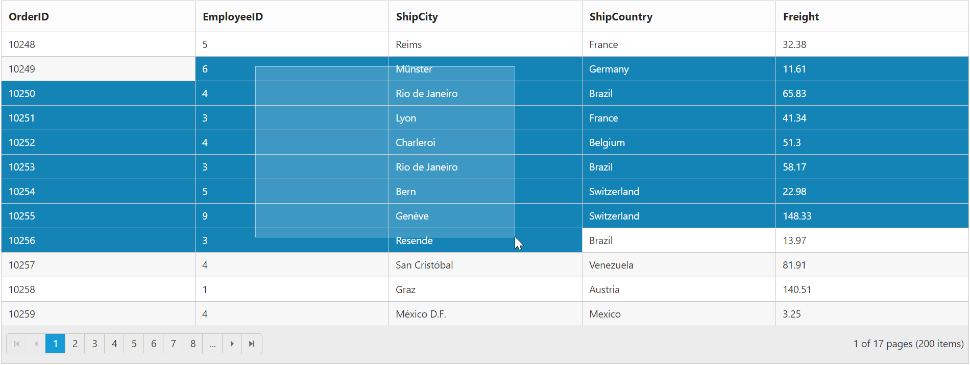
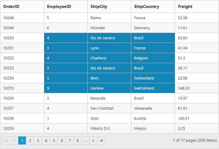
Row Selection
Row selection is enabled by setting selectionMode property of selectionSettings as row. For random row selection, press “Ctrl + mouse left” click and for continuous row selection press “Shift + mouse left” click on the grid rows. To unselect selected rows, press “Ctrl + mouse left” click on selected row.
The following code example describes the above behavior.
<ej-grid id="Grid" [dataSource]="gridData" allowPaging="true" allowSelection="true" selectionType="multiple" [selectionSettings]="selectionMode" >
    <e-columns>
        <e-column field="OrderID"  headerText="OrderID"></e-column>
        <e-column field="EmployeeID" headerText="EmployeeID"></e-column>
        <e-column field="ShipCity" headerText="ShipCity"></e-column>
        <e-column field="ShipCountry" headerText="ShipCountry"></e-column>
        <e-column field="Freight" headerText="Freight"></e-column>
    </e-columns>
</ej-grid>import {Component, ViewEncapsulation} from '@angular/core';
@Component({
selector: 'ej-app',
templateUrl: 'app/app.component.html', //give the path file for Grid control html file.
})
export class AppComponent {
public gridData;
public selectionMode;
constructor()
{
//The datasource "window.gridData" is referred from 'http://js.syncfusion.com/demos/web/scripts/jsondata.min.js'
this.gridData = window.gridData;
this.selectionMode = { selectionMode :["row"] };
}
}The following output is displayed as a result of the above code example
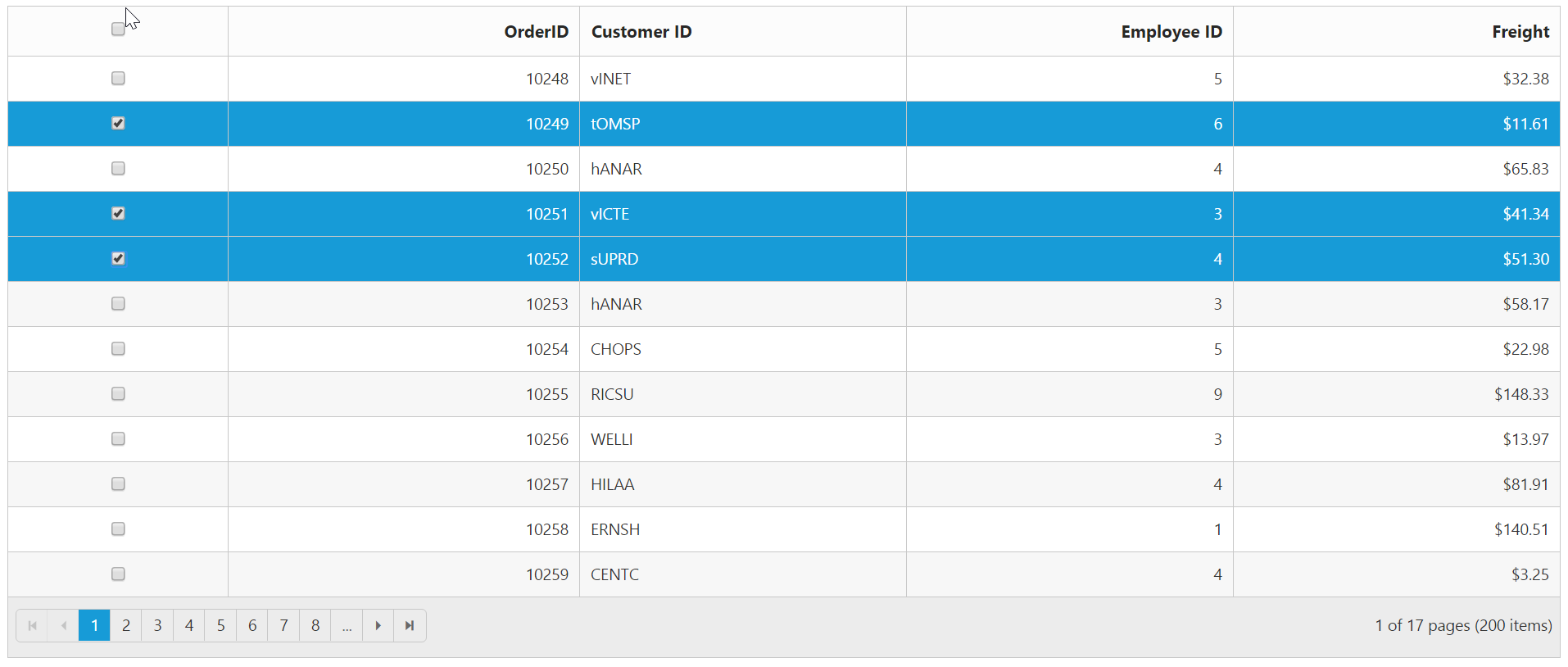
Multiple Row Selection using Checkbox Column
Select multiple rows in grid by using Checkbox column and it can be enabled by set column type as checkbox. It also provides the option to select/deselect all the rows in Grid using a checkbox in the corresponding column header.
If the field property of Checkbox column is not defined, then it acts as a template column. So field property is necessary to perform grid actions like sorting, editing, etc., for the corresponding Checkbox column.
The following code example describes the above behavior.
<ej-grid id="Grid" [dataSource]="gridData" allowPaging="true">
    <e-columns>
        <e-column type="checkbox" width="50"></e-column> //enables the checkbox column
        <e-column field="OrderID" headerText="OrderID" width="80" textAlign="right"></e-column>
        <e-column field="CustomerID" headerText="CustomerID" width="75" ></e-column>
        <e-column field="EmployeeID" headerText="EmployeeID" width="75" textAlign="right"></e-column>
        <e-column field="Freight" headerText="Freight" width="75" textAlign="right" ></e-column>
    </e-columns>
</ej-grid>import {Component, ViewEncapsulation} from '@angular/core';
@Component({
selector: 'ej-app',
templateUrl: 'app/app.component.html', //give the path file for Grid control html file.
})
export class AppComponent {
public gridData;
constructor()
{
//The datasource "window.gridData" is referred from 'http://js.syncfusion.com/demos/web/scripts/jsondata.min.js'
this.gridData = window.gridData;
}
}The following output is displayed as a result of the above code example
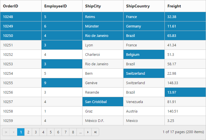
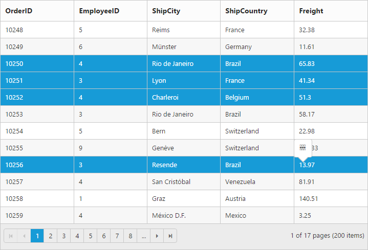
Cell Selection
Cell selection is enabled by setting selectionMode property of selectionSettings as cell. For random cell selection, press “Ctrl + mouse left” click and for continuous cell selection, press “Shift + mouse left” click on the grid cells. To unselect selected cells, press “Ctrl + mouse left” on selected cell click.
<ej-grid id="Grid" [dataSource]="gridData" allowPaging="true" allowSelection="true" selectionType="multiple" [selectionSettings]="selectionMode" >
    <e-columns>
        <e-column field="OrderID" headerText="OrderID"></e-column>
        <e-column field="EmployeeID" headerText="EmployeeID"></e-column>
        <e-column field="ShipCity" headerText="ShipCity"></e-column>
        <e-column field="ShipCountry" headerText="ShipCountry"></e-column>
        <e-column field="Freight" headerText="Freight"></e-column>
    </e-columns>
</ej-grid>import {Component, ViewEncapsulation} from '@angular/core';
@Component({
selector: 'ej-app',
templateUrl: 'app/app.component.html', //give the path file for Grid control html file.
})
export class AppComponent {
public gridData;
public selectionMode;
constructor()
{
//The datasource "window.gridData" is referred from 'http://js.syncfusion.com/demos/web/scripts/jsondata.min.js'
this.gridData = window.gridData;
this.selectionMode = { selectionMode :["cell"] };
}
}The following output is displayed as a result of the above code example
Cell Selection Mode
There are two types of cell selection available in grid. They are
- Continuous Selection
- Box Selection
Box cell selection is to select multiple cells vertically based on the initial column index selection.
The following code example describes the above behavior.
<ej-grid id="Grid" [dataSource]="gridData" allowPaging="true" allowSelection="true" selectionType="multiple" [selectionSettings]="selectionMode" >
    <e-columns>
        <e-column field="OrderID"  headerText="OrderID"></e-column>
        <e-column field="EmployeeID" headerText="EmployeeID"></e-column>
        <e-column field="ShipCity" headerText="ShipCity"></e-column>
        <e-column field="ShipCountry" headerText="ShipCountry"></e-column>
        <e-column field="Freight" headerText="Freight"></e-column>
    </e-columns>
</ej-grid>import {Component, ViewEncapsulation} from '@angular/core';
@Component({
selector: 'ej-app',
templateUrl: 'app/app.component.html', //give the path file for Grid control html file.
})
export class AppComponent {
public gridData;
public selectionMode;
constructor()
{
//The datasource "window.gridData" is referred from 'http://js.syncfusion.com/demos/web/scripts/jsondata.min.js'
this.gridData = window.gridData;
this.selectionMode = { selectionMode :["cell"], cellSelectionMode: "box" };
}
}The following output is displayed as a result of the above code example
NOTE
Continuous selection is the default cell selection mode in grid when
selectionModeis “cell”
Column Selection
Column selection can be enabled by setting selectionMode property of selectionSettings as column. For random column selection, press “Ctrl + mouse left click” and for continuous column selection, press “Shift + mouse left click” on the top of the column header. To unselect selected columns, press “Ctrl + mouse left click” on top of the selected column header.
The following code example describes the above behavior.
<ej-grid id="Grid" [dataSource]="gridData" allowPaging="true" allowSelection="true" selectionType="multiple" [selectionSettings]="selectionMode" >
    <e-columns>
        <e-column field="OrderID"  headerText="OrderID"></e-column>
        <e-column field="EmployeeID" headerText="EmployeeID"></e-column>
        <e-column field="ShipCity" headerText="ShipCity"></e-column>
        <e-column field="ShipCountry" headerText="ShipCountry"></e-column>
        <e-column field="Freight" headerText="Freight"></e-column>
    </e-columns>
</ej-grid>import {Component, ViewEncapsulation} from '@angular/core';
@Component({
selector: 'ej-app',
templateUrl: 'app/app.component.html', //give the path file for Grid control html file.
})
export class AppComponent {
public gridData;
public selectionMode;
constructor()
{
//The datasource "window.gridData" is referred from 'http://js.syncfusion.com/demos/web/scripts/jsondata.min.js'
this.gridData = window.gridData;
this.selectionMode = { selectionMode :["column"] };
}
}The following output is displayed as a result of the above code example
Touch options
While using grid in a touch device environment, there is an option for multi selection through single tap on the row and it will show a popup with multi-selection symbol. Tap the icon to enable multi selection in a single tap.
The following code example describes the above behavior.
<ej-grid id="Grid" [dataSource]="gridData" allowPaging="true" allowSelection="true" selectionType="multiple" enableTouch="true" >
    <e-columns>
        <e-column field="OrderID"  headerText="OrderID"></e-column>
        <e-column field="EmployeeID" headerText="EmployeeID"></e-column>
        <e-column field="ShipCity" headerText="ShipCity"></e-column>
        <e-column field="ShipCountry" headerText="ShipCountry"></e-column>
        <e-column field="Freight" headerText="Freight"></e-column>
    </e-columns>
</ej-grid>import {Component, ViewEncapsulation} from '@angular/core';
@Component({
selector: 'ej-app',
templateUrl: 'app/app.component.html', //give the path file for Grid control html file.
})
export class AppComponent {
public gridData;
constructor()
{
//The datasource "window.gridData" is referred from 'http://js.syncfusion.com/demos/web/scripts/jsondata.min.js'
this.gridData = window.gridData;
}
}The following output is displayed as a result of the above code example.
Toggle Selection
The Toggle selection allows to perform selection and unselection of the particular row, cell or column. To enable toggle selection, set enableToggle property of selectionSettings as true. If you click on the selected row, cell or column then it will be unselected and vice versa.
NOTE
If multi selection is enabled, then in first click on any selected row (without pressing Ctrl key), it will clear multi selection and in second click on the same row, it will be unselected.
The following code example describes the above behavior.
<ej-grid id="Grid" [dataSource]="gridData" allowPaging="true" allowSelection="true" selectionType="multiple" [selectionSettings]="selectionMode" >
    <e-columns>
        <e-column field="OrderID"  headerText="OrderID" ></e-column>
        <e-column field="EmployeeID" headerText="EmployeeID"></e-column>
        <e-column field="ShipCity" headerText="ShipCity"></e-column>
        <e-column field="ShipCountry" headerText="ShipCountry"></e-column>
        <e-column field="Freight" headerText="Freight"></e-column>
    </e-columns>
</ej-grid>import {Component, ViewEncapsulation} from '@angular/core';
@Component({
selector: 'ej-app',
templateUrl: 'app/app.component.html', //give the path file for Grid control html file.
providers:[NorthwindService]
})
export class AppComponent {
public gridData;
public selectionMode;
constructor()
{
//The datasource "window.gridData" is referred from 'http://js.syncfusion.com/demos/web/scripts/jsondata.min.js'
this.gridData = window.gridData;
this.selectionMode = { enableToggle: true };
}
}Drag Selection
The Drag selection allows to perform selection of the particular rows or cells by performing mouse dragging. To enable drag selection, set allowDragSelection property of the selectionSettings as true. Now you can select the cells or rows in the Grid by dragging the mouse.
NOTE
The
selectionTypeproperty should be set asmultiple, to select multiple cells in Grid by mouse dragging.
The following code example describes the above behavior.
<ej-grid id="Grid" [dataSource]="gridData" [allowPaging]="true" [allowSelection]="true" [selectionType]="multiple" [selectionSettings]="selectionMode" >
    <e-columns>
        <e-column field="OrderID"  headerText="OrderID" ></e-column>
        <e-column field="EmployeeID" headerText="EmployeeID"></e-column>
        <e-column field="ShipCity" headerText="ShipCity"></e-column>
        <e-column field="ShipCountry" headerText="ShipCountry"></e-column>
        <e-column field="Freight" headerText="Freight"></e-column>
    </e-columns>
</ej-grid>import {Component, ViewEncapsulation} from '@angular/core';
@Component({
selector: 'ej-app',
templateUrl: 'app/app.component.html', //give the path file for Grid control html file.
providers:[NorthwindService]
})
export class AppComponent {
public gridData;
public selectionMode;
constructor()
{
//The datasource "(window as any).gridData" is referred from 'http://js.syncfusion.com/demos/web/scripts/jsondata.min.js'
this.gridData = (window as any).gridData;
this.selectionMode = { selectionMode :["cell"], allowDragSelection: true };
}
}The following output is displayed as a result of the above code example.