Flutter Slider Tooltip (SfSlider)
18 Nov 201824 minutes to read
This section explains how to add a tooltip in the Flutter Slider.
Enable tooltip
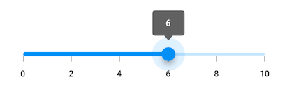
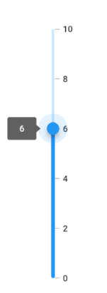
You can enable a tooltip for the thumb using the enableTooltip property. It is used to clearly indicate the current selection of the value during interaction. By default, tooltip text is formatted with either numberFormat or dateFormat.
By setting the value of
shouldAlwaysShowTooltipto true, you can always show a tooltip without having to interact with the slider thumb. The default value isfalseand it works independent of theenableTooltipbehavior.
Horizontal
import 'package:flutter/material.dart';
import 'package:syncfusion_flutter_sliders/sliders.dart';

class EnableTooltipPage extends StatefulWidget {
  @override
  _EnableTooltipPageState createState() => _EnableTooltipPageState();
}

class _EnableTooltipPageState extends State<EnableTooltipPage> {
  double _value = 6.0;

  @override
  Widget build(BuildContext context) {
    return MaterialApp(
        home: Scaffold(
            body: Center(
              child: SfSlider(
                min: 0.0,
                max: 10.0,
                interval: 2,
                showTicks: true,
                showLabels: true,
                enableTooltip: true,
                value: _value,
                onChanged: (double newValue) {
                  setState(() {
                    _value = newValue;
                  });
                },
              ),
            )
        )
    );
  }
}
Vertical
import 'package:flutter/material.dart';
import 'package:syncfusion_flutter_sliders/sliders.dart';

class VerticalEnableTooltipPage extends StatefulWidget {
  @override
  _VerticalEnableTooltipPageState createState() => _VerticalEnableTooltipPageState();
}

class _VerticalEnableTooltipPageState extends State<VerticalEnableTooltipPage> {
  double _value = 6.0;

  @override
  Widget build(BuildContext context) {
    return MaterialApp(
        home: Scaffold(
            body: Center(
              child: SfSlider.vertical(
                min: 0.0,
                max: 10.0,
                interval: 2,
                showTicks: true,
                showLabels: true,
                enableTooltip: true,
                value: _value,
                onChanged: (double newValue) {
                  setState(() {
                    _value = newValue;
                  });
                },
              ),
            )
        )
    );
  }
}
- Refer the
tooltipTextFormatterCallbackfor changing the default tooltip text.- Refer the
SfSliderThemeDatafor customizing the appearance of the tooltip text.
Tooltip shape
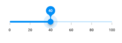
You can show tooltip in rectangular or paddle shape using the tooltipShape property. The default value of the tooltipShape property is SfRectangularTooltipShape.
The paddle tooltip shape is not applicable for vertical orientation of the sliders.
import 'package:flutter/material.dart';
import 'package:syncfusion_flutter_sliders/sliders.dart';

class TooltipShapePage extends StatefulWidget {
  @override
  _TooltipShapePageState createState() => _TooltipShapePageState();
}

class _TooltipShapePageState extends State<TooltipShapePage> {
  double _value = 40.0;

  @override
  Widget build(BuildContext context) {
    return MaterialApp(
        home: Scaffold(
            body: Center(
              child: SfSlider(
                min: 0.0,
                max: 100.0,
                interval: 20,
                showTicks: true,
                showLabels: true,
                enableTooltip: true,
                tooltipShape: SfPaddleTooltipShape(),
                value: _value,
                onChanged: (double newValue) {
                  setState(() {
                     _value = newValue;
                  });
                },
              ),
            )
        )
    );
  }
}
Tooltip position
This is only applicable for vertical orientation of the sliders.
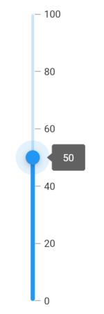
You can show tooltip in left or right positions using the tooltipPosition property. The default value of the tooltipPosition property is SliderTooltipPosition.left.
import 'package:flutter/material.dart';
import 'package:syncfusion_flutter_sliders/sliders.dart';

class TooltipPositionPage extends StatefulWidget {
  @override
  _TooltipPositionPageState createState() => _TooltipPositionPageState();
}

class _TooltipPositionPageState extends State<TooltipPositionPage> {
  double _value = 40.0;

  @override
  Widget build(BuildContext context) {
    return MaterialApp(
        home: Scaffold(
            body: Center(
              child: SfSlider.vertical(
                min: 0.0,
                max: 100.0,
                interval: 20,
                showTicks: true,
                showLabels: true,
                tooltipPosition: SliderTooltipPosition.right,
                enableTooltip: true,
                value: _value,
                onChanged: (double newValue) {
                  setState(() {
                     _value = newValue;
                  });
                },
              ),
            )
        )
    );
  }
}
Tooltip text format
By default it is formatted based on numberFormat property and dateFormat property based on whether it is date type SfSlider or numeric SfSlider.
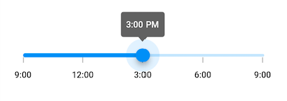
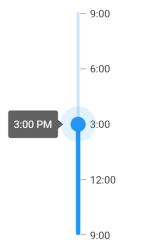
You can format or change the whole tooltip label text using the tooltipTextFormatterCallback. Its arguments are,
- actualValue – either
DateTimeordoublebased on givenvalue. - formattedText – If the actual value is
double, it is formatted bynumberFormatand if the actual value isDateTime, it is formatted bydateFormat.
Horizontal
import 'package:flutter/material.dart';
import 'package:intl/intl.dart';
import 'package:syncfusion_flutter_sliders/sliders.dart';

class TooltipTextFormatPage extends StatefulWidget {
  @override
  _TooltipTextFormatPageState createState() => _TooltipTextFormatPageState();
}

class _TooltipTextFormatPageState extends State<TooltipTextFormatPage> {
  DateTime _value = DateTime(2010, 01, 01, 15, 00, 00);

  @override
  Widget build(BuildContext context) {
    return MaterialApp(
        home: Scaffold(
            body: Center(
              child: SfSlider(
                min: DateTime(2010, 01, 01, 9, 00, 00),
                max: DateTime(2010, 01, 01, 21, 05, 00),
                value: _value,
                interval: 3,
                showTicks: true,
                showLabels: true,
                enableTooltip: true,
                dateFormat: DateFormat('h:mm'),
                dateIntervalType: DateIntervalType.hours,
                tooltipTextFormatterCallback: (dynamic actualValue, String formattedText) {
                  return DateFormat('h:mm a').format(actualValue);
                },
                onChanged: (DateTime newValue) {
                  setState(() {
                    _value = newValue;
                  });
                },
              ),
            )
        )
    );
  }
}
Vertical
import 'package:flutter/material.dart';
import 'package:intl/intl.dart';
import 'package:syncfusion_flutter_sliders/sliders.dart';

class VerticalTooltipTextFormatPage extends StatefulWidget {
  @override
  _VerticalTooltipTextFormatPageState createState() => _VerticalTooltipTextFormatPageState();
}

class _VerticalTooltipTextFormatPageState extends State<VerticalTooltipTextFormatPage> {
  DateTime _value = DateTime(2010, 01, 01, 15, 00, 00);

  @override
  Widget build(BuildContext context) {
    return MaterialApp(
        home: Scaffold(
            body: Center(
              child: SfSlider.vertical(
                min: DateTime(2010, 01, 01, 9, 00, 00),
                max: DateTime(2010, 01, 01, 21, 05, 00),
                value: _value,
                interval: 3,
                showTicks: true,
                showLabels: true,
                enableTooltip: true,
                dateFormat: DateFormat('h:mm'),
                dateIntervalType: DateIntervalType.hours,
                tooltipTextFormatterCallback: (dynamic actualValue, String formattedText) {
                  return DateFormat('h:mm a').format(actualValue);
                },
                onChanged: (DateTime newValue) {
                  setState(() {
                    _value = newValue;
                  });
                },
              ),
            )
        )
    );
  }
}
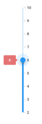
Tooltip color
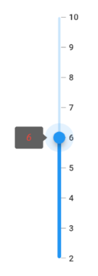
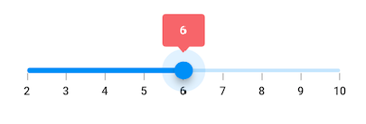
You can change the background color of the tooltip in the Flutter Slider using the tooltipBackgroundColor property.
Horizontal
import 'package:flutter/material.dart';
import 'package:syncfusion_flutter_core/theme.dart';
import 'package:syncfusion_flutter_sliders/sliders.dart';

class TooltipColorPage extends StatefulWidget {
  @override
  _TooltipColorPageState createState() => _TooltipColorPageState();
}

class _TooltipColorPageState extends State<TooltipColorPage> {
  double _value = 6.0;

  @override
  Widget build(BuildContext context) {
    return MaterialApp(
        home: Scaffold(
            body: Center(
                child: SfSliderTheme(
                  data: SfSliderThemeData(
                    tooltipBackgroundColor: Colors.red[300],
                  ),
                  child: SfSlider(
                    min: 2.0,
                    max: 10.0,
                    interval: 1,
                    showTicks: true,
                    showLabels: true,
                    enableTooltip: true,
                    value: _value,
                    onChanged: (double newValue){
                      setState(() {
                        _value = newValue;
                      });
                    },
                  ),
                )
            )
        )
    );
  }
}
Vertical
import 'package:flutter/material.dart';
import 'package:syncfusion_flutter_core/theme.dart';
import 'package:syncfusion_flutter_sliders/sliders.dart';

class VerticalTooltipColorPage extends StatefulWidget {
  @override
  _VerticalTooltipColorPageState createState() => _VerticalTooltipColorPageState();
}

class _VerticalTooltipColorPageState extends State<VerticalTooltipColorPage> {
  double _value = 6.0;

  @override
  Widget build(BuildContext context) {
    return MaterialApp(
        home: Scaffold(
            body: Center(
                child: SfSliderTheme(
                  data: SfSliderThemeData(
                    tooltipBackgroundColor: Colors.red[300],
                  ),
                  child: SfSlider.vertical(
                    min: 2.0,
                    max: 10.0,
                    interval: 1,
                    showTicks: true,
                    showLabels: true,
                    enableTooltip: true,
                    value: _value,
                    onChanged: (double newValue){
                      setState(() {
                        _value = newValue;
                      });
                    },
                  ),
                )
            )
        )
    );
  }
}
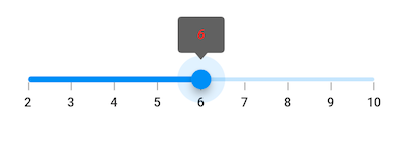
Tooltip label style
You can change the appearance of the tooltip text in the Flutter Slider using the tooltipTextStyle property.
Horizontal
import 'package:flutter/material.dart';
import 'package:syncfusion_flutter_core/theme.dart';
import 'package:syncfusion_flutter_sliders/sliders.dart';

class TooltipLabelStylePage extends StatefulWidget {
  @override
  _TooltipLabelStylePageState createState() => _TooltipLabelStylePageState();
}

class _TooltipLabelStylePageState extends State<TooltipLabelStylePage> {
  double _value = 6.0;

  @override
  Widget build(BuildContext context) {
    return MaterialApp(
        home: Scaffold(
            body: Center(
                child: SfSliderTheme(
                  data: SfSliderThemeData(
                    tooltipTextStyle: TextStyle(color: Colors.red, fontSize: 16, fontStyle: FontStyle.italic),
                  ),
                  child: SfSlider(
                    min: 2.0,
                    max: 10.0,
                    interval: 1,
                    showTicks: true,
                    showLabels: true,
                    enableTooltip: true,
                    value: _value,
                    onChanged: (double newValue){
                      setState(() {
                        _value = newValue;
                      });
                    },
                  ),
                )
            )
        )
    );
  }
}
Vertical
import 'package:flutter/material.dart';
import 'package:syncfusion_flutter_core/theme.dart';
import 'package:syncfusion_flutter_sliders/sliders.dart';

class VerticalTooltipLabelStylePage extends StatefulWidget {
  @override
  _VerticalTooltipLabelStylePageState createState() => _VerticalTooltipLabelStylePageState();
}

class _VerticalTooltipLabelStylePageState extends State<VerticalTooltipLabelStylePage> {
  double _value = 6.0;

  @override
  Widget build(BuildContext context) {
    return MaterialApp(
        home: Scaffold(
            body: Center(
                child: SfSliderTheme(
                  data: SfSliderThemeData(
                    tooltipTextStyle: TextStyle(color: Colors.red, fontSize: 16, fontStyle: FontStyle.italic),
                  ),
                  child: SfSlider.vertical(
                    min: 2.0,
                    max: 10.0,
                    interval: 1,
                    showTicks: true,
                    showLabels: true,
                    enableTooltip: true,
                    value: _value,
                    onChanged: (double newValue){
                      setState(() {
                        _value = newValue;
                      });
                    },
                  ),
                )
            )
        )
    );
  }
}