How can I help you?
Customizing labels
17 Jan 20255 minutes to read
ShowValueLabel
This property allows us to display labels for the ticks. When it sets to true, it displays the label for all the ticks based on the ValuePlacement property.
NOTE
The default value of the
ShowValueLabelproperty is false.
rangeSlider.ShowValueLabel= True;Set Custom Label
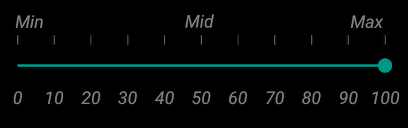
To display custom labels, ShowCustomLabel property should be set to true and need to populate the CustomLabels property with observable collection of items by specifying the custom labels for corresponding values.
SfRangeSlider rangeSlider;
ObservableCollection<Items>  customCollection;
public RangeSliderPage ()
{
      customCollection = new ObservableCollection<Items> ();
      customCollection.Add(new Items(){Label = "Min", Value= 0});
      customCollection.Add(new Items() { Label = "Max", Value = 100 });
      rangeSlider = new SfRangeSlider ();
      rangeSlider.HeightRequest = 400;
      rangeSlider.ShowCustomLabel = true;
      rangeSlider.CustomLabels = customCollection
}
ValuePlacement
The ValuePlacement property describes the position of the Value respective to ticks.
Available options for this property are:
-
BottomRight
-
TopLeft
rangeSlider.ValuePlacement=ValuePlacement.TopLeft;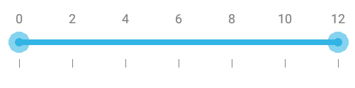
rangeSlider.ValuePlacement=ValuePlacement.BottomRight;
LabelPlacement
The LabelPlacement property describes the position of the labels respective to ticks.
Available options for this property are:
-
BottomRight
-
TopLeft
rangeSlider.LabelPlacement=LabelPlacement.TopLeft;Customizing label font
The range slider control provides the TypeFace and TextSize properties to customize the value text and custom label text.
namespace GettingStarted
{
      [Activity(Label = "GettingStarted", MainLauncher = true, Icon = "@mipmap/icon")]
      public class MainActivity : Activity
      {
            protected override void OnCreate(Bundle savedInstanceState)
            {
                  base.OnCreate(savedInstanceState);
                  LinearLayout linearLayout = new LinearLayout(this);
                  linearLayout.LayoutParameters = new LayoutParams(LayoutParams.MatchParent,LayoutParams.MatchParent);
                  SfRangeSlider rangeSlider = new SfRangeSlider(this);
                  rangeSlider.ShowValueLabel = true;
                  rangeSlider.Typeface = Typeface.Create("Times New Roman", TypefaceStyle.Italic);
                  rangeSlider.TextSize = 15;
                  rangeSlider.ShowCustomLabel = true;
                  rangeSlider.CustomLabels = new List<Items>()
                  {
                        new Items() { Value = 0, Label = "Min" },
                        new Items() { Value = 50, Label = "Mid" },
                        new Items() { Value = 100, Label = "Max" }
                  };
                  rangeSlider.Orientation = Com.Syncfusion.Sfrangeslider.Orientation.Horizontal;
                  linearLayout.AddView(rangeSlider);
                  SetContentView(linearLayout);
            }
      }
}
Customizing label color
The LabelColor property used to change the color of the label.
rangeSlider.Labelcolor = Color.Red;