Getting Started with Xamarin.Android NavigationDrawer
17 Jan 20258 minutes to read
This section provides overview for working with Essential® NavigationDrawer for Xamarin.Android. You can walk through the entire process of creating an NavigationDrawer.
Referencing Essential Studio® Components in Your Solution
After installing Essential Studio® for Xamarin, you can find all the required assemblies in the installation folders,
{Syncfusion Installed location}\Essential Studio\12.4.0.24\lib
Add the following assembly references to the Android project,
android\Syncfusion.SfNavigationDrawer.Andriod.dll
and
Xamarin.Android.Support.v4 library (from Nuget Packages)
Add SfNavigationDrawer
- Adding reference to NavigationDrawer.
using Com.Syncfusion.NavigationDrawer;- Create an instance of SfNavigationDrawer.
SfNavigationDrawer navigationDrawer = new SfNavigationDrawer(this);
SetContentView(navigationDrawer);
Add Drawer Content
The sliding main content of the SfNavigationDrawer which is a part of DrawerPanel can be set using DrawerContentView property with desired views.
namespace NavigationDrawerSample
{
    [Activity(Label = "NavigationDrawerSample", MainLauncher = true, Icon = "@drawable/icon")]
    public class MainActivity : Activity
    {
        ListView viewItem;
        ArrayAdapter<string> arrayAdapter;
        protected override void OnCreate(Bundle bundle)
        {
            base.OnCreate(bundle);

            SfNavigationDrawer navigationDrawer;

            navigationDrawer = new SfNavigationDrawer(this);
            List<string> positionlist = new List<string>();
            positionlist.Add("Home");
            positionlist.Add("Profile");
            positionlist.Add("Inbox");
            positionlist.Add("Outbox");
            positionlist.Add("Sent Items");
            positionlist.Add("Trash");
            arrayAdapter = new ArrayAdapter<string>(this, Android.Resource.Layout.SimpleListItem1, positionlist);
            viewItem = new ListView(this);
            viewItem.Adapter = arrayAdapter;
            viewItem.SetBackgroundColor(Android.Graphics.Color.ParseColor("#1aa1d6"));
            viewItem.LayoutParameters = new ViewGroup.LayoutParams(ViewGroup.LayoutParams.MatchParent, ViewGroup.LayoutParams.MatchParent);FrameLayout frameLayout = new FrameLayout(this);
            frameLayout.LayoutParameters = new ViewGroup.LayoutParams(ViewGroup.LayoutParams.MatchParent, ViewGroup.LayoutParams.MatchParent);
            frameLayout.AddView(viewItem);
            navigationDrawer.DrawerContentView = frameLayout;
			SetContentView(navigationDrawer);
		}
	}
}
Add Drawer Header Content
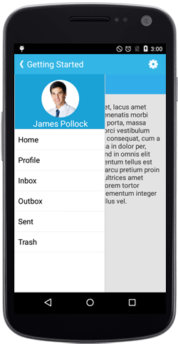
SfNavigationDrawer provides option to display certain information like user id or names in the header part instead of providing everything in the drawer content view.
This can be done using DrawerHeaderView property in SfNavigationDrawer.
namespace navigationDrawerSample
{
	[Activity(Label = "navigationDrawerSample", MainLauncher = true, Icon = "@mipmap/icon")]
	public class MainActivity : Activity
	{
           SfNavigationDrawer navigationDrawer;
           protected override void OnCreate(Bundle bundle)
        {
            base.OnCreate(bundle);

            navigationDrawer = new SfNavigationDrawer(this);

            ImageView userImg = new ImageView(this);
            userImg.SetImageResource(Resource.Drawable.Icon);
            userImg.SetBackgroundColor(Android.Graphics.Color.ParseColor("#1aa1d6"));
            TextView userName = new TextView(this);
            userName.Text = "James Pollock";
            userName.TextSize = 20;
            userName.SetBackgroundColor(Android.Graphics.Color.Transparent);
            userName.SetTextColor(Android.Graphics.Color.White);
            LinearLayout headerLayout = new LinearLayout(this);
            headerLayout.Orientation = Orientation.Vertical;
            headerLayout.SetBackgroundColor(Android.Graphics.Color.ParseColor("#1aa1d6"));
            headerLayout.SetPadding(0, 20, 0, 0);
            headerLayout.AddView(userImg);
            headerLayout.AddView(userName);
            navigationDrawer.DrawerHeaderView = headerLayout;
            SetContentView(navigationDrawer);
    }
}
}
Add Main Content
The main view of the SfNavigationDrawer can be set using ContentView property with desired views.
namespace navigationDrawerSample
{
	[Activity(Label = "navigationDrawerSample", MainLauncher = true, Icon = "@mipmap/icon")]
	public class MainActivity : Activity
	{
           SfNavigationDrawer navigationDrawer;
           protected override void OnCreate(Bundle bundle)
        {
            base.OnCreate(bundle);

            navigationDrawer = new SfNavigationDrawer(this);
            FrameLayout ContentFrame=new FrameLayout(this);
            ContentFrame.SetBackgroundColor(Android.Graphics.Color.White);
            ImageView userImg = new ImageView(this);
            userImg.SetImageResource(Resource.Drawable.Icon);
            userImg.SetBackgroundColor(Android.Graphics.Color.ParseColor("#1aa1d6"));
            ContentFrame.AddView(userImg);
            navigationDrawer.ContentView=ContentFrame;
			SetContentView(navigationDrawer);
		}
	}
}
Set Drawing Edge for Drawer Panel
SfNavigationDrawer provides support to change the sliding position of the DrawerView panel. This can be set using Position property. The position can be any one of the following four options.
-
Left
-
Right
-
Top
-
Bottom
NOTE
The default option is Left.
Position sliderposition = Position.Left;
navigationDrawer.Position=sliderposition;
Change Drawer Opening Animation
The Transition property specifies the sliding animations for the DrawerView panel. The Transition property has the following three options,
- SlideOnTop
- Push
- Reveal
NOTE
The default transition is SlideOnTop.
Transition sliderTransition = Transition.SlideOnTop;
	navigationDrawer.Transition = sliderTransition;