How can I help you?
Sliding Panel Contents
17 Jan 202520 minutes to read
The sliding panel contents are divided into three parts and they are as follows
The header and footer contents are optional and Drawer content is the mandatory one which is due to the maximum space allocated for Drawer content view.
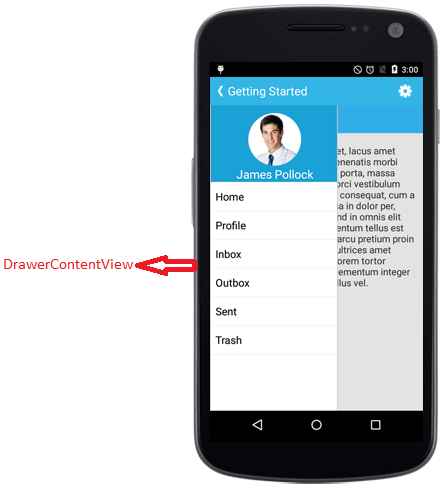
Drawer Main Content
The sliding main content of the SfNavigationDrawer which is a part of DrawerPanel can be set using DrawerContentView property with desired views.
namespace navigationDrawerSample
{
    [Activity(Label = "NavigationDrawerSample", MainLauncher = true, Icon = "@drawable/icon")]
    public class MainActivity : Activity
    {
        Button DrawerButton;
        ListView viewItem;
        TextView profileContentLabel;
        ArrayAdapter<string> arrayAdapter;
        protected override void OnCreate(Bundle bundle)
        {
            base.OnCreate(bundle);

            SfNavigationDrawer navigationDrawer;
            navigationDrawer = new SfNavigationDrawer(this);

            List<string> positionlist = new List<string>();
            positionlist.Add("Home");
            positionlist.Add("Profile");
            positionlist.Add("Inbox");
            positionlist.Add("Outbox");
            positionlist.Add("Sent Items");
            positionlist.Add("Trash");
            arrayAdapter = new ArrayAdapter<string>(this, Android.Resource.Layout.SimpleListItem1, positionlist);
            viewItem = new ListView(this);
            viewItem.Adapter = arrayAdapter;
            viewItem.SetBackgroundColor(Android.Graphics.Color.ParseColor("#1aa1d6"));
            viewItem.LayoutParameters = new ViewGroup.LayoutParams(ViewGroup.LayoutParams.MatchParent, ViewGroup.LayoutParams.MatchParent);

            LinearLayout HomeLayout = new LinearLayout(this);

            profileContentLabel = new TextView(this);
            profileContentLabel.TextSize = 20;
            profileContentLabel.Text = "Home";
            profileContentLabel.SetTextColor(Android.Graphics.Color.Black);
            profileContentLabel.SetBackgroundColor(Android.Graphics.Color.LightBlue);
            profileContentLabel.Gravity = GravityFlags.Center;
            profileContentLabel.LayoutParameters = new ViewGroup.LayoutParams(770, 100);

            HomeLayout.AddView(profileContentLabel);

            LinearLayout contentLayout = new LinearLayout(this);
            contentLayout.Orientation = Orientation.Vertical;

            LinearLayout buttonLayout = new LinearLayout(this);
            buttonLayout.SetBackgroundColor(Android.Graphics.Color.Gray);
            buttonLayout.SetGravity(GravityFlags.Center);

            buttonLayout.LayoutParameters = new LinearLayout.LayoutParams(1000, 1000);

            DrawerButton = new Button(this);
            DrawerButton.Text = "Drawer";
            DrawerButton.LayoutParameters = new LinearLayout.LayoutParams(ViewGroup.LayoutParams.WrapContent, ViewGroup.LayoutParams.WrapContent);
            DrawerButton.Gravity = GravityFlags.Center;

            buttonLayout.AddView(DrawerButton);
            DrawerButton.Click += (sender, e) =>
            {
                navigationDrawer.ToggleDrawer();
            };
            contentLayout.SetBackgroundColor(Android.Graphics.Color.SkyBlue);
            contentLayout.AddView(HomeLayout);
            contentLayout.AddView(buttonLayout);


            FrameLayout frameLayout = new FrameLayout(this);
            frameLayout.LayoutParameters = new ViewGroup.LayoutParams(ViewGroup.LayoutParams.MatchParent, ViewGroup.LayoutParams.MatchParent);
            frameLayout.AddView(viewItem);
            navigationDrawer.DrawerContentView = frameLayout;

            navigationDrawer.ContentView = contentLayout;

            SetContentView(navigationDrawer);
        }
    }
}
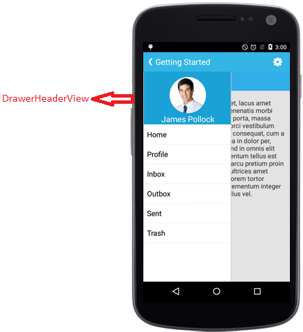
Drawer Header Content
Gets or sets the header of the DrawerView panel in the SfNavigationDrawer control using DrawerHeaderView property.
namespace navigationDrawerSample
{
	[Activity(Label = "navigationDrawerSample", MainLauncher = true, Icon = "@mipmap/icon")]
	public class MainActivity : Activity
	{
           SfNavigationDrawer navigationDrawer;
           protected override void OnCreate(Bundle bundle)
        {
            base.OnCreate(bundle);

            navigationDrawer = new SfNavigationDrawer(this);

            ImageView userImg = new ImageView(this);
            userImg.SetImageResource(Resource.Drawable.Icon);
            userImg.SetBackgroundColor(Android.Graphics.Color.ParseColor("#1aa1d6"));
            TextView userName = new TextView(this);
            userName.Text = "James Pollock";
            userName.TextSize = 20;
            userName.SetBackgroundColor(Android.Graphics.Color.Transparent);
            userName.SetTextColor(Android.Graphics.Color.White);
            LinearLayout headerLayout = new LinearLayout(this);
            headerLayout.Orientation = Orientation.Vertical;
            headerLayout.SetBackgroundColor(Android.Graphics.Color.ParseColor("#1aa1d6"));
            headerLayout.SetPadding(0, 20, 0, 0);
            headerLayout.AddView(userImg);
            headerLayout.AddView(userName);
            navigationDrawer.DrawerHeaderView = headerLayout;
            SetContentView(navigationDrawer);
    }
}
}
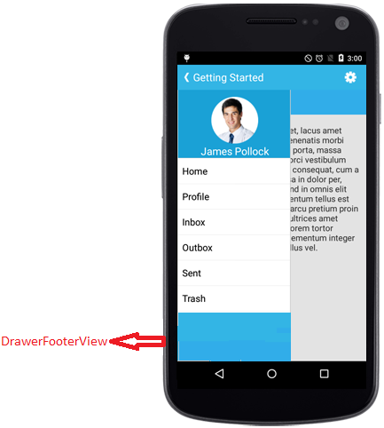
Drawer Footer Content
Gets or sets the footer for the DrawerView panel in the SfNavigationDrawer control using DrawerFooterView property.
namespace navigationDrawerSample
{
	[Activity(Label = "navigationDrawerSample", MainLauncher = true, Icon = "@mipmap/icon")]
	public class MainActivity : Activity
	{
            SfNavigationDrawer navigationDrawer;
            protected override void OnCreate(Bundle bundle)
        {
            base.OnCreate(bundle);
            navigationDrawer = new SfNavigationDrawer(this);
            TextView userName = new TextView(this);
            userName.Text = "James Pollock";
            userName.Gravity = GravityFlags.Center;
            userName.TextSize = 20;
            userName.SetBackgroundColor(Android.Graphics.Color.Transparent);
            userName.SetTextColor(Android.Graphics.Color.White);
            LinearLayout footerLayout = new LinearLayout(this);
            footerLayout.Orientation = Orientation.Vertical;
            footerLayout.SetBackgroundColor(Android.Graphics.Color.ParseColor("#1aa1d6"));
            footerLayout.SetPadding(0, 20, 0, 0);
            footerLayout.AddView(userName);
            navigationDrawer.DrawerFooterView = footerLayout;
            SetContentView(navigationDrawer);
    }
}
}
Drawer Size
Gets or sets the height and width of the DrawerView panel in the SfNavigationDrawer control using DrawerHeight and DrawerWidth properties.
navigationDrawer.DrawerHeight = (float)(300);
navigationDrawer.DrawerWidth = (float)(200);
Multiple drawers
The Navigation Drawer allows users to open the drawer on multiple sides with different toggle methods. The DrawerSettings class and its properties need to be used where users need to provide multiple drawers. The multiple drawers can be implemented using the following drawer settings:
- Default drawer settings
- Secondary drawer settings
NOTE
The header and footer content are optional, but the drawer content is mandatory to allocate space for the drawer.
Default drawer settings
Implement the default drawer using the default drawer settings class. The following code sample demonstrates how to set the properties of default drawer settings inside the DrawerSettings class.
DrawerSettings defaultDrawerSettings = new DrawerSettings();
defaultDrawerSettings.DrawerHeight = 150;
defaultDrawerSettings.Position = Position.Left;
defaultDrawerSettings.Transition = Transition.SlideOnTop;
defaultDrawerSettings.ContentBackgroundColor = Color.Red;
defaultDrawerSettings.DrawerWidth = 150;
navigationDrawer.DrawerHeaderHeight = 150;
navigationDrawer.DrawerFooterHeight = 150;
navigationDrawer.DefaultDrawerSettings = defaultDrawerSettings;
NOTE
The Navigation Drawer works with the value given for the properties inside the DrawerSettings class when using the default drawer settings.
Header view of the default drawer
The header content can be provided to the default drawer using the DrawerHeaderView property inside the DrawerSettings class of DefaultDrawerSettings. The following code sample demonstrates how to set header content to the default drawer.
DrawerSettings defaultDrawerSettings = new DrawerSettings();
TextView userName = new TextView(this);
userName.Text = "James Pollock";
userName.TextSize = 20;
userName.SetBackgroundColor(Android.Graphics.Color.Transparent);
userName.SetTextColor(Android.Graphics.Color.White);
LinearLayout headerLayout = new LinearLayout(this);
headerLayout.Orientation = Orientation.Vertical;
headerLayout.SetPadding(0, 20, 0, 0);
headerLayout.AddView(userName);
defaultDrawerSettings.DrawerHeaderView = headerLayout;
Content view of the default drawer
The drawer content can be provided to the default drawer using the DrawerContentView property inside the DrawerSettings class. The following code sample demonstrates how to set drawer content to the default drawer.
SfNavigationDrawer navigationDrawer = new SfNavigationDrawer(this);
DrawerSettings defaultDrawerSettings = new DrawerSettings();
defaultDrawerSettings.DrawerHeight = 150;
defaultDrawerSettings.Position = Position.Left;
List<string> positionlist = new List<string>();
positionlist.Add("Home");
positionlist.Add("Profile");
positionlist.Add("Inbox");
positionlist.Add("Outbox");
arrayAdapter = new ArrayAdapter<string>(this, Android.Resource.Layout.SimpleListItem1, positionlist);
viewItem = new ListView(this);
viewItem.Adapter = arrayAdapter;
viewItem.SetBackgroundColor(Android.Graphics.Color.ParseColor("#1aa1d6"));
FrameLayout frameLayout = new FrameLayout(this);
frameLayout.LayoutParameters = new ViewGroup.LayoutParams(ViewGroup.LayoutParams.MatchParent, ViewGroup.LayoutParams.MatchParent);
frameLayout.AddView(viewItem);
defaultDrawerSettings.DrawerContentView = frameLayout;
navigationDrawer.DefaultDrawerSettings = defaultDrawerSettings;
SetContentView(navigationDrawer);
Footer view of the default drawer
The footer content can be provided to the default drawer using the DrawerFooterView property inside the DrawerSettings class of DefaultDrawerSettings. The following code sample demonstrates how to set footer content to the default drawer.
DrawerSettings defaultDrawerSettings = new DrawerSettings();
TextView userName = new TextView(this);
userName.Text = "James Pollock";
userName.TextSize = 20;
userName.SetBackgroundColor(Android.Graphics.Color.Transparent);
userName.SetTextColor(Android.Graphics.Color.White);
LinearLayout footerLayout = new LinearLayout(this);
footerLayout.Orientation = Orientation.Vertical;
footerLayout.SetPadding(0, 20, 0, 0);
footerLayout.AddView(userName);
defaultDrawerSettings.DrawerFooterView = footerLayout;
Secondary drawer settings
Implement the secondary drawer using the secondary drawer settings class. Its properties and functionalities are same as the default drawer. The secondary drawer can be set to different positions similar to the default drawer. The following code sample demonstrates how to set the properties of secondary drawer settings inside the DrawerSettings class.
DrawerSettings secondaryDrawerSettings = new DrawerSettings();
secondaryDrawerSettings.DrawerHeight = 150;
secondaryDrawerSettings.Position = Position.Left;
secondaryDrawerSettings.Transition = Transition.SlideOnTop;
secondaryDrawerSettings.ContentBackgroundColor = Color.Red;
secondaryDrawerSettings.DrawerWidth = 150;
navigationDrawer.DrawerHeaderHeight = 150;
navigationDrawer.DrawerFooterHeight = 150;
navigationDrawer.SecondaryDrawerSettings = secondaryDrawerSettings;
NOTE
When the default drawer and the secondary drawer are set to the same position, the default drawer will open on swiping.
Header view of the secondary drawer
The header content can be provided to the secondary drawer using the DrawerHeaderView property inside the DrawerSettings class of SecondaryDrawerSettings. The following code sample demonstrates how to set the header content to the secondary drawer.
DrawerSettings secondaryDrawerSettings = new DrawerSettings();
TextView userName = new TextView(this);
userName.Text = "James Pollock";
userName.TextSize = 20;
userName.SetBackgroundColor(Android.Graphics.Color.Transparent);
userName.SetTextColor(Android.Graphics.Color.White);
LinearLayout headerLayout = new LinearLayout(this);
headerLayout.Orientation = Orientation.Vertical;
headerLayout.SetPadding(0, 20, 0, 0);
headerLayout.AddView(userName);
secondaryDrawerSettings.DrawerHeaderView = headerLayout;
Content view of the secondary drawer
The drawer content can be provided to the secondary drawer using the DrawerContentView property inside the DrawerSettings class of SecondaryDrawerSettings. The following code sample demonstrates how to set the drawer content to the secondary drawer.
SfNavigationDrawer navigationDrawer = new SfNavigationDrawer(this);
DrawerSettings secondaryDrawerSettings = new DrawerSettings();
secondaryDrawerSettings.DrawerHeight = 150;
secondaryDrawerSettings.Position = Position.Left;
List<string> positionlist = new List<string>();
positionlist.Add("Home");
positionlist.Add("Profile");
positionlist.Add("Inbox");
positionlist.Add("Outbox");
arrayAdapter = new ArrayAdapter<string>(this, Android.Resource.Layout.SimpleListItem1, positionlist);
viewItem = new ListView(this);
viewItem.Adapter = arrayAdapter;
viewItem.SetBackgroundColor(Android.Graphics.Color.ParseColor("#1aa1d6"));
FrameLayout frameLayout = new FrameLayout(this);
frameLayout.LayoutParameters = new ViewGroup.LayoutParams(ViewGroup.LayoutParams.MatchParent, ViewGroup.LayoutParams.MatchParent);
frameLayout.AddView(viewItem);
secondaryDrawerSettings.DrawerContentView = frameLayout;
navigationDrawer.SecondaryDrawerSettings = secondaryDrawerSettings;
SetContentView(navigationDrawer);
Footer view of secondary drawer
The footer content can be provided to the secondary drawer using the DrawerFooterView property inside the DrawerSettings class of SecondaryDrawerSettings. The following code sample demonstrates how to set footer content to the secondary drawer.
Toggling method
Users can toggle the secondary drawer using the ToggleSecondaryDrawer method.
navigationDrawer.ToggleSecondaryDrawer();Opening the drawer programmatically
The IsOpen property in the DrawerSettings of SecondaryDrawerSettings is used to open or close the drawer programmatically.
NOTE
Users can open only one drawer at a time.