How can I help you?
Tooltip in Xamarin.Android RangeNavigator
30 Nov 20222 minutes to read
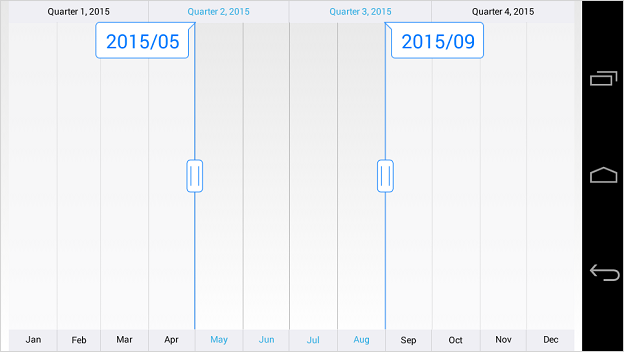
The tooltip is used to show the selected range start and end value of the SfDateTimeRangeNavigator.
Tooltip Visibility
The TooltipEnabled property of SfDateTimeRangeNavigator is used to control the visibility of the left and right tooltip. It is true by default.
[C#]
SfDateTimeRangeNavigator rangeNavigator = new SfDateTimeRangeNavigator(this);

rangeNavigator.TooltipEnabled = false;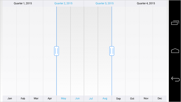
NOTE
The
TooltipDisplayModeproperty is used to determine whether the visibility of tooltip should beAlwaysorOn_Demandwhen selecting a range.
Tooltip Format
You can format the date value of the tooltip using TooltipFormat property of SfDateTimeRangeNavigator.
[C#]
dateTimeRangeNavigator.TooltipFormat = "yyyy/MM";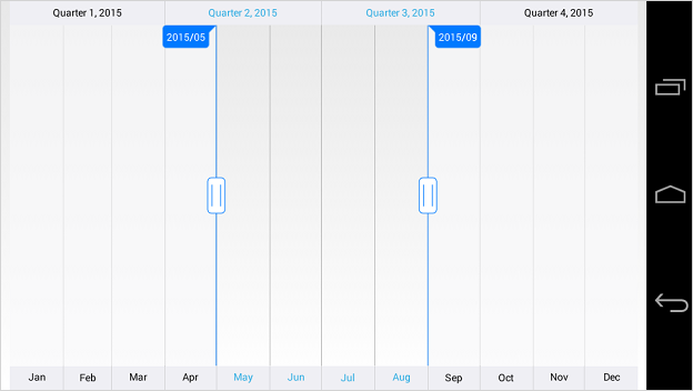
Appearance Customization
The LeftTooltipStyle and RightTooltipStyle properties of SfDateTimeRangeNavigator are used to customize the left and right tooltip. Following properties are available in each tooltip style to customize the appearance of the tooltip.
-
TextColor– used to change the color of the tooltip text. -
TextSize- used to change the text size of the tooltip. -
BackgroundColor– used to change the background color of the tooltip. -
StrokeColor– used to change the border color of the tooltip. -
StrokeWidth– used to change the thickness of the tooltip border. -
Typeface– used to change the font family and font weight -
MarginLeft- used to change the left margin of the tooltip text. -
MarginTop- used to change the top margin of the tooltip text. -
MarginRight- used to change the right margin of the tooltip text. -
MarginBottom- used to change the bottom margin of the tooltip text.
[C#]
dateTimeRangeNavigator.LeftTooltipStyle.TextColor = Color.Blue;
dateTimeRangeNavigator.LeftTooltipStyle.BackgroundColor = Color.White;
dateTimeRangeNavigator.LeftTooltipStyle.StrokeColor = Color.Blue;
dateTimeRangeNavigator.LeftTooltipStyle.StrokeWidth = 2;
dateTimeRangeNavigator.LeftTooltipStyle.TextSize = 30;
dateTimeRangeNavigator.LeftTooltipStyle.MarginLeft = 15;
dateTimeRangeNavigator.LeftTooltipStyle.MarginTop = 15;
dateTimeRangeNavigator.LeftTooltipStyle.MarginRight = 15;
dateTimeRangeNavigator.LeftTooltipStyle.MarginBottom = 15;
dateTimeRangeNavigator.RightTooltipStyle.TextColor = Color.Blue;
dateTimeRangeNavigator.RightTooltipStyle.BackgroundColor = Color.White;
dateTimeRangeNavigator.RightTooltipStyle.StrokeColor = Color.Blue;
dateTimeRangeNavigator.RightTooltipStyle.StrokeWidth = 2;
dateTimeRangeNavigator.RightTooltipStyle.TextSize = 30;
dateTimeRangeNavigator.RightTooltipStyle.MarginLeft = 15;
dateTimeRangeNavigator.RightTooltipStyle.MarginTop = 15;
dateTimeRangeNavigator.RightTooltipStyle.MarginRight = 15;
dateTimeRangeNavigator.RightTooltipStyle.MarginBottom = 15;