Getting Started
3 Sep 20208 minutes to read
This section explains the steps required to work with progress bar in Xamarin.Android.
Add progress bar reference
After installing Essential Studio for Xamarin, you can find all the required assemblies in the installation folders, typically:
{Syncfusion Installed location}\Essential Studio{version number}\lib
NOTE
Assemblies are available in unzipped package location in Mac.
You have to add the following assembly reference to the iOS unified project
android\Syncfusion.SfProgressBar.Android.dll
Initialize the progress bar
Import the progress bar namespace as shown in the following codes in your respective page,
using Syncfusion.Android.ProgressBar;There are two variants of progress bar: SfLinearProgressBar and SfCircularProgressBar. Each render the progress in its own shape such as rectangle and circle respectively. Initialize both the progress bar with a progress value using Progress property as shown in the following code snippet.
// Using linear progress bar.
LinearLayout linearLayout = new LinearLayout(this);
linearLayout.LayoutParameters=new LinearLayout.LayoutParams(
this.Resources.DisplayMetrics.WidthPixels - 120,
this.Resources.DisplayMetrics.HeightPixels / 2);
linearLayout.Orientation = Orientation.Vertical;
SfLinearProgressBar sfLinearProgressBar = new SfLinearProgressBar(this);
sfLinearProgressBar.LayoutParameters = new LinearLayout.LayoutParams(
this.Resources.DisplayMetrics.WidthPixels - 120,
this.Resources.DisplayMetrics.HeightPixels/18);
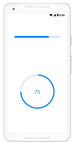
sfLinearProgressBar.Progress = 75;
linearLayout.AddView(sfLinearProgressBar);// Using circular progress bar.
SfCircularProgressBar circularProgressBar = new SfCircularProgressBar(this);
circularProgressBar.Progress = 75;
circularProgressBar.LayoutParameters = new LinearLayout.LayoutParams(
this.Resources.DisplayMetrics.WidthPixels - 120,
this.Resources.DisplayMetrics.HeightPixels / 2);
linearLayout.AddView(circularProgressBar);
SetContentView(linearLayout);NOTE
By default, the value of progress should be specified between 0 and 100. If you need to specify progress value between 0 and 1, you should specify Minimum property to 0 and Maximum property to 1.
Run the project, and check if you get following output to make sure that you have configured your project properly to add the progress bar.
Enable indeterminate state
When the progress of a task cannot be shown determinately, you can enable indeterminate state using IsIndeterminate property to let user know that some progress is happening in the background.
// Using linear progress bar.
LinearLayout linearLayout = new LinearLayout(this);
linearLayout.LayoutParameters=new LinearLayout.LayoutParams(
    this.Resources.DisplayMetrics.WidthPixels - 120,
    this.Resources.DisplayMetrics.HeightPixels / 2);
linearLayout.Orientation = Orientation.Vertical;
SfLinearProgressBar sfLinearProgressBar = new SfLinearProgressBar(this);
sfLinearProgressBar.LayoutParameters = new LinearLayout.LayoutParams(
    this.Resources.DisplayMetrics.WidthPixels - 120,
    this.Resources.DisplayMetrics.HeightPixels/18);
sfLinearProgressBar.Progress = 75;
sfLinearProgressBar.IsIndeterminate = true;
linearLayout.AddView(sfLinearProgressBar);
// Using circular progress bar.
SfCircularProgressBar circularProgressBar = new SfCircularProgressBar(this);
circularProgressBar.Progress = 75;
circularProgressBar.LayoutParameters = new LinearLayout.LayoutParams(
    this.Resources.DisplayMetrics.WidthPixels - 120,
    this.Resources.DisplayMetrics.HeightPixels / 2);
circularProgressBar.IsIndeterminate = true;
linearLayout.AddView(circularProgressBar);
SetContentView(linearLayout);
Enable segments
To visualize the progress of a multiple sequential task, split the progress bar into the multiple segments by defining the SegmentCount property as shown in the following code.
// Using linear progress bar.
LinearLayout linearLayout = new LinearLayout(this);
linearLayout.LayoutParameters=new LinearLayout.LayoutParams(
    this.Resources.DisplayMetrics.WidthPixels - 120,
    this.Resources.DisplayMetrics.HeightPixels / 2);
linearLayout.Orientation = Orientation.Vertical;
SfLinearProgressBar sfLinearProgressBar = new SfLinearProgressBar(this);
sfLinearProgressBar.LayoutParameters = new LinearLayout.LayoutParams(
    this.Resources.DisplayMetrics.WidthPixels - 120,
    this.Resources.DisplayMetrics.HeightPixels/18);
sfLinearProgressBar.Progress = 75;
sfLinearProgressBar.SegmentCount = 4;
linearLayout.AddView(sfLinearProgressBar);
// Using circular progress bar.
SfCircularProgressBar circularProgressBar = new SfCircularProgressBar(this);
circularProgressBar.Progress = 75;
circularProgressBar.LayoutParameters = new LinearLayout.LayoutParams(
    this.Resources.DisplayMetrics.WidthPixels - 120,
    this.Resources.DisplayMetrics.HeightPixels / 2);
circularProgressBar.SegmentCount = 4;
linearLayout.AddView(circularProgressBar);
SetContentView(linearLayout);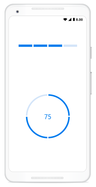
Apply colors
You can customize the color of the progress indicator and track by defining the ProgressColor and TrackColor properties respectively.
LinearLayout linearLayout = new LinearLayout(this);
linearLayout.SetPadding(50, 0, 0, 0);
linearLayout.LayoutParameters=new LinearLayout.LayoutParams(
    this.Resources.DisplayMetrics.WidthPixels - 300,
    this.Resources.DisplayMetrics.HeightPixels / 2);
linearLayout.Orientation = Orientation.Vertical;
// Using linear progress bar.
SfLinearProgressBar sfLinearProgressBar = new SfLinearProgressBar(this);
sfLinearProgressBar.LayoutParameters = new LinearLayout.LayoutParams(
    this.Resources.DisplayMetrics.WidthPixels - 120,
    this.Resources.DisplayMetrics.HeightPixels/18);
sfLinearProgressBar.Progress = 75;
sfLinearProgressBar.TrackColor = Color.Rgb(255, 241, 203);
sfLinearProgressBar.ProgressColor = Color.Rgb(255, 183, 63);
linearLayout.AddView(sfLinearProgressBar);
// Using linear progress bar.
SfLinearProgressBar linearProgressBar = new SfLinearProgressBar(this);
linearProgressBar.LayoutParameters = new LinearLayout.LayoutParams(
    this.Resources.DisplayMetrics.WidthPixels - 120,
    this.Resources.DisplayMetrics.HeightPixels / 18);
linearProgressBar.Progress = 75;
linearProgressBar.TrackColor = Color.Rgb(218, 218, 218);
linearProgressBar.ProgressColor = Color.Rgb(82, 69, 57);
linearLayout.AddView(linearProgressBar);
// Using circular progress bar.
SfCircularProgressBar circularProgressBar = new SfCircularProgressBar(this);
circularProgressBar.Progress = 75;
circularProgressBar.LayoutParameters = new LinearLayout.LayoutParams(
    this.Resources.DisplayMetrics.WidthPixels - 120,
    this.Resources.DisplayMetrics.HeightPixels / 4);
circularProgressBar.TrackColor = Color.Rgb(237, 224, 224);
circularProgressBar.ProgressColor = Color.Rgb(150, 84, 81);
linearLayout.AddView(circularProgressBar);
SetContentView(linearLayout);
// Using circular progress bar.
SfCircularProgressBar SfCircularProgressBar = new SfCircularProgressBar(this);
SfCircularProgressBar.Progress = 75;
SfCircularProgressBar.LayoutParameters = new LinearLayout.LayoutParams(
    this.Resources.DisplayMetrics.WidthPixels - 120,
    this.Resources.DisplayMetrics.HeightPixels / 4);
SfCircularProgressBar.TrackColor = Color.Rgb(231,232,227);
SfCircularProgressBar.ProgressColor = Color.Rgb(168, 179, 127);
linearLayout.AddView(SfCircularProgressBar);
SetContentView(linearLayout);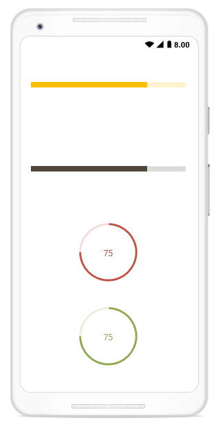
You can find the complete getting started sample from this link.