Interactive Features in WPF Wizard Control
18 Oct 202215 minutes to read
This section illustrates the following interactive feature of Wizard Control.
Populating pages in Wizard Control
The pages can be added to Wizard Control by following ways,
- Populating by Wizard Pages
- Populating by Data Binding
Populating by Wizard Pages
You can add any number of wizard pages to the Wizard Control and there are plenty of properties in the Wizard control that are used to customize the appearance and function of the wizard pages.
<syncfusion:WizardControl Name="wizardControl">
    <syncfusion:WizardPage Name="wizardPage1"/>
    <syncfusion:WizardPage Name="wizardPage2"/>
</syncfusion:WizardControl>
WizardControl wizardControl = new WizardControl();
WizardPage wizardPage1 = new WizardPage();
WizardPage wizardPage2 = new WizardPage();
wizardControl.Items.Add(wizardPage1);
wizardControl.Items.Add(wizardPage2);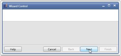
Populating by Data Binding
Below steps will explain on how to add the Items through ItemsSource property of Wizard Control.
-
Create a Model class with the necessary properties.
- C#
-
Create collection of PageItems in ViewModel class to populate pages.
- C#
-
Populate the PageItems collection as follows.
- C#
-
Create a ViewModel instance and use it as DataContext for the Root Window.
- XAML
-
Bind the PageItems collection to the ItemsSource property of the WizardControl. Content of the WizardPage can be displayed using the ItemTemplate property.
- XAML
public class Model : NotificationObject
{
    private string title;

    public string Title
    {
        get
        {
            return title;
        }
        set
        {
            title = value;
            RaisePropertyChanged("Title");
        }
    }

    private string content;

    public string Content
    {
        get
        {
            return content;
        }
        set
        {
            content = value;
            RaisePropertyChanged("Description");
        }
    }
}private ObservableCollection<Model> items;
public ObservableCollection<Model> PageItems
{
get
{
return items;
}
set
{
items = value;
RaisePropertyChanged("PageItems");
}
}private void PopulatePageItems()
{
items.Add(new Model { Title = "XML Developer's Guide", Content = "An in-depth look at creating applications with XML." });
items.Add(new Model { Title = "Midnight Rain", Content = "A former architect battles corporate zombies, an evil sorceress, and her own childhood to become queen of the world." });
items.Add(new Model { Title = "Oberon's Legacy", Content = "In post apocalypse England, the mysterious agent known only as Oberon helps to create a new life for the inhabitants of London." });
items.Add(new Model { Title = "Lover Birds", Content = "When Carla meets Paul at an ornithology conference, tempers fly as feathers get ruffled." });
items.Add(new Model { Title = "Science Fiction", Content = "After an inadvertent trip through a Heisenberg Uncertainty Device, James discovers the problems of being quantum." });
}<Window.DataContext>
<local:ViewModel/>
</Window.DataContext><Window.DataContext>
<local:ViewModel/>
</Window.DataContext>
<Window.Resources>
<Style x:Key="WizardPageStyle" TargetType="syncfusion:WizardPage">
<Setter Property="Title" Value="{Binding Title}"/>
<Setter Property="PageType" Value="Exterior"/>
<Setter Property="BannerImage" Value="/Images/W_O-BG.png"/>
</Style>
</Window.Resources>
<Grid>
<syncfusion:WizardControl x:Name="wizardcontrol" ItemContainerStyle="{StaticResource WizardPageStyle}" ItemsSource="{Binding PageItems}">
<syncfusion:WizardControl.ItemTemplate>
<DataTemplate>
<TextBlock Text="{Binding Content}" TextWrapping="Wrap"/>
</DataTemplate>
</syncfusion:WizardControl.ItemTemplate>
</syncfusion:WizardControl>
</Grid>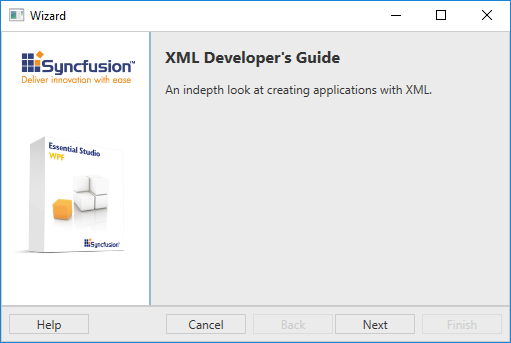
NOTE
Selecting an Wizard Page
SelectedWizardPage property is used to select the wizard page from the WizardControl. Since the type of SelectedWizardPage is WizardPage, binding is needed to set selected wizard page through XAML. The following code explains how to select the wizard page in XAML and in C#,
<syncfusion:WizardControl Name="WizardControl" SelectedWizardPage="{Binding ElementName=wizard2}" Foreground="SlateBlue">
    <syncfusion:WizardPage Title="Wizard Page1" x:Name="wizard1"/>
    <syncfusion:WizardPage Title="Wizard Page2" x:Name="wizard2"/>
    <syncfusion:WizardPage Title="Wizard Page3" x:Name="wizard3"/>
</syncfusion:WizardControl>//Initializing the Wizard control
WizardControl wizardControl = new WizardControl();
//Creating Wizard pages
WizardPage wizardPage1 = new WizardPage();
WizardPage wizardPage2 = new WizardPage();
WizardPage wizardPage3 = new WizardPage();
wizardControl.Foreground = Brushes.SlateBlue;
wizardPage1.Title = "Wizard Page1";
wizardPage2.Title = "Wizard Page2";
wizardPage3.Title = "Wizard Page3";
wizardControl.Items.Add(wizardPage1);
wizardControl.Items.Add(wizardPage2);
wizardControl.Items.Add(wizardPage3);
wizardControl.SelectedWizardPage = wizardPage2;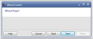
Title and Description
You can set the title and description for the wizard page by using the Title and Description properties respectively.
<syncfusion:WizardControl Name="wizardControl">
    <syncfusion:WizardPage Name="wizardPage" Foreground="Navy" Title="WizardPage1" Description="This is the first page of wizard" />
</syncfusion:WizardControl>
WizardControl wizardControl = new WizardControl();
WizardPage wizardPage = new WizardPage();
wizardControl.Items.Add(wizardPage);
wizardPage.Foreground = Brushes.Navy;
wizardPage.Title = "WizardPage1";
wizardPage.Description = "This is the first page of wizard";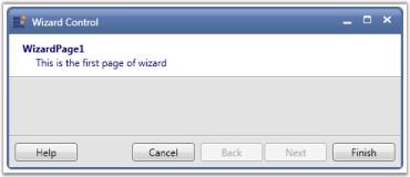
Wizard Page Type
You can set the type of the WizardPage by using the PageType property. There are three types of wizard pages.
- Blank
- Interior
- Exterior
The PageType with Blank has no content or control in it.
The PageType with Interior value has the BannerImage occupies the top position of page.
The PageType with Exterior value has the BannerImage occupies the left position of the page.
<syncfusion:WizardControl Name="wizardControl">
    <syncfusion:WizardPage Name="wizardPage" PageType="Exterior"/>
</syncfusion:WizardControl>
WizardControl wizardControl = new WizardControl();
WizardPage wizardPage = new WizardPage();
wizardControl.Items.Add(wizardPage);
wizardPage.PageType = WizardPageType.Exterior;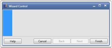
Navigation Buttons of Wizard Page
This topic illustrates the following about Navigation buttons of Wizard Page,
- Enabling or Disabling the Navigation Buttons
- Showing or Hiding the Navigation Buttons
- Text for the Navigation Buttons
Enabling or Disabling the Navigation Buttons
You can enable or disable the Back, Cancel, Next and Finish navigation buttons in the wizard control and wizard page. This is done by using the BackEnabled, CancelEnabled, NextEnabled and FinishEnabled properties.
<syncfusion:WizardControl Name="wizardControl" BackEnabled="True" FinishEnabled="True"NextEnabled="True" CancelEnabled="True">
    <syncfusion:WizardPage Name="wizardPage"/>
</syncfusion:WizardControl>
WizardControl wizardControl = new WizardControl();
WizardPage wizardPage = new WizardPage();
wizardControl.Items.Add(wizardPage);
wizardControl.NextEnabled = true;
wizardControl.BackEnabled = true;
wizardControl.FinishEnabled = true;
wizardControl.CancelEnabled = true;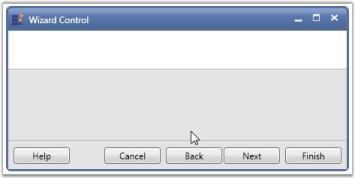
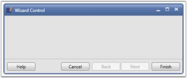
Showing or Hiding the Navigation Buttons
You can show or hide the Back, Cancel, Next, Help and Finish navigation buttons in the Wizard Control and wizard page by using the BackVisible, CancelVisible, NextVisible, HelpVisible and FinishVisible properties.
<syncfusion:WizardControl Name="wizardControl" BackVisible="False" NextVisible="True" CancelVisible="True" HelpVisible="True" FinishVisible="False">
    <syncfusion:WizardPage Name="wizardPage"/>
</syncfusion:WizardControl>
WizardControl wizardControl = new WizardControl();
WizardPage wizardPage = new WizardPage();
wizardControl.Items.Add(wizardPage);
wizardControl.CancelVisible = true;
wizardControl.BackVisible = false;
wizardControl.FinishVisible = true;
wizardControl.NextVisible = true;
wizardControl.HelpVisible = true;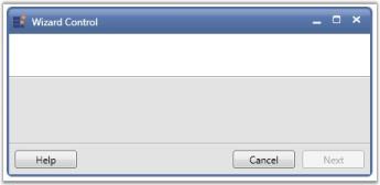
Text for the Navigation Buttons
You can set custom text for the Back, Next, Finish, Help and Cancel navigation buttons in the Wizard control by using the BackText, NextText, FinishText, HelpText and CancelText properties.
<syncfusion:WizardControl Name="wizardControl" BackText="Previous" HelpText="Help" CancelText="Exit" FinishText="Finish" NextText="Next">
    <syncfusion:WizardPage Name="wizardPage"/>
</syncfusion:WizardControl>
WizardControl wizardControl = new WizardControl();
WizardPage wizardPage = new WizardPage();
wizardControl.Items.Add(wizardPage);
wizardControl.NextText = "Next";
wizardControl.BackText = "Previous";
wizardControl.CancelText = "Exit";
wizardControl.HelpText = "Help";
wizardControl.FinishText = "Finish";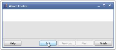
NOTE
You can set custom text for the navigation buttons in the wizard control but not for the navigation buttons in the wizard page.
Next Page and Previous Page Navigation
You can set the navigation to the Next and Previous pages of WizardPage by using the NextPage and PreviousPage properties.
WizardControl wizardControl = new WizardControl();

WizardPage wizardPage1 = new WizardPage();

WizardPage wizardPage2 = new WizardPage();

WizardPage wizardPage3 = new WizardPage();

wizardControl.Foreground = Brushes.SlateBlue;

wizardPage1.Title = "Wizard Page1";

wizardPage2.Title = "Wizard Page2";

wizardPage3.Title = "Wizard Page3";

wizardControl.Items.Add(wizardPage1);

wizardControl.Items.Add(wizardPage2);

wizardControl.Items.Add(wizardPage3);

wizardPage1.NextPage = wizardPage3;

wizardPage3.PreviousPage = wizardPage1;
Closing the Wizard Window
You can close the Wizard control window by clicking the Finish or Cancel button by enabling the FinishButtonClosesWindow or CancelButtonCancelsWindow properties respectively.
<syncfusion:WizardControl Name="wizardControl" FinishButtonClosesWindow="True" CancelButtonCancelsWindow="True">
    <syncfusion:WizardPage Name="wizardPage"/>
</syncfusion:WizardControl>
WizardControl wizardControl = new WizardControl();
WizardPage wizardPage = new WizardPage();
wizardControl.Items.Add(wizardPage);
wizardControl.CancelButtonCancelsWindow = true;
wizardControl.FinishButtonClosesWindow = true;Event for Next Button in Wizard Control
You can use the Next event in Wizard Control to perform any required operation when Next button is clicked.
<syncfusion:WizardControl Name="wizardControl" CancelEnabled="False" CancelVisible="False" Next="wizardControl_Next" FinishButtonClosesWindow="True" CancelButtonCancelsWindow="True" >
    <syncfusion:WizardPage Name="wizardPage1" Title="page1"  />
    <syncfusion:WizardPage Name="wizardPage2" Title="page2" />
    <syncfusion:WizardPage x:Name="wizardPage3" Title="page3"/>
    <syncfusion:WizardPage Name="wizardPage4" Title="page4"/>
</syncfusion:WizardControl>
private void wizardControl_Next(object sender, RoutedEventArgs e)
{
var obj = sender as WizardControl;
if (obj.CancelVisible != true && obj.CancelEnabled != true)
{
obj.SelectedWizardPage = wizardPage2;
}
}