How can I help you?
Actions and Customization in WPF Toast Notification
4 May 20266 minutes to read
This section explains how to customize toast interaction elements such as action buttons, callbacks, templates, and close button behavior.
Action Buttons
You can add interactive action buttons to a toast notification by using the Actions collection. You can also use the ShowActionButtons property to control whether the action button row is displayed for in-app toast modes.
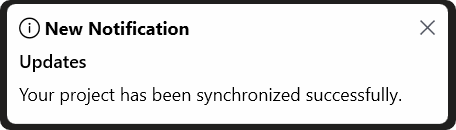
// Toast without action buttons
SfToastNotification.Show(this, new ToastOptions
{
    Title = "New Notification",
    Header = "Updates",
    Message = "Your project has been synchronized successfully.",
    Mode = ToastMode.Screen,
    ShowActionButtons = false
});SfToastNotification.Show(this, new ToastOptions
{
Title = "File Saved",
Message = "Your document has been saved.",
Actions = new List<ToastAction>
{
new ToastAction
{
Label = "Undo",
},
new ToastAction
{
Label = "OK",
CloseOnClick = true
}
}
});
private void UndoLastSave()
{
// Implement undo logic
}
Action Callbacks
You can assign a callback to an action button by using the Callback property of ToastAction. This allows you to execute custom logic when the user clicks the action button.
SfToastNotification.Show(this, new ToastOptions
{
    Title = "New Message",
    Message = "You have a new message.",
    Actions = new List<ToastAction>
    {
        new ToastAction
        {
            Label = "Reply",
            Callback = () => OpenReplyWindow(),
            CloseOnClick = true
        },
        new ToastAction
        {
            Label = "Later",
            CloseOnClick = true
        }
    }
});

private void OpenReplyWindow()
{
    // Open reply window
}
Action Template
You can customize the appearance of individual action buttons by using the ActionTemplate property available in the ToastAction class. When a template is assigned, the toast uses the specified template instead of the default action button style.
<DataTemplate x:Key="CustomizedActionTemplate">
    <Button Style="{StaticResource ToastActionButtonStyle}"
            Margin="4,0,4,0"
            Width="132"
            Height="24"
            HorizontalAlignment="Center"
            Tag="{Binding}"
            Content="{Binding Label}" />
</DataTemplate>

<Style x:Key="ToastActionButtonStyle" TargetType="Button">
    <Setter Property="Background" Value="Blue"/>
    <Setter Property="Foreground" Value="Orange"/>
    <Setter Property="BorderThickness" Value="0" />
    <Setter Property="Padding" Value="6,4" />
    <Setter Property="Width" Value="56" />
    <Setter Property="Height" Value="28" />
</Style>SfToastNotification.Show(this, new ToastOptions
{
Title = "New Message",
Message = "You have a new message.",
Actions = new List<ToastAction>
{
new ToastAction
{
Label = "Reply",
ActionTemplate = (DataTemplate)Application.Current.Resources["CustomizedActionTemplate"]
},
new ToastAction
{
Label = "Later"
}
}
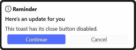
});Close Button
You can use the ShowCloseButton property to specify whether the close button is visible for the toast. The close button is available only in in-app toast modes (Window and Screen).
// Toast with the close button hidden
SfToastNotification.Show(this, new ToastOptions
{
    Title = "Reminder",
    Message = "This toast has its close button disabled.",
    Mode = ToastMode.Screen,
    ShowCloseButton = false
});