How can I help you?
WPF Skin Manager Classic
28 Aug 202521 minutes to read
The Classic Skin Manager in WPF applies themes by merging style definitions from theme assemblies into the application’s visual tree. Each theme assembly contains resource dictionaries with styles for controls. When the Theme property is set, the Skin Manager merges the appropriate theme resources into the resource dictionary of the target element or into Application.Current.Resources, ensuring consistent styling across the element and its descendants.
NOTE
Theme Studio-based themes provide improved consistency and uniqueness among various controls when compared to other themes. It is preferable to use Theme Studio-based themes in the application over other themes.
Themes list
The following table lists the available themes as well as the assembly or NuGet reference to be used in the application.
| Styles | Assembly | NuGet package |
|---|---|---|
| Metro | Syncfusion.Themes.Metro.Wpf.dll | |
| Lime | Syncfusion.Themes.Lime.Wpf.dll | |
| Saffron | Syncfusion.Themes.Saffron.Wpf.dll | |
| Blend | Syncfusion.Themes.Blend.Wpf.dll | |
| Office2013White | Syncfusion.Themes.Office2013White.Wpf.dll | |
| Office2013LightGray | Syncfusion.Themes.Office2013LightGray.Wpf.dll | |
| Office2013DarkGray | Syncfusion.Themes.Office2013DarkGray.Wpf.dll | |
| VisualStudio2013 | Syncfusion.Themes.VisualStudio2013.Wpf.dll | |
| Office2010Black | Syncfusion.Themes.Office2010Black.Wpf.dll | |
| Office2010Blue | Syncfusion.Themes.Office2010Blue.Wpf.dll | |
| Office2010Silver | Syncfusion.Themes.Office2010Silver.Wpf.dll | |
| Office365 | Syncfusion.Themes.Office365.Wpf.dll | |
| Office2016Colorful | Syncfusion.Themes.Office2016Colorful.Wpf.dll | |
| Office2016White | Syncfusion.Themes.Office2016White.Wpf.dll | |
| Office2016DarkGray | Syncfusion.Themes.Office2016DarkGray.Wpf.dll | |
| VisualStudio2015 | Syncfusion.Themes.VisualStudio2015.Wpf.dll |
The following table lists alternative theme studio themes suggestions to be used in the application.
| Styles | Alternative theme studio themes suggestion to use |
|---|---|
| Metro | FluentLight, Office2019Colorful |
| Lime | FluentLight, Office2019Colorful |
| Saffron | FluentLight, Office2019Colorful |
| Blend | FluentDark, MaterialDark, Office2019Black |
| Office2013White | Office2019White |
| Office2013LightGray | Office2019Colorful |
| Office2013DarkGray | Office2019DarkGray |
| VisualStudio2013 | - |
| Office2010Black | - |
| Office2010Blue | - |
| Office2010Silver | - |
| Office365 | Office2019Colorful |
| Office2016Colorful | Office2019Colorful |
| Office2016White | Office2019White |
| Office2016DarkGray | Office2019DarkGray |
| VisualStudio2015 | - |
Set theme
Themes will be applied to both Syncfusion® and Framework controls by using Theme attached property of the SfSkinManager.
<Window x:Class="DataGrid_Themes.MainWindow"
                             xmlns="http://schemas.microsoft.com/winfx/2006/xaml/presentation"
                             xmlns:x="http://schemas.microsoft.com/winfx/2006/xaml"
                             xmlns:local="clr-namespace:DataGrid_Themes"
                             xmlns:syncfusion="http://schemas.syncfusion.com/wpf"
                             xmlns:syncfusionskin ="clr-namespace:Syncfusion.SfSkinManager;assembly=Syncfusion.SfSkinManager.WPF"
                             Icon="App.ico"
                             Title="Getting Started"
                             WindowStartupLocation="CenterScreen"
                             syncfusionskin:SfSkinManager.Theme="{syncfusionskin:SkinManagerExtension ThemeName=Windows11Light}">

    <Grid DataContext="{StaticResource viewmodel}">
        <syncfusion:SfDataGrid Name="sfgrid" Margin="5"
                                       AutoGenerateColumns="False"
                                       AllowDraggingColumns="True"
                                       AllowEditing="True"
                                       LiveDataUpdateMode="AllowDataShaping"
                                       AllowFiltering="True"
                                       HeaderRowHeight="26"
                                       SelectionMode="Extended"
                                       ColumnSizer="Auto"
                                       ItemsSource="{Binding EmployeeDetails}">
        </syncfusion:SfDataGrid>
    </Grid>
</Window>SfSkinManager.SetTheme(this, new Theme("Windows11Light"));
NOTE
Apply a theme globally in the application
By default, SfSkinManager merges the required resource files from the theme assembly to the element to which the theme is applied. To apply a theme globally in an application, set the ApplyStylesOnApplication property to True. It merges all the theme resource files to Application.Current.Resources.
NOTE
The
SfSkinManager.ApplyStylesOnApplicationstatic property should be set beforeInitializeComponentof the window or during application start up, when applying for multiple windows.
SfSkinManager.ApplyStylesOnApplication = true;Apply themes to the controls derived from Syncfusion® controls
To apply themes to the derived control using SfSkinManager, call SetResourceReference method and, pass the StyleProperty and derived control type as parameters.
<local:SfDataGridExt x:Name="grid"
                             AllowGrouping="True"
                             AutoGenerateColumns="False"
                             ItemsSource="{Binding EmployeeDetails}"
                             ShowGroupDropArea="True">
            <local:SfDataGridExt.Resources>
                <ResourceDictionary>
                    <ResourceDictionary.MergedDictionaries>
                        <ResourceDictionary Source="/Syncfusion.SfGrid.WPF;component/Styles/Styles.xaml" />
                    </ResourceDictionary.MergedDictionaries>
                </ResourceDictionary>
            </local:SfDataGridExt.Resources>
            <local:SfDataGridExt.Columns>
                <syncfusion:GridNumericColumn MappingName="EmployeeAge" />
                <syncfusion:GridTextColumn MappingName="EmployeeName" />
                <syncfusion:GridTextColumn MappingName="EmployeeGender" />
                <syncfusion:GridTextColumn AllowEditing="True" MappingName="Country" />
                <syncfusion:GridNumericColumn MappingName="EmployeeSalary" />
            </local:SfDataGridExt.Columns>
</local:SfDataGridExt>public class SfDataGridExt : SfDataGrid
{
public SfDataGridExt()
{
SetResourceReference(StyleProperty, typeof(SfDataGrid));
}
}How to
Customize theme in application level
To customize the Syncfusion® theme at application level, merge the theme into ResourceDictionary and override the style using ‘BasedOn’ property.
In ‘ResourceDictionary’, mention the style path which needs to be overridden, in ‘BasedOn’, mention the key stated in the table.
We can customize or override the theme styles by following the steps outlined below.
Step 1: Merge the resource dictionaries of the controls which need to be customized. In this example, we have merged the Framework Button‘s resource dictionary.
<ResourceDictionary.MergedDictionaries>
     <ResourceDictionary Source="/Syncfusion.Themes.Windows11Light.WPF;component/MSControl/Button.xaml" />
</ResourceDictionary.MergedDictionaries>
Step 2: Declare style for the control with ‘BasedOn’ key. Here style of the button has been declared and its key is used in ‘BasedOn’. Button’s Background, Foreground, FontFamily, BorderBrush have been overridden.
<Style BasedOn="{StaticResource WPFButtonStyle}"
          x:Key="customizeButtonStyle"
          TargetType="{x:Type Button}">
         <Setter Property="Background" Value="#5dbea3" />
         <Setter Property="Foreground" Value="White" />
         <Setter Property="FontFamily" Value="Berlin Sans FB Demi" />
         <Setter Property="BorderBrush" Value="#5dbea3" />
   </Style>
Step 3: Now, utilize the customized styles in our application using the ‘Style’ property. This step adds custom styles of Buttons in WPF application.
<StackPanel Orientation="Horizontal" >
    <Button Content="OK" Height="30" Width="120" Margin="10" Style="{StaticResource customizeButtonStyle}"></Button>
    <Button Content="Cancel" Height="30" Width="120" Margin="10" Style="{StaticResource customizeButtonStyle}"></Button>
</StackPanel>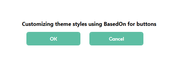
Change visual style at runtime
Themes for application can be changed at runtime by changing VisualStyle property. Make sure that the new theme assembly is attached as reference in the application when applying theme.
<syncfusion:ChromelessWindow x:Class="DataGrid_Themes.MainWindow"
                             xmlns="http://schemas.microsoft.com/winfx/2006/xaml/presentation"
                             xmlns:x="http://schemas.microsoft.com/winfx/2006/xaml"
                             xmlns:local="clr-namespace:DataGrid_Themes"
                             xmlns:system="clr-namespace:System;assembly=mscorlib"
                             xmlns:syncfusion="http://schemas.syncfusion.com/wpf"
                             xmlns:syncfusionskin ="clr-namespace:Syncfusion.SfSkinManager;assembly=Syncfusion.SfSkinManager.WPF"
                             syncfusionskin:SfSkinManager.VisualStyle="{Binding ElementName=comboVisualStyle, Path=SelectedValue, Mode=OneWay, UpdateSourceTrigger=PropertyChanged}">

    <syncfusion:ChromelessWindow.Resources>
        <ObjectDataProvider
            x:Key="Themes"
            MethodName="GetValues"
            ObjectType="{x:Type system:Enum}">
            <ObjectDataProvider.MethodParameters>
                <x:Type TypeName="syncfusionskin:VisualStyles" />
            </ObjectDataProvider.MethodParameters>
        </ObjectDataProvider>
    </syncfusion:ChromelessWindow.Resources>

    <Grid>
        <Grid.RowDefinitions>
            <RowDefinition Height="40"/>
            <RowDefinition Height="*"/>
        </Grid.RowDefinitions>
        <ComboBox
                x:Name="comboVisualStyle"
                Grid.Row="0"
                Width="250"
                Margin="5"
                ItemsSource="{Binding Source={StaticResource Themes}}"
                SelectedIndex="18" />

        <Grid Grid.Row="1" DataContext="{StaticResource viewmodel}">
            <syncfusion:SfDataGrid Name="sfgrid" Margin="5"
                                       AutoGenerateColumns="False"
                                       AllowDraggingColumns="True"
                                       AllowEditing="True"
                                       LiveDataUpdateMode="AllowDataShaping"
                                       AllowFiltering="True"
                                       HeaderRowHeight="26"
                                       SelectionMode="Extended"
                                       ColumnSizer="Auto"
                                       ItemsSource="{Binding EmployeeDetails}">

            </syncfusion:SfDataGrid>
        </Grid>
    </Grid>
</syncfusion:ChromelessWindow>SfSkinManager.SetVisualStyle(this, (VisualStyles)Enum.Parse(typeof(VisualStyles), comboVisualStyle.SelectedItem.ToString()));NOTE
Switch theme with custom styles
To change a theme dynamically with custom styles, utilize the resource dictionary and override the style using the ‘BasedOn’ property.
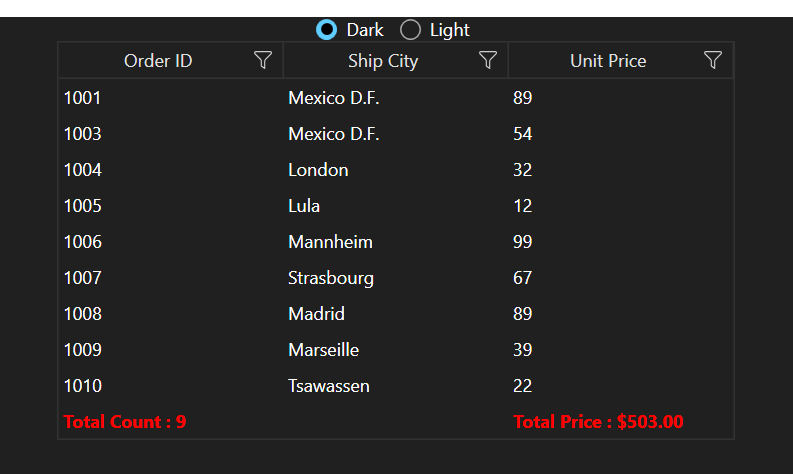
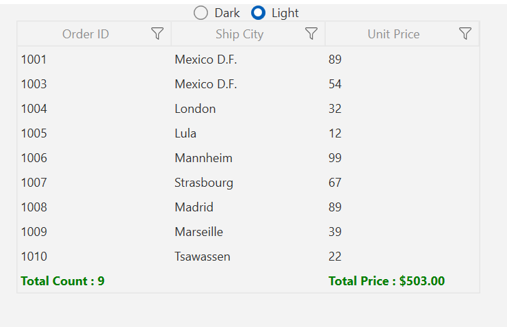
We have provided an example that demonstrates switching between the Window11Light and Windows11Dark themes using the SfGrid control. In this example, we customize the foreground color of the GridTableSummaryCell to green in Window 11 Light and red in Windows 11 Dark.
- Step 1: In this example, we have an SfDataGrid and a RadioButton which is used to switching theme and we need to add resource dictionaries with paths in merged dictionaries in view model or code behind. The following code can be used to effortlessly switch themes.
private void RadioButton_Click(object sender, RoutedEventArgs e)
        {
            var themeName = (sender as RadioButton).Content.ToString();
            string syncfusionTheme = string.Empty;
            if (themeName == "Dark")
            {
                syncfusionTheme = "Windows11Dark";
                SfSkinManager.SetTheme(Application.Current.MainWindow, new Theme("Windows11Dark"));
            }
            else if (themeName == "Light")
            {
                syncfusionTheme = "Windows11Light";
                SfSkinManager.SetTheme(Application.Current.MainWindow, new Theme("Windows11Light"));
            }

            MergeResourceDictionary(syncfusionTheme);
            MergeCustomResourceDictionary(themeName);
        }

        private void MergeResourceDictionary(string syncfusionTheme)
        {
            Application.Current.Resources.MergedDictionaries.Add(new ResourceDictionary()
            {
                Source = new Uri($"/Syncfusion.Themes.{syncfusionTheme}.WPF;component/MSControl/Window.xaml", UriKind.RelativeOrAbsolute)
            });
            Application.Current.Resources.MergedDictionaries.Add(new ResourceDictionary()
            {
                Source = new Uri($"/Syncfusion.Themes.{syncfusionTheme}.WPF;component/MSControl/ComboBox.xaml", UriKind.RelativeOrAbsolute)
            });
            Application.Current.Resources.MergedDictionaries.Add(new ResourceDictionary()
            {
                Source = new Uri($"/Syncfusion.Themes.{syncfusionTheme}.WPF;component/SfDataGrid/SfDataGrid.xaml", UriKind.RelativeOrAbsolute)
            });
        }

        private void MergeCustomResourceDictionary(object selectedTheme)
        {
            Application.Current.Resources.MergedDictionaries.Add(new ResourceDictionary()
            {
                Source = new Uri($"/WpfApp1;component/Themes/{selectedTheme}.xaml", UriKind.RelativeOrAbsolute)
            });
}- Step 2: Customize the foreground color and font weight of the table summary row in both light and dark themes.
Light Theme
<!--Light.xaml-->
<ResourceDictionary>
           <Style BasedOn="{StaticResource SyncfusionGridTableSummaryCellStyle}"
                  TargetType="syncfusion:GridTableSummaryCell">
                <Setter Property="FontWeight"  Value="Bold" />
                <Setter Property="Foreground" Value="Green" />
           </Style>
</ResourceDictionary>
Dark Theme
<!--Dark.xaml-->

<ResourceDictionary>
                <Style BasedOn="{StaticResource SyncfusionGridTableSummaryCellStyle}"
                           TargetType="syncfusion:GridTableSummaryCell">
                               <Setter Property="FontWeight"    Value="Bold" />
                               <Setter Property="Foreground"   Value="Red" />
            </Style>
</ResourceDictionary>
Output Screenshots
Light Theme:
Dark Theme: