How can I help you?
Tab Management in WPF Tabbed Window
5 May 20264 minutes to read
This section explains how to manage tabs in a WPF Tabbed Window interface. It provides an overview of common tab management operations such as closing tabs, creating new tabs, customizing tab buttons, and navigating tabs using keyboard shortcuts.
Closing Tabs
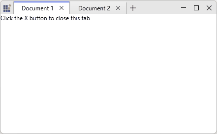
You can display close buttons on individual tabs using the CloseButtonVisibility property on SfTabItem.
<syncfusion:SfTabControl x:Name="maintabcontrol">
    <syncfusion:SfTabItem
        Header="Document 1"
        CloseButtonVisibility="Visible">
        <TextBlock Text="Click the X button to close this tab" />
    </syncfusion:SfTabItem>
    <syncfusion:SfTabItem
        Header="Document 2"
        CloseButtonVisibility="Visible">
        <TextBlock Text="Each tab has its own close button" />
    </syncfusion:SfTabItem>
</syncfusion:SfTabControl>
var tabItem = new SfTabItem
{
Header = "Document",
CloseButtonVisibility = Visibility.Visible,
Content = new TextBlock { Text = "Tab Content" }
};
tabControl.Items.Add(tabItem);When the user clicks the close button, the corresponding tab is automatically removed from the SfTabControl, and the next available tab is selected.
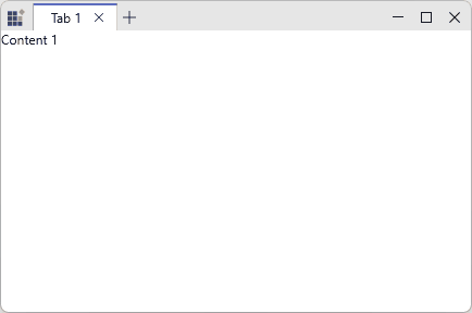
Adding New Tabs
The SfTabControl provides a built‑in new tab button that allows users to add tabs dynamically at runtime. Set the EnableNewTabButton property to True to display this button. Clicking it raises the NewTabRequested event, where a new SfTabItem can be created.
<syncfusion:SfTabControl
    EnableNewTabButton="True"
    NewTabRequested="OnNewTabRequested">
    <syncfusion:SfTabItem Header="Tab 1">
        <TextBlock Text="Content 1" />
    </syncfusion:SfTabItem>
</syncfusion:SfTabControl>
private void OnNewTabRequested(object sender, NewTabRequestedEventArgs e)
{
var newTabContent = new TextBlock
{
Text = $"New Document {DateTime.Now:g}"
};
var newTabItem = new SfTabItem
{
Header = $"Document {tabControl.Items.Count + 1}",
Content = newTabContent,
CloseButtonVisibility = Visibility.Visible
};
e.Item = newTabItem;
}
Customizing the New Tab Button
You can customize the appearance of the new tab button using the NewTabButtonStyle property. This allows you to modify visual properties such as background, border, width, and height.
<syncfusion:SfTabControl EnableNewTabButton="True"
                         x:Name="maintabcontrol">
    <syncfusion:SfTabControl.NewTabButtonStyle>
        <Style TargetType="{x:Type Button}">
            <Setter Property="Background" Value="Red"/>
            <Setter Property="BorderBrush" Value="Yellow"/>
            <Setter Property="MinWidth" Value="30"/>
            <Setter Property="MinHeight" Value="30"/>
        </Style>
    </syncfusion:SfTabControl.NewTabButtonStyle>
    <syncfusion:SfTabItem Header="Tab 1" Content="Tab 1 Content"/>
    <syncfusion:SfTabItem Header="Tab 2" Content="Tab 2 Content"/>
    <syncfusion:SfTabItem Header="Tab 3" Content="Tab 3 Content"/>
</syncfusion:SfTabControl>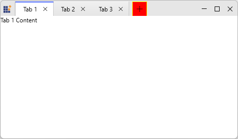
Keyboard Shortcuts
The Tabbed Window provides built‑in keyboard and mouse shortcuts for efficient tab navigation and management:
- Ctrl + Tab - Switch to the next tab.
- Ctrl + Shift + Tab - Switch to the previous tab.
- Ctrl + T - Create a new tab.
- Middle mouse click on a tab header - Close the tab.