How can I help you?
ToolTip in WPF DataGrid (SfDataGrid)
27 Feb 20259 minutes to read
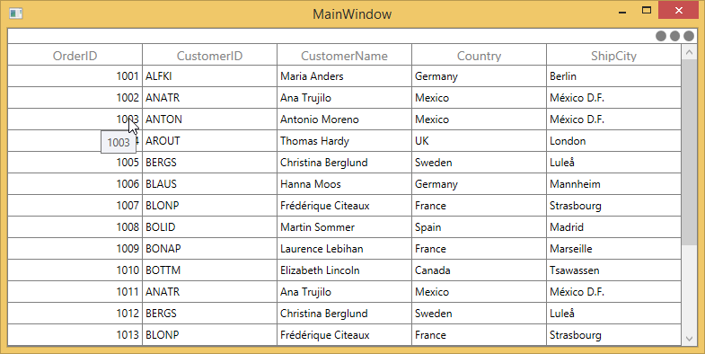
ToolTip provides the support to show the pop-up window that displays the information when the mouse hovers in cells of SfDataGrid.
Record cell tooltip
You can enable the ToolTip for the GridCell by setting the SfDataGrid.ShowToolTip as true.
this.dataGrid.ShowToolTip = true;You can enable the ToolTip for the particular column by setting the GridColumn.ShowToolTip as true.
<syncfusion:SfDataGrid.Columns>
    <syncfusion:GridTextColumn HeaderText="Order ID" ShowToolTip="True" MappingName="OrderID" />
    <syncfusion:GridTextColumn HeaderText="CustomerID" ShowToolTip="True" MappingName="CustomerID" />
</syncfusion:SfDataGrid.Columns>this.dataGrid.Columns["OrderID"].ShowToolTip = true;
this.dataGrid.Columns["CustomerID"].ShowToolTip = true;NOTE
GridColumn.ShowToolTiptakes higher priority than SfDataGrid.ShowToolTip.
Header tooltip
You can enable the ToolTip for the header cell by setting the GridColumn.ShowHeaderToolTip as true.
<syncfusion:SfDataGrid.Columns>
<syncfusion:GridTextColumn HeaderText="Order ID" ShowHeaderToolTip="True" MappingName="OrderID" />
</syncfusion:SfDataGrid.Columns>this.dataGrid.Columns["OrderID"].ShowHeaderToolTip = true;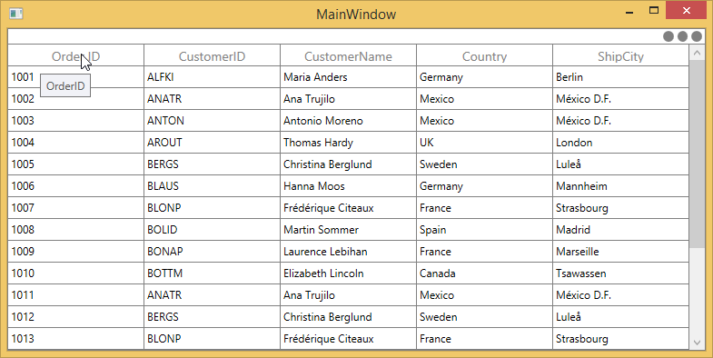
ToolTip Customization
You can change the appearance of the ToolTip by customizing the style with TargetType as ToolTip.
<Window.Resources>
    <Style x:Name="ToolTipStyle" TargetType="ToolTip">
        <Setter Property="BorderThickness" Value="1,1,1,1" />
        <Setter Property="BorderBrush" Value="Red" />
        <Setter Property="Background" Value="AliceBlue" />
    </Style>
</Window.Resources>

<syncfusion:SfDataGrid.Columns>
    <syncfusion:GridTextColumn HeaderText="Order ID"  ShowToolTip="True" MappingName="OrderID" />
</syncfusion:SfDataGrid.Columns>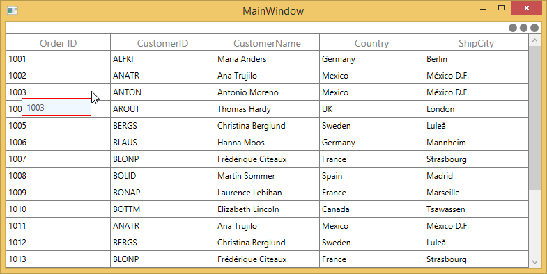
You can customize the template of ToolTip by using the GridColumn.ToolTipTemplate and GridColumn.ToolTipTemplateSelector properties.
Customize the ToolTip using ToolTipTemplate
You can customize the appearance of the ToolTip for particular column by setting GridColumn.ToolTipTemplate. And you can also customize the appearance of header ToolTip for particular column by GridColumn.HeaderToolTipTemplate property.
<Window.Resources>
    <local:StringToImageConverter x:Key="ImageConverter" />
    <DataTemplate x:Key="TemplateToolTip">
        <Image Height="100" Width="100" Source="{Binding CustomerID,Converter={StaticResource ImageConverter}}" />
    </DataTemplate>
</Window.Resources>

<syncfusion:SfDataGrid.Columns>
    <syncfusion:GridTextColumn HeaderText="Order ID"  ShowToolTip="True" MappingName="OrderID" />
    <syncfusion:GridTextColumn HeaderText="CustomerID" ToolTipTemplate="{StaticResource TemplateToolTip}" ShowToolTip="True" MappingName="CustomerID" />
</syncfusion:SfDataGrid.Columns>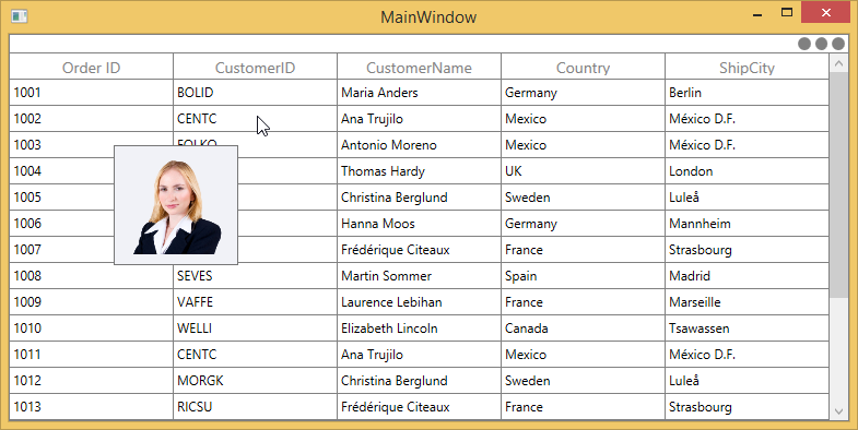
You can get the sample from here.
Customize the ToolTip with ToolTipTemplateSelector
The different ToolTip template can be loaded in a same column conditionally based on data by setting GridColumn.ToolTipTemplateSelector
<Window.Resources>
    <DataTemplate x:Key="ToolTip1">
        <Grid>
            <Rectangle Fill="Transparent"/>
            <TextBlock Text="{Binding OrderID}" FontWeight="Bold" Background="LightPink"/>
        </Grid>
    </DataTemplate>
    <DataTemplate x:Key="ToolTip2">
        <Grid>
            <Rectangle Fill="Transparent"/>
            <TextBlock Text="{Binding OrderID}" FontStyle="Italic" Background="LightGreen"/>
        </Grid>
    </DataTemplate>
</Window.Resources>

<syncfusion:SfDataGrid.Columns>
    <syncfusion:GridTextColumn HeaderText="Order ID" ShowToolTip="True" MappingName="OrderID" >
        <syncfusion:GridTextColumn.ToolTipTemplateSelector>
            <local:ToolTipTemplateSelector
                   AlternateTemplate="{StaticResource ToolTip2}"
                   DefaultTemplate="{StaticResource ToolTip1}" />
        </syncfusion:GridTextColumn.ToolTipTemplateSelector>
    </syncfusion:GridTextColumn>
</syncfusion:SfDataGrid.Columns>public class ToolTipTemplateSelector : DataTemplateSelector
{
private DataTemplate _defaultTemplate;
/// <summary>
/// Gets or sets DefaultTemplate.
/// </summary>
public DataTemplate DefaultTemplate
{
get { return _defaultTemplate; }
set { _defaultTemplate = value; }
}
private DataTemplate _alternateTemplate;
/// <summary>
/// Gets or Sets AlternateTemplate.
/// </summary>
public DataTemplate AlternateTemplate
{
get { return _alternateTemplate; }
set { _alternateTemplate = value; }
}
public override System.Windows.DataTemplate SelectTemplate(object item, System.Windows.DependencyObject container)
{
//The item that comes from ToolTipTemplate is DataContextHelper. When set SetCellBoundValue to true, it sets DataContextHelper as DataContext to DataTemplate. Refer property section of CellTemplate.
OrderInfo dataUnit = item as OrderInfo;
if (dataUnit == null) return this.DefaultTemplate;
//use reflection to retrieve property
Type type = dataUnit.GetType();
PropertyInfo property = type.GetProperty("OrderID");
//To see what template needs to be select according to the specified property value.
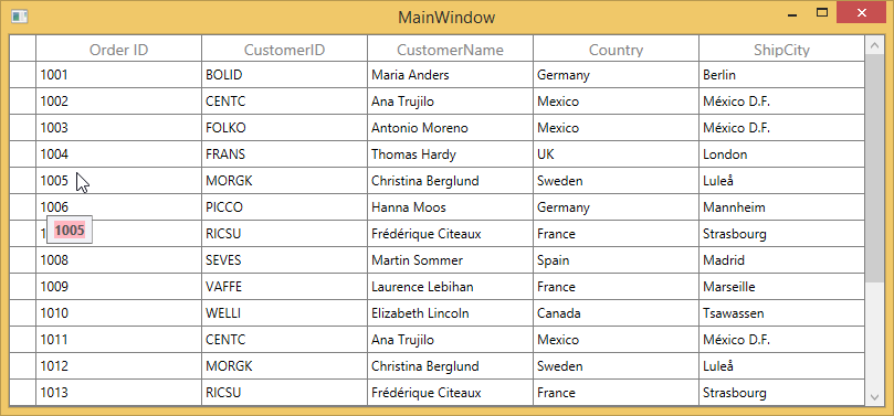
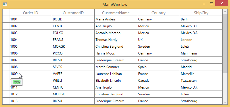
if (property.GetValue(dataUnit, null).ToString().Contains('9') || property.GetValue(dataUnit, null).ToString().Contains('4'))
return this.AlternateTemplate;
else
return this.DefaultTemplate;
}
}The below image refers the DefaultTemplate which is applied through ToolTipTemplateSelector.
The below image refers the AlternateTemplate which is applied through ToolTipTemplateSelector.
You can get the sample from here.
Events
CellToolTipOpening event
The CellToolTipOpening event occurs when any tooltip of the cell is opened. The CellToolTipOpening event receives the GridCellToolTipOpeningEventArgs as argument which has the following properties:
- Column : Gets the hovered cell column in the SfTreeGrid.
- Record : Gets the data context of hovered cell.
- RowColumnIndex : Gets the row and column index of the hovered cell.
- ToolTip : Gets the tooltip of the hovered cells.
<syncfusion:SfDataGrid Name="DataGrid"
                        CellToolTipOpening="DataGrid_CellToolTipOpening"
                        AutoGenerateColumns="True"
ItemsSource="{Binding Orders}">this.DataGrid.CellToolTipOpening += DataGrid_CellToolTipOpening;
private void DataGrid_CellToolTipOpening(object sender, Syncfusion.UI.Xaml.Grid.GridCellToolTipOpeningEventArgs e)
{
}