How can I help you?
Data Label in WPF SfChart3D
19 May 202615 minutes to read
Data points can be easily annotated with labels to help improve the readability of data.
Define Label Content
To enable the marker in adornments you have to set the ShowLabel property as True.
SegmentLabelContent property allows you to define the value to be displayed as adornment label.
<chart:ColumnSeries3D
    ItemsSource="{Binding CategoricalData}"
    XBindingPath="Year"
    YBindingPath="Plastic">
    <chart:ColumnSeries3D.AdornmentsInfo>
        <chart:ChartAdornmentInfo3D ShowLabel="True" SegmentLabelContent="DateTime" AdornmentsPosition="Top"/>
    </chart:ColumnSeries3D.AdornmentsInfo>
</chart:ColumnSeries3D>
ColumnSeries3D series = new ColumnSeries3D()
{
ItemsSource = new CategoryDataViewModel().CategoricalData,
XBindingPath = "Year",
YBindingPath = "Plastic"
};
ChartAdornmentInfo3D adornmentInfo = new ChartAdornmentInfo3D()
{
ShowLabel = true,
SegmentLabelContent=LabelContent.DateTime,
AdornmentsPosition=AdornmentsPosition.Top
};
series.AdornmentsInfo = adornmentInfo;
chart.Series.Add(series);| LabelContent | Output |
|---|---|
| LabelContent.DateTime | 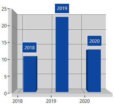 |
| LabelContent.LabelContentPath | 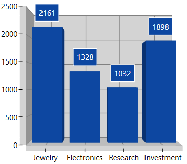 |
| LabelContent.Percentage | 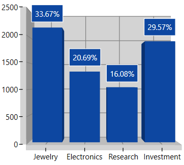 |
| LabelContent.XValue | 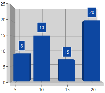 |
| LabelContent.YofTot | 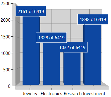 |
| LabelContent.YValue | 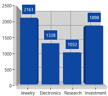 |
Customizing the label
The following properties are used to customize the adornment label.
-
BorderBrush- used to change the border color. -
BorderThickness- used to change the thickness of the border. -
Margin- used to change the margin size for label. -
FontStyle- used to change font family of the label. -
FontSize- used to change font size of the label. -
Foreground- used to change the color of the label. -
FontFamily- used to change the font family of the label. -
Background- used to change the label background color.
The following code example demonstrates the customization of label using the above properties:
<chart:ColumnSeries3D
    ItemsSource="{Binding Demands}"
    XBindingPath="Category"
    YBindingPath="Value">
    <chart:ColumnSeries3D.AdornmentsInfo>
        <chart:ChartAdornmentInfo3D
            ShowLabel="True"
            FontStyle="Italic"
            FontFamily="Segoe UI"
            Background="DarkGray"
            BorderBrush="LightGray"
            Foreground="White"
            BorderThickness="1">
        </chart:ChartAdornmentInfo3D>
    </chart:ColumnSeries3D.AdornmentsInfo>
</chart:ColumnSeries3D>
ColumnSeries3D series = new ColumnSeries3D()
{
ItemsSource = new StockViewModel().Demands,
XBindingPath = "Category",
YBindingPath = "Value",
};
ChartAdornmentInfo3D adornmentInfo = new ChartAdornmentInfo3D()
{
ShowLabel = true,
LabelPosition = AdornmentsLabelPosition.Outer,
Foreground = new SolidColorBrush(Colors.White),
BorderBrush = new SolidColorBrush(Colors.LightGray),
Background = new SolidColorBrush(Colors.DarkGray),
BorderThickness = new Thickness(1),
FontStyle = FontStyles.Italic,
FontFamily = new FontFamily("Segoe UI"),
};
series.AdornmentsInfo = adornmentInfo;
chart.Series.Add(series);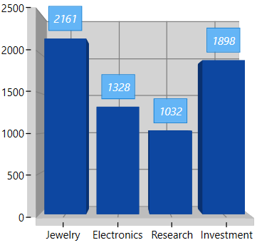
Label Rotation
LabelRotationAngle property is used to define the angle to which the label has to rotate. The following code demonstrates the label rotating angle.
<chart:ColumnSeries3D
    ItemsSource="{Binding Demands}"
    XBindingPath="Category"
    YBindingPath="Value">
    <chart:ColumnSeries3D.AdornmentsInfo>
        <chart:ChartAdornmentInfo3D
            LabelRotationAngle="45"
            UseSeriesPalette="True"
            ShowLabel="True"
            BorderBrush="White"
            BorderThickness="1"/>
    </chart:ColumnSeries3D.AdornmentsInfo>
</chart:ColumnSeries3D>
ColumnSeries3D series = new ColumnSeries3D()
{
ItemsSource = new StockViewModel().Demands,
XBindingPath = "Category",
YBindingPath = "Value",
};
ChartAdornmentInfo3D adornmentInfo = new ChartAdornmentInfo3D()
{
ShowLabel = true,
LabelRotationAngle=45,
LabelPosition=AdornmentsLabelPosition.Outer,
UseSeriesPalette=true,
BorderBrush = new SolidColorBrush(Colors.White),
BorderThickness = new Thickness(1),
};
series.AdornmentsInfo = adornmentInfo;
chart.Series.Add(series);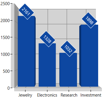
Label Format
SegmentLabelFormat property allows you to provide formatting for the labels.
The following code example demonstrates the label having three decimal digits:
<chart:ColumnSeries3D
    ItemsSource="{Binding CategoricalData}"
    XBindingPath="Year"
    YBindingPath="Plastic">

    <chart:ColumnSeries3D.AdornmentsInfo>
        <chart:ChartAdornmentInfo3D
            ShowLabel="True"
            LabelPosition="Outer"
            SegmentLabelFormat="#.###"/>
    </chart:ColumnSeries3D.AdornmentsInfo>

</chart:ColumnSeries3D>
ColumnSeries3D series = new ColumnSeries3D()
{
ItemsSource = new CategoryDataViewModel().CategoricalData,
XBindingPath = "Year",
YBindingPath = "Plastic",
};
ChartAdornmentInfo3D adornmentInfo = new ChartAdornmentInfo3D()
{
ShowLabel = true,
AdornmentsPosition = AdornmentsPosition.Top,
SegmentLabelFormat = "#.###"
};
series.AdornmentsInfo = adornmentInfo;
chart.Series.Add(series);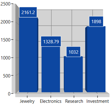
Connector Line
You can add connector line for the adornments using ShowConnectorLine property. Also this connector line can be customized using ConnectorHeight, ConnectorLineStyle and ConnectorRotationAngle properties.
The following code example shows the how to add connector line:
<chart:PieSeries3D
    ItemsSource="{Binding Demands}"
    XBindingPath="Category"
    YBindingPath="Value"
    LabelPosition="OutsideExtended">

    <chart:PieSeries3D.AdornmentsInfo>
        <chart:ChartAdornmentInfo3D
            ShowConnectorLine="True"
            ConnectorHeight="15"
            UseSeriesPalette="True"
            ShowLabel="True"
            BorderBrush="White"
            BorderThickness="1"/>
    </chart:PieSeries3D.AdornmentsInfo>

</chart:PieSeries3D>
PieSeries3D series = new PieSeries3D()
{
ItemsSource = new StockViewModel().Demands,
XBindingPath = "Category",
YBindingPath = "Value",
LabelPosition = CircularSeriesLabelPosition.OutsideExtended
};
ChartAdornmentInfo3D adornmentInfo = new ChartAdornmentInfo3D()
{
ShowLabel = true,
ShowConnectorLine = true,
ConnectorHeight = 15,
UseSeriesPalette = true,
BorderBrush = new SolidColorBrush(Colors.White),
BorderThickness = new Thickness(1)
};
series.AdornmentsInfo = adornmentInfo;
chart.Series.Add(series);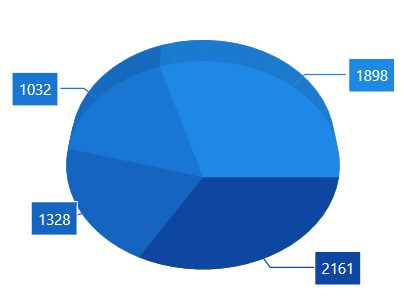
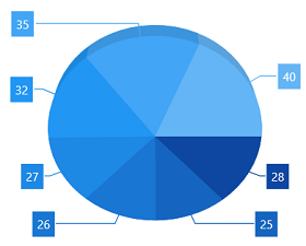
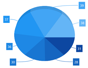
Connector Type
ConnectorType property in AccumulationSeries is used to specify the connector line type such as Line or Bezier. This property is only for AccumulationSeries like PieSeries and DoughnutSeries.
The following code example shows the how to specify connector type:
<chart:PieSeries3D
    Palette="BlueChrome"
    ItemsSource="{Binding CategoricalData}"
    XBindingPath="Year"
    ConnectorType="Line"
    LabelPosition="OutsideExtended"
    YBindingPath="Plastic">
    <chart:PieSeries3D.AdornmentsInfo>
        <chart:ChartAdornmentInfo3D ShowConnectorLine="True" UseSeriesPalette="True" ShowLabel="True"/>
    </chart:PieSeries3D.AdornmentsInfo>
</chart:PieSeries3D>
PieSeries3D series = new PieSeries3D()
{
ItemsSource = new ViewModel().DataPoints,
XBindingPath = "Year",
YBindingPath = "India",
LabelPosition=CircularSeriesLabelPosition.OutsideExtended,
ConnectorType=ConnectorMode.Line
};
ChartAdornmentInfo3D adornmentInfo = new ChartAdornmentInfo3D()
{
ShowLabel = true,
ShowConnectorLine = true
};
series.AdornmentsInfo = adornmentInfo;
chart.Series.Add(series);| Line | Bezier |
|---|---|
 |
 |
NOTE
ConnectorType.StraightLine behavior does not applicable for 3D series.
Customization of ConnectorLine Appearance
You can define the style for the connector line using ConnectorLineStyle properties.
<Window.Resources>
    <Style x:Key="lineStyle" TargetType="Path">
        <Setter Property="StrokeDashArray" Value="10,7,5"/>
        <Setter Property="Stroke" Value="Black"/>
    </Style>
</Window.Resources>

<chart:PieSeries3D
    ItemsSource="{Binding CategoricalData}"
    ConnectorType="Line"
    LabelPosition="Outside"
    XBindingPath="Year"
    YBindingPath="Plastic">

    <chart:PieSeries3D.AdornmentsInfo>
        <chart:ChartAdornmentInfo3D
            ShowLabel="True"
            ShowConnectorLine="True"
            ConnectorHeight="60"
            LabelPosition="Outer"
            ConnectorLineStyle="{StaticResource lineStyle}"/>
    </chart:PieSeries3D.AdornmentsInfo>

</chart:PieSeries3D>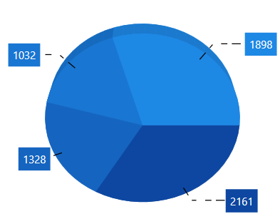
Applying Series Brush
The UseSeriesPalette property is used to apply the series color to background color of data marker labels.
For Accumulation like Pie, Doughnut, Funnel and Pyramid the segment interior color will be reflected in adornment background.
<chart:ChartAdornmentInfo3D
    ShowLabel="True"
    LabelPosition="Outer"
    UseSeriesPalette="True">
</chart:ChartAdornmentInfo3D>
ChartAdornmentInfo3D adornmentInfo = new ChartAdornmentInfo3D()
{
ShowLabel = true,
LabelPosition = AdornmentsLabelPosition.Outer,
UseSeriesPalette=true
};Smart Labels
When you have more datapoints in Pie or Doughnut series, the adornment labels might get overlap with each other. SfChart3D provides built-in support to avoid these overlapping by using EnableSmartLabels property.
The following code example demonstrates the EnableSmartLabels property:
<chart:PieSeries3D
    ItemsSource="{Binding CategoricalData}"
    ConnectorType="Bezier"
    XBindingPath="Year"
    YBindingPath="Plastic"
    EnableSmartLabels="True"
    LabelPosition="OutsideExtended"
    ExplodeAll="True"
    ExplodeRadius="3">

    <chart:PieSeries3D.AdornmentsInfo>
        <chart:ChartAdornmentInfo3D
            ShowLabel="True"
            ShowConnectorLine="True"
            HorizontalAlignment="Center"
            VerticalAlignment="Center"/>
    </chart:PieSeries3D.AdornmentsInfo>

</chart:PieSeries3D>
PieSeries3D series = new PieSeries3D()
{
ItemsSource = new CategoryDataViewModel().CategoricalData,
XBindingPath = "Year",
YBindingPath = "Plastic",
LabelPosition = CircularSeriesLabelPosition.OutsideExtended,
ConnectorType = ConnectorMode.StraightLine,
EnableSmartLabels = true,
ExplodeAll=true,
ExplodeRadius=3
};
ChartAdornmentInfo3D adornmentInfo = new ChartAdornmentInfo3D()
{
ShowLabel = true,
ShowConnectorLine = true,
HorizontalAlignment=HorizontalAlignment.Center,
VerticalAlignment=VerticalAlignment.Center
};
series.AdornmentsInfo = adornmentInfo;
chart.Series.Add(series);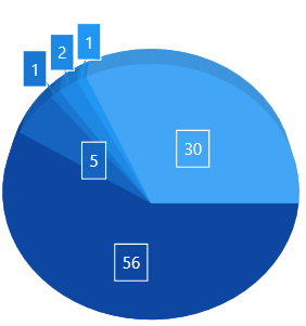
NOTE
For circular series, the adornment position can be changed to
Inside,OutsideorOutsideExtendedusing theLabelPositionproperty.